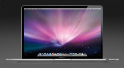
I like the MBA just fine the way it is. I previously had a unibody MB and can't recall the glass touchpad feeling any better than the one on the MBA. I don't really see the benefit of having the entire (well, the bottom half) of the touchpad being a button. I like the combination of the large touchpad and thin dedicated button. I actually prefer to have the touchpad remain flat while I'm click-dragging.
As for the edge to edge glass screen, I think the aluminum bezel on the MBA is far superior in terms of glare. To me a major distraction with the unibody display was the reflections on the black non-displaying area. Because of this, I think that the overall user experience with the MBA is far better.
I'm all for new stuff, but only when it's actually better than the old stuff.
John


