Got a tip for us?
Let us know
Become a MacRumors Supporter for $50/year with no ads, ability to filter front page stories, and private forums.
Google Keep: Why does this exist?
- Thread starter Michael Goff
- Start date
- Sort by reaction score
You are using an out of date browser. It may not display this or other websites correctly.
You should upgrade or use an alternative browser.
You should upgrade or use an alternative browser.
It doesn't bother me that it's rudimentary, I just really don't love the slightly skeumorphic look with the grainy grey faux paper background and the too-yellow overall tone. I find it really clashes with the new, sharper look of iOS since iOS 7. It just feels like it got left behind when the rest of the OS got updated...I haven't spent any meaningful time using Keep so I won't presume to evaluate it. And I agree that Note in iOS/OS is really rudimentary. Thankfully, Apple has given it a major overhaul in iOS 9 and the changes look nice. I've just barely taken a look at it as I just installed the iOS 9 beta so time will tell if it's genuinely more useful. Still probably won't rely on it since it's not cross platform.
As someone who flip flops across phones a lot, I don't really find keep to be a terribly useful tool for note-taking. It's not available as an app in the iOS ecosystem, and while you can get it on desktop, I just don't love the way it looks.
Evernote, by contrast, is available everywhere. It has excellent desktop apps on windows and mac, it's got phone apps on android, ios and windows phone, and it "hides" the home page for better categorization, so you can get at things in a more organized fashion. With keep I always wind up wanting to delete notes so I can "see" my main ones in the view. I don't worry about that with Evernote since they're hidden behind the notebooks.
Evernote, by contrast, is available everywhere. It has excellent desktop apps on windows and mac, it's got phone apps on android, ios and windows phone, and it "hides" the home page for better categorization, so you can get at things in a more organized fashion. With keep I always wind up wanting to delete notes so I can "see" my main ones in the view. I don't worry about that with Evernote since they're hidden behind the notebooks.
It doesn't bother me that it's rudimentary, I just really don't love the slightly skeumorphic look with the grainy grey faux paper background and the too-yellow overall tone. I find it really clashes with the new, sharper look of iOS since iOS 7. It just feels like it got left behind when the rest of the OS got updated...
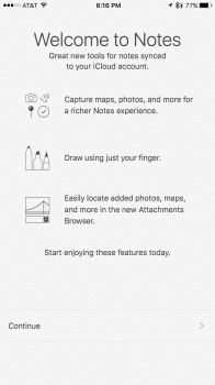
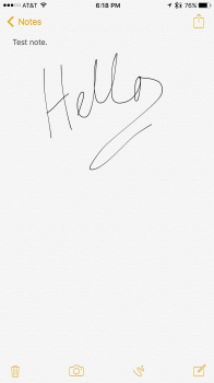
Well, you'll be happy to know that the skeumorphism is now gone. In fact, just about all color is gone--it is really, eh....quite white now.


Android exists to compete with iOS. It also provides a rather nice experience that contrasts with the closed nature of iOS.
Chrome started off as a sleek and fast browser to compete with IE. It can still compete with the best of them.
GMail started off to try to modernize the email.
Keep, though?
I can't figure out what Google sought to fix with this. Evernote and OneNote simply do more. Is there something I'm missing?
I use it for checklists. Evernote was too complicated for that I was trying to do... a SIMPLE checklist app. Key word simple... Keep does the job.
Hmm...I still see the same paper fibre texture...? And the dank pee yellow highlights too....Well, you'll be happy to know that the skeumorphism is now gone. In fact, just about all color is gone--it is really, eh....quite white now.
View attachment 574596 View attachment 574595
I use keep all the time on my Android's and Desktop's. It's simple, that's what I like about it.
Have you tried GoKeep for iOS? Any good? I think you can pay to remove the annoying ads. https://itunes.apple.com/us/app/gokeep-for-google-keep/id896842094?mt=8
I'm surprised Google hasn't bought Evernote. Seems like a good place for data mining.
I personally love Onenote, but their UI on mobile devices is terrible. The desktop UI simply doesn't translate to mobile at all. You can't use tags on mobile either. The great thing is their formatting is a dream come true.
Evernote UI is pretty good on all platforms. Unfortunately, their formatting sucks. Forget about copying a table from Word or spreadsheet from Excel to it. It simply loses all formatting. Bullet lists DO NOT work in Evernote. You can't resize pics or move things around in Evernote.
And this is the fault of EN is that they've not yet improved their core product. They are all about updating UI's and merchandise, but formatting issues should have been taken care of long ago.
It's like one app is great at a feature the other one isn't, and therefore I'm better off with Evernote, for now, simply because the mobile UI is much better to work with and easier to navigate. If Onenote can make their mobile offering like Evernote, then I'd switch.
Last edited:
Register on MacRumors! This sidebar will go away, and you'll see fewer ads.

