Become a MacRumors Supporter for $50/year with no ads, ability to filter front page stories, and private forums.
Noticed that with the new version also Google Music was unavailable for me, and yet it is there with the old version.

I think the leak version might only be suitable for certain devices ?

Altho you probably already got an answer, I saw that the new Play Store was incomplete for consumers outside the US.

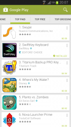
I installed and love the new layout, but it mostly has to do w/ the white color scheme. It gives it a more updated/modern look. My gripe w/ the Play Store has always been that it looked... cartoony? Given the black + every other color, color scheme.

One thing tho, icons getting reduced in size will likely be an unwanted change. For example the update button is probably less than half the previous size.
 
I prefer the new Play Store, just inverted. And icons are larger, not smaller:

Yeah I don't like the massive icons. Take up way too much space. Especially in your myapps page if you have a lot previously.....

I have 61 apps installed on my One, and that is only 1/2 on myapps list.
 
"The Google Play Store app for Android has just been updated, and features a brighter, card-based interface from which users can more easily source new content. For a long time, the Play Store has presented Droidsters with a decidedly dark look, but the lighter aesthetic really helps accentuate the card-based theme, and the official rollout is now underway.

It will trickle out to those running Android 2.2 and above during the next couple of weeks, and as well as the cards, you’ll also immediately notice the increased clarity of icons and larger images."

Source: http://ow.ly/jTTmW

Still doesnt say how/where to get the update, do i go to software update or eventually the app will update without notice ?

is it just me or the UI looks uglier??? what's up with such a bland and flat UI design?
 
is it just me or the UI looks uglier??? what's up with such a bland and flat UI design?

It's the new Google view, like Google Now cards. I actually like the cards in Google Now so I am not too stressed, some people say it looks better if you switch to dark theme.
 
is it just me or the UI looks uglier??? what's up with such a bland and flat UI design?

Google has instituted a common set of graphical standards called Holo. This design is to be followed on all Google apps and is encouraged to be used by 3rd party developers in order to present a more unified look.

This may not be appealing to people, just like many think iOS is nothing more than dead, outdated grid of icons, with horrible menus. But these are just opinions.

----------

I dont get it. Your saying when you install the new playstore, your icons on your phone will get bigger?

No. Just the icons of the apps within the play store. See my second picture above.
 
Turned on my GS3 ths morning and had a app update notice. Clicked on it and noticed a different look to it. After updating the app i went to the playstore page and it was updated to 4.0.
 
Got it couple of days ago, i actually didnt have to click on anything it just updated without notice.
 
Google has instituted a common set of graphical standards called Holo. This design is to be followed on all Google apps and is encouraged to be used by 3rd party developers in order to present a more unified look.

This may not be appealing to people, just like many think iOS is nothing more than dead, outdated grid of icons, with horrible menus. But these are just opinions.

----------


No. Just the icons of the apps within the play store. See my second picture above.

The issue I have with the new pay store design is that it actually follows holo less than the old version which kept pretty strictly to it. The other issue is that the scrolling is laggy on the new one. It was smooth on the old play store.
 
I don't know what I did to make Google hate me. I still haven't gotten the update.

Please Google, I promise, I can change, I swear, no more late nights after being out with that tramp Apple..... :)
 
I know this can be side loaded so everyone can use it, but

has anyone got it officially outside the US yet?
 
i had to reinstall the system software and i it updated for me. if you don't mind losing anything, or are backed up, try that.
 
Here's what mine looks like.
 

Attachments

  • 2013-04-28 20.07.40.png
    2013-04-28 20.07.40.png
    236.4 KB · Views: 121
Here's what mine looks like.

What does the home page look like?

One of the reasons I didn't want to manually install it was I read the home page is blank outside the US (no recommendations etc), it only has a link to the different categories
 
What does the home page look like?

One of the reasons I didn't want to manually install it was I read the home page is blank outside the US (no recommendations etc), it only has a link to the different categories

I did the same, manually forced an update and it was mostly blank, downgraded the store now and waiting for it to get the update pushed out normally.
 
What does the home page look like?

One of the reasons I didn't want to manually install it was I read the home page is blank outside the US (no recommendations etc), it only has a link to the different categories

The home page lists app recommendations.
 
Looks more like Google Now, with the cards.

I wonder if this is any indication of what's to come with KLP. They'll be cards everywhere!!
 
Register on MacRumors! This sidebar will go away, and you'll see fewer ads.