Got a tip for us?
Let us know
Become a MacRumors Supporter for $50/year with no ads, ability to filter front page stories, and private forums.
Has Mountain Lion Fixed these issues?
- Thread starter azpc
- Start date
- Sort by reaction score
You are using an out of date browser. It may not display this or other websites correctly.
You should upgrade or use an alternative browser.
You should upgrade or use an alternative browser.
What about Lion's "feature" of not being able to find or connect to one's wifi network after waking from sleep? Has that been addressed in ML ??
Never experienced that.
What about Lion's "feature" of not being able to find or connect to one's wifi network after waking from sleep? Has that been addressed in ML ??
Pretty sure that was fixed in Lion.
Pretty sure that was fixed in Lion.
No. It started in Lion. Check Apple's support forums. There's an active thread that started last year about it.
No. It started in Lion. Check Apple's support forums. There's an active thread that started last year about it.
Yes, i know it started in lion.
I believe it was also fixed in a patch, for Lion.
At least it was on our MBA.
I don't think that that's fair; Snow Leopard is kind of the ideal that Apple should be shooting for, as it was a great update with clear improvements over Leopard. Anyone that prefers Snow Leopard can happily stay with it, it's just the kind of update that Apple should be using as the target to achieve or beat with every new update.This thread screams of 'I just want them to release Snow Leopard again!'.
Anyone that prefers Snow Leopard can happily stay with it, it's just the kind of update that Apple should be using as the target to achieve or beat with every new update.
The problem is for many users is it's not a choice.
You can keep with Snow Leopard only if you have an older Mac. All current and future Mac hardware won't run it, so this is why the option of having colour finder icons in Mountain Lion is so important to me.
If I was able to run 10.6 on the latest hardware, than I wouldn't moan about any changes in the OS.
However as it stands we don't have a choice of OSX on new Macs, so I'm desperate for them to bring the colour back!
...so this is why the option of having colour finder icons in Mountain Lion is so important to me.
...so I'm desperate for them to bring the colour back!
Seriously? Of all the serious things in Lion NOT to like you chose this petty "eye candy" issue to complain about?
Seriously? Of all the serious things in Lion NOT to like you chose this petty "eye candy" issue to complain about?
It's not 'eye candy' its a fundamental change to its usability.
Colour makes navigating folders in the finder MUCH easier.
it's a functionality issue, not just an 'eye candy' one as you claim.
This sounds like exaggeration to me; the only place that you're forced to have duotone icons is in the sidebar, and I've been using it without trouble for a while now. Once I got used to what the new icons looked like I don't think I've had a single issue using the duotone sidebar at all, except for a completely unrelated disk in favourites issues.Colour makes navigating folders in the finder MUCH easier.
The finder window itself still supports colour icons exactly as before; if you can't live without the colour icons in the main area of the finder window, then you can easily change them.
That said, the only changed icons are the Apple official ones which only really exist at top-levels, i.e - your user folder and root folder, where the icons are perfectly distinguishable from one another without colour. Maybe if the change had taken place at a level with hundreds of icons then it'd be different, but I think they've done a good job of proving that the colour wasn't needed.
This sounds like exaggeration to me; .
Its not an exaggeration. I place shortcuts to my most used folders in the sidebar and now they all look the same (even the customised ones).
That's not an 'improvement' however you try and swing it.
I'm not asking for the grey to go away, I'm simply asking for the option to restore the colour sidebar for those (like me) who it genuinely degrades the user experience for.
And I'm not alone, theres many who feel the same, see here...https://discussions.apple.com/thread/3190705?start=270&tstart=0
So it's not an exaggeration at all, its a fact.
I'm happy it doesn't affect your workflow, but it does affect mine.
When you are typing in this forum, if all the smilies in the right were grey and all the icons above were grey, it wouldn't 'streamline' the interface, it'd simply make it more difficult to distinguish them from one another.
That's effectively what Apple chose to do with 10.7 and I'm hoping the option for colour returns in 10.8.
You can use Shift+Option+Volume Up/Down for fine control in 10.7.4. Not sure about lower versions.Fine tune audio controls is back. I think it wasn't in 10.7.3 not sure.
Not really true; it encourages better icon design as the icon should be able to clearly distinguish itself from others. If loss of colour causes loss of meaning then the icon was relying on colour as a crutch.if all the smilies in the right were grey and all the icons above were grey, it wouldn't 'streamline' the interface, it'd simply make it more difficult to distinguish them from one another.
I'm not saying it's a right move for everyone, but for the majority duotone icons are a lot cleaner and less chaotic, and keep focus on content rather than UI, which is a trend Apple has been following for a while now. I just don't think that enough people benefit from a return of colour to the sidebar to warrant an option. The real issue is a lack of good icons that work with the sidebar, rather than the loss of colour icons which IMO never really worked at the small size of the sidebar anyway. Besides which, the sidebar includes the name of each item anyway, so I don't really see how it can be hard to find anything, I have plenty of things in my sidebar as well, but the trouble I have is with the items that show up as regular folders because their icons don't work properly in the sidebar.
Oh, and I'd love it if this forum had duotone smileys and topic icons, as smileys on forums have always been too colourful; the red angry face for example doesn't immediately convey anger/dislike to me, it just makes it harder to distinguish the actual shape of the face. The big grin being green is also essentially meaningless as it looks like its happy to be sick or something, all perfect examples of misuse of colour
Now you are just being obtuse.
All I'm asking is for the colour sidebar (that I and many others prefer), to be made available again as an option for those who want it.
A checkbox in system preferences is all it would take and would not impact on your 'duotone' system that you love so much.
We live in a colour world and we see things in colour too, so to reduce an interface to just two colours (white and grey) makes absolutely no sense at all.
Next you'll be arguing that black and white TV was actually better than colour as you could 'focus on the content' - utter nonsense!
And you don't use the sidebar to 'view content' anyway, you use it to navigate it!
Colour cues are used everyday throughout society and make things MUCH easier.
That's why you have a red light to stop and a green light to go - not an icon in sight!
Traffic signs (that you also use to navigate) are different colours too.
it's no different for a computer interface.
Icons have been and always will be a secondary cue to colour.
That's why Adobe (who use nice clear icons), still put each of their apps in a different coloured box - it makes identifying them quicker and easier.
Its not rocket science and I think most reasonable people would accept my argument.
Last edited:
Now you are just being obtuse.
All I'm asking is for the colour sidebar (that I and many others prefer), to be made available again as an option for those who want it.
A checkbox in system preferences is all it would take and would not impact on your 'duotone' system that you love so much.
We live in a colour world and we see things in colour too, so to reduce an interface to just two colours (white and grey) makes absolutely no sense at all.
Next you'll be arguing that black and white TV was actually better than colour as you could 'focus on the content' - utter nonsense!
And you don't use the sidebar to 'view content' anyway, you use it to navigate it!
Colour cues are used everyday throughout society and make things MUCH easier.
That's why you have a red light to stop and a green light to go - not an icon in sight!
Traffic signs (that you also use to navigate) are different colours too.
it's no different for a computer interface.
Icons have been and always will be a secondary cue to colour.
That's why Adobe (who use nice clear icons), still put each of their apps in a different coloured box - it makes identifying them quicker and easier.
Its not rocket science and I think most reasonable people would accept my argument.
Of course. One has to be particularly unreasonable to even attempt to make a case for the contrary.
No I'm not; you just have to look at many apps, pro-apps in particular and you can see a trend towards content-focused UI's, which means UI's that stay out of the way by being neutral in appearance.Now you are just being obtuse.
Apple has been going that way with its OS for some time now, with flatter greys and various other touches that keep the UI from intruding on what you're doing. Colour icons in sidebars just aren't in keeping with that overall trend, so expecting Apple to include an option for something they clearly don't believe to be in the future of good UI design is unrealistic. I understand why some people want it, but I don't think those people are in the majority at all, as the majority most likely barely noticed the change, and are just happy to silently benefit from what is a cleaner overall UI.
Colour sidebar icons are by far the most minor thing in the Finder right now anyway, as it has about a hundred other things that need to be fixed or improved. The inability to keyboard + click on things within an unfocused Finder window being my personal favourite, as that's a feature of the old sidebar which I lament the loss of far more, since it means I have to click a Finder window then Apple-click the sidebar to open a new window for Downloads, which is a massive annoyance by comparison.
Adobe is possibly the worst example you could have picked; their icons aren't really icons at all, they're just letters on a square, conveying absolutely no hint as to what the app is supposed to do. The reason their icons are coloured is because there is absolutely zero real visual information to tell them apart; a good icon shouldn't require you to learn what colour means what, it should convey some idea of what the app is for. Not to say that Apple's icons are really any better, but if you were to reduce the Adobe icons to their basic elements (the letters) and use them without the app-name then you can see just how little information they convey. In short; colour in Adobe's icons is a crutch to prop up bad icon design.That's why Adobe (who use nice clear icons), still put each of their apps in a different coloured box - it makes identifying them quicker and easier.
Which is a shame, as Adobe otherwise seems to follow Apple's UI philosophy, with nice neutral UI's. Photoshop CS6 especially showed this with the new black UI, which is great, though riddled with other problems (it's useless in a two-monitor setup).
Last edited:
Let's not also forget that I don't think the following have been fixed:
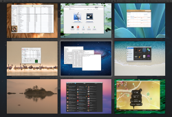
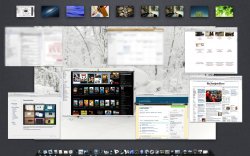
A choice between "classic Spaces in a grid" and "Spaces in Mission Control"
A choice between "Full-Screen in the current Space" to allow the use of a 2nd monitor and "Full-Screen in it's own Space."
Plus, it's my understanding that Expose is only partially fixed. SL's Expose/Spaces still easier to move a specific window to another Space.
Done:
TotalSpaces
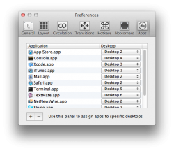
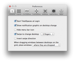
A developer, Stephen Sykes, began work on "ReSpaceApp", to bring back 10.5/6 "Spaces". He did so well, BinaryAge, the makers of "TotalFinder" and other apps, bought his project and renamed it "TotalSpaces". Stephen has been working hard every day, and has produced an app that is exactly like Spaces but even better. I've been using it on Lion and ML since day one, and it's perfect! As it's technically still in beta (and Stephen responds to everyone's posts and emails that same day, is extremely nice and very helpful), it's free. It will be $12/license which can be used on as many Mac's as you have. Already bought a license (as have many) to support his work.
Exposé:
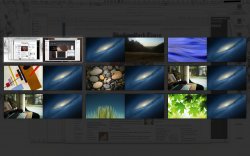
The latest DP3.2, you can uncheck "Group windows by application" and now have "All Windows" Exposé.
10.8 has surprised me. Apple engineers are finally listening to developers and customers, memory management is finally improved/fixed and over stability is greatly improved. I can handle the iOS-ification, although I do not like it, just as long as they keep it a DESKTOP system for those who need it for work and not for just surfing the web and email - leave that for iOS (and don't give me this is a "post-PC era", Steve Jobs used a Mac Pro for his primary machine; desktop systems are not going away, they may change, but they will not disappear).
Attachments
Last edited by a moderator:
Exactly! And I couldn't agree more.This thread screams of 'I just want them to release Snow Leopard again!'.
I have personally downgraded from Lion back to Snow Leopard. And won't upgrade again. They SIMPLY HAVE to make autosave something I can turn off. My iMac is not a 21" iPad.
I am in the process of upgrading my mid-2007 iMac.
What is the latest version of the iMac that still supports Snow Leopard? I hope to be able to find a new one still in a shop somewhere.
Did anyone catch if Apple said they'd fixed messages so that the Mac client can receive messages sent to my phone number, rather than only my Apple I.D?
At WWDC, they announced that they are going to merge your phone number with your Apple ID
It's not 'eye candy' its a fundamental change to its usability.
Colour makes navigating folders in the finder MUCH easier.
it's a functionality issue, not just an 'eye candy' one as you claim.
Yup, I may not have alot in my Finder Sidebar but it's a heck of a lot easier to get around with nice little different colored icons.
Attachments
Fine tune audio controls is back. I think it wasn't in 10.7.3 not sure.
Please explain that... I don't know what fine tune audio controls means. I'm new to Mac.
Restore Save As?
No. This isnt coming back for Apple applications . Hopefully 3rd party programs will allow you to choose which save system you would like to use.
__
Apple's deliberately drawing attention to the Save As feature in Mountain Lion.
http://www.apple.com/osx/whats-new/features.html#autosave
No. This isnt coming back for Apple applications . Hopefully 3rd party programs will allow you to choose which save system you would like to use.
__
Apple's deliberately drawing attention to the Save As feature in Mountain Lion.
http://www.apple.com/osx/whats-new/features.html#autosave
Please explain that... I don't know what fine tune audio controls means. I'm new to Mac.
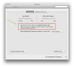
In previous versions of OS X, Apple allowed you to control the brightness and audio in fine increments. Basically, you hit Option + Shift and the F keys and it raises or lowers the sound or brightness in little squares of 4 instead of one.
Option + Shift +F1 will lower the brightness. O+S+F2 will brighten it. It's the same for the volume control except you hit F11 (lowers) or F12 (raises) after O+S. Try it out!
Just make sure that the box which says "Use all F1, F2 etc. keys as standard function keys" (image below) is unchecked and your good to go. To make sure, go to the apple logo in the upper left hand of your screen, click, hit system preferences, than select keyboard.
On a side note, i never actually knew about this till people started complaining that it was gone.
Attachments
Register on MacRumors! This sidebar will go away, and you'll see fewer ads.


