Become a MacRumors Supporter for $50/year with no ads, ability to filter front page stories, and private forums.

mmomega

macrumors demi-god
Dec 30, 2009
3,888
2,101
DFW, TX
What has the font to do with you knowing whether or not you are connected to wireless?

I just disabled the WiFi symbol all together, in all actuality I don't need it. Anything I do will pretty much instantly let me know I'm not connected to a network anyway.
That and the bluetooth symbol as well as time machine and airplay on machines that I'm not going to airplay from.

also, once you know that if you are not connected to wifi the symbol will be grey, when you are connected the symbol is black then the thin font doesn't matter anymore. It's just different than what we are used to seeing.
 

illusionmist

macrumors member
Jul 27, 2013
51
2
Actually wait. If it's a font rendering issue, that is a software issue, and NOT an result of poor quality LCD, it WILL show up on the screenshot.

For me, it doesn't actually look too bad, not worse than on Mavericks, but to be completely honest I still do prefer crisp font rendering from win8.

Safari font rendering on my MBA:
http://i.imgur.com/EWvdHjk.png

The address bar has very weak font smoothing or disabled it altogether, but that's not a huge deal and everything else is OK. I remember Safari on Mavericks had some similiar issues as well, the fonts on bookmarks bar weren't correctly rendered.

You're only part right. How the OS render the font indeed affects greatly the quality of how typography looks, but to determine what you actually "see," you need to take into account translating that digital image onto physical pixels, including size of the pixels, resolution of the display, PPI, and all those anti-aliasing/sub-pixel stuff.
 

3282868

macrumors 603
Jan 8, 2009
5,281
0
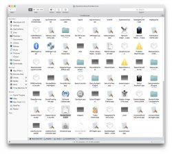
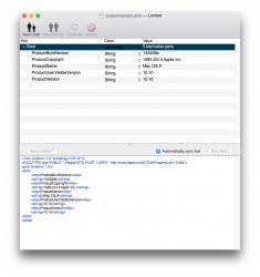
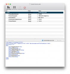
I used a work around to tweak system fonts. "TinkerTool" won't launch in 10.10. In Macintosh HD/System/Library/CoreServices, edit the "SystemVersion.plist" (recommend "PlistEdit Pro"), edit to reflect 10.9.3:

ProductBuildVersion 13D65
..
..
..
ProductUserVisibleVersion 10.9.3
ProductVersion 10.9.3

Backup the original file, edit the modded version and save to desktop. Delete the original (again, keep a copy first), then copy and paste the modded version. This will tell app's the system is 10.9.3, and app's that won't run in 10.10 will. Use app's you need to, ex "TinkerTool", mod system fonts, etc., then replace the modded file with the 10.10 original. Done.

I've kept a copy of the original "SystemVersion.plist" and modded version in sep. folders for future use.

Hope this helps (attached pics for ref)
 

Attachments

  • :System:Library:CoreServices.jpeg
    :System:Library:CoreServices.jpeg
    276.4 KB · Views: 264
  • SystemVersion.plist.jpeg
    SystemVersion.plist.jpeg
    95.7 KB · Views: 216
  • SystemVersion.plist 2.jpeg
    SystemVersion.plist 2.jpeg
    95.2 KB · Views: 183

SmOgER

macrumors 6502a
Jun 2, 2014
805
89
You're only part right. How the OS render the font indeed affects greatly the quality of how typography looks, but to determine what you actually "see," you need to take into account translating that digital image onto physical pixels, including size of the pixels, resolution of the display, PPI, and all those anti-aliasing/sub-pixel stuff.

When you take the screenshot neither PPI nor the resolution will change. The only thing what can change is the "physical" size of the image depending on the size of the pixels of your screen, but all the details will remain. I have a desktop PC with entirely different DPI, yet I can clearly see on the screenshots the same quality of fonts as it is originally on my MBA.
 

SmOgER

macrumors 6502a
Jun 2, 2014
805
89
Not long ago someone mentioned app which can change/adjust os x fonts on system level, can't find it. Can anyone point me in the right direction?
 

cocky jeremy

macrumors 603
Jul 12, 2008
6,490
7,125
It's decent enough on the menubar. However, it's absolutely wretched in some weights and size. In particularly in Calendar and the url bar in Safari. Hopefully they can work on hinting and rendering to make it more non-retina friendly by the time of the release, because right now it's as bad as you'd probably imagine.

Looks perfectly fine to me on my 2013 iMac.
 

malih

macrumors member
May 11, 2013
95
25
Safari font rendering on my MBA:
http://i.imgur.com/EWvdHjk.png

Looking at it on my screen, the small "You last visited..." font is going to give my (just starting to age) eyes a hard time.

Hopefully there'll be an option to adjust font rendering to our display (probably can with Calibration tool?).

I remembered Microsoft had with ClearType tool to help with this issue, would somebody care to check Accessibility settings.

[OFF TOPIC]
Although on the plus side, looks like Boom works fine on Yosemite.
 

coldjeanzzz

macrumors 6502a
Nov 4, 2012
655
17
Actually wait. If it's a font rendering issue, that is a software issue, and NOT an result of poor quality LCD, it WILL show up on the screenshot.

For me, it doesn't actually look too bad, not worse than on Mavericks, but to be completely honest I still do prefer crisp font rendering from win8.

Safari font rendering on my MBA:
http://i.imgur.com/EWvdHjk.png

The address bar has very weak font smoothing or disabled it altogether, but that's not a huge deal and everything else is OK. I remember Safari on Mavericks had some similiar issues as well, the fonts on bookmarks bar weren't correctly rendered.
The menu bar looks fine. But the Safari URL bar, the tabs, and the content of the web page look absolutely dreadful. This might hold me back from upgrading, hope Apple sorts this out by the time GM release comes around.
 

SmOgER

macrumors 6502a
Jun 2, 2014
805
89
Well Apple certainly needs to look into it as clearly there are some visible font issues on all computers besides rMBP (including all iMacs since pixel density is way smaller on them than on rMBP). The more I use it, the more I notice choppy font rendering here and there.
 

Lolito

macrumors 6502
Mar 20, 2013
397
34
here
Is this corrected in DP2? this is a deal breaker for me in orther to consider a posible future upgrade...
 

SmOgER

macrumors 6502a
Jun 2, 2014
805
89
I'am not sure if they changed something at all at all regarding fonts in DP2. It's not fixed yet. :|
 
Last edited:

zen

macrumors 68000
Jun 26, 2003
1,713
472
Is this corrected in DP2? this is a deal breaker for me in orther to consider a posible future upgrade...

Yosemite DP2 isn't out yet.

Edit: Damn, I need to refresh my browser! Of course it is out :)
 

TheBuffather

macrumors 6502a
Jul 19, 2009
514
282
Tampa, FL
I haven't noticed an improvement in DP2 yet. On my MBA, I am having a very hard time with the font. I have a hard time going from my MBPr to my MBA anyway. There's a world of different in quality between the two. With that said, the fonts in 10.10 are very hard to read on my MBA. I dislike it very much.
 

plasticphyte

macrumors 6502
Nov 9, 2009
272
0
I'm not a fan of the switch from Lucida Grande to Helvetica Nueue.

The font (Helvetica Nueue) just seems "off". Kind of like how when you smell milk that is just starting to turn sour, and you're not sure if it's still good, but something seems fishy about its smell anyway.

On the other hand, I think Helvetica Nueue works great in text documents and such.
 

coldjeanzzz

macrumors 6502a
Nov 4, 2012
655
17
I'm not a fan of the switch from Lucida Grande to Helvetica Nueue.

The font (Helvetica Nueue) just seems "off". Kind of like how when you smell milk that is just starting to turn sour, and you're not sure if it's still good, but something seems fishy about its smell anyway.

On the other hand, I think Helvetica Nueue works great in text documents and such.

It looks fine if used correctly. For example in iTunes I have no issue with the way it is being used. You can still see that distinctive Apple font smoothing hint to it. But from the screenshots I've been seeing of it on Yosemite, it looks like it was just ported from Windows. Too thin and jagged.
 

TheBuffather

macrumors 6502a
Jul 19, 2009
514
282
Tampa, FL
(...) from the screenshots I've been seeing of it on Yosemite, it looks like it was just ported from Windows. Too thin and jagged.

My exact thoughts. I have always loved the font rendering in OS X. It was the first thing I noticed when switching from a Windows life to a Mac life.
 

zen

macrumors 68000
Jun 26, 2003
1,713
472
It wouldn't surprise me if 10.10 had some kind of "increase contrast", or "increase readability" option coming - like iOS7 allows you to reduce transparency, motion, increase contrast, add button shapes. As I recall, none of that was in the initial release.

At the moment we're just at DP2, so as long as those who are having problems with the font send their reports to Apple, we might get lucky.

I have posted in this thread earlier about this, but I do think it is because Jonny Ive is a designer designer, not a UI designer. Apple has largely been about form over function for some years now, and unfortunately this has crept into the UI now that he is designing it. He is also designing UIs based on design trends - flat design is in at the moment, but expect the return of 3D elements in 10.11 when flat design has become passé.

I say all this as a fan of Yosemite (and iOS7) in general. I like it, but it does need some tweaks.
 

SmOgER

macrumors 6502a
Jun 2, 2014
805
89
it looks like it was just ported from Windows. Too thin and jagged.

Windows fonts are thin, but certainly not jagged. Let's be honest, you may not like them, but windows fonts on non-retina displays look just as sharp as mac os x fonts on retina displays. It's not a typeface, yes, but it's not jagged. Apple trying to bring typeface gets that jagginess practically on purpose which I'am not very big fan of to be honest.
 

Lolito

macrumors 6502
Mar 20, 2013
397
34
here
windows smallest fonts are simply not antialiased, not rendered, they are bitfont, with the sharpest pixel; they look not so pretty, but readibiblity is so much better.

Anywyas, no need to send apple any report, they are well aware of this issue. they had to be extremely stupid not to notice, and they are not. They just though retina is the future, screw up this user of old hardware, we want you to upgrade machines more often, screw up ram upgrade, screw up battery upgrade...
 

Prabas

macrumors 65816
Sep 14, 2010
1,149
1,282
Europe
The font in Safari's bookmark list folder looks perfect on non-retina Mac.

I'd love to have it everywhere possible, especially instead of Favorites bar font in Safari.
 

Attachments

  • Screen Shot 2014-06-18 at 5.24.45 PM.png
    Screen Shot 2014-06-18 at 5.24.45 PM.png
    23.6 KB · Views: 621

organic bond

Cancelled
May 5, 2007
226
192
In my opinion, the font kerning is too tight.

In looking at samples of the same text in both Lucida Grande and Helvetica Neue, I find the spacing of Lucida Grande easier to read.

Using a mid 2011 Mac Mini with an HP 2311x (non-retina 1920x1080) monitor.

Totally agree! This is a patch that brings Lucida Grande back. This way I can use Yosemite, if not, forget it. Unbelievable choice by Apple.

https://github.com/schreiberstein/lucidagrandeyosemite
 
Register on MacRumors! This sidebar will go away, and you'll see fewer ads.