First and foremost thank you all for you comments! They are really insightful! When ever I ask my friends I always just get the "oh yeah, thats nice..."-comment.
I would make it so it automatically adjusts (wraps) to different browser window sizes, for example on the site if you resize your browser window the website will adjust with it. On this 12" screen it's a lot of horizontal scrolling.
--Cheers
I must admit I have no idea how to do this - I learned HTTP a very long time ago, and I think if you take a look at my coding you would be horrified - I don't use CSS because I've never learned how to use it and also when I want somthing to look in a certain way I always just try my way there. Also I think it's hard - maybe even too hard for me to make a design that will look nice even if you change the dimensions, I have played around with this before bu always ended up dropping the idea.
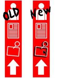
1) the nav bar needs some sort of rollover (see attached example, the black triange is supposed to be a cursor) this was done in Photoshop with a layer shadow, the shadow I used was the Outline shadow.
2) give the user color options (red, blue, green) let them pick the theme, and since every since object on the page is that color it shouldn't be thta hard
I really like both your suggestions they are certainly something I will try and work with!
Ow, my eyes!
Keep the read header and side bar if you want, but make the text black or dark gray. Red text is *not* fun to read. Honestly, though, solid red is not only hard of the eyes but it's a bit boring. How about using a slightly different red? A little more yellow or a little more blue. A little less saturated (just enough to take the "bite" off).
I would work on the kerning in the title a bit (mostly the word "Western"), the letters are a little loose. Also, because of the typeface you used, I thought it said "The Western 200" instead of Zoo.
Now on the red issue - I really like the one color-theme, but I guess you might be right, personally I like red and I don't think it's hard on the eyes - but I guess it might be because I'm used to it. Also I choose red because, firstly I think it's a cool colour and secondly because it is a bit boring, although I don't think of it as boring but as neutral because I didn't want a colour that's hard on the eyes - hehe ironic that I ended up doing the exact opposite!
I don't understand the word kerning...? But I like the the typeface very much and I'm pretty sure that will never change!
")
I like the masthead for some strange reason. Rather unique. I would lose the drop-shadow on the 'new' corner cut. It breaks the design.
Icons are HUGE and don't really read as a family, and don't tell me wtf I'm clicking on.
I think you mean to say 'Starring' not not 'Staring'?
Yup, it's supposed to be starring, I didn't even see that misspelling before you pointed it out - staring makes no sense...
I was kind of both for and against the shadow but just chose to put it on, but I guess you're right on that one - I've also tried putting shadow on all of the header but that's an absolute no go!
Again the menu is in focus, guess I cut corners on it because I couldn't decide on a family of Icons and also I think icons are rather hard to do - infact if anybody got suggestions on what the icons should look like they are very welcome to speak up!
2. Web sites, even experimental sites, are first and foremost about user experience. If people don't "get it", the site doesn't work. This is confusing and un-intuitive. Try interjecting at least a little bit of color somewhere other than read, get rid of the frames, and somehow draw attention to the fact that those large icons are in fact a navigation menu.
Web design is about elegance - even when your style is funky or original. There are plenty of designs that are incredibly unconvential, but still intuitively direct people to the content they want. Sit down and really think about what you're trying to accomplish with the site instead of just making something that looks funky in Photoshop and plopping the extra large images into a web page.
I guess my major problem is that I know how the site is supposed to work and therefore have a hard time see that the site is not that intuitive, but it's really nice to hear other peoples opinion cause now I know!
The reason I used the iframe is that otherwise the site gets pretty graphics heavy and might take a long time to load - if that is what you meant?
Also I guess when I really think about it I've always thought it a bit cool when you're not completely sure where the next click will take you but I'm getting more convinced now that I need to make navigations more intuitive!
My problem might be that I'm really not trying to accomplish much more than making a pretty site...
I don't find my self that an interesting person, and haven't got strong oppions about much that I would like to share with other people on the net, but I think it's nice to have a website just so I have somewhere where I can speak my mind and if at some point in the future something important to share with the world I would have a place to put it!
As I said in the start I don't care much if the site gets any hits - it's more for my own piece of mind...
Once again thanks for taking the time to give me some respons, I really appreciate it!