Become a MacRumors Supporter for $50/year with no ads, ability to filter front page stories, and private forums.
I've got some spare time. I'll comment without reading anything else so it doesn't influence my remarks; though I'll probably be repeating all the other posts.

Firstly, the front page offers nothing except a photo. I would like to see background info there. Why does this site exist? A taster of what's inside. Like how a novel should grab you on the first page, there should be something to make me want to click one of your links. Why should I click a link if you've given me no incentive to?

The font needs adjusting (OK, I did read the first reply). The repetition of links above and below the picture looks like a screen redraw. The front picture is not so good (the sunlight angle? I'm no expert). And more than one would be a good idea - and at least do an iPhoto 'Enhance' on them.

One thing that I don't understand is why many web pages, as on yours, have a 'Home' link on the Home page. Why give me the opportunity to come back where I already am?

Second page could do with a lot more information. It's your choice, of course - this isn't a commercial website, but if you're going to the trouble of making a site I suggest you make it worthwhile.

The photos are far too big for my 20 inch screen, and many people are on smaller than that. And the one I'm looking at ( bottom left) is out of focus or is suffering from camera shake.

Javascript pop-ups on the non-links is unnecessary. More than that, it forces me to make an extra mouse movement.

I wonder at the purpose of the Firefox link at the bottom. Is my Safari not good enough? What about cross-browser compatibility? W3C and all that?

Sorry, all negative. However, I am eager to learn more (see note above :)) and your site is bookmarked. I'll be keeping an eye on what you're up to there. It looks beautiful. Good luck and have fun. Lucky bugger.
 
Thanks for the great advice.

I am thinking about adding a small intro to the homepage.
And I changed the footer (sorry about the firefox link, but I was planning on it being viewed by more peecee's) I'm sure you'll all agree it much better now:cool:

Edit: just killer the second nav bar.
 
I've just updated the site.

I've started playing around with fireworks :)eek: )
What do you think?

I've taken the best bits from all three site designs, and looked at some of the suggestions for clues.
 
I like the font for the title and the vignette... But really, who cares? The important thing is the content. Look at the big sites like Apple or Amazon. No-one cares about the background colour. As long as the site is easy to read (e.g. limited in width like the one a previous poster knocked up on Rapidweaver) and navigate, the content is what the people are there for. People who design web sites aren't at the cutting edge of web design - they drive it. Web sites are about content. We've been reading books printed on nothing but white paper for over half a millennium. Pulp fiction and timeless classics. Just forget about the design and get information up there. If it's interesting, people will read it. Go the other way, of course, and it's a different story. No-one wants to read a site in flashing day-glo orange.

Nevertheless, just a few comments on the design. I mentioned before the photos. You really should retake them. Maybe the one on the front page is taken into the sun? I'm not saying they should look like stock footage, but they could be better to look at. The bit at the bottom about 'best viewed on a Mac' will make you look a jerk to a fair number of people, I would think. Making a web site browser-specific is bad enough. Making it sound platform-dependent is, well... The copyright tag is enough to get your name in. No need to repeat it. Who cares who made the site? Content again...

So to the nitty-gritty: Content... Here's a few things I would like to know:

Who are 'we'? Are you husband and wife? How long have you been together? How did you meeting end up with you buying a property in France?
What's your nationality?
If not French, what are you doing there?
Why did you buy THAT property?
Were you always looking for property (in France?) to buy?
What are your jobs?
What will you do for work when you live there?
How far is the property from the nearest town or city?
How much did the property cost? EVERYONE will want to know; and will feel excluded from the adventure if you don't say (or curb interest in some way).
When was the property built, by whom, and why?
What is the history of the place (in detail) up until you purchased it?
In detail, what are your plans for the place?
What will you do with the spare rooms?

I would be interested in a blow-by-blow account of what you do, the problems you come up against, regular photos to back up your reports, etc. After spending every day working and renovating I imagine you will soon lose interest in reliving every detail through the keyboard, though. But I would be interested in reading it and I'm sure a lot of other people would too.
 
MrSmith said:
I would be interested in a blow-by-blow account of what you do, the problems you come up against, regular photos to back up your reports, etc. After spending every day working and renovating I imagine you will soon lose interest in reliving every detail through the keyboard, though. But I would be interested in reading it and I'm sure a lot of other people would too.

Yeah, that reminds me, we were going to do a video podcast.:p
and... maybe an rss feed.
 
As for podcasts and rss feeds, again RW is great for this.

I watched the screencasts showing you how do create these and it's really easy.

I do agree with all the above posts though, much more content and better images will make the site much better and also much more search engine friendly, after all spiders crawling your site aren't bothered about how your site looks to a human.

I think with as with most things it's a case of getting a good balance of form and function.

There's no point having a beautifully designed site if it never gets any visitors, but on the other hand you don't want any visitors you do get clicking the back button as soon as they see a site due to poor design.

That's why personally I love software like RW, although technically it may not be upto the same standards as a hand coded site, as long as the end results are well designed for human visitors but also get the SEO parts right as well then it allows people to get their ideas and creativity on the web very easily.
 
Try not to center everything, it make sites look amaturish. Try the gold ratio :D

For good design use The Hugo Boss Web Site as a very good guide, it's so simple and acheivable for anyone who can use Dreamweaver and Photoshop.

Also check out here


Some dirty picture of Kate Beckinsale wouldn't go astray either ;)
 
As an Amazon Associate, MacRumors earns a commission from qualifying purchases made through links in this post.
ezekielrage_99 said:
Try not to center everything, it make sites look amaturish. Try the gold ratio :D

For good design use The Hugo Boss Web Site as a very good guide, it's so simple and acheivable for anyone who can use Dreamweaver and Photoshop.

Also check out here

Will this career change be before or after mastering French :D
 
As an Amazon Associate, MacRumors earns a commission from qualifying purchases made through links in this post.
I had another look at your site. At first I thought it was a site to record your personal endeavours, but now I see it is a commercial site. Well, considering you will be appealing to a world-wide audience my advice is to get a site professionally made. People browsing for holidays will judge the condition of your hospitality and amenities from the state of your webpage. Instant impressions and all that. I'm sure it'd pay off in no time. You may be lucky and get coach parties stay when you've completed the rest of the property.

Just my 2 pence worth.
 
chateaudelucy. said:
Site best view on a mac

True of every web site. :p
but unfortunately not something the majority of your -pc using- visitors will want to read to be honest. Maybe lose that one line :)


also, if it's something you're interested in I would too recommend getting the site professionally made (as somebody mentioned above).
I'm sure I for one and some of the other guys on these forums would like to offer you a great deal and help you out.
 
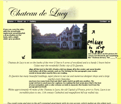
Trying making the picture of the house stretch across the body, make sure it's not distorted. I don't have PS with me now, but i'll mock up something and edit this post later.

mr.GIF
Remember, visitors most often read your site in an "F" shape (see: digg,) so it's important to maintain that shape. Aligning your text in the center and your pictures will throw your users off completely. Hope it helps.
 
waynesun said:
Trying making the picture of the house stretch across the body, make sure it's not distorted. I don't have PS with me now, but i'll mock up something and edit this post later.

View attachment 55257
Remember, visitors most often read your site in an "F" shape (see: digg,) so it's important to maintain that shape. Aligning your text in the center and your pictures will throw your users off completely. Hope it helps.

Yeah good advice. I'm not sure about the font I've chosen anymore though.
 
The hugo boss site mentioned earlier does look very nice, however I sometimes find that sites such as this are almost too fancy for me.
I don't want to have to choose which version of the site to view or wait for a fancy animation before I see a selection of shoes, I know I can use the skip function provided but I never asked to see the animation in the first place and now I have do something to avoid seeing it! they could at least allow me to see what I'm there to look at before making me view the equivalent of a splash screen.

Thankfully this animation is used only on the first time you choose a subcategory!

Again, the scrollable zoomed image looks nice, but I would rather have views from different angles, for example I want to know what type of sole the shoe has or does the insole have a big thick label sewn in that could feel strange when I'm wearing them!

Maybe I'm just a control freak but same goes for the watches, I want a side profile to see how bulky they are.

You can't please all the people all of the time (or maybe it's just me :p ) so as long as you stick to tried and tested design techniques (layout, colours, navigation etc) then you should be ok, you may never have a groundbreaking or award winning site but to be honest unless you're professionally trained and spending every day building sites you probably won't have the time or knowledge to build a site such as the hugo one (that includes me!).
But you can at least get some 'inspiration' from it and just add your own style to it, but quite often the simpler the site the easier and better it is to use, after all, the only thing anyone really needs from a website is information.

I'm not saying design isn't important, just that I think that a site should look as good as possible without lots of unneccesary frills.
 
Register on MacRumors! This sidebar will go away, and you'll see fewer ads.