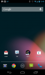
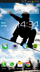
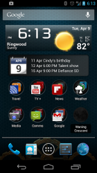
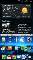
Do you guys just have widgets in your home screen and just go to the apps section for your apps or do you have your favourite apps only in your home screen and apps you don't use all the time you leave in the apps section?
Got a tip for us?
Let us know
Become a MacRumors Supporter for $50/year with no ads, ability to filter front page stories, and private forums.
How do you format your home screen on android?
- Thread starter The Game 161
- Start date
- Sort by reaction score
You are using an out of date browser. It may not display this or other websites correctly.
You should upgrade or use an alternative browser.
You should upgrade or use an alternative browser.
I have clock/weather widget. No more widgets. I find them annoying generally.
I prefer simple design rather than cluttered mess.
I prefer simple design rather than cluttered mess.
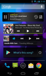
I have these select folders on my main screen, I used to have a clock, but when wondered why have 2? So I let Google Now have free reign. My 2nd screen is just various music widgets.
Attachments
I like simple and clean. Widgets are on other screens (Evernote, SoundHound, etc) as are folders. I have a single row along the bottom of every screen to follow the clean lines look.


I like simple and clean. Widgets are on other screens (Evernote, SoundHound, etc) as are folders. I have a single row along the bottom of every screen to follow the clean lines look.
Image
Very nice indeed. Car to share what widgets/themes you've used here?
Very nice indeed. Car to share what widgets/themes you've used here?
Sure, no problem.
I use Nova Prime as my launcher. The circle on the left of the dock opens the app drawer and the one on the right opens multitasking.
The worded icons are done using Icon Changer and an app called Simple Text. With this, you can type out the names of the apps as anything you want and change the size and position of the words within the icon area. It's pretty addictive once you start...LOL.
The calendar is Simple Calendar. I love it because you can really tailor it to how you want it to look, what calendars it shows, how far into the future, etc. You can even change the opacity of the background. Right now I've got it completely clear.
And I have the persistent Google search bar on every screen through Nova Prime. You can choose from two different looks (either ICS or Jellybean). I like the minimal design of just an outline, so I use the ICS search bar, though I'm running Jellybean on my Optimus G.
Feel free to let me know if there's anything else you'd like to know.
Do you guys just have widgets in your home screen and just go to the apps section for your apps or do you have your favourite apps only in your home screen and apps you don't use all the time you leave in the apps section?
Ribbon bar (similar to Pie Control found on some ROMs) opens for a few seconds when you swipe from the right edge of the screen and allows for any app to be placed there. I use it for menu, back, recent apps and frequently used apps.
News ticker on top, customized for the RSS feeds I want.
And then a few apps onscreen with custom icons and folders. Sometimes I use a dock and sometimes not. Depends.
FTL drive live wallpaper. Or warp speed. Whatever you want to call it. Only live wallpaper I use.
Screenshots with and without ribbon bar;
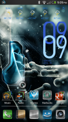
I don't really care for widgets except for clock, battery, weather and maybe a news feed. I'm a minimalist fan myself. Here are some of my screens over time


Last edited:
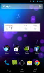
On my main screen I have 2 widgets
One is for the weather, like to see at a glance what the weather is going to be for the next few days - living in the UK it's usually wet and cold though
Another for my book reading app, shows current book with stats, and I can flip through to see other recently added books, quicker than opening the book app
Apart from that it's the apps I use most often set into folders (Books, Music, Social, Video), things like Gmail, Chrome are on the bottom tray
Apps I only use occasionally just sit in the app drawer, never put these on home screens
On my lock screen I have a widget that is for the emergency services in case of accident (ICE)
On my home screen I have 3 widgets, clock, battery and weather.
Lock Screen

Home Screen

My other screens are quite minimalist.
Films and YouTube etc.

Reading and social media.

Music

Web and cloud based facilities

On my home screen I have 3 widgets, clock, battery and weather.
Lock Screen

Home Screen

My other screens are quite minimalist.
Films and YouTube etc.

Reading and social media.

Music

Web and cloud based facilities

Last edited:
Sure, no problem.
I use Nova Prime as my launcher. The circle on the left of the dock opens the app drawer and the one on the right opens multitasking.
The worded icons are done using Icon Changer and an app called Simple Text. With this, you can type out the names of the apps as anything you want and change the size and position of the words within the icon area. It's pretty addictive once you start...LOL.
The calendar is Simple Calendar. I love it because you can really tailor it to how you want it to look, what calendars it shows, how far into the future, etc. You can even change the opacity of the background. Right now I've got it completely clear.
And I have the persistent Google search bar on every screen through Nova Prime. You can choose from two different looks (either ICS or Jellybean). I like the minimal design of just an outline, so I use the ICS search bar, though I'm running Jellybean on my Optimus G.
Feel free to let me know if there's anything else you'd like to know.
If you are using nova, you do not need icon changer....that is actually redundant. Nova allows you to change the icons without having a separate app to do so
My home screen is just the htc one blinkfeed, I love it! I'm a massive fan of just reading news, seeing what's going on in soccer etc and being able to have an update on all technology is heaps cool! On my sg3 I used to have 2/3 pages of widgets for all my news and sport intake, so now that I have this blinkfeed, I'm super happy haha.
My secondary, main page though just consists of the google search widget, the htc one weather/time widget which looks really nice, and 4 folders of apps which contain: a google apps folder, a multi media folder, a social network folder, and a productivity folder.
I only have two pages though at the moment haha
If you are using nova, you do not need icon changer....that is actually redundant. Nova allows you to change the icons without having a separate app to do so
You know, now that you say that, I realize it...LOL. I've noticed that option in Nova but never really explored it. Thanks for the heads-up!
----------
I don't really care for widgets except for clock, battery, weather and maybe a news feed. I'm a minimalist fan myself. Here are some of my screens over time
Image
I'd love to know what you're using to get this look. Especially the toggles and icons below them. This is VERY nice!
You know, now that you say that, I realize it...LOL. I've noticed that option in Nova but never really explored it. Thanks for the heads-up!
----------
I'd love to know what you're using to get this look. Especially the toggles and icons below them. This is VERY nice!
Thanks, been a while since I did that one. I can't remember what news feed that was but the clock, date, battery and (mail/text/phone) counter bar were all made using UCCW. If you're not familiar with UCCW go read up on the original thread over at xda. The counter bar is one of the templates you'll find there. It takes a bit of trial & error but once you figure it out, you can create any widget your heart desires.
Last but not least, the icons are ICS plates EX and the power toggle is widgetsoid donate version (I created the actual toggle icons myself using the 'simple text' app).
Last edited:
Thanks, been a while since I did that one. I can't remember what news feed that was but the clock, date, battery and (mail/text/phone) counter bar were all made using UCCW. If you're not familiar with UCCW go read up on the original thread over at xda. The counter bar is one of the templates you'll find there. It takes a bit of trial & error but once you figure it out, you can create any widget your heart desires.
Last but not least, the icons are ICS plates EX and the power toggle is widgetsoid donate version (I created the actual toggle icons myself using the 'simple text' app).
Thanks! I appreciate the help.
I've tried messing with UCCW before, but MAN...it'll give you a headache fast if you don't know exactly what you're doing! I need to do some more reading and figure out how to use it correctly. You can do some really amazing things with it.
Thanks again!
Totally empty except for the Google-bar and Google Now-widget.
Swiping up reveals the app drawer.
Very minimal, I really don't need anything more.

Swiping up reveals the app drawer.
Very minimal, I really don't need anything more.
kdarling and I have similar approaches. I have exactly what I need in my home screen. While I appreciate the aesthetics other people show, my primary drive is function not form.
This phone is both work and personal, so I have a weather widget, a calendar widget and my heavily used stuff on the main home screen.
Here ya go.
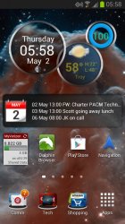
The top is rings widget, then calendar widget.
The background is a recent Hubble image of the Horsehead nebula in infrared bands, which is then realized in visible frequencies.
This phone is both work and personal, so I have a weather widget, a calendar widget and my heavily used stuff on the main home screen.
Here ya go.

The top is rings widget, then calendar widget.
The background is a recent Hubble image of the Horsehead nebula in infrared bands, which is then realized in visible frequencies.
Register on MacRumors! This sidebar will go away, and you'll see fewer ads.


