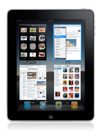
But it's still there. That's like saying that the Calendar application isn't good because it's not exactly the same as the one on an iPhone. The features are still there, but they just have slightly different manners of being accessed. I don't know who in their right mind would prefer a little iPod control popping up in the center of the screen over having the ability to change applications on the fly with the controls moved a few inches up. There's nothing wrong with a slight learning curve to any addition. By your logic, it seems like any additional functionality wouldn't be possible just because it's different from what has already been established.
The difference is that it is a new device. I don't think anyone would expect the same apps given the increase in real estate. Now, if Apple all of a sudden changed the Calendar UI drastically on the existing iPhones, that would be more of a concern. Not to say it would be bad or shouldn't be done. But there are many things that need to be considered before doing so.
However, the underlying functions of the OS should remain the same. Whether or not they are actually good ideas.
My logic is carefully thinking about usability concerns. This is not an attempt to shoot down your every move, but to make you realize this isn't as easy as dropping it in and moving **** around to get what you want.
Learning curves are fine, but you still have to consider how the user will feel about that. There is a reason that popular websites and applications can flop after a change to the UI.
SBsettings works by swiping the top from left to right, not top-down.
Fair enough, but an errant swipe is still a concern, albeit maybe less so.