I hate it too. My advice, reduce transparency in settings and effectively return to the old iOS look. Improves speed as wellJust “up”graded my iPhone to iOS 26 and I absolutely hate it. It’s visually the ugliest iOS Apple has ever produced. The icons all have a distracting (and non-sensical) edge to them. The blurred wallpapers look nothing like they used to.
It’s so ugly I’m thinking of cancelling my iPhone Air order and looking at Samsung options.
Got a tip for us?
Let us know
Become a MacRumors Supporter for $50/year with no ads, ability to filter front page stories, and private forums.
I absolutely loathe iOS 26
- Thread starter profmjh
- Start date
- Sort by reaction score
You are using an out of date browser. It may not display this or other websites correctly.
You should upgrade or use an alternative browser.
You should upgrade or use an alternative browser.
You can roll it back with minimal effort, if you find it that 'bad'.
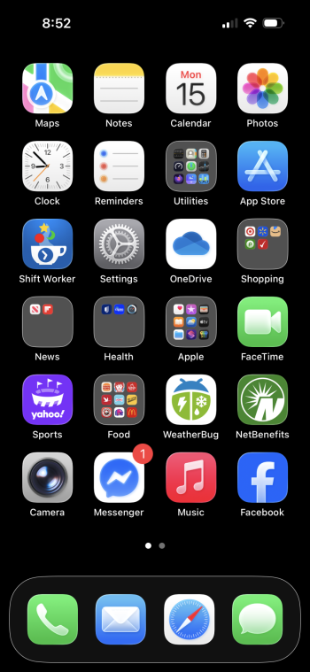
Doesn't do any good if you are getting new phone on Friday. I don't mind the iOS 26, just don't like the "outlines" around the icon folders. I'll get used to them but I'd like to be able to make them go away.
My advice is to go to setting a toggle on reduce transparency. Improves responsiveness a lot on my iPhone 13.I dislike it as well. And the experience on my 13 Pro is terrible - all the animations run slower than iOS 18, and there is a sluggish feeling in how things perform
I hate it too. My advice, reduce transparency in settings and effectively return to the old iOS look. Improves speed as well
I've had to switch to dark mode with this release to help visuals. I usually use increase contrast with light mode and worked well for me. Not anymore.
just don't understand or see the worthwhile of "liquid glass".... marketing i guess.
I tried the Pixel 10 for two weeks and just switched back to my iPhone today, while I personally don't like the design of 26, overall the system still is way smoother and feels more polished than android 16.
I tried the Pixel 10 for two weeks and just switched back to my iPhone today, while I personally don't like the design of 26, overall the system still is way smoother and feels more polished than android 16.
iOS always has been that way
So far I'm okay with things .... but as someone who uses a black desktop on his iPhone, these outlined icons look like utter trash. 
So far I'm okay with things .... but as someone who uses a black desktop on his iPhone, these outlined icons look like utter trash.
agreed, really needs an option to do away with that
I don’t hate it but Liquid Glass is disappointing. If you are using your phone normally than all they’ve done is make everything transparent because you need to be very slow and deliberate to even see the glass effect.
It’s very cartoony. The bubbles and floaty icons.
It’s definitely going to take some getting used to. Not overly impressed at the moment but time will tell.
I suppose that Apple at its worst (meaning today) is still doing a far better job than Microsoft could ever hope to.Windows 7 was the last version of Windows that looked relatively cohesive. Even the oldest UI elements of the OS at that point still fit nicely within the Aero aesthetic.
Even now in Windows 11, many of the built-in OS functions still haven't migrated to the "new" metro/modern/UWP UI introduced way back in 2012. Off the top of my head, the UI for formatting a disk dates back to Windows 95.
I love it. It’s cataclysmic.Just “up”graded my iPhone to iOS 26 and I absolutely hate it. It’s visually the ugliest iOS Apple has ever produced. The icons all have a distracting (and non-sensical) edge to them. The blurred wallpapers look nothing like they used to.
It’s so ugly I’m thinking of cancelling my iPhone Air order and looking at Samsung options.
the contrast is awful with this release. turn increase contrast on in settings and the outlines around the icon folders get worse but the text legibility gets better in messages.
sucks having a trade off, really need to do away with the outlines around the icons and the task bar at the bottom of the screen.
sucks having a trade off, really need to do away with the outlines around the icons and the task bar at the bottom of the screen.
Yeah, I remember all the hate iOS 7 brought. I don't think iOS 26 looks bad but it runs kind of spotty on my iPhone 13. I notice when I scroll left to right or right to left the icons take a 1-2 seconds to appear, then at other times it's fine. Maybe it will get better in a few days.View attachment 2549543
iOS 7 was a lot worse than iOS 26.
I just updated. I used it for a bit and thought, "this is what the Apple Defense Squad is drooling over?" It's still iOS—it's still an iPhone. Nothing new. Next!
I absolutely love it, and loathe people that can't see what a good design is.
Looks more like LSD to me.Apple's software team must have been on cocaine when they designed this.
...says the person who trashes the iPhone Air.Ok. Hope you feel better soon.
Remember when Apple was known for its UI coherence?
It’s not anymore. Wtf even is this.

It’s not anymore. Wtf even is this.
It's not possible. IPSW files are specific to the respective device model, and Apple certainly won't publish iOS 18 IPSWs for the new iPhone models.I think it's likely you could load 18.7 onto it? I don't know, but it's worth a shot.
Register on MacRumors! This sidebar will go away, and you'll see fewer ads.