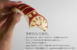
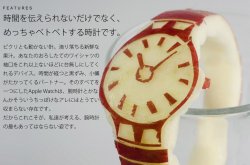
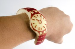
Although I'm judging this without actually holding one, I feel like the mockups of iWatch were much better than what was produced. Not saying that it's ugly - it's decent, but these mockups raised the bar for me, personally. One thing it does have that I really like is the interface. Now that's awesome!
Got a tip for us?
Let us know
Become a MacRumors Supporter for $50/year with no ads, ability to filter front page stories, and private forums.
I feel like the mockups looked better
- Thread starter thedeejay
- Start date
- Sort by reaction score
You are using an out of date browser. It may not display this or other websites correctly.
You should upgrade or use an alternative browser.
You should upgrade or use an alternative browser.
so do all iPhone mockups. people still buy it. people still complain. Apple stock goes higher. Rinse. Repeat
I doubt most of the people who made those mockups have any actual experience with engineering or UI design.

I loved this design cause it got away from the square metal housing concept. Not practical for the next few years though, until one of those bendy Oled screens and tiny powerful batteries become cheap.
Image
I loved this design cause it got away from the square metal housing concept. Not practical for the next few years though, until one of those bendy Oled screens and tiny powerful batteries become cheap.
I didn't like this one, mostly because it reminded me of those cheap bangle bracelets you can get.
Image
I loved this design cause it got away from the square metal housing concept. Not practical for the next few years though, until one of those bendy Oled screens and tiny powerful batteries become cheap.
I don't see how you could get the firm contact with the skin needed by sensors in the Apple watch with such a design.
Image
I loved this design cause it got away from the square metal housing concept. Not practical for the next few years though, until one of those bendy Oled screens and tiny powerful batteries become cheap.
The design is a lot less versatile. It looks great on teenagers, not so great on businessmen. Also, the screen is long enough that you would have to rotate your wrist as you shift your focus from the top to the bottom and vice versa.
Quite a huge difference between the constraints of Photoshop and imagination versus the constraints of physics, economics and stuff actually working.
I don't see how you could get the firm contact with the skin needed by sensors in the Apple watch with such a design.
The Samsung Gear Fit is similar to that design though.

I have that. I like the fact that the battery life is around 3 days. Feels very cheap and low quality now that I have seen the
 Watch. Not to mention that doesn't do much really, except the notifications. Steps, heart rate and other stuff, not accurate at all.
The fit still has a flexible strap.That concept design appears to have a a rigid spherical body.
The fit still has a flexible strap.That concept design appears to have a a rigid spherical body.
Yea, that's why I said similar. Concepts are just concepts, like a rough draft.
Image
I loved this design cause it got away from the square metal housing concept. Not practical for the next few years though, until one of those bendy Oled screens and tiny powerful batteries become cheap.
i hope it comes one day.
Image
I loved this design cause it got away from the square metal housing concept. Not practical for the next few years though, until one of those bendy Oled screens and tiny powerful batteries become cheap.
I really hoped it wasnt going to be like this...really dont like them. I prefer a watch to look like a watch not a bangle or one of those charity wristbands.
I really hoped it wasnt going to be like this...really dont like them. I prefer a watch to look like a watch not a bangle or one of those charity wristbands.
The bangles work better for those of is who don't want a watch from Apple...
I think the actual watch is better than any of the mock ups. Every mockup took the existing ios paradigm and squeezed it into a watch. The Apple Watch's UI is is the best I've seen for a smart watch, and that's probably because they tried to start from scratch and actually test it.
It is amazing what one can create when not bound by the realities of technical, practical, and financial limitations.
Unfortunately, Apple (or any tech company for that matter) does not live in that world.
Unfortunately, Apple (or any tech company for that matter) does not live in that world.
This here is a beauty. I'm not usually into these Android phones/gadgets but damn this sure is beautiful.
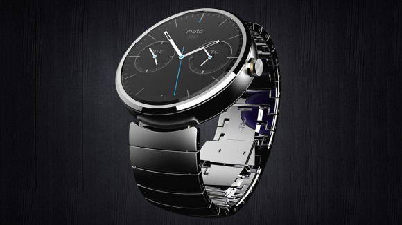

I'm tempted to make one of those (with the Apple Watch face) and wear it to work as a joke
This here is a beauty. I'm not usually into these Android phones/gadgets but damn this sure is beautiful.
Image
While the render looks great, it's actually pretty terrible in real life (i.e., on the wrist).

Register on MacRumors! This sidebar will go away, and you'll see fewer ads.


