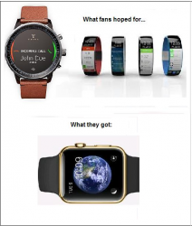
While the render looks great, it's actually pretty terrible in real life (i.e., on the wrist).
Image
Oh god... that doesn't even look as nice as the render
While the render looks great, it's actually pretty terrible in real life (i.e., on the wrist).
Image
This here is a beauty. I'm not usually into these Android phones/gadgets but damn this sure is beautiful.
Image
 Watch feels more premium. It wasn't just designing an aluminum tire and throwing a band on it.
This looks like a Timex I'd you could get at Target or JCPenney. I'm glad Apple didn't try and make something that looked like a traditional watch but would really come across as a cheap knockoff. Based on the initial hands on reports that I've read I get the impression the Moto Almost 360 looks better but theWatch feels more premium. It wasn't just designing an aluminum tire and throwing a band on it.
While the render looks great, it's actually pretty terrible in real life (i.e., on the wrist).
Image


Although, hmmm. The Watch is an anomaly for Apple, in that it has more than one main button or control. I don't think Jobs would've approved (tm).
The iPhone has the home button, a sleep/wake button, a ring/silent switch and volume up and down buttons, for a total of 5 buttons/controls.
I repeat: main button or control.
This thing combines navigation via crown, crown press, spare button press (and double presses!) and touch.
Image
I loved this design cause it got away from the square metal housing concept. Not practical for the next few years though, until one of those bendy Oled screens and tiny powerful batteries become cheap.
Of course none of the watch mockups we saw were realistic. It's easy to create a cool/sexy/futuristic render when all you have to care about is how something looks and you don't have to give any consideration to engineering or mass production.Fans never get what they expectWhich can be good or otherwise.
First, with the iPhone:
View attachment 491575
Then seven years later, with the Watch:
View attachment 491574
Apple likes to stick with what has worked for them in the past. Rounded rectangles with a shiny bezel, for instance.
Although, hmmm. The Watch is an anomaly for Apple, in that it has more than one main button or control. I don't think Jobs would've approved (tm).

