Become a MacRumors Supporter for $50/year with no ads, ability to filter front page stories, and private forums.

SwiftRain9056

macrumors newbie
Original poster
Aug 2, 2022
6
2
I was inspired by this post on StackExchange. Adjust screen resolution to 16:10, and everything should go below the notch. I don't have a MacBook with a notch, so I went to an Apple Store to give this idea a try. The first two things that came to my mind are SwitchResX (as in that post) and EasyRes. Since the demo MacBooks need passwords to download apps from App Store, I need to find some software that doesn't need the App Store. This excludes EasyRes, and I don't know how to use SwitchResX. Finally, I found BetterDisplay.

I think you need to first go to its preferences and choose "Always use resolution submenu" in the App Menu tab. Then you can choose the resolution with the same width but slightly smaller height, from the menu, right below the default resolution. Now you have your MacBook display without the notch!

Here is the proof:
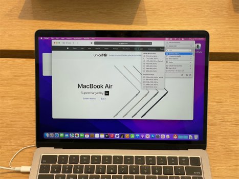
notch removed.jpg

Using command line to switch the resolution is also possible. I didn't get a chance to try at the Apple Store again, but once I get a chance, I'll try the script in that post or some other command line tools.

I'm kind of worried that the resolution of the internal screen will change if you connect an external monitor. That means the notch will reappear and you possibly need to adjust the resolution every time you connect or disconnect the external monitor. Can anybody test it for me?

This solution was originally posted here and as a reply to this post. Looks like everybody gets used to the notch and nobody really cares about it today.
 
  • Haha
Reactions: senttoschool

w5jck

Suspended
Nov 9, 2013
1,516
1,934
Hmmm, how about just putting a popup on the backside of the case so people who don't need the camera and what not can just ignore it altogether. If you need it, pop it up. Then the notch would not exist at all and would not require a makeshift solution.
 
  • Like
Reactions: Sydde

Carlo Aguilar Castrat

macrumors member
Sep 30, 2020
62
89
LOL what?? 🤣🤣🤣 If you put a wallpaper that's dark at the top you can't see the notch AT ALL. I don't get it. I find it weird that people dislike the notch that much but why don you just choose a wallpaper that's dark on top? If you want a light wallpaper (which will drain more battery with miniLED anyway, not a good idea) and really care that much then edit the wallpaper and put a black bar at the top. Simple. Why waste screen real estate and ruin the design/implementation of such a great device? This is crazy
 

SwiftRain9056

macrumors newbie
Original poster
Aug 2, 2022
6
2
LOL what?? 🤣🤣🤣 If you put a wallpaper that's dark at the top you can't see the notch AT ALL. I don't get it. I find it weird that people dislike the notch that much but why don you just choose a wallpaper that's dark on top? If you want a light wallpaper (which will drain more battery with miniLED anyway, not a good idea) and really care that much then edit the wallpaper and put a black bar at the top. Simple. Why waste screen real estate and ruin the design/implementation of such a great device? This is crazy
Yes, that wallpaper trick visually hides the notch but you can never get the seamless menu bar as on those devices without the notch. The notch is still there and menu items still go around it. That's also the way most notch-hiding software uses.

I don't think a black menu bar will save you much battery, even on a Mini LED screen, comparing the area of the menu bar and the whole screen.

I appreciate the extra space that Apple gives to us, but I don't think such design is great.
 
  • Like
Reactions: trusso

Carlo Aguilar Castrat

macrumors member
Sep 30, 2020
62
89
Yes, that wallpaper trick visually hides the notch but you can never get the seamless menu bar as on those devices without the notch. The notch is still there and menu items still go around it. That's also the way most notch-hiding software uses.

I don't think a black menu bar will save you much battery, even on a Mini LED screen, comparing the area of the menu bar and the whole screen.

I appreciate the extra space that Apple gives to us, but I don't think such design is great.
I meant having an entire dark wallpaper saved battery. Like some of the default dark ones. Menu items go around the notch… yeah, I don’t get what the issue is with that, the main thing is the notch is no longer visible and you can screen real estate
 

1096bimu

macrumors 6502
Nov 7, 2017
459
571
Why would you just waste the extra screen? that's like the stupidest design choice ever.
The hierarchy should be like this :
  1. all-screen (impossible so not an option)
  2. all-screen with notch
  3. all-screen with nostril cam
  4. not all-screen
You've literally changed it from 2nd-best solution to the worst.
 

Carlo Aguilar Castrat

macrumors member
Sep 30, 2020
62
89
Why would you just waste the extra screen? that's like the stupidest design choice ever.
The hierarchy should be like this :
  1. all-screen (impossible so not an option)
  2. all-screen with notch
  3. all-screen with nostril cam
  4. not all-screen
You've literally changed it from 2nd-best solution to the worst.
Exactly. It might sound harsh but I think these people need to see a psychologist. They can already hide it with a dark wallpaper and they complain that the menu items have a space between them so they decide to shut off part of the screen and lose screen real estate…. Might as well set the screen to 10hz refresh rate as well to save battery, oh and it you don’t like how the HDMI port looks, you should fill it with cement and then paint it silver so you don’t have to see it!
 

chouseworth

macrumors 6502
Dec 3, 2012
299
833
Wake Forest, NC
I was inspired by this post on StackExchange. Adjust screen resolution to 16:10, and everything should go below the notch. I don't have a MacBook with a notch, so I went to an Apple Store to give this idea a try. The first two things that came to my mind are SwitchResX (as in that post) and EasyRes. Since the demo MacBooks need passwords to download apps from App Store, I need to find some software that doesn't need the App Store. This excludes EasyRes, and I don't know how to use SwitchResX. Finally, I found BetterDisplay.

I think you need to first go to its preferences and choose "Always use resolution submenu" in the App Menu tab. Then you can choose the resolution with the same width but slightly smaller height, from the menu, right below the default resolution. Now you have your MacBook display without the notch!

Here is the proof:

View attachment 2052210

Using command line to switch the resolution is also possible. I didn't get a chance to try at the Apple Store again, but once I get a chance, I'll try the script in that post or some other command line tools.

I'm kind of worried that the resolution of the internal screen will change if you connect an external monitor. That means the notch will reappear and you possibly need to adjust the resolution every time you connect or disconnect the external monitor. Can anybody test it for me?

This solution was originally posted here and as a reply to this post. Looks like everybody gets used to the notch and nobody really cares about it today.
Bartender 4 works very well on my M1 16” MBP giving complete control over the menu bar. I also use it on my MBA, which does not even have the notch.

 
  • Like
Reactions: Tagbert

fakestrawberryflavor

macrumors 6502
May 24, 2021
423
569
I probably sound like an incognito Tim Cook, but honestly I don’t even notice the notch on my MBP or iPhone like, at all. After the first 2 mins of using the product it disappears. They are literally placed out of the way, by design.
 

senttoschool

macrumors 68030
Nov 2, 2017
2,625
5,477
This problem was solved within the first week of the new Macbook Pros.


MiniLED black levels are so good that it's impossible to tell the black menu bar away from the notch.

And you don't have to waste any screen real estate.

Adjusting the resolution to 16:10 to go below the notch is insanity.
 

wilberforce

macrumors 68030
Aug 15, 2020
2,923
3,199
SF Bay Area
I probably sound like an incognito Tim Cook, but honestly I don’t even notice the notch on my MBP or iPhone like, at all. After the first 2 mins of using the product it disappears. They are literally placed out of the way, by design.
I notice the notch on my phone quite a bit, because I often check the status icons on top left and right, which are squished into a small space by the notch.
On my MBP I don't notice the notch at all, I basically am oblivious to it.
 

Carlo Aguilar Castrat

macrumors member
Sep 30, 2020
62
89
This problem was solved within the first week of the new Macbook Pros.


MiniLED black levels are so good that it's impossible to tell the black menu bar away from the notch.

And you don't have to waste any screen real estate.

Adjusting the resolution to 16:10 to go below the notch is insanity.
it really is insanity.
 
  • Like
Reactions: Tagbert

SwiftRain9056

macrumors newbie
Original poster
Aug 2, 2022
6
2
Why would you just waste the extra screen? that's like the stupidest design choice ever.
The hierarchy should be like this :
  1. all-screen (impossible so not an option)
  2. all-screen with notch
  3. all-screen with nostril cam
  4. not all-screen
You've literally changed it from 2nd-best solution to the worst.
No, my hierarchy is 1 (possible, like Dell or iPad-style all-screen, just put that tiny camera in the bezel), 3 (acceptable if software is good), 4 (traditional), 2 (ugly, not acceptable). The notch is the stupidest design for me.


This problem was solved within the first week of the new Macbook Pros.


MiniLED black levels are so good that it's impossible to tell the black menu bar away from the notch.

And you don't have to waste any screen real estate.

Adjusting the resolution to 16:10 to go below the notch is insanity.
I've said why turning the menu bar black isn't good enough. The notch is rather wasting menu bar space at the software level. Besides, I want to keep the light menu bar like we had in macOS prior to Big Sur, when its color doesn't change along with desktop background.
 

Carlo Aguilar Castrat

macrumors member
Sep 30, 2020
62
89
No, my hierarchy is 1 (possible, like Dell or iPad-style all-screen, just put that tiny camera in the bezel), 3 (acceptable if software is good), 4 (traditional), 2 (ugly, not acceptable). The notch is the stupidest design for me.


I've said why turning the menu bar black isn't good enough. The notch is rather wasting menu bar space at the software level. Besides, I want to keep the light menu bar like we had in macOS prior to Big Sur, when its color doesn't change along with desktop background.
You don’t logic very well. The notch does not waste menu bar space at the software level, it adds screen space and basically leaves the menu bar alone. Not really any drawback to the menu bar having a space in the middle. The only thing you are doing is wasting screen space. Hell, changing the resolution is what wastes space on a software level. You’re breaking multiple things in order to change one thing.
 

wilberforce

macrumors 68030
Aug 15, 2020
2,923
3,199
SF Bay Area
You don’t logic very well. The notch does not waste menu bar space at the software level, it adds screen space and basically leaves the menu bar alone. Not really any drawback to the menu bar having a space in the middle. The only thing you are doing is wasting screen space. Hell, changing the resolution is what wastes space on a software level. You’re breaking multiple things in order to change one thing.
You are trying to counter a subjective emotion with objective logic. Won’t work, just like it hasn’t worked in the many other endless threads on the same topic. Good luck.
 

januarydrive7

macrumors 6502a
Oct 23, 2020
537
578
I noticed the notch on my 14" while setting it up, up until I switched to Dark mode. Since then, I've only noticed it when I have enough menu bar items to cause them to jump to the right side of the notch.
 

darngooddesign

macrumors P6
Jul 4, 2007
18,355
10,106
Atlanta, GA
Yes, that wallpaper trick visually hides the notch but you can never get the seamless menu bar as on those devices without the notch. The notch is still there and menu items still go around it. That's also the way most notch-hiding software uses.

I don't think a black menu bar will save you much battery, even on a Mini LED screen, comparing the area of the menu bar and the whole screen.

I appreciate the extra space that Apple gives to us, but I don't think such design is great.
Lunar Pro will let you push everything below the notch.
 

altaic

macrumors 6502a
Jan 26, 2004
703
475
The only thing the OP proved by posting that picture is that he doesn’t actually have enough menu extras to interfere with the notch, despite his theoretical issue with existing solutions to a problem that is mostly psychological anyway. And on top of that, all of this was hashed out long ago.
 
  • Like
Reactions: Tagbert
Register on MacRumors! This sidebar will go away, and you'll see fewer ads.