I can see a use case for this. I usually fill the vacant space in the menu bar with iStat Menus and the notch tends to break it due to there being far less vacant space available.Nice waste of screen real estate. 👍
Got a tip for us?
Let us know
Become a MacRumors Supporter for $50/year with no ads, ability to filter front page stories, and private forums.
I think I've found the best way to remove the notch on MacBooks
- Thread starter SwiftRain9056
- Start date
- Sort by reaction score
You are using an out of date browser. It may not display this or other websites correctly.
You should upgrade or use an alternative browser.
You should upgrade or use an alternative browser.
That’s a reason for Bartender it moves those extra menubar icons to a separate overlay that can be shown when you want them. I have used Bartender for years as it helped cleanup all of those icons even before the notch came around.I can see a use case for this. I usually fill the vacant space in the menu bar with iStat Menus and the notch tends to break it due to there being far less vacant space available.
Yep exactly, +1 for Bartender to deal with that. Never sacrifice precious extra vertical screen estate on purpose.That’s a reason for Bartender it moves those extra menubar icons to a separate overlay that can be shown when you want them. I have used Bartender for years as it helped cleanup all of those icons even before the notch came around.
but they don't do that, do they?I noticed the notch on my 14" while setting it up, up until I switched to Dark mode. Since then, I've only noticed it when I have enough menu bar items to cause them to jump to the right side of the notch.
menuitems do not jump to the right side of the notch, but just get covered up by it, no?
Not at all. If the menu items don’t fit on the left, the extras are drawn in the right. Most often that is just the “window” and “help” menus.but they don't do that, do they?
menuitems do not jump to the right side of the notch, but just get covered up by it, no?
Things get a little more complicated for app icon on the right side. If you have a lot they can get hidden but that happens even without a notch. I’ve used Bartender to manage them even before the arrival of the notch.
Last edited:
I just received my M2 Air yesterday and still adjusting to the notch. A free alternative to Bartender (if you only need the future of hiding some app icons) is Hidden Bar. It is super simple, free, and available from the App Store.Not at all. If the menu items don’t fit on the left, some are drawn in the right. Most often that I’d just the “window” and “help” menus.
Things get a little more complicated for app icon on the right side. If you have a lot they can get hidden but that happens even without a notch. I’ve used Bartender to manage them even before the arrival of the notch.
I want to make some updates before Apple's Scary Fast event, which might be the end of notched MacBooks, if Dynamic Island or hole-punch display is coming to the Mac.
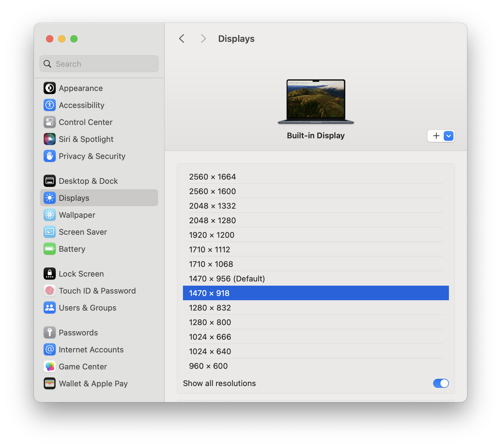
In macOS Ventura and above (including Sonoma), you can choose resolutions without the notch in System Settings without third-party software. You just need to open System Settings, go to Displays, choose the Built-in Display, hold Option key and click any of the resolutions. You can see a list of resolutions. Then turn on "Show all resolutions", and choose one of these 16:10 resolutions.

I'm glad that Apple finally realized some people don't like the notch and gave us these options. If you want more screen resolution options, you can still use BetterDisplay. (Disclaimer: I am not the developer nor related or paid by BetterDisplay. I just found the app useful for this purpose.)
In macOS Ventura and above (including Sonoma), you can choose resolutions without the notch in System Settings without third-party software. You just need to open System Settings, go to Displays, choose the Built-in Display, hold Option key and click any of the resolutions. You can see a list of resolutions. Then turn on "Show all resolutions", and choose one of these 16:10 resolutions.
I'm glad that Apple finally realized some people don't like the notch and gave us these options. If you want more screen resolution options, you can still use BetterDisplay. (Disclaimer: I am not the developer nor related or paid by BetterDisplay. I just found the app useful for this purpose.)
Last edited:
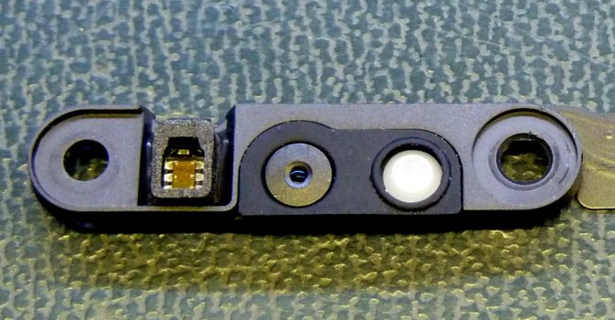
The notch doesn’t just contain a camera, there’s the ambient light sensor, truetone sensor, and camera recording LED. I prefer the tiny bezels, the old style top bezel looks huge to me now, but the notch is easy to hide if you cant ignore it.Hmmm, how about just putting a popup on the backside of the case so people who don't need the camera and what not can just ignore it altogether. If you need it, pop it up. Then the notch would not exist at all and would not require a makeshift solution.

Last edited:
Yes, that's why I find this solution the best. The notch takes up some precious menu bar space. Bartender only takes care of status bar icons, but not overlong menu bar items. Those free alternatives are not as good as Bartender. I remember they'll mess up the icons after reboots or something.I can see a use case for this. I usually fill the vacant space in the menu bar with iStat Menus and the notch tends to break it due to there being far less vacant space available.
It turns out Apple didn't make any change to the notch. They're all the same old design. People may still need this solution.Analysis of the Event leaked laptop image (on YT) showed a narrower notch, like on iPhone 13 compared to iPhone 12.
I "upgraded" to Sonoma now the grey menu bar is back. Top Notch doesn't do the job it's still dark grey - not black and no love with the wallpaper trick. if go to setting and use accessibility and up the contrast Notch goes away but then my screen colours are effected of course.
Has anyone programmed just the menu bar screen contrast app?
I'd go back to Catalina but I need Xcode.
Has anyone programmed just the menu bar screen contrast app?
I'd go back to Catalina but I need Xcode.
I don't have a problem with it. I see that area as 'extra' screen real estate for settings and 'apps'. Wanna see 'annoying'?... take a look at the Windows 11 default desktop, with the start menu in the friggen middle... Now that's a waste of 1/2 the task bar. Don't forget to notice the junk piled on the taskbar to the right of the START button while you are at it, along with the worthless start menu. They finally had a useful start menu in Windows 10 (pinned apps and all apps listed at the same time) and turned it into the worst start menu... I bought this M2MBA (first MAC ever) out of my dislike of Windows 11 AND how the small light Windows laptops just felt so junky.
I don't have a problem with it. I see that area as 'extra' screen real estate for settings and 'apps'. Wanna see 'annoying'?... take a look at the Windows 11 default desktop, with the start menu in the friggen middle... Now that's a waste of 1/2 the task bar. Don't forget to notice the junk piled on the taskbar to the right of the START button while you are at it, along with the worthless start menu. They finally had a useful start menu in Windows 10 (pinned apps and all apps listed at the same time) and turned it into the worst start menu... I bought this M2MBA (first MAC ever) out of my dislike of Windows 11 AND how the small light Windows laptops just felt so junky.
The Windows start menu has been such a pile of junk since Windows 8 that I use Stardock's Object Desktop and specifically Start 11 to have the old-school Windows 7 style Start menu. That gives me the items I want in the Start Menu without endless ads masquerading as app icons, a bunch of options I will never use, and the asinine layout Microsoft thinks is good. I also used the app to move the taskbar icons back to the left side (where they belong).
Thank you for posting that BetterDisplay can move things below the notch so I can see more Menu Bar items. That is more important to me than the extra space with the notch!I was inspired by this post on StackExchange. Adjust screen resolution to 16:10, and everything should go below the notch. I don't have a MacBook with a notch, so I went to an Apple Store to give this idea a try. The first two things that came to my mind are SwitchResX (as in that post) and EasyRes. Since the demo MacBooks need passwords to download apps from App Store, I need to find some software that doesn't need the App Store. This excludes EasyRes, and I don't know how to use SwitchResX. Finally, I found BetterDisplay.
I think you need to first go to its preferences and choose "Always use resolution submenu" in the App Menu tab. Then you can choose the resolution with the same width but slightly smaller height, from the menu, right below the default resolution. Now you have your MacBook display without the notch!
Here is the proof:
View attachment 2052210
Using command line to switch the resolution is also possible. I didn't get a chance to try at the Apple Store again, but once I get a chance, I'll try the script in that post or some other command line tools.
I'm kind of worried that the resolution of the internal screen will change if you connect an external monitor. That means the notch will reappear and you possibly need to adjust the resolution every time you connect or disconnect the external monitor. Can anybody test it for me?
This solution was originally posted here and as a reply to this post. Looks like everybody gets used to the notch and nobody really cares about it today.
Register on MacRumors! This sidebar will go away, and you'll see fewer ads.

