Got a tip for us?
Let us know
Become a MacRumors Supporter for $50/year with no ads, ability to filter front page stories, and private forums.
Im creating a logo , But need some help and advice.
- Thread starter MiniMan.
- Start date
- Sort by reaction score
You are using an out of date browser. It may not display this or other websites correctly.
You should upgrade or use an alternative browser.
You should upgrade or use an alternative browser.
I have 0 experience in this area, but at first glance the "rn" in International is too scrunched, and looks more like "m"...
Your Right, on the big image its no so bad but the small image it does look bad. Ill change it but ill wait for more replies first.
But Thanks
you know this you're getting paid were not is going to come up here ")
I'm not going to comment heavily on the designs as your client is the one who should be (plus I'm not getting paid), simple as that, they have to like the design(s) you put forward, they then pick the one or bits they like and then you come back with a new one .
But the "world" looks like a beachball without any colour. Also is it carers or careers
To be perfectly honest I don't really like any of them, they don't really do anything for me and I'm struggling to relate the design to the company, except the international bit. The "world" also looks familiar to atleast one of logo I've seen but can't think where.
you know this you're getting paid were not is going to come up here
I'm not going to comment heavily on the designs as your client is the one who should be (plus I'm not getting paid), simple as that, they have to like the design(s) you put forward, they then pick the one or bits they like and then you come back with a new one .
But the "world" looks like a beachball without any colour. Also is it carers or careers
To be perfectly honest I don't really like any of them, they don't really do anything for me and I'm struggling to relate the design to the company, except the international bit. The "world" also looks familiar to atleast one of logo I've seen but can't think where.
o.k, by the way im not getting paid so i should probs change the title
Gotta be a globe, not a beachball
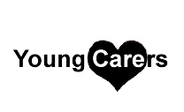
Is it Carers (people who care for others)?
If it is, then this is a really, really weak name. Scrap the globe, I would be reinforcing the word Care (with a heart, or hand graphic) rather than International
Or Careers?
Why is it Young? What does that mean? Ideally, the logo will help us understand that.
Does International have to be the same size as the Young Care(e)rs?
I find the type too light. It can't compete with the globe and it may disappear or break up in small sizes / low res reproduction.
Gotta be a globe, not a beachball
Is it Carers (people who care for others)?
Yer Carers
Thanks for this, it all helps
the client should prob start over with a new name, and actually pay someone who is a professional to help come up with that name and a real brand.
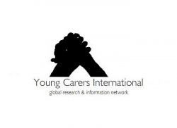
Its not your fault Miniman, you have nothing to work with, Young Carers International has sooooooooo many problems.
Its not your fault Miniman, you have nothing to work with, Young Carers International has sooooooooo many problems.
First...start out designing in B&W...eventually, no matter what the intended usage...someone is gonna fax this. So make sure the design looks good coming from a fax machine. Like others have said, heavier type.
If the client wants a globe, no problem...but you've given them a cold, logical, unfeeling, political globe...aim more for a natural, nurturing, feeling, life sustaining globe. And, following CanadaRAM's train of thought, find a way to get a more human element in there...maybe a globe with continents shaped like stylised youth/hands/hearts (actually...Africa and North America are basically heart shaped, South America and Europe are generally hand shaped).
Is YCI a group of persons caring for youth...or a group of youth caring for others?
Gotta be a globe, not a beachball
I know it's meant to be but it does look like a beachball too
Its all right but needs a LOT of work to make it nice...what do you think to the conept of this logo, Its just a mockup!
Normally, I am opposed to graphic elements that break words, however, in this case, the name is so much of a problem, you may want to use a device like this (although in a better font and much better arranged)
Edit - OK I am several posts behind, you've moved on.
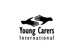
One thing about any photo or graphic you use, you must be sure it is copyright cleared (that is, purchase it from a stock art company, take it / draw it yourself, or make &#*)ed sure it's released as freeware.)
The hands image -- remember what we said about - "It has to work in Black?"
The third one: Who says that International has to be on the same line and the same size?
Edit - OK I am several posts behind, you've moved on.
One thing about any photo or graphic you use, you must be sure it is copyright cleared (that is, purchase it from a stock art company, take it / draw it yourself, or make &#*)ed sure it's released as freeware.)
The hands image -- remember what we said about - "It has to work in Black?"
The third one: Who says that International has to be on the same line and the same size?
Attachments
what do you think to the conept of this logo, Its just a mockup!

That would not work in black & white. It would just be that general shape.
Even greyscale may be iffy due to the effect of photocopies.
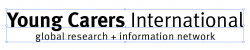
Try going with a thicker, slightly more less formal font than the one you have, that'll allow you to get thicker without feeling too corporate...something like this:
I know it was just a quickie, but a mish-mash of four fonts is a no-no...
Miniman. could you tell us a little more about the company/organization?
Is it people caring for youth...pediatricians, teachers, etc....or is it aimed at fostering more caring in our youth, educating them about world poverty, environmental issues...or is it neither? (if it's neither...then what is it about?)
Knowing more a little more about the client can help us critique your mockups more effectively and will help us give more appropriate suggestions/inspirations.
I know it was just a quickie, but a mish-mash of four fonts is a no-no...
It's only three versions of one font...but yeah, it still looked a little busy to me.
And I got the name wrong...Doh!
Edit...I reposted it above, with a slightly less busy design and the correct name.
I know you have no control over the name, but the word "carers" is just so uncommon it looks mispelled. If you decide to go with the globe type logo that you have on the first examples you should created it in a 3d program so that all the proportions are correct, as it is now the whole globe looks a bit off.
I know you have no control over the name, but the word "carers" is just so uncommon it looks mispelled. If you decide to go with the globe type logo that you have on the first examples you should created it in a 3d program so that all the proportions are correct, as it is now the whole globe looks a bit off.
Totaly agree with everything you just said, Thanks.
Do you like this one ANYONE?
better, still dont get why the world is so important. I'd also move the I in the globe to the left a bit.
Register on MacRumors! This sidebar will go away, and you'll see fewer ads.