Become a MacRumors Supporter for $50/year with no ads, ability to filter front page stories, and private forums.

Digital Skunk

macrumors G3
Dec 23, 2006
8,100
930
In my imagination
That last one is actually i think something for 2012 or so. but actually you said thoose were bad mockups and you could create a better one... make one and show it.;)

Sorry... not Ive as in I have or I've... but Ive as in Jonathan Ive

JONATHAN IVE
Product Designer (1967-)
25/25 - Celebrating 25 Years of Design
29 March - 22 June 2007

(linkie) http://www.designmuseum.org/design/jonathan-ive
 

dingdongbubble

macrumors 6502a
Original poster
Jun 1, 2007
538
0
All those fake designs posted do not look Apple so I think we can forget about those designs.

I would be very surprised if Apple doesnt roll out a new design. Lastly because of ppl complaining about the chin, I think Apple will discontinue the 17" iMac as rumored.:apple:
 

thesdx

macrumors 6502a
Jul 12, 2007
673
2
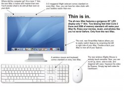
Here's my attempt at a mockup. It's just a MacBook screen put on the iMac pedestal. :)
 

Attachments

  • iMac 1.jpg
    iMac 1.jpg
    81.1 KB · Views: 179

netdog

macrumors 603
Feb 6, 2006
5,760
38
London
I can understand why some people find the chin a bit dated, but I also think that the iMac would lose something in moving toward simply looking like a standard monitor (whatever the color of the bezel) on an aluminum stand. The chin may not be to your taste, but it is distinctive, and I trust that whatever Ive comes up with for the next gen of iMacs, that it will remain quite distinctive.
 

nlivo

macrumors 6502a
Jun 18, 2007
914
3
Ballarat, Australia
Here's my attempt at a mockup. It's just a MacBook screen put on the iMac pedestal. :)


that doesn't look too bad.....the smack feature is pretty stupid, but i like the mouse and the fact wireless keyboard and mouse come standard....

yeah, my iMac is getting pretty dull.....i would love for them to bring back the swivel from the iMac G4......i reckon apple is actually trying to bring the swivel back!!
 

stimpycat

macrumors regular
Jul 2, 2007
142
0
How the original poster can say the current iMac is more attractive than any PC is beyond me - shoving everything into a big monitor is clever yes - but it comes at the expense of your monitor looking like a pizza box with a hole cut out of it.

At least with a PC, you sit the machine on the floor out of sight and all your left with is an ultrathin screen - better than an iMac every time.

I have wanted an iMac for a long time now - but no matter how many times I try and get used to it by starring at it in a shop or something, I know I can never work on something so hideously ugly and that is the single reason that has prevented me from buying one.

The thing is, there are many people - Mac users includes - who hate the fat plastic chin, and a lot of potential buyers who like me won't buy into something ugly -I can only expect sales to go through the roof once they finally remove it and come back with something more pleasing to the eye.
 

stimpycat

macrumors regular
Jul 2, 2007
142
0
Rather than all these space age suggestions - I think it would be more likely that they simply thickened the screen backwards slightly to allow more space. That way creating enough space to allow them to reduce or remove the chin.

I am sure they will also offer it in an iphone style black or perhaps brushed aluminium.

Here's my mock..

f_imacm_719ac1d.jpg
 

slffl

macrumors 65816
Mar 5, 2003
1,303
4
Seattle, WA
I think the current iMac design is still the best out there. Of course I would always like to see new designs, but the current one is not 'dated' IMO.
 

imac/cheese

macrumors 6502a
Jun 7, 2007
555
2
The chin doesn't really bother me. All good superheroes have large chins--it makes them look tough and powerful. I think that a bigger chin is better than a fat body. :)
 

xUKHCx

Administrator emeritus
Jan 15, 2006
12,583
9
The Kop
Rather than all these space age suggestions - I think it would be more likely that they simply thickened the screen backwards slightly to allow more space. That way creating enough space to allow them to reduce or remove the chin.

I am sure they will also offer it in an iphone style black or perhaps brushed aluminium.

Here's my mock..

The original iMac G5 was quite a bit thicker than the current iMacs, i've owned both. I must say that the thickness of this model makes it looks very sleek even with the disputed chin. the old iMac looked fat and with the chin didn't look very good at all. The difference between the Original iMac and Angel poise iMac was massive, the difference between the Angel poise iMac and the current iMac was again massive so who the hell knows what they will come out with.
 

thesdx

macrumors 6502a
Jul 12, 2007
673
2
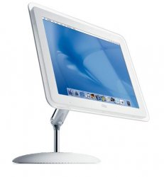
As for me, the chin is fine. I have to say I liked the G4's design better than the G5. I made another mockup, using a G4. I extended the screen bracket, removed the Apple and CD-ROM tray, and squashed the igloo. Basically, the internals would be in the monitor, and the igloo just becomes a pedestal. The screen might get a little thicker, but that's not too big of a deal. Obviously, the pedestal would look totally different, possibly a nice aluminum one that's thinner and has the inside cut out.
 

Attachments

  • newimac2.jpg
    newimac2.jpg
    14.8 KB · Views: 607

RainCityMacFan

macrumors 6502a
Jun 10, 2007
930
5
NC
How the original poster can say the current iMac is more attractive than any PC is beyond me - shoving everything into a big monitor is clever yes - but it comes at the expense of your monitor looking like a pizza box with a hole cut out of it.

At least with a PC, you sit the machine on the floor out of sight and all your left with is an ultrathin screen - better than an iMac every time.

I have wanted an iMac for a long time now - but no matter how many times I try and get used to it by starring at it in a shop or something, I know I can never work on something so hideously ugly and that is the single reason that has prevented me from buying one.

The thing is, there are many people - Mac users includes - who hate the fat plastic chin, and a lot of potential buyers who like me won't buy into something ugly -I can only expect sales to go through the roof once they finally remove it and come back with something more pleasing to the eye.

Personally I hate that chin too but it's far better than any PC I seen...

My dad won't let me put my PC on the ground due to the dust so I have my Dell Inspiron (2004 model) on my desk, w/ wireless usb receiver, wireless keyboard/mouse, giant AIO Dell Printer, speaker w/ base, and not to mention a 17" flat screen monitor w/ power + VGA cord....

Jesus Christ (no offence to any Christians here), I hate those god damn cords. Only time I'll ever put up w/ cords everywhere is when I'm plugging a laptop as a desktop replacement. Trust me, w/ a iMac it's far better than any PC setup I ever had, no giant desktop blocking my work space, no cords to grab and throw when I'm trying to dug to put my books down, and at least the printer can be put down on the ground due to BlueTooth (I didn't even have that).

Worse of all my dad is thinking of getting the new Dell Inspiron E530 PC due to my old model broken after 3 years (well less considering the video card got screwed in the a..)
 

Scarlet Fever

macrumors 68040
Jul 22, 2005
3,262
0
Bookshop!
i reckon the imac will be completely re-designed. there will be no chin reduction, because the 'chin' that we know now will not exist. i don't know what they are going to do, but it will be completely different.
 

Mekgek

macrumors member
Jun 15, 2007
84
0
I agree the iMac doesn't look very good at all. It's just too bulky, and I don't like the materials they used, looks pretty cheap. It looks alright on the pictures but in real life it's not that good imo.

I prefer a seperate screen with a small computer like the mini, too bad the specs are just too low.
 

miniConvert

macrumors 68040
miniConvert doesn't think the iMac looks dated at all.

miniConvert thinks the current iMac design is rather timeless.

However, miniConvert thinks that Apple should keep pushing the design envelope and come up with something new anyway.

miniConvert watched Greys Anatomy last night on Living TV...
 

derboy

macrumors regular
Feb 25, 2004
117
22
UK
I dont think it looks bad at the moment. My biggest issue is with the laptop parts they use, and so limit the imacs performance a bit.

I'd like to see more desktop class parts inside, and for them to be interchangable, using standard connections.

I dont think the imac framework has much space for vast form change. Steve gave the command that the screen must move, so thats the way it will stay. So i predict that the screen will pivot in the x & y. Screen bezeil will be thinner. Material change. spec improvement. -Thats it!

I prefer the screen to not hold the computer. I'd like a mac mini built into the base of the screen pivot, that way keeping an elegant screen. With the user option to detach the screen and mount it on a wall.
 

L3X

macrumors 6502a
Oct 18, 2006
511
0
Chesapeake, VA
I like the current imacs, nothing wrong with them. They are still "rare" to a lot of people as someone mentioned. A new design is always welcomed. I would buy a black one today if it came out even with a chin.

If anything, i'm getting tired of the brushed aluminum look.
 
Register on MacRumors! This sidebar will go away, and you'll see fewer ads.