loving this app - just wish we could move the tabs abit better so they were located proberly, loving the other design that was produced nice one.
Got a tip for us?
Let us know
Become a MacRumors Supporter for $50/year with no ads, ability to filter front page stories, and private forums.
IntelliScreen
- Thread starter techguy1
- Start date
- Sort by reaction score
You are using an out of date browser. It may not display this or other websites correctly.
You should upgrade or use an alternative browser.
You should upgrade or use an alternative browser.
macduke
That one I like. It is right to the point and it isn't so big that it takes up to much real estate on the front. If something like this was out I would use it.
Agreed. That looks much better and gives you the quick summary info that you would want from the 'Slide To Unlock' screen. If you want more details, then slide to unlock!
Another vote of agreement here!
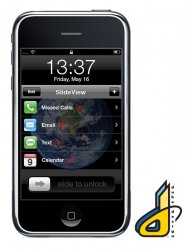
At first, I thought this app was going to completely *replace* the original "slide to unlock" display screen with a revamped one. Instead, it just tossed a bunch of translucent windows over the top of it. Messy!
If you HAVE to do this with a window drawn over the top of the existing screen, then something like the mock-up example posted is FAR superior. Don't cover up the original clock time display, at least!
Even so, your readability and results will vary, based on the selected background wallpaper. (The "earth" wallpaper is probably one of the best possible ones to choose, since it's a simple object with a black background around it.)
That's why I'd rather see a wholesale replacement of the original screen. Maybe display the selected wallpaper in a translucent (faded/dimmed) fashion, with information clearly drawn in the foreground? The clock digits could be drawn in a smaller font or moved to a different place too, if necessary, to keep it all from getting too "cluttered".
Agreed. That looks much better and gives you the quick summary info that you would want from the 'Slide To Unlock' screen. If you want more details, then slide to unlock!
Here is a simple mockup I designed that I think would be cleaner. There could also be news feeds and weather sections added as well.
Another idea that I had was using representative icons, but I'm too tired to make it now and it might get too confused with the home screen. I just like the idea of being able to expand / collapse various sections.
I would also like to work on a cleaner interface that didn't just use the blue bubble background. Something that appears more natural in set into the space between the clock and the slide to unlock switch. I may work on a few more designs tomorrow after my last final. I also just want to make it clear that this is not a working program, just some Photoshop fun inspired by this new app. Hope you all like it.
Amazing. Someone create this program that looks something more like this; billfold is hand.
I just want to see if i have new emails in the slide to unlock screen.
You can replace that useless 10px clock icon that does nothing but take up space with a little mail icon and a number indicating new msgs.
Have you tried Taskbar Notifier? It won't tell you how many new emails you have, but it does show a little envelope in the top bar when you have an unread email, SMS, or missed call.
I LOVE THIS!
I have an iSkin Revo and use the cover to protect the screen. Now I don't have to remove the cover to check weather, just hit the "home button".
You can leave the clock on and turn off notifications you don't want.
I only care about the weather, SMS, and calendar.
NICE!
These iPhones are just soooooooo cooooool!!!
Thanks for all the positive responses. Finals are finally over, so maybe I will work on some more designs tonight. I have some better ideas in my head but I just need to spend the time to flesh them out. I'm thinking about replacing the whole top and middle sections, effectively shrinking the clock but keeping it dominate. I also want the interface to be cleaner and look more like the regular iPhone one, although maybe with more grays and blacks to give it more separation as a limited home screen quickview app.
Only problem is that I have no idea how to code it. I have the SDK installed but I've been out of programming too long. I actually did programming through most of high school, graduated, and was going to do that for a career. But everyone knows you don't go into college with one major and come out with the same major. At least most people don't. I was always more interested in the design of the GUI than all the actual coding. I'm a big fan of things that work easily and efficiently, that are effectively engineered well. Thats why I love Apple products, because most of the time thats how I would build something if I had the ability to code it. Too bad I don't. If anyone here knows how to code for Cocoa Touch or whatever its called PM me and maybe we could sell some apps? Lol...wouldn't that be nice.
Only problem is that I have no idea how to code it. I have the SDK installed but I've been out of programming too long. I actually did programming through most of high school, graduated, and was going to do that for a career. But everyone knows you don't go into college with one major and come out with the same major. At least most people don't. I was always more interested in the design of the GUI than all the actual coding. I'm a big fan of things that work easily and efficiently, that are effectively engineered well. Thats why I love Apple products, because most of the time thats how I would build something if I had the ability to code it. Too bad I don't. If anyone here knows how to code for Cocoa Touch or whatever its called PM me and maybe we could sell some apps? Lol...wouldn't that be nice.
Hey everyone, I finished my latest mockup. I'll be making a separate post for discussion in the iPhone forum. In this version, you would click on each one to slide over to another screen that shows details for each item. There is an edit button to rearrange and delete items, as well as an add button to put in new items such as weather, etc. I hope you all like it!
Attachments
Hey everyone, I finished my latest mockup. I'll be making a separate post for discussion in the iPhone forum. In this version, you would click on each one to slide over to another screen that shows details for each item. There is an edit button to rearrange and delete items, as well as an add button to put in new items such as weather, etc. I hope you all like it!
Compared to the image in my original post at the start of this thread, that is an amazing improvement. I hope that either you or the present developers can release something similar .. well done .. awesome.
Hey everyone, I finished my latest mockup. I'll be making a separate post for discussion in the iPhone forum. In this version, you would click on each one to slide over to another screen that shows details for each item. There is an edit button to rearrange and delete items, as well as an add button to put in new items such as weather, etc. I hope you all like it!
That is absolutely amazing....Intelliscreen is too cluttered...yours is much better
Wirelessly posted (iPhone: Mozilla/5.0 (iPhone; U; CPU like Mac OS X; en) AppleWebKit/420.1 (KHTML, like Gecko) Version/3.0 Mobile/4A102 Safari/419.3)
This is really neat. I doubt they will be able to release a version that doesn't require the phone to be jailbroken since this would essentially require the program to be running in the background.
This is really neat. I doubt they will be able to release a version that doesn't require the phone to be jailbroken since this would essentially require the program to be running in the background.
I notice that intelliscreen has a update today 0.81 it now allows multiple email address and custom news feeds.
I think that if the designer can clean it up and it not look so cluttered then it could be a really good hack
And for all those people in the UK it now has BBC added to the news feeds already there.
I think that if the designer can clean it up and it not look so cluttered then it could be a really good hack
And for all those people in the UK it now has BBC added to the news feeds already there.
Here is a simple mockup I designed that I think would be cleaner. There could also be news feeds and weather sections added as well.
Another idea that I had was using representative icons, but I'm too tired to make it now and it might get too confused with the home screen. I just like the idea of being able to expand / collapse various sections.
I would also like to work on a cleaner interface that didn't just use the blue bubble background. Something that appears more natural in set into the space between the clock and the slide to unlock switch. I may work on a few more designs tomorrow after my last final. I also just want to make it clear that this is not a working program, just some Photoshop fun inspired by this new app. Hope you all like it.
YES!!! Much better. That first example was not pretty AT ALL. I'd much rather get a synapse as opposed to any real info cluttering my screen. Looks nice man.
")
Hello!
I tried this application, but i didn't like so much and i decided to uninstall it. But after that the "slide to unlock" screen doesn't appear like it did before after an application install/uninstall. Has somebody any ideea about this?
Thank you very much
I tried this application, but i didn't like so much and i decided to uninstall it. But after that the "slide to unlock" screen doesn't appear like it did before after an application install/uninstall. Has somebody any ideea about this?
Thank you very much
In this version, you would click on each one to slide over to another screen...... There is an edit button.........
the whole purpose of the lock screen and the slider is so that you don't accidently touch anything.
those editing options should be in the app's preference settings only.
otherwise, nice design.
but nontheless this is still a useful app.
ok i've tried it for a few days and liked it so far.
the demo image you saw in the first post is cluttered because it showed everything. but this program is very highly customizable so you can put whatever you want at whereever you want on the lock screen.
what i would like to see in the next release though, is to compress everything into one dimmed button, kind of like a plus sign whose size, transparency and position is customizable. so that whenever you want to see something quickly, you just click on it and glance quickly at your phone.
afterall, i think you dont need to look at your calendar or weather all day. as for mail or sms they'll give you a notification anyway. and finally, news is probably the only thing that changes through out the day, so that's the only one you dont want to be compressed.
with an interface like that i think you'll be able to keep your screen un-cluttered while having information at your fingertip
Register on MacRumors! This sidebar will go away, and you'll see fewer ads.