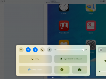
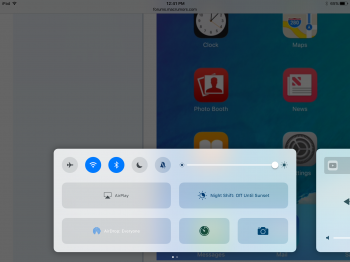
In iOS 9, the control centre would show translucency based on what was behind it. For example, if you were in the mail app ad there was photos of a green car, it would leak the green colours.
In iOS 10 however, it not only shows content beneath it such as the car example, but will also use your wallpaper as its main colour scheme. I love this change, and feel it would, if implimented more system wide (I'm thinking toggle switch colours in settings and in the keyboard), that it would make for a very personal UI for each individual user without the need for complicated settings. Is was ultimately the aim of some of the original iOS 7 UI choices in the first place.
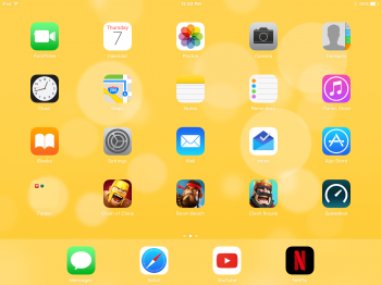
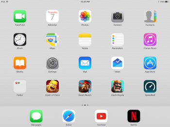
Here is some examples, note of the wallpaper change effects the hue of the control centre:


In iOS 10 however, it not only shows content beneath it such as the car example, but will also use your wallpaper as its main colour scheme. I love this change, and feel it would, if implimented more system wide (I'm thinking toggle switch colours in settings and in the keyboard), that it would make for a very personal UI for each individual user without the need for complicated settings. Is was ultimately the aim of some of the original iOS 7 UI choices in the first place.
Here is some examples, note of the wallpaper change effects the hue of the control centre: