Become a MacRumors Supporter for $50/year with no ads, ability to filter front page stories, and private forums.

960design

macrumors 68040
Apr 17, 2012
3,793
1,670
Destin, FL
Missed this response before. I had not relayed the suggestion, but I have now :) Thanks for the link.
That and a bathroom button. For a couple of reasons.
1). It finds the nearest bathroom exit with possible ratings, so you know what you are getting into.
2). To keep Siri from continually saying 'please do a U-Turn' or some other directions while you are trying to quite her and navigate into a possible complex entry with Big Trucks and other 'lost' and tired bathroom break drivers.
 
  • Like
Reactions: QuarterSwede

boltjames

macrumors 601
May 2, 2010
4,876
2,852
Google would have to update their app I assume, I am sure that will happen

IMG_5784.png


I don’t think Google updating their app is the answer. Since there is no way in settings to tell CarPlay which map to use in the dashboard view, I believe dashboard view is exclusively for use with Apple Maps only.

Besides, now that screenshots have emerged of what maps looks like in dashboard view while navigating on a route I think it looks terrible and I would never use it anyway. The map is small, the turn by turn directions have moved off the map, it’s just not a good experience compared to Google maps on fullscreen.

Apple could’ve done so much to allow maps to take over the whole screen and then float small boxes on it for things like music and calendar. They’ve dedicated way too much space, a 50-50 split when navigating somewhere is ridiculous.
 
  • Like
Reactions: OlliFlamme

MozMan68

macrumors 603
Jun 29, 2010
6,152
5,261
South Cackalacky
IMG_5784.png


I don’t think Google updating their app is the answer. Since there is no way in settings to tell CarPlay which map to use in the dashboard view, I believe dashboard view is exclusively for use with Apple Maps only.

Besides, now that screenshots have emerged of what maps looks like in dashboard view while navigating on a route I think it looks terrible and I would never use it anyway. The map is small, the turn by turn directions have moved off the map, it’s just not a good experience compared to Google maps on fullscreen.

Apple could’ve done so much to allow maps to take over the whole screen and then float small boxes on it for things like music and calendar. They’ve dedicated way too much space, a 50-50 split when navigating somewhere is ridiculous.

But all you have to do is tap the home button to have the full map.

I see the split screen view as being really helpful for highway driving. As soon as I know I’m getting into a detailed area, I’ll switch to full screen mode. I probably won’t be interested in changing the song anyway.

Taking up the screen is taking up the screen...they’ve dedicated 3/4 of it to mapping. I think that’s pretty good.
 
  • Like
Reactions: QuarterSwede

boltjames

macrumors 601
May 2, 2010
4,876
2,852
But all you have to do is tap the home button to have the full map.

I see the split screen view as being really helpful for highway driving. As soon as I know I’m getting into a detailed area, I’ll switch to full screen mode. I probably won’t be interested in changing the song anyway.

Taking up the screen is taking up the screen...they’ve dedicated 3/4 of it to mapping. I think that’s pretty good.

It's the opposite. The idea is to not toggle between Map and Music over and over again. That's what CarPlay has forced us to do for several years and we're over it. Dashboard sounded like the answer. But the way Apple has laid it out is brutally bad.

When you're on a long trip, you've got that full map up for 5 hours, and what many of us have longed for is if we could see what song is playing along with a little album art on the same screen. Dad needs a big map for the drive and the wife and kids want to know what's playing and who's singing. The new Dashboard *could* have been a great solution, but it's not because it *compromises* the map way too much. Look at how thin and square the map is. You lose a ton of vertical and horizontal viewing area.

When navigating, the map is the #1 priority. But music is important too and we want Map + Music on the same screen so we don't have to toggle endlessly, but we want to sacrifice only 10% or 15% of the map for that. Not 50%.
 
  • Like
Reactions: ColoArtist

thx9286

macrumors newbie
Jun 14, 2019
2
4
After seeing a few hands-on videos about Carplay on ios13, i must say that i‘m hugely dissapointed about the fact that album art ist still not shown on the Now Playing screen. It is still blurred in the background on standard size screens. (They showed a wide-screen display at WWDC). I know that it‘s still early beta but i have a bad feeling about this. This was one of the most important features i hoped for.
 
  • Like
Reactions: PeteLP

GDF

macrumors 68000
Jun 7, 2010
1,506
1,587
After seeing a few hands-on videos about Carplay on ios13, i must say that i‘m hugely dissapointed about the fact that album art ist still not shown on the Now Playing screen. It is still blurred in the background on standard size screens. (They showed a wide-screen display at WWDC). I know that it‘s still early beta but i have a bad feeling about this. This was one of the most important features i hoped for.

I agree with you. Don't like how they have it in the background - can barely see it like that.
 
  • Like
Reactions: PeteLP

PeteLP

macrumors 6502
Sep 12, 2008
327
53
IMG_5784.png


I don’t think Google updating their app is the answer. Since there is no way in settings to tell CarPlay which map to use in the dashboard view, I believe dashboard view is exclusively for use with Apple Maps only.

Besides, now that screenshots have emerged of what maps looks like in dashboard view while navigating on a route I think it looks terrible and I would never use it anyway. The map is small, the turn by turn directions have moved off the map, it’s just not a good experience compared to Google maps on fullscreen.

Apple could’ve done so much to allow maps to take over the whole screen and then float small boxes on it for things like music and calendar. They’ve dedicated way too much space, a 50-50 split when navigating somewhere is ridiculous.

I love the new dashboard view, and feel your point is really not a good one

Look at the old maps view in this photo, and look how much actual map space is sacrificed as compared to the dashboard. That section of map on the left between the black insert and the white insert is practically useless. That’s all we’re losing, and we’re getting a now playing instead of that. Just a great trade off in my opinion.

upload_2019-6-16_11-0-48.jpeg


If your complaint is that you’d like apples inserts to be smaller on their main screen and don’t like either Apple maps or the dashboard view, you certainly have that right. It’s an opinion, however that I don’t share at all.

As for your point that third party map apps will not be able to support dashboard because of of current restrictions in Apple settings, I don’t get that at all. Perhaps you can elaborate. I’m personally certain that third party map apps will have full support for dashboard. And very happy about it.
 
Last edited:
  • Like
Reactions: TitsLegendary

boltjames

macrumors 601
May 2, 2010
4,876
2,852
As for your point that third party map apps will not be able to support dashboard because of of current restrictions in Apple settings, I don’t get that at all. Perhaps you can elaborate. I’m personally certain that third party map apps will have full support for dashboard. And very happy about it.

There is nothing in Settings saying "choose default map for Dashboard" which is what you'd expect, therefore only Apple Maps looks to be supported in that view.

And if you think about it, it makes sense. If you use Waze, for example, in Dashboard there is not enough physical room for social features like reporting police, with Google there isn't enough real estate to tap a restaurant icon and bring up the sheet with the ratings, address, etc. anyway.
 

MozMan68

macrumors 603
Jun 29, 2010
6,152
5,261
South Cackalacky
There is nothing in Settings saying "choose default map for Dashboard" which is what you'd expect, therefore only Apple Maps looks to be supported in that view.

And if you think about it, it makes sense. If you use Waze, for example, in Dashboard there is not enough physical room for social features like reporting police, with Google there isn't enough real estate to tap a restaurant icon and bring up the sheet with the ratings, address, etc. anyway.

That doesn’t mean they won’t have it...and what about the area on the top right where turn info is noted (when applicable)?

At worst, Waze will lose that input feature (just like Maps doesn’t show eta data in split mode)
 
  • Like
Reactions: QuarterSwede

backontwo

macrumors member
Feb 2, 2014
34
22
I'm thinking about buying the hub just for this reason. Does Siri work in CarPlay for you. Whenever I press my steering wheel button for Siri the screen dims like it trying to launch the Siri animation, but it never launches.
I don’t have steering wheel controls, but Siri does work for me if I press the CarPlay layout button (used to be Home button) in the bottom left corner.
 

town3r

macrumors demi-god
Jul 15, 2012
202
130
Madison, WI
Has anyone experienced issues w/ Maps displaying an “Overview” view of the route and never rooming back in behind the arrow?

Have been unable to figure out how to restore the automatic map zoom feature that used to changed based on your speed.
 

PeteLP

macrumors 6502
Sep 12, 2008
327
53
There is nothing in Settings saying "choose default map for Dashboard" which is what you'd expect, therefore only Apple Maps looks to be supported in that view.

I don't believe that such a settings option is necessary for dashboard support of third party maps. Nor do I believe such an option would be consistent with what apple has already done with carPlay, or an improvement.

I think future CarPlay support for map apps could require the developer to properly support dashboard, by making appropriate calls to an iOS API whereby the developer supplies widget info like next turn road, distance to turn, lane guidance, ETA, etc. either as a completed graphic or as as a bunch of data fields; and other calls for supplying dashboard appropriate map view (ie WITHOUT the addition info)

If we assume that's true, Apple can choose which map app is displayed in the dashboard view just as they now choose which map app's icon is displayed on the left panel: By choosing the most recently used Map App. Its the same way apple chooses the icon for a music app or communications app in that panel. I don't see why having a preference in settings improves upon that behavior. Or why the lack of such a setting implies that they don't intend to support dashboard for third party Map Apps.


And if you think about it, it makes sense. If you use Waze, for example, in Dashboard there is not enough physical room for social features like reporting police, with Google there isn't enough real estate to tap a restaurant icon and bring up the sheet with the ratings, address, etc. anyway.

Dashboard will never be intended to support every feature of evey map app. Its a very useful option for people who want to combine widgets from multiple apps while driving. Any user is free to go to the full map view for full functionality when they want. It's just as easy to tap the Map icon on the left (for full a full map view and full functionality) as it is to tap the dashboard icon on the left. Some users will primarily use the dashboard view, others the full map view, and others will go back and forth. Seems like a very nice setup.
[doublepost=1560793476][/doublepost]
Has anyone experienced issues w/ Maps displaying an “Overview” view of the route and never rooming back in behind the arrow?

Have been unable to figure out how to restore the automatic map zoom feature that used to changed based on your speed.

When you tap once towards the center a map, you'll see some additional options appear on screen.
  • A Speaker Icon (Top Left, Tap this to Mute or unMute)
  • Overview or Detail (Top Right, tap to toggle between a detailed view or an overview)
  • End (top right, tap to cancel navigation)
  • Zoom options, in the form of a Plus and Minus (bottom right, tap Plus to zoom in, Minus to Zoom Out)
 
Last edited:

boltjames

macrumors 601
May 2, 2010
4,876
2,852
I don't believe that such a settings option is necessary for dashboard support of third party maps. Nor do I believe such an option would be consistent with what apple has already done with carPlay, or an improvement.

Since one can run multiple maps on CarPlay (I do it all the time, I run Google Maps and Waze simultaneously on all long trips) there is no way that Dashboard could manage that effectively. And since 99% of CarPlay users aren't 'power users' at all you'd have all hell breaking loose with your mom not understanding why the map in Dashboard keeps changing when she's trying to un-change it.

There is no setting for Dashboard to choose its map therefore only Apple Maps will be supported.

I think future CarPlay support for map apps could require the developer to properly support dashboard, by making appropriate calls to an iOS API whereby the developer supplies widget info like next turn road, distance to turn, lane guidance, ETA, etc. either as a completed graphic or as as a bunch of data fields; and other calls for supplying dashboard appropriate map view (ie WITHOUT the addition info)

Since CarPlay 13 doesn't allow for custom widgets or re-ordering of custom widgets, this isn't going to happen either. Apple added a Settings app to CarPlay. Pay attention to what's not there and it makes things very clear about Dashboard.

Dashboard will never be intended to support every feature of evey map app. Its a very useful option for people who want to combine widgets from multiple apps while driving. Any user is free to go to the full map view for full functionality when they want. It's just as easy to tap the Map icon on the left (for full a full map view and full functionality) as it is to tap the dashboard icon on the left. Some users will primarily use the dashboard view, others the full map view, and others will go back and forth. Seems like a very nice setup.

People have been anxiously waiting for CarPlay to allow for "music controls on top of the map" for a long time. We just want to have the big, full-screen map up like we always do and be able at a glance to see what song is playing, a thumbnail for album art, and be able to skip right there on one screen, no need to toggle between Maps, Music, Home, etc. to get to that simple function.

So instead of doing just that, instead of a simple option with a radio button in Settings that says "show Media controls in Maps" Apple went and created this Dashboard thing which is not what we wanted, compromises the Map, and apparently only works with Apple Maps which most of us eschew for superior third-party options. So it's a major disappointment and a bad implementation of something important to a lot of people.
 

buzzman

macrumors regular
Aug 11, 2007
116
48
Has anyone experienced issues w/ Maps displaying an “Overview” view of the route and never rooming back in behind the arrow?

Have been unable to figure out how to restore the automatic map zoom feature that used to changed based on your speed.

That bothers me too, I just replied in another thread here on macrumors.
Sometimes it works, but most of the time it doesn't. Hopefully just e bug of the beta
 

PeteLP

macrumors 6502
Sep 12, 2008
327
53
Has anyone experienced issues w/ Maps displaying an “Overview” view of the route and never rooming back in behind the arrow?

Have been unable to figure out how to restore the automatic map zoom feature that used to changed based on your speed.


That bothers me too, I just replied in another thread here on macrumors.
Sometimes it works, but most of the time it doesn't. Hopefully just e bug of the beta


When you tap once towards the center a map, you'll see some additional options appear on screen.
  • Overview or Detail (Top Right, tap to toggle between a detailed view or an overview)
  • Zoom options, in the form of a Plus and Minus (bottom right, tap Plus to zoom in, Minus to Zoom Out)
  • End (top right, tap to cancel navigation)
  • A Speaker Icon (Top Left, Tap this to Mute or unMute)
 

buzzman

macrumors regular
Aug 11, 2007
116
48
Thanks, but that doesn't work. You probably mean the "overview or detail", right?
It starts good an the arrow follows the road, but as soon as the car is out of the picture nothing happens. Seems like the map is stuck, it doesn't move with the arrow.
It worked for once or twice, but since then no chance
 

PeteLP

macrumors 6502
Sep 12, 2008
327
53
Has anyone experienced issues w/ Maps displaying an “Overview” view of the route and never rooming back in behind the arrow?

Have been unable to figure out how to restore the automatic map zoom feature that used to changed based on your speed.
Thanks, but that doesn't work. You probably mean the "overview or detail", right?
It starts good an the arrow follows the road, but as soon as the car is out of the picture nothing happens. Seems like the map is stuck, it doesn't move with the arrow.
It worked for once or twice, but since then no chance

Perhaps you’re in a week coverage area, and your iPhone is not receiving adequate satelite info while connected. One thing you should try, which could confirm this theory and provide a work around is the following:

Try a much longer lightning cable and connect it to your phone with your phone OUT of you console compartment (where people often keep there carplay iPhones). Then try to get your phone up on the dash where it will get both the best satellite and cell tower coverage. See if running carplay with such a setup works any better
 

buzzman

macrumors regular
Aug 11, 2007
116
48
I haven't tested that but I don't think this is the reason. Because in the full screen navigation it works just fine, everytime. I hope it's just a bug. The little map in the dashboard is just stuck.
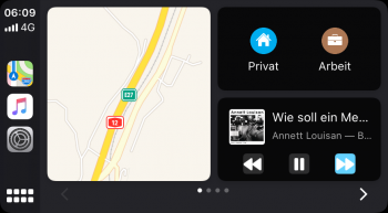
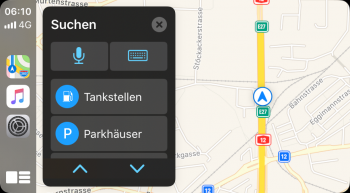
You can see that in the screenshot. In the first one, the map just doesn't move and there arrow is long gone, in the full screen, it works perfect.

When I started the car in the morning it suggested the way to my workplace. Which is nice and fine, but I know that way. Anyway, I did nothing and the arrow moved along with the map. But only in the overview view. When I cancelled the suggestion just to see the map, it stopped working
 

Attachments

  • cp1.png
    cp1.png
    118.1 KB · Views: 303
  • cp2.png
    cp2.png
    269.4 KB · Views: 301
  • Like
Reactions: ColoArtist

buzzman

macrumors regular
Aug 11, 2007
116
48
I now know the problem. It works only when I remove my home and my work address from the favorites.
In the morning it suggested to navigate to my workplace. I cancelled the suggestion and the map was stuck.
After I deleted my home and my work address (and maps can't make a navigation suggestion) everything works fine. I guess they'll fix that in a coming beta
 
  • Like
Reactions: QuarterSwede

Solver

macrumors 65816
Jan 6, 2004
1,230
3,205
USA
Anyone notice in ios13 beta 2, Siri now able to say, at the next light turn right?
 
Register on MacRumors! This sidebar will go away, and you'll see fewer ads.