Got a tip for us?
Let us know
Become a MacRumors Supporter for $50/year with no ads, ability to filter front page stories, and private forums.
iOS 26 Beta Screenshot Thread
- Thread starter MakaniKai
- Start date
-
- Tags
- beta ios ios 26 screenshots
- Sort by reaction score
You are using an out of date browser. It may not display this or other websites correctly.
You should upgrade or use an alternative browser.
You should upgrade or use an alternative browser.
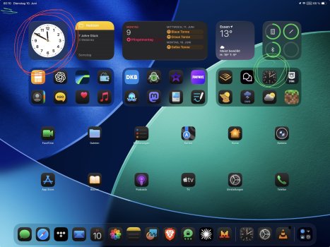
Here’s one of my home screens! I’m really excited about the clear glass icons and light mode tinted icons. I always was sad that iOS 18 only allowed dark tinted icons. This update feels so much more “me” so far.

It’s not always a win though! For example this combo is very hard to read. In fact somehow the screenshot is easier to read than the real thing; I wish I could capture how bright that top right group really is.

It’s not always a win though! For example this combo is very hard to read. In fact somehow the screenshot is easier to read than the real thing; I wish I could capture how bright that top right group really is.
Last edited:
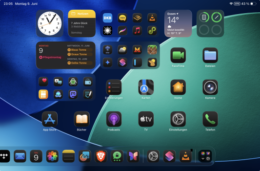
Here’s an example of the new Lock Screen wallpaper. I was able to make the clock huge. And the widgets are at the bottom. It looks like depending on the font you choose for the clock, and how big you make it (not all of them can be expanded), the widgets will appear either on the top or bottom.


Last edited:
I think the clear icons work with the right background. I’m still experimenting with what works best


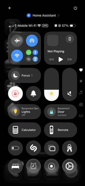
Here’s a pic of my control center in my Sleep (dark) theme, I think it’s pretty nice. I’d say the background could be a little more blurred though.

Last edited:
You will so much like it!
Oh, iPadOS 26 is buggy without end! Music plays or doesn't play, then suddenly races, fast-forwards, but never shuffles automatically!
And the dock crashes, at its finest! You press the Brave Browser icon to open the Photos app!
And the clock widget: be happy when it works. And if you oversleep the next morning, it's probably because the clock widget (and the alarms, the alarm clock) froze again at night. iPadOS 26 is so incredibly buggy, it's indescribable! This is not a beta, this is a pre-alpha version at the moment!
Attachments
Better yet, can somebody please provide some screen recordings. Liquid Glass seems to rely on animation/movement but it’s hard to appreciate based on still screenshots and distant YouTube videos.
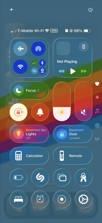
And use cases like the control center are where this new style falls apart. The white control center icons/sliders lose their edge contrast against white backgrounds. Also the background color refraction effect seems a little heavy handed:Here’s one of my home screens! I’m really excited about the clear glass icons and light mode tinted icons. I always was sad that iOS 18 only allowed dark tinted icons. This update feels so much more “me” so far.
[nice screenshot]
It’s not always a win though! For example this combo is very hard to read. In fact somehow the screenshot is easier to read than the real thing; I wish I could capture how bright that top right group really is.
[control center screenshot]

Red colors are especially noticeable, overblown and destroy contrast, especially when there are lighter fonts or actual red icons on top:

I don't hate it, it just needs some work lol
Here you go! It is a bit laggy when I am recording for some reason. Also, about 30 seconds in, you may notice a big pause. I was trying to swipe but the screen wasn't responding at all. It has happened to me many times in this beta.Better yet, can somebody please provide some screen recordings. Liquid Glass seems to rely on animation/movement but it’s hard to appreciate based on still screenshots and distant YouTube videos.
You might also notice a black border around the categories when I swipe initially from the home page to the app drawer. That is not a video artifact, it really is there. Probably just a beta bug.
Thank you so much. The glass effect looks fantastic.Here you go! It is a bit laggy when I am recording for some reason. Also, about 30 seconds in, you may notice a big pause. I was trying to swipe but the screen wasn't responding at all. It has happened to me many times in this beta.
View attachment 2519247
You might also notice a black border around the categories when I swipe initially from the home page to the app drawer. That is not a video artifact, it really is there. Probably just a beta bug.
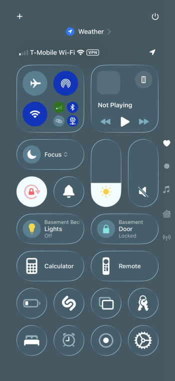
The dark theme looks more ok. How does it look if you turn on the Reduce transparency?Here’s a pic of my control center in my Sleep (dark) theme, I think it’s pretty nice. I’d say the background could be a little more blurred though.
View attachment 2518212
Before and after reduced transparency.The dark theme looks more ok. How does it look if you turn on the Reduce transparency?
I will say that I find the control center to be the ugliest part of the UI so far. I suspect it will get better over time.
Also, personally I would not over analyze the reduced transparency mode right now. Most likely they are waiting until more of the UI is fleshed out in normal mode before tweaking it to look nicer for accessibility.
Attachments
Last edited:
Would someone post some screenshots with a pure black wallpaper?
I would like to know how the glass icons look on plain black.
I would like to know how the glass icons look on plain black.
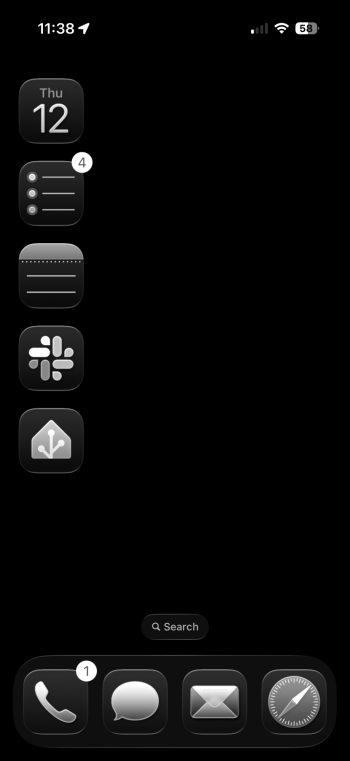
Here you go, using dark clear icons. Light clear is basically the same but appears more grey.Would someone post some screenshots with a pure black wallpaper?
I would like to know how the glass icons look on plain black.
Attachments
Solid black wallpaper background looks EXCELLENT!
Colorful background wallpapers look kinda yucky .
Colorful background wallpapers look kinda yucky .
Thank you so much!Here you go, using dark clear icons. Light clear is basically the same but appears more grey.
Now it's even harder for me to wait until all important apps I need are working on iOS26

Hi, can I ask how you moved the widget to the top of the screen? I can't seem to move them from the bottom, to the top.
Register on MacRumors! This sidebar will go away, and you'll see fewer ads.