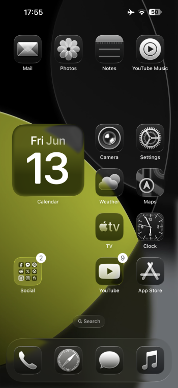
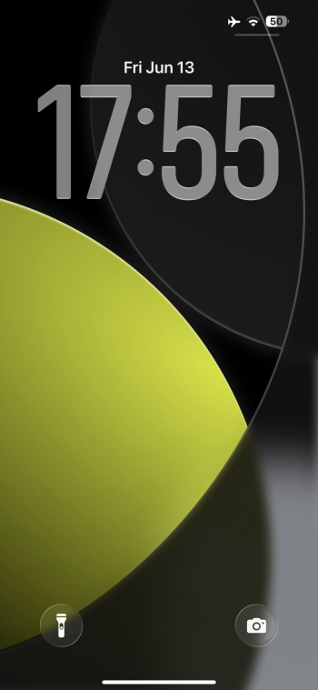
It’s defined by the height of the clock as far as I can tell. A clock that is expanded in height will move the widgets to the bottom. Try a different clock font if resizing isn’t workingHi, can I ask how you moved the widget to the top of the screen? I can't seem to move them from the bottom, to the top.
Got a tip for us?
Let us know
Become a MacRumors Supporter for $50/year with no ads, ability to filter front page stories, and private forums.
iOS 26 Beta Screenshot Thread
- Thread starter MakaniKai
- Start date
-
- Tags
- beta ios ios 26 screenshots
- Sort by reaction score
You are using an out of date browser. It may not display this or other websites correctly.
You should upgrade or use an alternative browser.
You should upgrade or use an alternative browser.
Great, thank you. That worked. 👍It’s defined by the height of the clock as far as I can tell. A clock that is expanded in height will move the widgets to the bottom. Try a different clock font if resizing isn’t working
iOS toggles ...
Personally, I find iOS 5 to the best looking and most clear about what's happening.

Personally, I find iOS 5 to the best looking and most clear about what's happening.

I feel like I keep repeating myself but this blur on top and button of Safari needs to go away. It is driving me absolutely insane and I am not exaggerating. Especially when I scroll on a website. It makes me feel like I am getting blind and it also makes the screen seem smaller than it is somehow? All I focus on is the washed out content

UGH it also exists in the Mail app. Hate it.

UGH it also exists in the Mail app. Hate it.
Last edited:
I don‘t know why they picked this depiction of the 26 toggle, that is the pill shape while toggling. It‘s supposed to be inset and not overlapping the toggle when settled / not in motion.iOS toggles ...
Personally, I find iOS 5 to the best looking and most clear about what's happening.

Report in the feedback app, still early so there is time for them to tackle these issues. Also include proper reasoning behind why you want the blur tweaked / removed (e.g. helps when your reason is somewhat medical, like motion sickness from the corner blur). Once we hit Beta 4-5, feedback like this is mostly ignored due to them locking into polishing season.I feel like I keep repeating myself but this blur on top and button of Safari needs to go away. It is driving me absolutely insane and I am not exaggerating. Especially when I scroll on a website. It makes me feel like I am getting blind and it also makes the screen seem smaller than it is somehow? All I focus on is the washed out content
View attachment 2519740
UGH it also exists in the Mail app. Hate it.
View attachment 2519741
I don‘t know why they picked this depiction of the 26 toggle, that is the pill shape while toggling. It‘s supposed to be inset and not overlapping the toggle when settled / not in motion.
Thank you for adding this additional info. I did not know that.
It sounds better than this is portraying. 👍
My guess is that the blur is their solution to the glass not having enough contrast with the content below it.I feel like I keep repeating myself but this blur on top and button of Safari needs to go away. It is driving me absolutely insane and I am not exaggerating. Especially when I scroll on a website. It makes me feel like I am getting blind and it also makes the screen seem smaller than it is somehow? All I focus on is the washed out content
View attachment 2519740
UGH it also exists in the Mail app. Hate it.
View attachment 2519741
My honest opinion is that they should ditch the liquid glass concept and stick with frosted glass. But that’s not gonna happen. I liked the way iOS 18 looked lol
I have never before seen anyone put folders in the dock. Gives me a lot to think aboutmy (usual) minimalism, and 1-page home screen (all my apps are organized in folders, and first 3 have most-used apps one folder-level only). no swiping!
View attachment 2519858
View attachment 2519859
am too OCD to deal with pages of icons, and hunting for stuff. i have the folders well-organized to my needs (and only the last folder has several layers, stuff i rarely use or don't need to access). plus it looks good ☺️I have never before seen anyone put folders in the dock. Gives me a lot to think about
Mine flickers a little but it doesn’t look that flickery. I did just update to the new release, maybe they adjusted it. It still looks unpolished though
I feel like I keep repeating myself but this blur on top and button of Safari needs to go away. It is driving me absolutely insane and I am not exaggerating. Especially when I scroll on a website. It makes me feel like I am getting blind and it also makes the screen seem smaller than it is somehow? All I focus on is the washed out content
View attachment 2519740
UGH it also exists in the Mail app. Hate it.
View attachment 2519741
I think it is a part of a new design, as it is also on top of the Maps.
My guess is that the blur is their solution to the glass not having enough contrast with the content below it.
My honest opinion is that they should ditch the liquid glass concept and stick with frosted glass. But that’s not gonna happen. I liked the way iOS 18 looked lol
LG could get better if/once Apple tweak its transparency adaptation to different backgrounds. For now it looks pretty, but can get really difficult to read in certain colour combos, usually against light backgrounds.
Frosted glass will take us back to iOS 18, but also adding some gloss to it, as currently it is quite neutral.
I actually think it looks very nice in dark mode.
Still don’t like the blur in safari in light mode though. Too distracting

Still don’t like the blur in safari in light mode though. Too distracting
Seriously. I want to change the color like on the Mac. I want it blue.iOS toggles ...
Personally, I find iOS 5 to the best looking and most clear about what's happening.

That gradient looks nice with those icons!I actually think it looks very nice in dark mode.
Still don’t like the blur in safari in light mode though. Too distracting
View attachment 2520180
I would pay a monthly subscription fee if I could get back iOS1 or iOS5 buttons.iOS toggles ...
Personally, I find iOS 5 to the best looking and most clear about what's happening.

I'm very happy when the new glas design finds it end in a few years.
I like this liquid glass effect / it’s even better with nice wallpaper


I hope they change that, too. I use the top of the screen/view to keep track of which line I'm reading and the gradual blur makes it impossible to see which line I'm on.I feel like I keep repeating myself but this blur on top and button of Safari needs to go away. It is driving me absolutely insane and I am not exaggerating. Especially when I scroll on a website. It makes me feel like I am getting blind and it also makes the screen seem smaller than it is somehow? All I focus on is the washed out content
View attachment 2519740
UGH it also exists in the Mail app. Hate it.
View attachment 2519741
Mind to share the wallpaper?I like this liquid glass effect / it’s even better with nice wallpaper View attachment 2520343View attachment 2520344View attachment 2520345View attachment 2520346
Register on MacRumors! This sidebar will go away, and you'll see fewer ads.


