Become a MacRumors Supporter for $50/year with no ads, ability to filter front page stories, and private forums.
Status
Not open for further replies.

Jare

macrumors 65816
Original poster
Jun 17, 2010
1,190
1
Canada
As seen originally on: Mod-Gadget

It's me again, this time with a much more realistic iOS 6 Concept I'm sure you'll enjoy.

Please use this thread from now on as the old thread should be closed and a Cydia tweak will be coming soon. I based this off of what would be a logical step forward for Apple to go with iOS without looking too much like competitors as well as bringing in some much needed features.

Coming Soon:

- New Lockscreen
- Home Screen with "live" icons
- Improved Widget UI in Dashboard
- Spotlight demo image
- improved graphics
- 2 new secret concepts

So let's get started. First of all, something that needs to go.. Spotlight. I know there are a ton of you using it but it can be much improved, which I will display below.

Notification Center
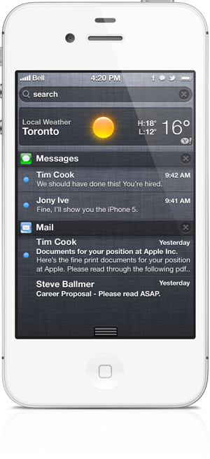
M0FNh.png


Spotlight

First of I've added Spotlight directly into notification center. When tapping on the search bar the screen goes black, the spotlight bar turns white and you're able to type in just like the old UI was. All of this in notification center.


Status Bar Icons

Yes, that's right.. status bar icons. This helps us visually see that notification center has new alerts, in case we've already dismissed our lock screen notifications.

Status Bar Icons display on the homescreen, lock screen and in notification center. Anywhere the status bar can be displayed, you'll see your notifications.

-----------------------------------------------

Dashboard
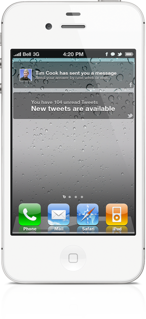
TqNBC.png


Instead of the old Spotlight page, when swiping to the left of your homescreen you'll see a new screen called Dashboard.


REAL Widgets

Live information at your finger tips. This page is scrollable, allowing you to have as many widgets as you'd like. Of course not all of the widgets that would be available would look like above, those are only demonstrations. Facebook Messages, New Tweets, Current Music, Settings Toggles, Photo Gallery, New Emails and SMS with quick reply. These all can fit here in one section.

DASHBOARD IS OPTIONAL. You can turn off Dashboard completely under Settings -> General -> Dashboard -> Toggle Disable.
 
Last edited:

AustinIllini

macrumors G5
Oct 20, 2011
12,699
10,566
Austin, TX
I really like the concept of a dashboard, but I also like being able to hit the home button and start typing for search. However, with the advancement in voice recognition technology, the less simple searching mechanism seems logical.
 

ChristianVirtual

macrumors 601
May 10, 2010
4,122
282
日本
Looks nice; I hardly ever use the search page; your dashboard could make it more useful for me.

Where should the widgets come from ? I guess AppStore ? or HTML5/JS ?

BTW: You better answer your mails and messages ... :rolleyes:
 
Last edited:

GoCubsGo

macrumors Nehalem
Feb 19, 2005
35,742
155
I like the look of it. Like ChristianJapan, I don't use the search enough either.
 

Kyotoma

macrumors 68000
Nov 11, 2010
1,996
46
Carnegie and Ontario
[...]Where should he widgets come from ? I guess AppStore ? or HTML5/JS ?[...]

I would think that they would either be bundled with an existing App, meaning you can toggle it on or off as you install it and also establish the order in which they are displayed just like the notification center right now. Another option for standalone widgets(say you don't want the App icon to clutter your Springboard) would be to give them their own section within the App store.

I also see Widgets just being a future developer API, perhaps released in iOS 6 or a later iOS 5.x version.

To go along with the idea that some App icons, while being helpful, just make the Springboard look cluttered. I think Apple, while minding intellectual property rights and such, should be able to again take a leaf from Android's book and give iOS the ability to hide App icons without uninstalling the App. This app would still function normally, and would still be searchable within Spotlight Search. Another thing they could take from Android that would play into this idea would be the App drawer. This would be the master App list, being sort-able, searchable, and having the ability to be broken down into categories much like the App Store is today.

Also, make the Springboard a static grid instead of a stack, where you can place your icons where you want on the Springboard. I know this is already doable within the Jailbreak community, but I believe that it is time for Apple to bring this feature to the stock iOS.
 

Jare

macrumors 65816
Original poster
Jun 17, 2010
1,190
1
Canada
I would think that they would either be bundled with an existing App, meaning you can toggle it on or off as you install it and also establish the order in which they are displayed just like the notification center right now. Another option for standalone widgets(say you don't want the App icon to clutter your Springboard) would be to give them their own section within the App store.

I also see Widgets just being a future developer API, perhaps released in iOS 6 or a later iOS 5.x version.

To go along with the idea that some App icons, while being helpful, just make the Springboard look cluttered. I think Apple, while minding intellectual property rights and such, should be able to again take a leaf from Android's book and give iOS the ability to hide App icons without uninstalling the App. This app would still function normally, and would still be searchable within Spotlight Search. Another thing they could take from Android that would play into this idea would be the App drawer. This would be the master App list, being sort-able, searchable, and having the ability to be broken down into categories much like the App Store is today.

Also, make the Springboard a static grid instead of a stack, where you can place your icons where you want on the Springboard. I know this is already doable within the Jailbreak community, but I believe that it is time for Apple to bring this feature to the stock iOS.

It's funny you mention those, when in my old thread: https://forums.macrumors.com/threads/1313988/ I got bashed by a good chunk of the readers for doing what you mentioned.

----------

Where should the widgets come from ? I guess AppStore ? or HTML5/JS ?

BTW: You better answer your mails and messages ... :rolleyes:

Built into the apps as you download them and optional, of course.

And to your BTW: ;)
 

Jare

macrumors 65816
Original poster
Jun 17, 2010
1,190
1
Canada
You think those are bad ideas?

No I mean when you mentioned the app drawer idea, I had already had a concept done for it in which the number one complaint was "it adds another tap which is super exhausting for my finger". In my old thread which I linked.
 
Last edited:

Samskeyti

macrumors member
Feb 7, 2012
68
0
Widgets to the left is pretty ideal. Any chance you could do a mockup with some graphical tweaks? UI is starting to look stale and it could really use some simple changes to make it "pop out".

Take for example the header we're so used to...
apple-iphone-settings-sound.png

And give it a sharper look, like...
screenshot_08.jpg


It's a small change I'd really welcome.
 

Jare

macrumors 65816
Original poster
Jun 17, 2010
1,190
1
Canada
Widgets to the left is pretty ideal. Any chance you could do a mockup with some graphical tweaks? UI is starting to look stale and it could really use some simple changes to make it "pop out".

Take for example the header we're so used to...
Image
And give it a sharper look, like...
Image

It's a small change I'd really welcome.

Yup, my actual goal here is to completely modernize iOS in my own way. I want to try every last detail I can and pump my idea's out for others to view and comment on. Of course the majority of them will turn into Cydia tweaks/themes.
 

Samskeyti

macrumors member
Feb 7, 2012
68
0
Yup, my actual goal here is to completely modernize iOS in my own way. I want to try every last detail I can and pump my idea's out for others to view and comment on. Of course the majority of them will turn into Cydia tweaks/themes.
Excited to see what you come up with!
 
No I mean when you mentioned the app drawer idea, I had already had a concept done for it in which the number one complaint was "it adds another tap which is super exhausting for my finger". In my old thread which I linked.

What Kyotoma is suggesting is quite a bit different than your other idea. He's basically saying hide all the icons that you don't use, but still being able to search for them or have some comprehensive list of your apps that you can still access them if you need them. Your previous concept has only 7 apps on your springboard with all of the rest hidden in the launchpad.

So to contrast, in his concept majority of your apps are in your springboard, you maintain your grid of 20 apps per page, but you have the option to disable Apple apps, widget apps, and very rare use-case apps, while still maintaining an ability to find them if needed. The way I understood your old concept was 7 apps +1 widget on your springboard, then all the rest of your apps are embedded within launchpad.

But as for your new concept. So far it seems pretty good. I think the status bar icons are the the biggest difficulty so far. On my iPhone I use battery percentage, bluetooth, orientation lock, and alarms set... It's already full. Every time I use GPS I lose battery percentage because there is no room. Then typically I have notifications from at least 3 various apps at any given time. I think it would need to be an icon which just signifies "Notifications!" and maybe even a small number to idicate how many notifications you have.
 

Jare

macrumors 65816
Original poster
Jun 17, 2010
1,190
1
Canada
But as for your new concept. So far it seems pretty good. I think the status bar icons are the the biggest difficulty so far. On my iPhone I use battery percentage, bluetooth, orientation lock, and alarms set... It's already full. Every time I use GPS I lose battery percentage because there is no room. Then typically I have notifications from at least 3 various apps at any given time. I think it would need to be an icon which just signifies "Notifications!" and maybe even a small number to idicate how many notifications you have.

I think a solution to this could be removing the carrier name and re-arranging the status bar so that all of your "notifications" end up on one side, and "system images" on the other, including time. Sort of how OS X has it set up but without the menu/finder inside of the menu bar. Having notifications on that side could work.
 

Bajaz001

macrumors newbie
Feb 8, 2012
12
0
Ok, but where is initial launchpad from old thread? I hate so much icons on home screen it's so stopid and useless. I have iPhone 4s, and before i had iPhone 4, but iOS is such bad OS (not tehnical side), so limited and gives no information like Android or WP (although iOS 5 with notification center improves this a bit). Perfect combination for me would be Apple iPhone (4/4S) + WP7.x

Support for project :)
 

Jare

macrumors 65816
Original poster
Jun 17, 2010
1,190
1
Canada
Ok, but where is initial launchpad from old thread? I hate so much icons on home screen it's so stopid and useless. I have iPhone 4s, and before i had iPhone 4, but iOS is such bad OS (not tehnical side), so limited and gives no information like Android or WP (although iOS 5 with notification center improves this a bit). Perfect combination for me would be Apple iPhone (4/4S) + WP7.x

Support for project :)

That concept is becoming an actual Cydia tweak. This is more for a "logical" forward thinking concept on what iOS 6 will "probably" look like.

----------

Someone must have picked up a symbian phone lately.
Please: forwards not backwards!

Is it weird that I've never actually seen or used a Symbian device, just heard the name?
 

lordofthereef

macrumors G5
Nov 29, 2011
13,161
3,721
Boston, MA
May have already been said (and I am not reading through the posts), but this looks a LOT like Intelliscreen X, only a bit more minimalistic.
 
Status
Not open for further replies.
Register on MacRumors! This sidebar will go away, and you'll see fewer ads.