Become a MacRumors Supporter for $50/year with no ads, ability to filter front page stories, and private forums.
Status
Not open for further replies.

Jare

macrumors 65816
Original poster
Jun 17, 2010
1,190
1
Canada
Ooooohw,
Now i'm in love :p

I really like THE idea.
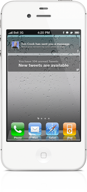
Launchpad is a feature I'd love to see on iOS 6,
(even if all android users gonna say: "they stole the idea from us :(" )

Just for the rcord, I like the idea of a single notification icon more.
But don't get me wrong,
If for example only twitter has given you notifications,
I would like to see a twitter icon,
And when there's more than just 1,
I's prefer a notification icon.

Than you can see if there's one or more apps that need your attention.


(any idea on when we can expect a beta of it?)

Not quite sure, I'd rather release something that works then rush it to market.
 

cbmstocks

macrumors member
Jan 26, 2012
67
0
will this require winterboard?

i would like to see what you have in store for the lockscreen as well. integrating a tap to unlock feature or at least something more attractive than slide.

personally i would not use the "dashboard", but if you were able to integrate a sms widget or quick emailer i would be more inclined to use it..

i have spotlight hidden already so if it was in the nc it would be perfect. as for the notifications.. personally, i want an icon with a number like bitesms has currently. you could have a setting where it integrates all the notifications into one icon or separates them per app.
 

TheKnowledgeGuy

macrumors member
Apr 23, 2010
78
0
I like where Spotlight is, it is easily accessible when you have 350+ apps, and Notification Center sometimes has some lag opening. And it IS for notifications.

TqNBC.png

Dashboard page icon is just Spotlight icon rotated 270º?
 

Jare

macrumors 65816
Original poster
Jun 17, 2010
1,190
1
Canada
I like where Spotlight is, it is easily accessible when you have 350+ apps, and Notification Center sometimes has some lag opening. And it IS for notifications.


Dashboard page icon is just Spotlight icon rotated 270º?

Yeah that's just laziness on my side, I haven't drawn a shrunken down Dashboard icon yet.
 

mavere

macrumors member
Jun 6, 2007
86
58
Conceptually, Dashboard and Notifications seem very similar, but the latter has the benefit of being usable anywhere. I don't really see myself using Dashboard too much unless it has a "killer" widget of some sort.

On the other hand, I'd use the crap out of NC Spotlight search. Ability to directly launch new apps from within apps would make things so much more efficient. I hope that it wouldn't slow down the NC, though.
 

Jare

macrumors 65816
Original poster
Jun 17, 2010
1,190
1
Canada
Conceptually, Dashboard and Notifications seem very similar, but the latter has the benefit of being usable anywhere. I don't really see myself using Dashboard too much unless it has a "killer" widget of some sort.

On the other hand, I'd use the crap out of NC Spotlight search. Ability to directly launch new apps from within apps would make things so much more efficient. I hope that it wouldn't slow down the NC, though.

From what I can tell NC wouldn't be effected speed or usability wise. :)

----------

will this require winterboard?

i would like to see what you have in store for the lockscreen as well. integrating a tap to unlock feature or at least something more attractive than slide.

personally i would not use the "dashboard", but if you were able to integrate a sms widget or quick emailer i would be more inclined to use it..

i have spotlight hidden already so if it was in the nc it would be perfect. as for the notifications.. personally, i want an icon with a number like bitesms has currently. you could have a setting where it integrates all the notifications into one icon or separates them per app.

Nope, no Winterboard needed.

Still working on the other concepts as well they'll be posted soon-ish.
 

TheKnowledgeGuy

macrumors member
Apr 23, 2010
78
0
Hm, on the topic of Winterboard, I wish some themes of Dreamboard weren't like whole other OSes...I want some themes which I don't have to respring yet it still looks the least bit like iOS5.

Looking forward to trying this concept.
 

Jare

macrumors 65816
Original poster
Jun 17, 2010
1,190
1
Canada
I like where Spotlight is, it is easily accessible when you have 350+ apps, and Notification Center sometimes has some lag opening. And it IS for notifications.


Dashboard page icon is just Spotlight icon rotated 270º?

You've noticed lag in NC? That's really strange, I've never noticed anything of the sort.
 

TheKnowledgeGuy

macrumors member
Apr 23, 2010
78
0
Yeah, like, the first time I open it every once in awhile. The tab goes down 1/12 of the way, waits half a second, then opens. After, it works fine.
 

Jare

macrumors 65816
Original poster
Jun 17, 2010
1,190
1
Canada
Update: Tweak is about 20% done for the old concept. It's a lot harder then I anticipated to get it to work without some form of battery drain/etc.

New imagines almost done as well.
 

Branskins

macrumors 65816
Dec 8, 2008
1,235
180
Usability wise, why would a user expect to open Notification Center to search for other applications from it in Spotlight?

This would either need to result in a name change for Notification Center (which seems unlikely...) or a new UI to somehow change what Spotlight is.

Compacting features seems cleaner, but it doesn't make it any more useable because both features offer something wildly different
 

Jare

macrumors 65816
Original poster
Jun 17, 2010
1,190
1
Canada
Usability wise, why would a user expect to open Notification Center to search for other applications from it in Spotlight?

This would either need to result in a name change for Notification Center (which seems unlikely...) or a new UI to somehow change what Spotlight is.

Compacting features seems cleaner, but it doesn't make it any more useable because both features offer something wildly different

Think of being able to search for apps from within apps. IE: You're in mail, you pull down NC and search.

----------

Concepts = great.

Screenshot humour = priceless.

Top notch.

Thank you sir.
 

Branskins

macrumors 65816
Dec 8, 2008
1,235
180
Think of being able to search for apps from within apps. IE: You're in mail, you pull down NC and search.

----------


Thank you sir.

I understand the idea, but if I am a casual user of iOS, why would I think to go to Notification Center to search for apps?

Just a Cognitive Walkthrough type question :p
 

Jare

macrumors 65816
Original poster
Jun 17, 2010
1,190
1
Canada
I understand the idea, but if I am a casual user of iOS, why would I think to go to Notification Center to search for apps?

Just a Cognitive Walkthrough type question :p

Well you're right, don't get me wrong. But I've met tons of people who don't even know you can swipe to the left and access spotlight.

You're going to actually be using Notification Center regardless of how new/old you are to iOS. This way it brings the feature to view.
 

Branskins

macrumors 65816
Dec 8, 2008
1,235
180
Well you're right, don't get me wrong. But I've met tons of people who don't even know you can swipe to the left and access spotlight.

You're going to actually be using Notification Center regardless of how new/old you are to iOS. This way it brings the feature to view.

I know a lot of people that don't even know about Notification Center lol.

That's a problem with a lot of new features Apple keeps adding: how will people know to do that?

That's why I hope iOS 6 will be a UI tweaking to make these cool things they have been adding make more sense rather than adding even more new features.

What about adding the app search to the springboard like it is in Mountain Lion?
 

MattInOz

macrumors 68030
Jan 19, 2006
2,760
0
Sydney
I feel like this would an argument to put it in the notification center. Easily search no matter what page you were on.

That would be nice but to me they don't mesh as ideas.

Notifications are bits of information the app wants me to know.
Spotlight is something I want to know from which ever apps might have an answer.

They could get spotlight to work from anywhere by changing its gesture to a screen edge swipe.
 

Jare

macrumors 65816
Original poster
Jun 17, 2010
1,190
1
Canada
I'm perfectly okay with sacrificing a trivial piece of metaphorical coherence for a massive functional improvement.

Exactly. Think about it this way.

Let's say you're in App A and you'd like to go to your App B which isn't open in the multi-tasking tray. Since you have tons of apps, you like to use Spotlight to find your apps. Click home button. Click home button again (or swipe). Start typing.

Why do this when you can shorten it to one single action. Swipe down. Start typing. No need to even leave the app your in.
 

Branskins

macrumors 65816
Dec 8, 2008
1,235
180
Exactly. Think about it this way.

Let's say you're in App A and you'd like to go to your App B which isn't open in the multi-tasking tray. Since you have tons of apps, you like to use Spotlight to find your apps. Click home button. Click home button again (or swipe). Start typing.

Why do this when you can shorten it to one single action. Swipe down. Start typing. No need to even leave the app your in.

Because when you start sacrificing the structural integrity of something, the project will begin to fall apart somewhere down the road when pieces have become so bloated.

Here are the problems I foresee if we keep adding things to NC:
  • Explaining that Notification Center exists is already a usability problem. I had one friend who discovered it a few days after buying the phone. I originally thought that a notification coming down from the top and then "rolling" back up to the top would get the point across, but it doesn't because people just do not think about it. Explaining to a friend to go to Notification Center (if they even know that it exists) to access spotlight might confuse them because you wouldn't normally associate searching with notifications (unless you are searching Notifications which just means that the system is flooding you with too much!)
  • Mountain Lion is separating Spotlight from Notification Center. By joining them on iOS, you are then breaking the unified system they are attempting to make.
  • Widgets in NC might create a problem down the road already since it is a weird place to access them...especially in a list that can scroll for a long time.

It is clear that going forward Apple wants to create a cohesive ecosystem between iOS and OS X.

I guess my question is where do you draw the line about what makes sense to be in Notification Center and what doesn't?
 

MattInOz

macrumors 68030
Jan 19, 2006
2,760
0
Sydney
Exactly. Think about it this way.

Let's say you're in App A and you'd like to go to your App B which isn't open in the multi-tasking tray. Since you have tons of apps, you like to use Spotlight to find your apps. Click home button. Click home button again (or swipe). Start typing.

Why do this when you can shorten it to one single action. Swipe down. Start typing. No need to even leave the app your in.

Well it's more swipe down, tap search field then start typing
Or they could have swipe on to the screen from the left edge and activate the search field and keyboard all in one action. Keeping the clear distinction of the two functions. It takes the current habits and makes the gesture work any where any time.
 
Status
Not open for further replies.
Register on MacRumors! This sidebar will go away, and you'll see fewer ads.