Become a MacRumors Supporter for $50/year with no ads, ability to filter front page stories, and private forums.

Jare

macrumors 65816
Original poster
Jun 17, 2010
1,190
1
Canada
** THIS THREAD SHOULD NOW BE CLOSED AS DEVELOPMENT ON THE CYDIA TWEAK BEGINS **

Please use: https://forums.macrumors.com/threads/1321499/ to discuss my new iOS 6 concept.


AS SEEN ON: Mod-Gadget

** CYDIA TWEAK COMING SOON ** If you'd like to be a part of the dev team, please PM.

So I have been thinking of how we could improve on the iOS homescreen. A grid of icons get's very boring, so I'd like to introduce you to my concept of iOS 6. (And soon to be a Cydia tweak, hopefully!) It has some radical new changes you will love.

This is not the final version, but a demo idea. As I tweak and perfect the idea so I can turn it into a real cydia tweak I'll create much larger scale images with more clarity/graphical improvement.

The Concept
IYRDG.png

OFq0K.png
Sq48O.png


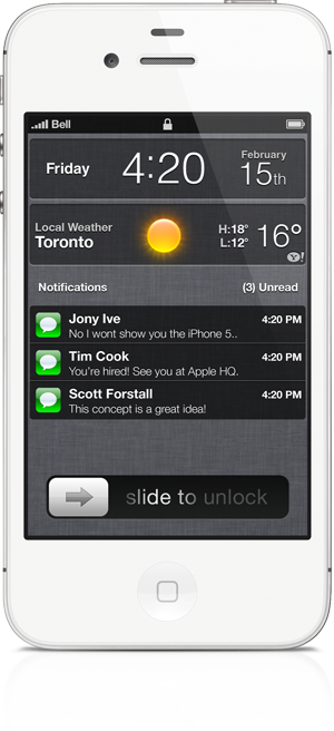
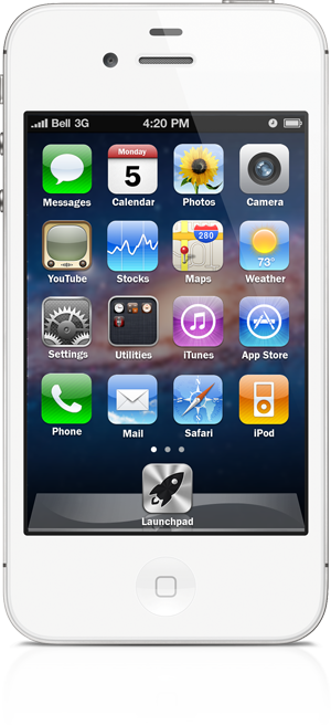
So this here would be a "typical" homescreen. A widget, icons able to be arranged in any order/placement you'd like. Notice the 2nd icon on the dock?

This, is launchpad. Now, we've seen launchpad before on OS X. Tapping launchpad opens this screen:

YatAv.png
ilHLe.png


Ah, the grid of icons. It's not truely gone, but it's now away from our homescreens and only one tap away. The background is blurred (probably darkened or something as well) and getting back to our homescreen is only a tap of the home button (or launchpad icon) away. This screen can be customizable, have folders, etc. Just like your home screen. Can hold 4 rows of icons, and swipe-able to the next page(s)! It contains all of your apps.

Of course I also want to take my hammer at redoing the notification center sans linen and widgets.

What do you all think?
 
Last edited:

Phil A.

Moderator emeritus
Apr 2, 2006
5,800
3,100
Shropshire, UK
Wirelessly posted (iPhone 4: Mozilla/5.0 (iPhone; CPU iPhone OS 5_0_1 like Mac OS X) AppleWebKit/534.46 (KHTML, like Gecko) Version/5.1 Mobile/9A405 Safari/7534.48.3)

I think it looks like Samsung TouchWiz
 

Jare

macrumors 65816
Original poster
Jun 17, 2010
1,190
1
Canada
Wirelessly posted (iPhone 4: Mozilla/5.0 (iPhone; CPU iPhone OS 5_0_1 like Mac OS X) AppleWebKit/534.46 (KHTML, like Gecko) Version/5.1 Mobile/9A405 Safari/7534.48.3)

I think it looks like Samsung TouchWiz

Samsung TouchWiz looks like iOS. XD
 

verwon

macrumors 68030
Jul 26, 2011
2,676
2
Seattle
So I have been thinking of how we could improve on the iOS homescreen. A grid of icons get's very boring, so I'd like to introduce you to my concept of iOS 6. (And soon to be a Cydia tweak, hopefully!) It has some radical new changes you will love.

This is not the final version, but a demo idea. As I tweak and perfect the idea so I can turn it into a real cydia tweak I'll create much larger scale images with more clarity/graphical improvement.

The Concept
Image

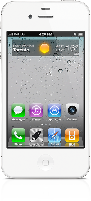
So this here would be a "typical" homescreen. A widget, icons able to be arranged in any order/placement you'd like. Notice the 3rd icon on the dock?

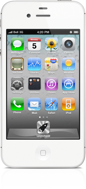
This, is launchpad. Now, we've seen launchpad before on OS X. Tapping launchpad opens this screen:
Image

Ah, the grid of icons. It's not truely gone, but it's now away from our homescreens and only one tap away. The dock gets hidden, the background is blurred (probably darkened or something as well) and getting back to our homescreen is only a tap of the home button (or launchpad icon) away. This screen can be customizable, have folders, etc. Just like your home screen. Can hold 5 rows of icons, and swipe-able to the next page(s)! It contains all of your apps.

Of course I also want to take my hammer at redoing the notification center sans linen and widgets.

What do you all think? This *could* work on an iPhone, to a lesser extent.

I'm in, I'm a fan!!! ;-)
 

Calidude

macrumors 68000
Jun 22, 2010
1,730
0
Just get yourself an Android phone already. This is embarrassing to even look at.
 

soy

macrumors regular
Jan 25, 2012
114
97
Brooklyn
This looks exactly like most Android Launchers. Renaming the Launcher to Launchpad doesn't magically turn it into iOS/OS X. Also, an extra tap just to get to your apps would be a bit un-Applelike. They spent ages reducing the number of taps needed for common tasks, just like they did with the iPod menu system before it.

Slightly off-topic, but why do people making mock-ups always use ancient screenshots? Why would iOS 6 return to the old Voice Memos and iPod icons?

(not a comment on you personally, everyone seems to do it, the iPhone 5 mock-ups Macrumors had also somehow had iOS 4 running on them, even though iOS 5 betas had been out for quite a few months by then)
 

Stella

macrumors G3
Apr 21, 2003
8,883
6,477
Canada
I'm sure that iOS 6 will have live widgets in some form. Apple have already begun the process by putting stocks and weather on the Notification pull down.

Apple need to make these notifications apart of the SDK.
 

Small White Car

macrumors G4
Aug 29, 2006
10,972
1,468
Washington DC
I guess my problem with this is that it places too much importance on widgets.

When I'm unlocking my phone 99% of the time I want an app and 1% of the time I want to see the weather.

Seems backwards that I should see widgets first every time. With widgets I think Apple will continue on the path they have with notifications: Using both the lock-screen as well as some off-screen gesture-accessable widget area. So...always close by and also a part of the un-lock process, but never as an impediment to getting to the apps.

Although I do want widgets, I view apps as more important than widgets, and from what I can tell, Apple feels the same.
 

Menel

Suspended
Aug 4, 2011
6,351
1,356
I guess my problem with this is that it places too much importance on widgets.

When I'm unlocking my phone 99% of the time I want an app and 1% of the time I want to see the weather.

Seems backwards that I should see widgets first every time. With widgets I think Apple will continue on the path they have with notifications: Using both the lock-screen as well as some off-screen gesture-accessable widget area. So...always close by and also a part of the un-lock process, but never as an impediment to getting to the apps.

Although I do want widgets, I view apps as more important than widgets, and from what I can tell, Apple feels the same.
Others want weather more. It's one of my primary purposes, to check temps before run or ride in the way GA oscillates between extremes.

Good news is, it's a quick easy swipe from the top now. And leaves my springboard free for tons of apps =)

Lockscreen could be nice though.
 

PlaceofDis

macrumors Core
Jan 6, 2004
19,241
6
the only thing i like about this concept is that you don't have to see all your apps or hide them in folder necessarily. the thing that has been bothering me about iOS lately is managing applications. there are so many that are useful, but only need every now and then, but putting them in a folder kinda makes them disappear. its a conundrum.
 

Small White Car

macrumors G4
Aug 29, 2006
10,972
1,468
Washington DC
Others want weather more. It's one of my primary purposes, to check temps before run or ride in the way GA oscillates between extremes.

Then I would argue that you'd be better served by having that in the lock screen, as you said.

I'm having trouble of thinking of things that are more important than apps, but less important than the lock screen. That's such a narrow range for things to fall in.
 

george-brooks

macrumors 6502a
Oct 31, 2011
732
16
Brooklyn, NY
All this really does is makes me have to press an extra button to see all my apps and wastes valuable real estate on the home screen. Remember in Isaacson's biography how many times he mentioned that steve would design something so that you could get where you needed to be in 3 clicks?
 

Hellhammer

Moderator emeritus
Dec 10, 2008
22,164
582
Finland
Others want weather more. It's one of my primary purposes, to check temps before run or ride in the way GA oscillates between extremes.

The thing is, weather should not be the only option because plenty of people would prefer something else. Personally, I have never used the default weather app/widget. I prefer a dedicated, local app because the Yahoo weather readings seem like spray&pray sometimes. Also, local apps give me more accurate readings for every hour and rain radar etc. Usually I just use a good ol' thermometer though, forecasts are always forecasts.

I think there should be an option for something else, e.g. latest tweets or FB status updates.
 

verwon

macrumors 68030
Jul 26, 2011
2,676
2
Seattle
It's a great concept, he did a very good job on it, but you all need to remember while you're complaining that it's just that, an idea.

I wouldn't use widgets myself, but I can see why others would find them useful.
 

jlhandy

macrumors newbie
Jan 23, 2012
27
0
Los Angeles
I like the concept though I think the launchpad for iphone would be an unnecessary step to get to your apps and I think for an iphone being a portable device, simplicity is key and creating an extra botton to view apps would simply be an annoyance for users in the long run.
Though your home page looks fantastic and i would love having that on my phone, i'd just recommend having all the other apps found on the second to third or fourth page w/o an extra botton...
 

Jare

macrumors 65816
Original poster
Jun 17, 2010
1,190
1
Canada
Slightly off-topic, but why do people making mock-ups always use ancient screenshots? Why would iOS 6 return to the old Voice Memos and iPod icons?

(not a comment on you personally, everyone seems to do it, the iPhone 5 mock-ups Macrumors had also somehow had iOS 4 running on them, even though iOS 5 betas had been out for quite a few months by then)

I used what was available as an icon psd. I wanted to use as close to Apple icons as possible. There isn't really any psd's around that have the updated icons. Had to make the launchpad one from scratch.

@soy: I didn't rename "launcher" to "launchpad", Launchpad is an OS X feature. https://en.wikipedia.org/wiki/Launchpad_(Mac_OS_X)
 

Schtumple

macrumors 601
Jun 13, 2007
4,905
131
benkadams.com
https://en.wikipedia.org/wiki/Launchpad_(Mac_OS_X)

So let me get this straight... You want an iOS feature that emulates an OSX feature that emulates an iOS feature.

inceptiontitle.jpg

In all seriousness though, I think it's an awesome little idea, but it needs refining, launchpad should be it's own thing, not taking an icon away from the dock, I like having Phone, SMS, Safari and Mail as my bottom 4, and having to remove one seems needless, a swipe may be more appropriate, also, having those 4 icons above the dock permanently seems to negate the dock graphic in the first place.

This is a really great idea, but like most mockups, there's a few kinks that should be worked out.
 

Jare

macrumors 65816
Original poster
Jun 17, 2010
1,190
1
Canada
inceptiontitle.jpg

In all seriousness though, I think it's an awesome little idea, but it needs refining, aunchpad should be it's own thing, not taking an icon away from the dock, I like having Phone, SMS, Safari and Mail as my bottom 4, and having to remove one seems needless, a swipe may be more appropriate.

I thought of that, it was one of the first designs I mocked up. The issue with that is there wasn't a good way to implement it without removing homescreens for people to use.

For example, I think it would look ugly if all your apps were still stuck on the Springboard and the only way to "hide" them would be a folder. This way your apps aren't anywhere but launchpad, and shortcuts can be used to these apps via Springboard.

They wouldn't be permanent. The only thing that would be permanent would be the Launchpad icon in the dock. (It can be moved into any of the 4 spots, but not off the dock itself.) That was just my graphical lazyness that you see.
 
Register on MacRumors! This sidebar will go away, and you'll see fewer ads.