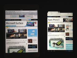
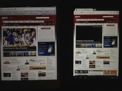
I've been a longtime iPad owner (1 through 3), have been using a Nexus 7 for over a month, and just picked up an iPad Mini a couple of days ago to compare. Thought I'd give my early impressions regarding the Nexus 7 vs. the iPad Mini.
Mini Pros:
- Terrific build quality and exceptional materials--very thin and light, aluminum and glass feel solid
- Bright, vibrant screen
- Larger screen--extra 0.9" and 4:3 ratio does give a lot more screen real estate
- iOS ecosystem (high quality apps)
Mini Cons:
- Inferior screen resolution--definitely noticable next to the Nexus 7 and iPad 3/4
- Dated processor
- Price
Nexus 7 Pros:
- Good build quality and good materials--not a match for the Mini (IMO)--larger gaps, but still feels solid and I do like the grippiness of the back material
- 720p screen resolution
- Flexibility of Android--can pretty much customize it exactly how you'd like it
- Price
Nexus 7 Cons:
- 16:9 screen ratio--less ideal for portrait but even worse in landscape for anything other than viewing movies
- App quality--I've you'd dozens of apps on both iOS and Android on both a phone and tablet and they generally just don't match up to iOS. I'll elaborate further but this point has already been discussed to death prior to my post and I think it still holds true
- screen colors and brightness not as good as iPad's
- screen size when coupled with lost space (on screen buttons/status bar)
The Nexus 7 was my second foray into Android (Galaxy Nexus being the first) and overall it's been a good experience. Thanks to using it, I realize that I really like the smaller form factor and as a result, thought I'd give the iPad Mini a try with the hopes that I could ditch the iPad 3 (which I love, just would rather use a single 7" device), but more on that in a minute.
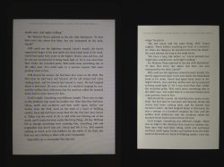
First the Nexus. It's a very good device. I has a nice weight in the hand and is very easy to hold for extended periods of time due to the nice grippy back and narrow profile. It also has a good (not great) screen--text renders nice and sharp and colors are good but a little too warm (it is somewhat on the yellowish side vs. cooler iPad Mini). I also am not a big fan of the 16:9 ratio as it makes the display a bit too narrow in portrait and really limits the display in landscape, especially due to the status bar/on screen buttons at the bottom. The higher resolution coupled with the screen size limitations actually make native font rendering a bit tool small. That being said, having full autonomy over customize the device to your liking is great. I like using large widgets on a tablet--have them for my calendar, Facebook, Twitter and Flipboard. I even have a live wallpaper than incorporates local weather, time, and battery life. Unfortunately, app quality still doesn't match up with iOS, especially for tablets. Far too many apps are just larger versions of phone apps. I also find web browsing inferior vs. iOS--not as smooth, selecting links is hit or miss. Chrome isn't great--I actually prefer the stock Browser app that's not even included in JB on the Nexus, but thankfully the Paranoid Android custom ROM I installed does include it. Also, highlighting text or moving the cursor is not as easy in Android.
The Mini is also good device. The form factor is terrific--great materials and build quality and while larger than the N7, in many ways feels smaller--really like how they minimized the bezel on the sides. While you certainly can't do everything one handed, because it feels so light and thin, you can actually hold it in one hand and do simple navigation with that same hand (turn pages in Kindle/iBooks/Flipboard, scroll up and down in Safari). My personal issues with the device start and end with the display.
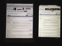
It's not a bad display--very good colors and brightness. The real problem is the resolution (no surprise). If I hadn't used anything better than an iPad 2 prior to using the Mini (and that includes any iPhone since the 4), I probably would be very happy with it. However, after using the iPad 3 for 7 months and the Nexus 7 for only a month, the inferior pixel density on the Mini was immediately noticeable to my eye. Putting them side by side just highlights the problem further. Text wasn't as smooth and pictures/graphics didn't pop as they did on either of the other devices. Also, and contrary to Apple's keynote, it results in
less web page being display vs. a Nexus 7 (see my photos). And sadly, it became quite bothersome after just a couple of days of use. This issue alone is reason enough for me to have already decided to return it.
Don't get me wrong, I really like the idea of the Mini. I generally prefer iOS and the Apple ecosystem and would compromise certain features to use them but in this case and considering the price difference, it's just not enough to overcome this flaw, in my personal opinion. It's not an superior device to the Nexus 7 (which is also far from perfect) and inferior to the iPad 3 (obviously) so I simply cannot justify replacing either of those 2 devices with this tablet, as I'd hoped. For the time being, I'll be sticking with the full size iPad and probably keep the Nexus for a while to continue to explore what Android offers. Once the Mini offers a higher resolution display and a bit more horsepower, it'll be the perfect tablet for my needs.
Screenshots:
1) Macrumors forums. Notice how the Nexus 7 actually natively displays more of the forum thread than the mini. Text is sharper, less washed out than on the Mini.
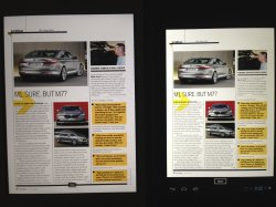
2) Zinio. While the text is sharper, the screen size is a problem for the Nexus, making text too small to read comfortably.
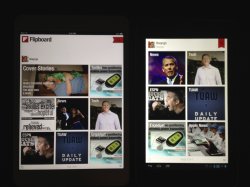
3) Flipboard. Another advantage for the Mini as app layout is superior to the Android version.


