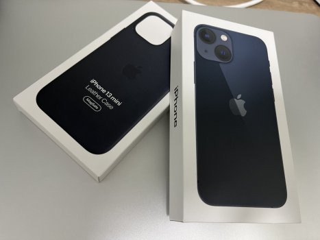
I got myself a 13 mini today, will give the 12 mini to my mother.
Initial impressions:
1. SCREEN is noticeably cooler than the 12 mini, which was on the warmer side. This screen (with True Tone) is now as great as my 8.
- I checked pure black and grey gradients, the 12 mini showed sort of a reddish band to the left, this 13 mini is neat and flat grey.
2. WEIGHT is noticeably more than 12 mini, but is less than the outgoing 8. I would have liked the weight of the 12 mini, but am totally okay with this as well. Feels well-weighted in the hand.
Speaking of in the hand...
Tried a 13. Loved it, it did not feel as large as it did when I first saw it. But - something unacceptable for me about it:
The resolution is a little larger than the mini, and this forum is rendered exactly the same as on the mini, except for 1 or 2 extra lines of text vertically. But, the 12/ 13 devices are wider, and Apple is being lazy in not making Safari take advantage of that width on the 13 as against the mini. My Android OnePlus Nord2 is sort of a similar width as the 13, and that device renders web pages in a more acceptable fashion. The 13 only looks like a scaled version of mini but with 2 extra lines of text at the bottom. USD 200 for that (in my country)? No way. So, the 13 was out. I want to say here that if Tim's Apple was not lazy and had taken advantage of the extra width of the 13 as against the mini, I would have booked a 13 (here we are booking them, they are not available over the counter for some reason, maybe chip shortage affecting supplies?).
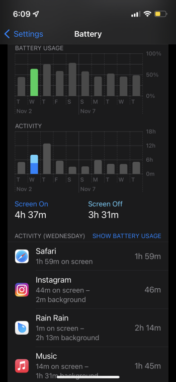
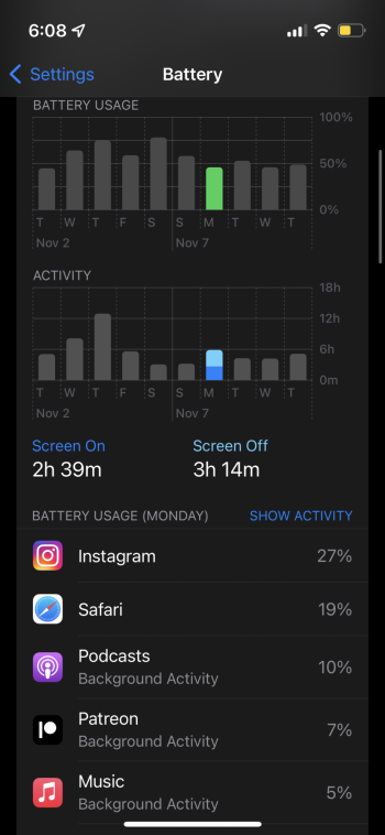
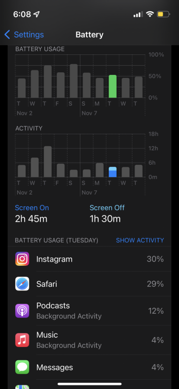
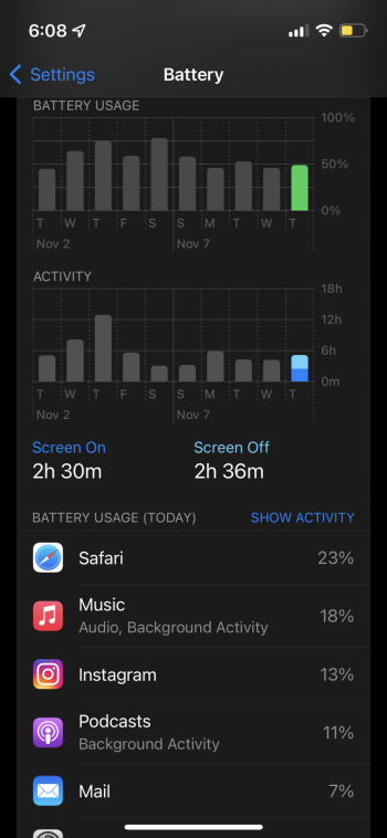
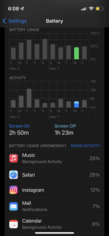
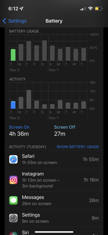
3. BATTERY LIFE is not something I can comment on or about right now, considering it is only a few hours I have had the phone with me and I have just charged it up to 100. Will charge it back to 100 before unplugging and sleeping, to see how much of an overnight drain did I get with this. Sure, the true drain would be reflected in some days, but I should be able to get some idea about the drift.
4. COLOR - I loved the White 12 mini, and I love the Starlight 13 mini more.
All said and done, I think this is a great device and I see no reason to take the larger device, especially when Apple does not take advantage of the extra width. I have taken the Starlight and I am thinking of going commando at home and putting on a case only when I go out (ordered a Golden Brown leather case and contemplating green and cherry too! I am going crazy with the case colours this time for the first time in my life, and I will have to sit and talk myself out of the 2 extra colours - each one costs USD 89 here). I will miss the Saddle Brown profusely.
Here is a photo of my 13 mini in Starlight along with the 12 mini in white. In comparison, the 12 mini looks pinkish. Though the camera system of the 12 mini looks slightly golden in some light and along with Saddle Brown case I loved it. Yet to see how the Golden Brown and Starlight combination looks. The case in the image is Saddle Brown for the 12 mini. While the button positions are same for 12 mini and 13 mini, the camera square is larger and does not fit in the 12 mini case.
Last edited:


