Become a MacRumors Supporter for $50/year with no ads, ability to filter front page stories, and private forums.

matttye

macrumors 601
Mar 25, 2009
4,957
32
Lincoln, England
I can't believe how much weight people seem to put on the ability to "customize" the home screen. Call me crazy, but I'm more concerned about the apps on my phone than making my home screen pretty.

Me too. Launchers and widgets are part of home screen customisation, however, and they do much more than simply look pretty. :)
 

Frankied22

macrumors 68000
Nov 24, 2010
1,788
594
Just look at how many iOS users are praising the new app "Launch Center Pro". There's even a thread on it showing off people's setups. It's essentially the closest thing you're going to get to a launcher on iOS, and people love it. A lot of people like customizing that stuff obviously. It's not just some weird small android niche of people.
 

matttye

macrumors 601
Mar 25, 2009
4,957
32
Lincoln, England
Copy/Paste is always brought up this way as a pro-Android point. To me it's the perfect pro-iOS point. Yes, Android had copy/paste first. But it didn't actually work universally until more than a year after copy/paste came to iOS. It didn't even work with the email app! And reviews almost universally favored the iOS implementation to Android or WebOS.

To me, that's the clearest example of what the "Android has more features so it's clearly more advanced" argument is lacking.

That's only one example though. I think copy/paste is relatively equal now, but text positioning is a little better in iOS because of the magnifying glass. I wish Android had that, but I think Google would get Apple's wrath :p

THAT is an idea that I think is perfect for a patent, as it's really intuitive and not at all obvious. Given that I haven't seen anyone copy Apple, I suspect they do have a patent for that.
 

BaldiMac

macrumors G3
Jan 24, 2008
9,010
11,201
Me too. Launchers and widgets are part of home screen customisation, however, and they do much more than simply look pretty. :)

Sure. But, like with multitasking, similar functionality that includes the most common use cases already exists in iOS. When I see the screen shots people post of their Android home screens, the most common widgets I see are clocks, weather, and twitter updates/headlines. On iOS the clock is obvious, and weather and twitter updates/headlines are a swipe away at any time in the notification center.

Meanwhile, I have room for 24 apps on my main home screen, including the ones that provide useful information in their badges.

It's a trade-off. On Android, apps are a swipe away. On iOS, widgety information is a swipe away. As I said before, apps are more important to me. Obviously, you prefer the other way. :)

I haven't taken time to look into what a launcher is, but the post after yours seems to think Launcher Pro provides similar functionality.
 

BaldiMac

macrumors G3
Jan 24, 2008
9,010
11,201
That's only one example though.

Sure, but it was meant to illustrate a larger point. There are differences between having a feature and implementing it well.

Another example is messaging. Yes, Android has tons of messaging options including Google Talk. The problem is that everyone i know still uses text messaging almost exclusively on Android because they don't know which service the person they are texting is using.

iMessage, on the other hand, was implemented in such a way that it doesn't matter. If the recipient has an iPhone, you both save a text/MMS message.
 

DodgeV83

macrumors 6502a
Feb 8, 2012
879
6
Sure, but it was meant to illustrate a larger point. There are differences between having a feature and implementing it well.

Another example is messaging. Yes, Android has tons of messaging options including Google Talk. The problem is that everyone i know still uses text messaging almost exclusively on Android because they don't know which service the person they are texting is using.

iMessage, on the other hand, was implemented in such a way that it doesn't matter. If the recipient has an iPhone, you both save a text/MMS message.

Yea, iMessage is a godsend. No more limitations on how big a photo/video can be, no compression, integrated directly into the standard SMS app, no separate interface where I need to make sure I'm sign-in and remember a separate username and password.

Same with FaceTime, I use this daily with both techies and non-techies, yet I couldn't get these same people to use video-chat on Skype before FaceTime came out.

If you're just comparing the number of checkboxes on a list, without weighing each item appropriately, you're not seeing the full picture.
 

matttye

macrumors 601
Mar 25, 2009
4,957
32
Lincoln, England
Sure. But, like with multitasking, similar functionality that includes the most common use cases already exists in iOS. When I see the screen shots people post of their Android home screens, the most common widgets I see are clocks, weather, and twitter updates/headlines. On iOS the clock is obvious, and weather and twitter updates/headlines are a swipe away at any time in the notification center.

Meanwhile, I have room for 24 apps on my main home screen, including the ones that provide useful information in their badges.

It's a trade-off. On Android, apps are a swipe away. On iOS, widgety information is a swipe away. As I said before, apps are more important to me. Obviously, you prefer the other way. :)

I haven't taken time to look into what a launcher is, but the post after yours seems to think Launcher Pro provides similar functionality.

Apps don't have to be a swipe away on Android. You can add up to 20 apps to a screen (including the dock) on Android. That's with the default launcher. You can add more than that with some of the other launchers. The point is you have the customisation potential to do whatever you want with your home screens. You want a grid of icons? You've got it. You want widgets? You've got them. You want them to be completely empty so you can admire your wallpaper? It's your choice. You can also put shortcuts to settings pages on the home screen, so you can simply tap rather than having to delve into the settings menu.

I gave an example earlier where the iOS multitasking doesn't cut it; when you're downloading something in the background, it will only do so for ten minutes. So when I'm saving my Spotify playlists so they can be used offline, after ten minutes it pauses the syncing process and I have to switch to Spotify again to get it to start again. This means I can't just simply start the syncing then leave the device alone.

A launcher basically replaces the entire home screen and can implement its' own functionality. For example, this is a 3D launcher for Android:

Pvul5FCvg6efO8MQbwuu69rWEfjZu-TruQ6-WC4P1t6gD4qzYdBW-Emu8yjFNxw55Oo


0TTyqmlMsKfqFvNGukq0jxhawuMzRJCXmHQ5X_odlO7gsNS_EZhBXwkv3dPKC7nhkiZz


Personally I don't like that one, but it demonstrates what can be done.

Launchers are the home screens themselves. They can implement their own transition effects between screens, they can decide what can be added to each home screen, they can choose how many home screens there are, they can choose what widgets to support and how many icons can fit on the screen, etc etc. You can also get ones that support gestures, so for example I could swipe downwards on any part of the home screen to bring down the notification bar. :)

Sure, but it was meant to illustrate a larger point. There are differences between having a feature and implementing it well.

Another example is messaging. Yes, Android has tons of messaging options including Google Talk. The problem is that everyone i know still uses text messaging almost exclusively on Android because they don't know which service the person they are texting is using.

iMessage, on the other hand, was implemented in such a way that it doesn't matter. If the recipient has an iPhone, you both save a text/MMS message.

Yep - another example iOS is better at :) I've long said that Android needs an iMessage equivalent.

Whatsapp is probably the most popular on Android but it's not built into stock Android, so it's not going to penetrate the market as much.
 

matttye

macrumors 601
Mar 25, 2009
4,957
32
Lincoln, England
Yea, iMessage is a godsend. No more limitations on how big a photo/video can be, no compression, integrated directly into the standard SMS app, no separate interface where I need to make sure I'm sign-in and remember a separate username and password.

Same with FaceTime, I use this daily with both techies and non-techies, yet I couldn't get these same people to use video-chat on Skype before FaceTime came out.

If you're just comparing the number of checkboxes on a list, without weighing each item appropriately, you're not seeing the full picture.

Most messaging apps have auto-signin features, so having to remember passwords is not necessary. The only difference between using Skype and Facetime is really clicking on Skype instead of Facetime. It's no more or less complicated to use one than the other.

You act like Apple's solution is oh so much more user friendly than the alternatives, when it's not really that much more so - only that it integrates with your Apple ID.
 

404 tech junkie

macrumors regular
Jun 30, 2012
133
0
Sure. But, like with multitasking, similar functionality that includes the most common use cases already exists in iOS. When I see the screen shots people post of their Android home screens, the most common widgets I see are clocks, weather, and twitter updates/headlines. On iOS the clock is obvious, and weather and twitter updates/headlines are a swipe away at any time in the notification center.

Meanwhile, I have room for 24 apps on my main home screen, including the ones that provide useful information in their badges.

It's a trade-off. On Android, apps are a swipe away. On iOS, widgety information is a swipe away. As I said before, apps are more important to me. Obviously, you prefer the other way. :)

I haven't taken time to look into what a launcher is, but the post after yours seems to think Launcher Pro provides similar functionality.

I have to disagree about it being a trade off. On Android, if I want a screen full of icons, I can easily do that. If I want a more functional screen, I can do that. On iOS (without jailbreaking), there's only one choice, and that's the screen full of icons.
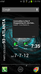
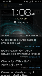
Here's my main home screen, as you can see, there is a bit of information there. I have time and weather on the left. If I tap it, it will give me a full forecast. The date and time is there, and they both serve as shortcuts. Tapping the time takes me to the alarm clock, and tapping the date takes me to my calendar. Also on that screen, I have a ticker that shows me forex market news (I can scroll through and see the headlines) that shows me notable events of the day. The main screen also shows if there is any traffic and commute time for both home and work.
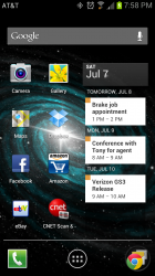
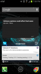
On the screen to the left of the main screen, I have some of my more frequently used apps, and a calendar widget displaying my schedule. On the screen to the right of my home screen, I have a widget displaying local news, and a Google Voice widget. The Google Voice widget is scrollable, and shows my voicemails in text format along with any text messages on my Google Voice number. It also has a control on the bottom right of it, that allows me to turn on Google Voice dialing if I would like to use it.

On an iPhone, to get all the information and functionality I have on my home screen, or within a swipe of it, I'd have to type in two different addresses one by one in Maps to check the traffic on my way to work or home. I'd have to swipe down to get the weather, then open a news app and wait for the headlines for local news and the forex market to be downloaded. Then I'd have to open my calendar to see my schedule. Then I'd have to open the Google Voice app (or visual voicemail depending on which one you use) to check my voicemails. There isn't even a way to turn on Google Voice dialing in iOS, so there's no comparison for that. The only similarities would be that on iOS I can put my most used apps on the first page so I can access them quickly.
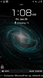
Side Note: I also have an expandable news ticker on my lock screen. So I can get news just by turning the screen on, as opposed to having to unlock the phone, go to my news app of choice, wait for news to be downloaded, then reading it.
 

Attachments

  • Screenshot_2012-07-07-19-35-50.png
    Screenshot_2012-07-07-19-35-50.png
    876.1 KB · Views: 88
  • Screenshot_2012-07-07-19-58-30.png
    Screenshot_2012-07-07-19-58-30.png
    902.5 KB · Views: 111
  • Screenshot_2012-07-07-19-58-39.png
    Screenshot_2012-07-07-19-58-39.png
    591.7 KB · Views: 89
  • Screenshot_2012-06-29-01-08-39.png
    Screenshot_2012-06-29-01-08-39.png
    1 MB · Views: 91
  • Screenshot_2012-06-29-01-08-09.png
    Screenshot_2012-06-29-01-08-09.png
    989.3 KB · Views: 90

Vegastouch

macrumors 603
Jul 12, 2008
6,185
992
Las Vegas, NV
Apps don't have to be a swipe away on Android. You can add up to 20 apps to a screen (including the dock) on Android. That's with the default launcher. You can add more than that with some of the other launchers. The point is you have the customisation potential to do whatever you want with your home screens. You want a grid of icons? You've got it. You want widgets? You've got them. You want them to be completely empty so you can admire your wallpaper? It's your choice. You can also put shortcuts to settings pages on the home screen, so you can simply tap rather than having to delve into the settings menu.

I gave an example earlier where the iOS multitasking doesn't cut it; when you're downloading something in the background, it will only do so for ten minutes. So when I'm saving my Spotify playlists so they can be used offline, after ten minutes it pauses the syncing process and I have to switch to Spotify again to get it to start again. This means I can't just simply start the syncing then leave the device alone.

A launcher basically replaces the entire home screen and can implement its' own functionality. For example, this is a 3D launcher for Android:

Image

Image

Personally I don't like that one, but it demonstrates what can be done.

Launchers are the home screens themselves. They can implement their own transition effects between screens, they can decide what can be added to each home screen, they can choose how many home screens there are, they can choose what widgets to support and how many icons can fit on the screen, etc etc. You can also get ones that support gestures, so for example I could swipe downwards on any part of the home screen to bring down the notification bar. :)


Yep - another example iOS is better at :) I've long said that Android needs an iMessage equivalent.

Whatsapp is probably the most popular on Android but it's not built into stock Android, so it's not going to penetrate the market as much.

+1 Launchers are great. As you said, Launchers are your home screen(s) and then you tap the Apps button in the middle of your dock and then you see all your apps. Launchers you set up the ones you use the most, how you want and give it your own look with or without widgets. I use some widgets but i dont go crazy.

Im using Apex ans Nova right now but think ill stick with Nova. Perhaps give Go Launcher a try unless you know of one that is a must try. (Ive used launcher pro and ADW often already)
 

ahfu25

macrumors 6502a
Dec 28, 2009
968
32
From what I've seen, the S3 does not have a good camera at all. The dynamic range is very bad, with highlights consistently blown out, where the iPhone 4S shows additional detail in those areas.

Image

Image

Image

Image

Those pictures look horrible...lol... I can take better pictures with my old blackberry. I'm taking pictures with both phones of identical sceneries... My galaxy s3 pictures look better than my iPhone 4S pictures. Videos as well.
 

Shockwave78

macrumors 65816
Jul 10, 2010
1,083
61
Those pictures look horrible...lol... I can take better pictures with my old blackberry. I'm taking pictures with both phones of identical sceneries... My galaxy s3 pictures look better than my iPhone 4S pictures. Videos as well.

HDR was not turned on in the pics taken with the s3 there. They were with the iPhone and it is quite obvious. The 4s would have taken the same pics as the s3 did if HDR was not on. By default HDR is turned off on the s3
 

matttye

macrumors 601
Mar 25, 2009
4,957
32
Lincoln, England
+1 Launchers are great. As you said, Launchers are your home screen(s) and then you tap the Apps button in the middle of your dock and then you see all your apps. Launchers you set up the ones you use the most, how you want and give it your own look with or without widgets. I use some widgets but i dont go crazy.

Im using Apex ans Nova right now but think ill stick with Nova. Perhaps give Go Launcher a try unless you know of one that is a must try. (Ive used launcher pro and ADW often already)

Apex is my favourite :p

I'm sticking with Touchwiz for now though, it's the first version of Touchwiz I actually think enhances the user experience!
 

DodgeV83

macrumors 6502a
Feb 8, 2012
879
6
Most messaging apps have auto-signin features, so having to remember passwords is not necessary. The only difference between using Skype and Facetime is really clicking on Skype instead of Facetime. It's no more or less complicated to use one than the other.

You act like Apple's solution is oh so much more user friendly than the alternatives, when it's not really that much more so - only that it integrates with your Apple ID.

If Skype were integrated into the OS, I never had to generate a separate username and password, it reliably kept me logged in 24/7, and I could seamlessly push one button to transition from a normal call to a video call *while on the phone*, and have it connect within a few seconds, they would be equivalent.

As it is now, the people I want to video chat with are never online, I have to call and ask them to login first, which for some reason always takes forever, I sometimes think I'm online when I've somehow been logged out, the video quality isn't as good for some reason, I have to remember which Skype username corresponds to which person, since everyone decides to have their own crazy username...

it's just something else to manage. With FaceTime you don't have to manage anything, a video call is one button away. Like BaldiMac said, it's all about the implementation.
 

matttye

macrumors 601
Mar 25, 2009
4,957
32
Lincoln, England
If Skype were integrated into the OS, I never had to generate a separate username and password, it reliably kept me logged in 24/7, and I could seamlessly push one button to transition from a normal call to a video call *while on the phone*, and have it connect within a few seconds, they would be equivalent.

As it is now, the people I want to video chat with are never online, I have to call and ask them to login first, which for some reason always takes forever, I sometimes think I'm online when I've somehow been logged out, the video quality isn't as good for some reason, I have to remember which Skype username corresponds to which person, since everyone decides to have their own crazy username...

it's just something else to manage. With FaceTime you don't have to manage anything, a video call is one button away. Like BaldiMac said, it's all about the implementation.

And if you want to video chat with non-iOS/mac users? Surely not all of your friends have macs or iDevices.

I prefer to stick with multi-platform apps where possible.
 

Aquaporin

macrumors 6502a
Jun 27, 2005
515
220
USA
If Skype were integrated into the OS, I never had to generate a separate username and password, it reliably kept me logged in 24/7, and I could seamlessly push one button to transition from a normal call to a video call *while on the phone*, and have it connect within a few seconds, they would be equivalent.

As it is now, the people I want to video chat with are never online, I have to call and ask them to login first, which for some reason always takes forever, I sometimes think I'm online when I've somehow been logged out, the video quality isn't as good for some reason, I have to remember which Skype username corresponds to which person, since everyone decides to have their own crazy username...

it's just something else to manage. With FaceTime you don't have to manage anything, a video call is one button away. Like BaldiMac said, it's all about the implementation.

I think that is a selling point of WP8.
 

DodgeV83

macrumors 6502a
Feb 8, 2012
879
6
HDR was not turned on in the pics taken with the s3 there. They were with the iPhone and it is quite obvious. The 4s would have taken the same pics as the s3 did if HDR was not on. By default HDR is turned off on the s3

You know it looks bad when it seems the iPhone has HDR activated and the S3 does not :)

Here is the source:

http://www.youtube.com/watch?v=hDnk82G0mzY

You'll notice the audio is much better on the iPhone 4S as well.

----------

I think that is a selling point of WP8.

If they can pull it off, that'd be pretty nice!

Unfortunately, unless everyone else also has a Windows phone, they'll have the same issues I described on their end. All my close friends and family have either an iPhone, an iPad, or both, so FaceTime works perfectly for me. Luckily I don't have to deal with Skype anymore :)
 

matttye

macrumors 601
Mar 25, 2009
4,957
32
Lincoln, England
You know it looks bad when it seems the iPhone has HDR activated and the S3 does not :)

Here is the source:

http://www.youtube.com/watch?v=hDnk82G0mzY

You'll notice the audio is much better on the iPhone 4S as well.

----------


If they can pull it off, that'd be pretty nice!

Unfortunately, unless everyone else also has a Windows phone, they'll have the same issues I described on their end. All my close friends and family have either an iPhone, an iPad, or both, so FaceTime works perfectly for me. Luckily I don't have to deal with Skype anymore :)

One bit where the Galaxy S3 shined in that video is when he moved in close on the grass. Why is the S3 better in that scenario?

Genuine question :p Trying to learn more about photography.
 

BaldiMac

macrumors G3
Jan 24, 2008
9,010
11,201
Apps don't have to be a swipe away on Android. You can add up to 20 apps to a screen (including the dock) on Android. That's with the default launcher. You can add more than that with some of the other launchers. The point is you have the customisation potential to do whatever you want with your home screens. You want a grid of icons? You've got it. You want widgets? You've got them. You want them to be completely empty so you can admire your wallpaper? It's your choice. You can also put shortcuts to settings pages on the home screen, so you can simply tap rather than having to delve into the settings menu.

Absolutely. But that wasn't my point. You can have 20 apps on your home screen OR widgets. Once you get away from your primary home screen, the difference between accessing the data on an alternate home screen or in an app become minimized.

Again, obviously Android has many, many more ways to customize the device. If that is your thing, it's the obvious choice. If you like to tinker with ROMs and hack on additional functionality, it's the obvious choice.

I was just pointing out that the most popular use cases for widgets are easily accessible on iOS as well.

I gave an example earlier where the iOS multitasking doesn't cut it; when you're downloading something in the background, it will only do so for ten minutes. So when I'm saving my Spotify playlists so they can be used offline, after ten minutes it pauses the syncing process and I have to switch to Spotify again to get it to start again. This means I can't just simply start the syncing then leave the device alone.

Yep. But the trade off is obvious.

Most messaging apps have auto-signin features, so having to remember passwords is not necessary. The only difference between using Skype and Facetime is really clicking on Skype instead of Facetime. It's no more or less complicated to use one than the other.

You act like Apple's solution is oh so much more user friendly than the alternatives, when it's not really that much more so - only that it integrates with your Apple ID.

You dismiss the last part like it's unimportant! Just like iMessage, the difference is that people actual use FaceTime!*

*FaceTime over 3G being the major, soon to be implemented, fly in the ointment. :)

I have to disagree about it being a trade off. On Android, if I want a screen full of icons, I can easily do that. If I want a more functional screen, I can do that. On iOS (without jailbreaking), there's only one choice, and that's the screen full of icons.

The tradeoff that I was referring to is between apps and widgets on one screen. Adding a widget will displace apps.

Here's my main home screen, as you can see, there is a bit of information there. I have time and weather on the left. If I tap it, it will give me a full forecast. The date and time is there, and they both serve as shortcuts. Tapping the time takes me to the alarm clock, and tapping the date takes me to my calendar.

Time is also on the home screen in iOS, weather is in the notification center. My clock and weather app are also on my home screen for one click access. My schedule is available in the notification center.

Also on that screen, I have a ticker that shows me forex market news (I can scroll through and see the headlines) that shows me notable events of the day.

I get the same thing through notifications and the notification center.

The main screen also shows if there is any traffic and commute time for both home and work.

Interesting! But not a popular use case. :) Personally, I wouldn't use my home screen for something that I use at most twice a day and hardly ever changes during the usual times I commute. Traffic alerts seem more useful.

On the screen to the left of the main screen, I have some of my more frequently used apps, and a calendar widget displaying my schedule. On the screen to the right of my home screen, I have a widget displaying local news, and a Google Voice widget. The Google Voice widget is scrollable, and shows my voicemails in text format along with any text messages on my Google Voice number. It also has a control on the bottom right of it, that allows me to turn on Google Voice dialing if I would like to use it.

:) I also use Google Voice, and I have never actually gotten a voicemail transcription that was useful. :D Again, everything else is available in notification center.

On an iPhone, to get all the information and functionality I have on my home screen, or within a swipe of it, I'd have to type in two different addresses one by one in Maps to check the traffic on my way to work or home. I'd have to swipe down to get the weather, then open a news app and wait for the headlines for local news and the forex market to be downloaded. Then I'd have to open my calendar to see my schedule. Then I'd have to open the Google Voice app (or visual voicemail depending on which one you use) to check my voicemails. There isn't even a way to turn on Google Voice dialing in iOS, so there's no comparison for that. The only similarities would be that on iOS I can put my most used apps on the first page so I can access them quickly.
Side Note: I also have an expandable news ticker on my lock screen. So I can get news just by turning the screen on, as opposed to having to unlock the phone, go to my news app of choice, wait for news to be downloaded, then reading it.

You overstated almost everything here. Traffic alerts are available for a specific commute. Ask Siri about traffic on the way home. No addresses required. Your calendar for the next 24 hours is available in notification center. Recent headlines from your source of choice are available in notification center and on the lock screen.
 

matttye

macrumors 601
Mar 25, 2009
4,957
32
Lincoln, England
Absolutely. But that wasn't my point. You can have 20 apps on your home screen OR widgets. Once you get away from your primary home screen, the difference between accessing the data on an alternate home screen or in an app become minimized.

Not completely. If you had an app on one of your latter home screens on iOS, you have to scroll through each page to get there (or use Spotlight), but with Android you can pinch to open up helicopter view and jump to any screen you like, thus making it easier to get to any screen.

Android is obviously better in this regard. Widgets are there if you want them, but if you don't you can still have pages full of apps, only you can access each page more quickly.

Again, obviously Android has many, many more ways to customize the device. If that is your thing, it's the obvious choice. If you like to tinker with ROMs and hack on additional functionality, it's the obvious choice.[/qupte]

Agreed.

I was just pointing out that the most popular use cases for widgets are easily accessible on iOS as well.

Widgets that toggle settings are very popular too, and iOS doesn't have those.

The iPad doesn't have the Facebook/Twitter widgets in the notification bar. :(

Yep. But the trade off is obvious.

Guessing you mean battery life? There's a solution for that - put a bigger battery in the phone! Arbitrarily limiting tasks so that they can only run for ten minutes to conserve battery life is such a cop out. If I went to run my battery into the ground it should be my prerogative. iOS sometimes caters for the technophobes TOO much.

You dismiss the last part like it's unimportant! Just like iMessage, the difference is that people actual use FaceTime!*

*FaceTime over 3G being the major, soon to be implemented, fly in the ointment. :)

It kinda is unimportant. I've had Skype on my iPad for months and I've only ever had to log in once. :confused: It's also multi-platform so I can speak to people using a PC, Android phone, Windows Phone, etc. Seems like a no brainer to me.

I'll give you iMessage :p
 

DodgeV83

macrumors 6502a
Feb 8, 2012
879
6
One bit where the Galaxy S3 shined in that video is when he moved in close on the grass. Why is the S3 better in that scenario?

Genuine question :p Trying to learn more about photography.

Don't worry Matttye, I know you don't troll :p

Are you referring to this scene:

hjlnTl.jpg


That's actually one of the worst scenes of the bunch in terms of dynamic range. The sky is completely blown out in a bright white, showing no gradient in the color of the sky, and causing a blooming effect that's overpowering some of the leaves.

If you're referring to focus, the S3 is focused on the leaves, while the iPhone 4S is focused on the building above the leaves. Since he's so close to the leaves, the two phones have a different perspective, as the S3's view of the building is blocked. Can't say much here.

If you're referring to the colors being less bright, that's a byproduct of the iPhone 4S not blowing out the sky, it made the whole scene a bit darker to allow a more even tone. My DSLR would've done the same thing, while using the flash as a fill-light for the foreground. Of course my DSLR flash is a bit more powerful than the LED light on today's mobile phones :D
 

matttye

macrumors 601
Mar 25, 2009
4,957
32
Lincoln, England
Don't worry Matttye, I know you don't troll :p

Are you referring to this scene:

Image

That's actually one of the worst scenes of the bunch in terms of dynamic range. The sky is completely blown out in a bright white, showing no gradient in the color of the sky, and causing a blooming effect that's overpowering some of the leaves.

If you're referring to focus, the S3 is focused on the leaves, while the iPhone 4S is focused on the building above the leaves. Since he's so close to the leaves, the two phones have a different perspective, as the S3's view of the building is blocked. Can't say much here.

If you're referring to the colors being less bright, that's a byproduct of the iPhone 4S not blowing out the sky, it made the whole scene a bit darker to allow a more even tone. My DSLR would've done the same thing, while using the flash as a fill-light for the foreground. Of course my DSLR flash is a bit more powerful than the LED light on today's mobile phones :D

I was referring to the grass looking better, but like you say it's probably just the focus.
 

matttye

macrumors 601
Mar 25, 2009
4,957
32
Lincoln, England
Hmm my phone doesn't seem to blow out the sky as shown in many S3 pics. Maybe different firmware or maybe just because it wasn't as bright a day?

uploadfromtaptalk1341710402839.jpg

uploadfromtaptalk1341710422487.jpg

uploadfromtaptalk1341710450329.jpg

uploadfromtaptalk1341710470244.jpg

uploadfromtaptalk1341710490156.jpg
 

ahfu25

macrumors 6502a
Dec 28, 2009
968
32
HDR was not turned on in the pics taken with the s3 there. They were with the iPhone and it is quite obvious. The 4s would have taken the same pics as the s3 did if HDR was not on. By default HDR is turned off on the s3

HDR on or off...I have 20/20 vision and when I take pictures with both phones my eyes like the pictures taken on the GS3. Im not taking anything away from the iPhone. Im one that likes both iOS and Android equally. When it comes to cell phones there is no superior imo. Laptops...Apple all the way...But there are too many good phones out now to say one is better at everything compared to the rest. Some are easier to use and thats the key with iOS and what I like most about it. iPhone 5 I will own as well...I like apples and oranges :)
 

404 tech junkie

macrumors regular
Jun 30, 2012
133
0
Time is also on the home screen in iOS, weather is in the notification center. My clock and weather app are also on my home screen for one click access. My schedule is available in the notification center.
Time is a non-issue (unless you just want it to look nicer lol). Every phone shows the time. As for you talking about one click access. Mine brings up an overlay showing the forecast, but I never actually leave the home screen. I'll address the schedule thing further down.

Interesting! But not a popular use case. :) Personally, I wouldn't use my home screen for something that I use at most twice a day and hardly ever changes during the usual times I commute. Traffic alerts seem more useful.
Popular or not, it's there and available, whereas on iOS I don't even have the choice of doing so. Traffic alerts are fine, but I have the OPTION of having this information available to me as soon as I unlock my phone. BTW, I'm not sure where you live, but in Atlanta, during rush hour if you have alerts, you'd be constantly getting alerted. I'd much rather just look at the traffic when I'm ready to look at it.


:) I also use Google Voice, and I have never actually gotten a voicemail transcription that was useful. :D Again, everything else is available in notification center.
Google Voice's transcription is FAR from perfect lol. But typically, it gets it correct enough that I can know what the voicemail is about. Also, it's very useful to be able to turn my Google Voice number on when I want to (I don't like using the "ask me each time option"). Toggling from the widget is WAY faster than doing it in the app, as it is buried in the options menu inside the app.

You overstated almost everything here. Traffic alerts are available for a specific commute. Ask Siri about traffic on the way home. No addresses required. Your calendar for the next 24 hours is available in notification center. Recent headlines from your source of choice are available in notification center and on the lock screen.
I don't think I overstated anything. What I showed is how I have the CHOICE of functionality as opposed to no choice at all. Asking Siri about traffic isn't the same as having something that constantly monitors the traffic. As for the calendar, seeing the next 24 hours is not the same as seeing my upcoming week. If someone asks you, "what are you doing wednesday", you won't be able to just glance in the notification center and tell them. I can just unlock my phone and look at the screen to the right and tell them if I'm free or not. Recent headlines in the notification panel is a sloppy implementation quite frankly. The way I'm set up, I get whatever particular news I want to by looking at that particular ticker, and scrolling through it. The same functionality cannot be said for the notification center. The functionality is not the same, nor is the trade off like you mentioned. My apps are one tap away, whereas all the information I have available on my home screens would require you to go to several different places in your phone to get what I get in mine just by unlocking it.
You'd be opening your calendar to see your week, asking Siri for traffic information, looking in the notification panel for the weather, having to sift through unwanted news to get to the topic you're wanting to see (as opposed to only seeing local news when you want local, hence the different tickers). BTW, I didn't even mention my other two screens, one of which is a multimedia screen, I have widgets to control Pandora (including thumbs up and down), googe music, and tune in Radio. I can control all those from my home screen. So if I want to turn on some music, I can just swipe over and hit play on any of those widgets, whereas you'd have to go to those individual apps to do so.
In summary (yes this is a tad redundant), to get the same functionality I have on my home screens, you'd be opening your calendar, asking Siri about traffic, going to the notification panel for weather, sifting through mixed in news topics, opening visual voicemail to check your messages, then going to pandora (or whatever music player you chose to use) to turn on music. That's an awful lot of trouble to go through just to have the same functionality, when it could be right there easily accessible all at once.
 
Register on MacRumors! This sidebar will go away, and you'll see fewer ads.