See, you could do something like this, because you don't have to worry about the eyeholes. I believe Apple's intent is to always make the time centered even if it means the separator moves as time progresses.
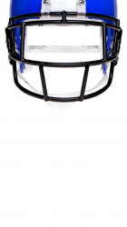
When I line up the clock, the date doesn't fit. But when I line up the date, the clock box just needs to be a little taller. Other than that, they look great. If possible, can you get more of the helmet in the frame?. Sorry about being so particular. Thanks again!.
Attachments

Last edited:
") That'll take some tweaking. Let's see.
That'll take some tweaking. Let's see.