Become a MacRumors Supporter for $50/year with no ads, ability to filter front page stories, and private forums.

irnchriz

macrumors 65816
May 2, 2005
1,034
2
Scotland
When you have read to the end of the book why do you want to flip back to the first page. Tap to go to bottom makes more sense.

And pressing the back button is infinitely faster and easier than doing the gesture especially if you want to go back several steps.

I disagree, swiping to go back can be done anywhere on the display compared to reaching to and touching the back button.

Also, when reading a book you can touch the bottom and scroll through to any page you wish.
 

BlueGoldAce

macrumors 68000
Oct 11, 2011
1,951
1,455
I use my 6+ one handed 90% of the time. Maybe I have large hands, and maybe I have done it before with large phones. I even typed this one handed while drinking my coffee.

It depends on the person.

The bezels are big, but it clearly apple in its design, and symmetrical.

Could they have put the finger print scanner in the screen? I don't know. Forgetting the fragmentation that might cause with third party apps (iOS 8 has opened up the finger print scanner)... Do they even have the technology ready for mainstream yet? Samsung does this... And it doesn't work as well as apples implementation.

There is a lot that goes into a design. Think of that before calling for someone's job.
 

JaySoul

macrumors 68030
Jan 30, 2008
2,629
2,865
Alright genius, how would you reduce the size without removing the Touch ID and maintaining design symmetry?

Pretty simple.

The bottom bezel with Touch ID is fine, but the top is way too thick.

The reason is because of Apple's obsession with making the iPhone slimmer and slimmer. If they added 1mm in thickness, that would take care of the bigger battery, allow space for the camera lens, some components are stackable and you could probably shave a touch off the sides too.

The alternative would have been to add a slight curve like they did with the MacBook Air - so the the edges are tapered and the middle has more room.

There are ways to do it. Even the iPhone 6 4.7" is massive for what it is.
 

pdqgp

macrumors 68020
Mar 23, 2010
2,131
5,460
There is a lot that goes into a design. Think of that before calling for someone's job.

There's no indication that the poster didn't consider everything that goes into this. At the end of the day, he's providing pretty honest feedback that many, including myself, agree with. I completely understand all that goes into things such as fragmentation and app development. IMO it's Apple that didn't think that through when creating a larger than life phone that isn't anything different other than larger. There phone is bigger but what difference is it really making in the grand scheme? If it's not making a difference then is it of real value? Seems to me they made it just because they didn't have a footprint in the larger screen arena.
 

BlueGoldAce

macrumors 68000
Oct 11, 2011
1,951
1,455
There's no indication that the poster didn't consider everything that goes into this. At the end of the day, he's providing pretty honest feedback that many, including myself, agree with. I completely understand all that goes into things such as fragmentation and app development. IMO it's Apple that didn't think that through when creating a larger than life phone that isn't anything different other than larger.


Agreed....but I am referring to keeping Touch ID and the symmetry of the device. Apple wouldn't compromise on that, even if we wanted.
 

tbayrgs

macrumors 604
Jul 5, 2009
7,467
5,097
Pretty simple.

The bottom bezel with Touch ID is fine, but the top is way too thick.

The reason is because of Apple's obsession with making the iPhone slimmer and slimmer. If they added 1mm in thickness, that would take care of the bigger battery, allow space for the camera lens, some components are stackable and you could probably shave a touch off the sides too.

The alternative would have been to add a slight curve like they did with the MacBook Air - so the the edges are tapered and the middle has more room.

There are ways to do it. Even the iPhone 6 4.7" is massive for what it is.

Read my post again--how do you reduce size without removing the Touch ID and maintaining design symmetry? There's a reason nearly every smartphone on the market has symmetrical top and bottom bezels--because it looks like crap if you don't.

And let's say they do reduce the top bezel bezel by a couple mm--what's the real benefit? There is no physical interaction with the device beyond the top of the display so what does shaving a couple of mm save you? Your solution has now added thickness and potentially compromised feel in hand and usability (I'd contend width and thickness are far more important than height) for the sake of removing a little height than at most impacts how it feels in your pocket--which is also debateable as my iPhone 6+ isn't sticking out of my pocket by that crucial 3-4 mm you're looking to save.

You're nitpicking if you think it's too wide as the most they might save is a mm because the taper in the glass starts almost right where the display ends. And last check showed the 6+ is actually narrower than the Note 4.
 

JaySoul

macrumors 68030
Jan 30, 2008
2,629
2,865
Read my post again--how do you reduce size without removing the Touch ID and maintaining design symmetry? There's a reason nearly every smartphone on the market has symmetrical top and bottom bezels--because it looks like crap if you don't.

And let's say they do reduce the top bezel bezel by a couple mm--what's the real benefit? There is no physical interaction with the device beyond the top of the display so what does shaving a couple of mm save you? Your solution has now added thickness and potentially compromised feel in hand and usability (I'd contend width and thickness are far more important than height) for the sake of removing a little height than at most impacts how it feels in your pocket--which is also debateable as my iPhone 6+ isn't sticking out of my pocket by that crucial 3-4 mm you're looking to save.

You're nitpicking if you think it's too wide as the most they might save is a mm because the taper in the glass starts almost right where the display ends. And last check showed the 6+ is actually narrower than the Note 4.

Most Android devices that don't have a physical home button tend to have a symmetrical design. Samsung ones pretty much, because the home button is more rectangular.

Apple is pretty much the only manufacturer that has a large home button and replicates the space needlessly on the top simply to be symmetrical, it's a nonsense. Doctor an image of the iPhone 6 by compressing the top bezel, it would still look gorgeous. Why would it suddenly look crap??

Of course it's narrower than a Note 4 - the 6+ has a smaller screen!!

Anyway nice chat.
 

tbayrgs

macrumors 604
Jul 5, 2009
7,467
5,097
Most Android devices that don't have a physical home button tend to have a symmetrical design. Samsung ones pretty much, because the home button is more rectangular.

Apple is pretty much the only manufacturer that has a large home button and replicates the space needlessly on the top simply to be symmetrical, it's a nonsense. Doctor an image of the iPhone 6 by compressing the top bezel, it would still look gorgeous. Why would it suddenly look crap??

Of course it's narrower than a Note 4 - the 6+ has a smaller screen!!

Anyway nice chat.

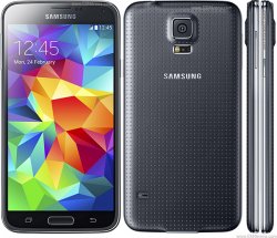
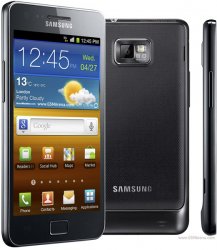
I'm sorry but you're simply not correct about Apple needlessly replicating the top bezel for symmetry. Two major manufacturers use a physical home button and both follow the exact same design principle. Look at the Galaxy S5--Samsung left a pretty significant portion of their top bezel for nothing other than their name. The Galaxy S2 had a bigger home button and look at the top bezel--matches, with quite a bit of space dedicated to their company name again.

And you still didn't address what's the benefit of shaving off those couple of mm off the top of the device? It's certainly not for improved functionality.

Point is, Apple is doing nothing that the rest of the smartphone industry isn't also doing. Nearly all devices have symmetrical designs because it looks better. You may not think it matters but the fact that nearly every OEM uses that design says more about it.
 

Attachments

  • samsung-galaxy-s5-g900f-1.jpg
    samsung-galaxy-s5-g900f-1.jpg
    116.6 KB · Views: 121
  • samsung-galaxy-s-ii-real-ofic-1.jpg
    samsung-galaxy-s-ii-real-ofic-1.jpg
    85.2 KB · Views: 124

Fireblade

macrumors 65816
Jan 25, 2011
1,101
321
Italy
The LG G3 has smaller top bezels than bottom bezels, and it looks much more beautiful than the 6+ in my eyes, but it's a matter of taste I guess
 

cdmoore74

macrumors 68020
Jun 24, 2010
2,413
711
Not sure what Apple was thinking of by releasing a phone taller than the majority of Android devices on the market yet have a smaller screen than the Note series. Even the $499 5.1” Moto X is much smaller with the same resolution and the LG G3 has a smaller body with a 5.5” quad HD display. The experience of making large phones within Android is starting to pay off. What’s sad here is that Apple will just release an “S” model in 2015 with no real changes to the screen or the body. All the major players in Android will be releasing smaller phones with bigger displays.
I still remember the criticism Google received when they ditched physical buttons for onscreen buttons with Ice Cream Sandwich back in 2011. Fast forward 3 years and it’s the smartest move they could have made.
 

robgendreau

macrumors 68040
Jul 13, 2008
3,471
339
I tried a 6+ in the store for a while and realized I just don't use two hands. It hadn't really occurred to me I had this bias.

But I also noticed that all the apps seemed designed for a smaller screen. You could, for instance, have some controls on the side rather than the top and bottom.

So...since Android has had bigger phones for a while, are some apps (especially photo ones) optimized for the bigger screen? with more accessible controls?
 

jrswizzle

macrumors 603
Aug 23, 2012
6,107
129
McKinney, TX
It's pretty surprising how people are going nuts over what amounts to a few mm extra height......

The 6+ is roughly 4.5mm taller than the upcoming Note 4. It's also slightly thinner and skinnier than the Note 4.

For reference sake, the 6+ is 7.1mm thick.....

The devices are effectively the same size. The 6+ is extremely comparable to other phablets out there (5.5" and up).

Heck, the 6 is actually really small and easy to hold in my opinion. The design makes a big difference.

And if I'm being honest (this is just my use case), I actually like the bezels on the top and bottom as the new landscape mode is nice and it gives me a perfect thumb size area for holding the device.
 

Fireblade

macrumors 65816
Jan 25, 2011
1,101
321
Italy
It's pretty surprising how people are going nuts over what amounts to a few mm extra height......

The 6+ is roughly 4.5mm taller than the upcoming Note 4. It's also slightly thinner and skinnier than the Note 4.

For reference sake, the 6+ is 7.1mm thick.....

The devices are effectively the same size. The 6+ is extremely comparable to other phablets out there (5.5" and up).

Heck, the 6 is actually really small and easy to hold in my opinion. The design makes a big difference.
This is sarcasm, right?
 

jrswizzle

macrumors 603
Aug 23, 2012
6,107
129
McKinney, TX
This is sarcasm, right?

Uhh, no....it's not at all.

Dimensions:

5.5" LG G3- 146.3 mm (5.76 in) H; 74.6 mm (2.94 in) W; 8.9 mm (0.35 in) D
5.7" Note 4- 153.5 mm (6.04 in) H; 78.6 mm (3.09 in) W; 8.5 mm (0.33 in) D
5.5" 6+- 158.1 mm (6.22 in) H; 77.8 mm (3.06 in) W; 7.1 mm (0.28 in) D
5.5" Note 3- 151.2 mm (5.95 in) H; 79.2 mm (3.12 in) W; 8.3 mm (0.33 in) D

|| <- this is about 1.5 mm. Are we really getting worked up over this?

Also height and width come into play with regards to handling as the overall area your hand has to cover is less. I believe someone calculated overall surface area and the 6+ is actually one of the smaller devices of the bunch I mentioned.

More comparisons: http://www.gizmag.com/phablet-comparison-2014-1/33026/
 

pdqgp

macrumors 68020
Mar 23, 2010
2,131
5,460
The 6+ is roughly 4.5mm taller than the upcoming Note 4. It's also slightly thinner and skinnier than the Note 4.

I think it's because of all the dimensions hieght is the one that's going to yield the most impact. The differences in thickness and width are barely noticeable but when the top of an already big phone sticking out the top of my jeans like the Note series is made even bigger it becomes more of a focus. Compounding the height is the fact that the actual usable screen is smaller.

And if I'm being honest (this is just my use case), I actually like the bezels on the top and bottom as the new landscape mode is nice and it gives me a perfect thumb size area for holding the device.

I see your point and use the bezels on the Note 3 just the same.
 

jrswizzle

macrumors 603
Aug 23, 2012
6,107
129
McKinney, TX
I think it's because of all the dimensions hieght is the one that's going to yield the most impact. The differences in thickness and width are barely noticeable but when the top of an already big phone sticking out the top of my jeans like the Note series is made even bigger it becomes more of a focus. Compounding the height is the fact that the actual usable screen is smaller.


I see your point and use the bezels on the Note 3 just the same.

Height may be a bigger factor with regards to sticking out of your pocket - but as far as usability and handling go, width and thickness are more important.

Thinner and skinnier means less area for your hand to travel to grip the device.

FWIW, I don't like putting my 6+ in my pocket....its not comfortable. I wouldn't like a Note in there either. I bought the device knowing I would use it differently than I have other devices in the past. And it hasn't been a problem.
 

gotluck

macrumors 603
Dec 8, 2011
5,717
1,260
East Central Florida
Height may be a bigger factor with regards to sticking out of your pocket - but as far as usability and handling go, width and thickness are more important.

Thinner and skinnier means less area for your hand to travel to grip the device.

thats true, personally my limitation on phone size revolves around how it feels in the pocket though

I mean, Id rather just use an ipad if I had the means to carry it around easily
 

pdqgp

macrumors 68020
Mar 23, 2010
2,131
5,460
Height may be a bigger factor with regards to sticking out of your pocket - but as far as usability and handling go, width and thickness are more important.

Thinner and skinnier means less area for your hand to travel to grip the device.

I have relatively small hands and the Note is perfectly fine and again, 1mm in both the other directions is still not noticeable. Here's a visual for the point I was making though so you see height wise, it is more impactful. My wife's first comment when looking at them at AT&T was "let me get this straight, the phone is clearly bigger but the screen is smaller" "why would they do that?"

It reminds me of the 2007 Plasma TV I moved to our basement. Bezels and speakers abound. (still a great set) Compare that to the new 4K TV that has 1/2 bezel around it and looks like a window on my wall.

iPhone_6_Note-3-630.jpg
 

jrswizzle

macrumors 603
Aug 23, 2012
6,107
129
McKinney, TX
thats true, personally my limitation on phone size revolves around how it feels in the pocket though

I mean, Id rather just use an ipad if I had the means to carry it around easily

I have no problem walking around with it in my pocket....I just usually pull it out before sitting down. That's where it is uncomfortable for me.

I don't feel like I have unusually large pockets. I wear slacks/suits to work and regular fitting jeans normally. It fits in my pockets without sticking out when I walk.
 

Fireblade

macrumors 65816
Jan 25, 2011
1,101
321
Italy
Uhh, no....it's not at all.

Dimensions:

5.5" LG G3- 146.3 mm (5.76 in) H; 74.6 mm (2.94 in) W; 8.9 mm (0.35 in) D
5.7" Note 4- 153.5 mm (6.04 in) H; 78.6 mm (3.09 in) W; 8.5 mm (0.33 in) D
5.5" 6+- 158.1 mm (6.22 in) H; 77.8 mm (3.06 in) W; 7.1 mm (0.28 in) D
5.5" Note 3- 151.2 mm (5.95 in) H; 79.2 mm (3.12 in) W; 8.3 mm (0.33 in) D

|| <- this is about 1.5 mm. Are we really getting worked up over this?

Also height and width come into play with regards to handling as the overall area your hand has to cover is less. I believe someone calculated overall surface area and the 6+ is actually one of the smaller devices of the bunch I mentioned.

More comparisons: http://www.gizmag.com/phablet-comparison-2014-1/33026/
It is more the length of the 6+ that I am criticising. As you listed the dimensions of some devices compare the G3 with the 6+: while featuring the same display size, the 6+ is 12mm longer...
 

gotluck

macrumors 603
Dec 8, 2011
5,717
1,260
East Central Florida
I have no problem walking around with it in my pocket....I just usually pull it out before sitting down. That's where it is uncomfortable for me.

I don't feel like I have unusually large pockets. I wear slacks/suits to work and regular fitting jeans normally. It fits in my pockets without sticking out when I walk.

fair enough, and there is my beef, I want to be able to sit down.

bear in mind the note 4 , g3, etc are too big as well IMO
 

Oohara

macrumors 68040
Jun 28, 2012
3,050
2,423
I have relatively small hands and the Note is perfectly fine and again, 1mm in both the other directions is still not noticeable. Here's a visual for the point I was making though so you see height wise, it is more impactful. My wife's first comment when looking at them at AT&T was "let me get this straight, the phone is clearly bigger but the screen is smaller" "why would they do that?"
I do think that 1mm thinner and skinnier does make a noticeable difference for how far you can reach with one hand, especially when you add in the rounded edges. However the effect of that might be somewhat cancelled out by the slippery edges making it more difficult to maintain a reliable grip.

Also what really stands out about that comparison photo is how much further up on the 6+ the screen even begins.
 

jrswizzle

macrumors 603
Aug 23, 2012
6,107
129
McKinney, TX
It is more the length of the 6+ that I am criticising. As you listed the dimensions of some devices compare the G3 with the 6+: while featuring the same display size, the 6+ is 12mm longer...

The G3 is the outlier here though.....

I'm not saying the 6+ is the most svelte phablet out there. Simply that the size difference is not all that huge when compared with most phablets out there.

And really, TouchID functionality makes it worth it. I'd rather have a few extra mm and TouchID, than no TouchID and less height.

But that's just me. Everyone is different.
 

Oohara

macrumors 68040
Jun 28, 2012
3,050
2,423
fair enough, and there is my beef, I want to be able to sit down.

bear in mind the note 4 , g3, etc are too big as well IMO

Yeah, sitting down with my Note 2 in my pocket is something I've had to accept that I simply cannot do. At least not comfortably in any way.
 
Register on MacRumors! This sidebar will go away, and you'll see fewer ads.