Become a MacRumors Supporter for $50/year with no ads, ability to filter front page stories, and private forums.

bpeeps

Suspended
Original poster
May 6, 2011
3,678
4,630
No true comparisons will be out until this weekend, I know.

Samsung finally got it right however, and switched from the cheap plastic phone casings to glass and aluminum. Actually I quite miss the all glass designs of the iPhone 4. It's also strange Samsung didn't get the same criticism Apple did when they made all glass phones (shattering due to user error and the subsequent complaints to Apple).

Anyway, the Samsung studio here allows you to try a Samsung phone for five days and I grabbed the Note 5 and took it home. The screen is amazing in comparison to the iPhone 6+. Simply beautiful. The new design is great. I also played around with the edge version and while great to look at, it just didn't seem that functional. Plus I'd be afraid to drop it. Overall the OS was clunky and unfamiliar, it took me quite a while to grasp simple things like find the "@" symbol on they keyboard.

I'm curious as to how the new S version will stack up to the Note 5. Productivity wise I really enjoyed the Note over my 6+. I just don't think I'd ever be able to leave the Apple ecosystem and I bet that's why a good number of people stay tied to upgrading with Apple. I think one of the reasons I considered the Note so heavily is because I loved the design and Apple has felt stagnant in that department lately. I feel like Apple hasn't radically changed the phone design since the iPhone 4. It seems more like iterational updates. iPhone 5 removed the glass back, iPhone 6 removed the square edges and returned to the curves of the 3 series. Maybe the design of the 7 will change my mind.

Anyone else played with the Note? Thoughts on both phones design?
 

audiofx

macrumors regular
Feb 26, 2009
112
17
NYC
No true comparisons will be out until this weekend, I know.

Samsung finally got it right however, and switched from the cheap plastic phone casings to glass and aluminum. Actually I quite miss the all glass designs of the iPhone 4. It's also strange Samsung didn't get the same criticism Apple did when they made all glass phones (shattering due to user error and the subsequent complaints to Apple).

Anyway, the Samsung studio here allows you to try a Samsung phone for five days and I grabbed the Note 5 and took it home. The screen is amazing in comparison to the iPhone 6+. Simply beautiful. The new design is great. I also played around with the edge version and while great to look at, it just didn't seem that functional. Plus I'd be afraid to drop it. Overall the OS was clunky and unfamiliar, it took me quite a while to grasp simple things like find the "@" symbol on they keyboard.

I'm curious as to how the new S version will stack up to the Note 5. Productivity wise I really enjoyed the Note over my 6+. I just don't think I'd ever be able to leave the Apple ecosystem and I bet that's why a good number of people stay tied to upgrading with Apple. I think one of the reasons I considered the Note so heavily is because I loved the design and Apple has felt stagnant in that department lately. I feel like Apple hasn't radically changed the phone design since the iPhone 4. It seems more like iterational updates. iPhone 5 removed the glass back, iPhone 6 removed the square edges and returned to the curves of the 3 series. Maybe the design of the 7 will change my mind.

Anyone else played with the Note? Thoughts on both phones design?
I have a note 5 and love the design and the screen ! android has come a long way and the note 5 is snappy. I also love the smoothNess of iOS , as I said in another thread I'd love a note 5 with iOS. that would be a gear combo of a beautiful screen 5.7 in a great form factor. the physical size of the 6 plus to only house a 5.5 screen it a shame . plus and minus to everything I guess .
 
  • Like
Reactions: AX338

tbayrgs

macrumors 604
Jul 5, 2009
7,467
5,097
I find the front design of the iPhone to be aesthetically better, especially the all black front panel on the space gray model--no text or logos, a nice monolithic slab. Overall though, I think the Note 5 is a prettier design. If they'd just get rid of the big text logos, it would be stunning.
 
  • Like
Reactions: scott craft

bpeeps

Suspended
Original poster
May 6, 2011
3,678
4,630
I have a note 5 and love the design and the screen ! android has come a long way and the note 5 is snappy. I also love the smoothNess of iOS , as I said in another thread I'd love a note 5 with iOS. that would be a gear combo of a beautiful screen 5.7 in a great form factor. the physical size of the 6 plus to only house a 5.5 screen it a shame . plus and minus to everything I guess .

A note 5 with iOS would be perfect for me too.
 

LIVEFRMNYC

macrumors G3
Oct 27, 2009
8,878
10,987
I just can't go back to iOS on a phone until it becomes more open. But I do enjoy it on the iPad, although I would probably hate iOS on the iPad Pro due to huge waste of space sticking with the app grid size.

As far as physical design ..... S6 Edge(+) > Note 5 > iPhone 6(s).
Samsung put the shine in the design of their phones, where as the iPhone has a more matte look, and it's bands aren't helping neither.
 

Rayy42

macrumors 6502
Oct 7, 2014
344
155
Hate to say it but the Edge+ is probably the sexiest device I've ever seen. Truly stunning.

Sad thing is you almost HAVE to get a case with that thing because it's almost screaming to be shattered.
 
  • Like
Reactions: OceanView

spinedoc77

macrumors G4
Jun 11, 2009
11,488
5,413
That stupid huge Samsung logo ruins the design, I don't care how much metal and glass it has. Also going with the blue took away that nice stealth look.
 
  • Like
Reactions: tbayrgs and Oohara

MRU

macrumors Penryn
Aug 23, 2005
25,370
8,952
a better place
I like them both. No preference, they both look like premium devices. Though I still prefer the edge + curved screen ;)
 
  • Like
Reactions: jamezr

jamezr

macrumors P6
Aug 7, 2011
16,077
19,075
US
I have said it many many times here in multiple threads. The combination of having both the Note 5 and iPhone 6 Plus (6s Plus on Friday) is the best IMHO. I have both devices and constantly switch back and forth. Can't go wrong best of both worlds. They are both fantastic phones!
 

GadgetSN

macrumors 6502
Sep 7, 2014
376
121
The edge plus is the best looking phone currently available. Ive not seen a Note 5 in person but would say it is a better looking phone than the iphone 6 from pics. Thats because the iphone 6 is Apples ugliest iphone to date with the exception of the plastic 3g/3gs models.

I own a 6 plus and eagerly await the 7 to fix the ugliness of the 6.
 
  • Like
Reactions: bpeeps

Savor

Suspended
Jun 18, 2010
3,742
918
Pure aesthetics, Samsung beat Apple this year. Actually HTC topped Apple two years ago in that department.

But ergonomically, the iPhone 6 series is arguably the most comfortable to hold since the iPhone 2G and iPhone 3G/3Gs days.

But BOTH specific models aren't in my realm of comfort. Something in the dimensions of the Nokia Lumia 730/735 is more my liking.
 

EnVyCaLiBeR

macrumors member
Jul 25, 2012
45
14
Samsung trounced Apple in terms of design this year and the S6 Edge+ is the most beautiful phone ever. The Note 5 looks better and it feels much better to hold in the hand than the 6+.All of their phones can be a bit slippery and are fingerprint prone, but man if it doesn't feel amazing to hold in the hand. Samsung nailed it this year.
 

nj-morris

macrumors 68000
Nov 30, 2014
1,897
804
UK
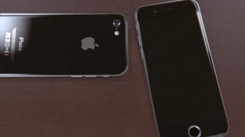
Personal preference, but I prefer the Samsung designs. I'm a huge fan of the glass backs. That's part of the reason why I'm getting the S6 Edge+ next month. And to be honest, I also think that Sammy did it better with glass backs. The iPhone 4, while old, didn't really have the seamless look and feel of the S6. If :apple: can make a phone similar to the concept below, I'll be a very happy person.
 

Attachments

  • image.jpeg
    image.jpeg
    141.6 KB · Views: 132

The-Real-Deal82

macrumors P6
Jan 17, 2013
17,317
25,469
Wales, United Kingdom
Both stunning looking devices based on looks as both deliver a premium feel. I do prefer the classic iPhone look which is no surprise. Samsung definitely entered the game with this one though.
 
  • Like
Reactions: MRU

Zwhaler

macrumors 604
Jun 10, 2006
7,267
1,965
Samsung user here. Much better than the iPhone IMO. The operating system is the main thing I prefer about Android. Way less sandboxed and more customizable. The edge screen is my favorite feature of the edge+. Not for the edge functionality, but just the look. Pages pop out more than on a flat screen and I really like it. Not bashing the Note at all, I had the Note II and Note 4.
 

epicrayban

macrumors 604
Nov 7, 2014
6,517
5,353
The edge screen is my favorite feature of the edge+. Not for the edge functionality, but just the look. Pages pop out more than on a flat screen and I really like it.


That's always where I felt the Edge's advantage was. Not so much in the features that come with the Edge screen, but that the screen itself just popped. It almost seemed like a 3D device. Also, slide out menus were easier and more natural feeling.

The Edge's screen is beautiful just as a screen itself.
 

Zwhaler

macrumors 604
Jun 10, 2006
7,267
1,965
That's always where I felt the Edge's advantage was. Not so much in the features that come with the Edge screen, but that the screen itself just popped. It almost seemed like a 3D device. Also, slide out menus were easier and more natural feeling.

The Edge's screen is beautiful just as a screen itself.

Apps edge is super lame in my opinion. Swipe pad is so much better, although it ran better on the Note 4 for some reason as now when I select an app sometimes it is finicky and won't open it; I have to do it twice or more on occasion. I agree about the look of the screen though. If the iPhone 7 has something similar or better I might switch, but Samsung would probably already be way ahead by then in terms of screen technology.
 

Suckfest 9001

Suspended
May 31, 2015
1,748
2,482
Canada
Well the Note 5 is shorter, narrower, yet has a significantly larger display. It's also quite a chunk lighter than a 6s Plus. I'd say (and I never thought I'd say this about Samsung, but) Samsung did a better job than Apple this time around.
 
  • Like
Reactions: OceanView

spinedoc77

macrumors G4
Jun 11, 2009
11,488
5,413
To me the iPhone 6s is like a nice Rolex, heavy and has that quality heft to it, beautiful metal them, the bezel and front blend in perfectly with the screen when darkened and no logo to ruin the effect. A breathtaking phone, well the only caveats being the bezel are too large, but heck that's only when it's on. The 6s is a bit dumb, as iOS is and the Rolex watch, but it does the job, does it well and never fails to do the job.

The Samsung lineup this year is a bit much more like one of those newer style huge watches I see the kids wearing nowadays (yeah I'm older), and I don't mean because of size, they are just a bit overdone, gaudy, discordant styles all mashed together with little though to a continuity of style. I'm not saying the Samsung are that bad, they're not, but they do have some similarity in how their style is put together. They are more functional though, like little computers that are capable of great things, but sometimes fail at their job.
 
Register on MacRumors! This sidebar will go away, and you'll see fewer ads.