Got a tip for us?
Let us know
Become a MacRumors Supporter for $50/year with no ads, ability to filter front page stories, and private forums.
iPhone X iPhone X Wallpaper Request Thread
- Thread starter Cravendale
- Start date
-
- Tags
- iphone wallpaper
- Sort by reaction score
You are using an out of date browser. It may not display this or other websites correctly.
You should upgrade or use an alternative browser.
You should upgrade or use an alternative browser.
Can this be done for the lock screen and then for the home screen with the logo just above the dock? Not my link btw: https://www.dropbox.com/s/5my3t8dqj0xwx3u/Westworld_Lock_1242x2208.jpg?dl=0
How’s this? I used the repair tool in the new Pixelmator Pro. Can’t wait until they release that for iPad
View attachment 741848
Amazing work! Thank you!
Good quality artwork. Let me know how this version looks. The names cut off on the left and right, but the logo is RIGHT above the row of dots. For the next one, I can try to get the logo in the middle. But this looks good on the lock screen, too.Can this be done for the lock screen and then for the home screen with the logo just above the dock? Not my link btw: https://www.dropbox.com/s/5my3t8dqj0xwx3u/Westworld_Lock_1242x2208.jpg?dl=0

[doublepost=1513198565][/doublepost]
Oops, didn’t do solid white Apple. But I’ll go ahead and post this one anyway. So you want a solid white Apple, no glow?These are great! Really! Can you design one with the white neon outline over a pure black background. And with a solid white logo similar size as the purple one that you recently did. That would definitely be my go-to wallpaper if I had it. Thanks in advance!

[doublepost=1513199143][/doublepost]
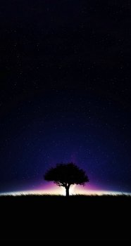
People gone, the grass line falls right above the row of dots (page indicators).Hi. Can we edit this photo so that the tree should be sitting on top of the dock. Is it possible if we can remove the couple near the tree. Thanks in advance.. really!!
Nope. This one's great! Thank you!Good quality artwork. Let me know how this version looks. The names cut off on the left and right, but the logo is RIGHT above the row of dots. For the next one, I can try to get the logo in the middle. But this looks good on the lock screen, too.
View attachment 741884
[doublepost=1513198565][/doublepost]
Oops, didn’t do solid white Apple. But I’ll go ahead and post this one anyway. So you want a solid white Apple, no glow?
View attachment 741887
[doublepost=1513199143][/doublepost]
People gone, the grass line falls right above the row of dots (page indicators).
View attachment 741888
[doublepost=1513201762][/doublepost]
Check this one out. Found on imore forumsGood quality artwork. Let me know how this version looks. The names cut off on the left and right, but the logo is RIGHT above the row of dots. For the next one, I can try to get the logo in the middle. But this looks good on the lock screen, too.
View attachment 741884
[doublepost=1513198565][/doublepost]
Oops, didn’t do solid white Apple. But I’ll go ahead and post this one anyway. So you want a solid white Apple, no glow?
View attachment 741887
[doublepost=1513199143][/doublepost]
People gone, the grass line falls right above the row of dots (page indicators).
View attachment 741888
That’s pretty cool, nice find!Nope. This one's great! Thank you!
[doublepost=1513201762][/doublepost]View attachment 741902
Check this one out. Found on imore forums
Could someone add a small sf giants logo “SF” to the middle of this ?
https://heyeased.weebly.com/uploads/4/9/1/1/49114053/the_x_orange2.png
iPhone X by the way. Thank you
I have 3 Rows of icons so pref a little below the third row of icons.

Here you go. Can someone increase resolution and add to the orange border.
https://heyeased.weebly.com/uploads/4/9/1/1/49114053/the_x_orange2.png
iPhone X by the way. Thank you
I have 3 Rows of icons so pref a little below the third row of icons.

Here you go. Can someone increase resolution and add to the orange border.
Could someone add a small sf giants logo “SF” to the middle of this ?
https://heyeased.weebly.com/uploads/4/9/1/1/49114053/the_x_orange2.png
iPhone X by the way. Thank you
I have 3 Rows of icons so pref a little below the third row of icons.

Here you go. Can someone increase resolution and add to the orange border.
https://heyeased.weebly.com/uploads/4/9/1/1/49114053/the_x_orange2.png
iPhone X by the way. Thank you
I have 3 Rows of icons so pref a little below the third row of icons.

Here you go. Can someone increase resolution and add to the orange border.
Good quality artwork. Let me know how this version looks. The names cut off on the left and right, but the logo is RIGHT above the row of dots. For the next one, I can try to get the logo in the middle. But this looks good on the lock screen, too.
View attachment 741884
[doublepost=1513198565][/doublepost]
Oops, didn’t do solid white Apple. But I’ll go ahead and post this one anyway. So you want a solid white Apple, no glow?
View attachment 741887
[doublepost=1513199143][/doublepost]
People gone, the grass line falls right above the row of dots (page indicators).
View attachment 741888
That looks fantastic. Can you make it so that the sky above it is not black and blends the colour surrounding the tree all the way?
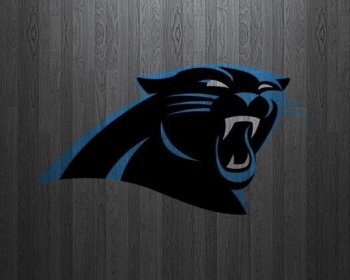
[doublepost=1513382687][/doublepost]Can someone talented enough make this wallpaper with some sports wallpapers but following the colour variant? Kinda hard to explain but I'd like this logo in the center there and have the lines of the logo in the same colour. Does that make sense?
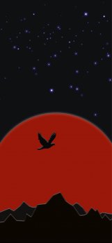
This one was kinda fun. I ended up redoing it so some of the shading is not the same, but I hope you still like it.Can these two be combined? Make the red the same as the thunder cats logo. And put the lion centered in the red. No bird.
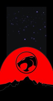
[doublepost=1513476228][/doublepost]
So, you want the entire sky to be purple-ish?That looks fantastic. Can you make it so that the sky above it is not black and blends the colour surrounding the tree all the way?
[doublepost=1513382687][/doublepost]Can someone talented enough make this wallpaper with some sports wallpapers but following the colour variant? Kinda hard to explain but I'd like this logo in the center there and have the lines of the logo in the same colour. Does that make sense?
Last edited:
Could someone add a small sf giants logo “SF” to the middle of this ?
https://heyeased.weebly.com/uploads/4/9/1/1/49114053/the_x_orange2.png
iPhone X by the way. Thank you
I have 3 Rows of icons so pref a little below the third row of icons.
Here you go. Can someone increase resolution and add to the orange border.
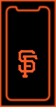
How’s this one?
[doublepost=1513478718][/doublepost]
Is there a higher resolution version of it? I can’t find oneCan some please convert for the iPhone X?
This one was kinda fun. I ended up redoing it so some of the shading is not the same, but I hope you still like it.
View attachment 742370
[doublepost=1513476228][/doublepost]
So, you want the entire sky to be purple-ish?
This is awesome! The only thing I can think of is, is it possible to change that starry sky for a high res one? Anything with constellations or really anything.
OH, Sure! Great idea. If you find something, post a link to it, but I'll see if I can find something that looks ok.This is awesome! The only thing I can think of is, is it possible to change that starry sky for a high res one? Anything with constellations or really anything.
[doublepost=1513525892][/doublepost]
By the way, thanks a ton for linking to heyeased. He's gone farther than I have at getting the alignment down perfect and allows me to check some of my assumptions. I'm still a fan of being able to use parallax, though, so I'll use his guides to update my template.Could someone add a small sf giants logo “SF” to the middle of this ?
https://heyeased.weebly.com/uploads/4/9/1/1/49114053/the_x_orange2.png
Here you go. Can someone increase resolution and add to the orange border.
Looks like heyeased has confirmed for me that the corners are NOT just plain rounded, I mean why WOULD they be, right? That’d be too easy  Updating my template to where I’m happier with the corners
Specifically, it seems to be a form of squircle corner, like around the icons, instead of a circle corner. Because his outline hugs the corner REALLY well, and I can’t get a circle to bend that way
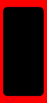
Another thing I learned from that site, set this as your home screen and look at the cool thing it does to your dock! Also, any “icon collections” you may have near the right or left edge pick up the offscreen color, too.
Specifically, it seems to be a form of squircle corner, like around the icons, instead of a circle corner. Because his outline hugs the corner REALLY well, and I can’t get a circle to bend that way

Another thing I learned from that site, set this as your home screen and look at the cool thing it does to your dock! Also, any “icon collections” you may have near the right or left edge pick up the offscreen color, too.
Last edited:
Hi there. I was wondering if I could get these formatted for the X.
Thank you!
Thank you!
Attachments
Could I get these formatted for the X? Many thanks!
Attachments
So, you want the entire sky to be purple-ish?
yes please!
Hey use the exact wallpaper from that website and just transfer the small sf logo to that orange wallpaper. Keep the sf in the same spot. Ty tyView attachment 742373
How’s this one?
[doublepost=1513478718][/doublepost]
Is there a higher resolution version of it? I can’t find one
Is anyone able to put this logo on a pure black backround for my iPhone X OLED?
[doublepost=1513965177][/doublepost]Also is anyone able to make this logo for the iPhone X? Pure black background... it’ll look so lovely
[doublepost=1513965177][/doublepost]Also is anyone able to make this logo for the iPhone X? Pure black background... it’ll look so lovely
Attachments
Register on MacRumors! This sidebar will go away, and you'll see fewer ads.


