Become a MacRumors Supporter for $50/year with no ads, ability to filter front page stories, and private forums.

The Game 161

macrumors Nehalem
Dec 15, 2010
30,969
20,166
UK
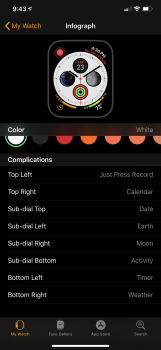
My current infograph setup. Has stuck so far. But I’m always on the lookout for a better config.
Breathe
Timer
Weather
Activity
Calendar
Solar
Apple Music
Outcast

My watch face design philosophy is that it must look relatively good and provide useful, dynamic information that I want without asking Siri, diving into the home screen or accessing the dock.

Outcast works on infograph? waiting on apple podcasts but this is interesting if it does.
 

ReardenMetal

macrumors 6502
May 1, 2015
263
120
Los Angeles
Outcast works on infograph? waiting on apple podcasts but this is interesting if it does.
It works well on Infograph.
Inside the dial complication area, it’ll show the icon of the currently active podcast and give you a circular progress bar when paused.
Or, display a progress gauge with the podcast’s icon in the outer complication area.
Nice app.
 

RodThePlod

macrumors 6502a
Sep 7, 2005
837
499
London
That reminds me. Calendar in that top position is one of my least favorite complications. I don't see the utility of "NO EVENTS TODAY" taking up a third of the dial.

For me the calendar is really important as I have my work Outlook calendar set up to show my next meetings through there, so I do have it in the big middle position of the Infograph modular. However, I have another identical face which has the weather complication in the middle instead as I also like the look of that.

During the work week I mainly use the 'calendar/weekday face', and on a Friday evening when the work week is done, I just swipe to the next one along which is the 'weather/weekend face'. Works well for me.

Weekday faces:

DMEn20B.png
zgCu2SU.png


Weekend face:

GdYbLOo.png


EDIT: Added additional Weekday image.
 
Last edited:

tromboneaholic

Suspended
Jun 9, 2004
3,706
3,024
Clearwater, FL
For me the calendar is really important as I have my work Outlook calendar set up to show my next meetings through there, so I do have it in the big middle position of the Infograph modular. However, I have another identical face which has the weather complication in the middle instead as I also like the look of that.

During the work week I mainly use the 'calendar face', and on a Friday evening when the work week is done, I just swipe to the next one along which is the 'weather face'. Works well for me.
Don't get me wrong, I do like the event showing on the top of the dial. It's just that I would prefer it to not show anything if there are no events. I find the "NO EVENTS TODAY" text to be a bit redundant considering leaving the dial empty would provide the same info.
 
  • Like
Reactions: staggerlee41

RodThePlod

macrumors 6502a
Sep 7, 2005
837
499
London
Don't get me wrong, I do like the event showing on the top of the dial. It's just that I would prefer it to not show anything if there are no events. I find the "NO EVENTS TODAY" text to be a bit redundant considering leaving the dial empty would provide the same info.

Yeah - I do get what you're saying. Interestingly, though, after a day of meetings, I do like to see the "No more events" message appear. I get a weird sense of satisfaction from it, and it's my cue to start winding down.

I updated my post above to add an additional weekday image showing a calendar event.
 

ipaddaro

macrumors 6502
Dec 6, 2014
290
73
Don't get me wrong, I do like the event showing on the top of the dial. It's just that I would prefer it to not show anything if there are no events. I find the "NO EVENTS TODAY" text to be a bit redundant considering leaving the dial empty would provide the same info.

well, in my opinion “no events today” is an info. showing nothing could mean the same or maybe you don’t know if the app is not sync etc., or if there is an event but too far away and not shown... additionally, if you get used to have nothing you could forget to set the complication again should you delete/change it for some reasons.

i get your point in any case, especially for inforgraph where “no events today” covers the minutes for “nothing”..
 

tromboneaholic

Suspended
Jun 9, 2004
3,706
3,024
Clearwater, FL
Yeah - I do get what you're saying. Interestingly, though, after a day of meetings, I do like to see the "No more events" message appear. I get a weird sense of satisfaction from it, and it's my cue to start winding down.

I updated my post above to add an additional weekday image showing a calendar event.

well, in my opinion “no events today” is an info. showing nothing could mean the same or maybe you don’t know if the app is not sync etc., or if there is an event but too far away and not shown... additionally, if you get used to have nothing you could forget to set the complication again should you delete/change it for some reasons.

i get your point in any case, especially for inforgraph where “no events today” covers the minutes for “nothing”..

I guess it's partially because I got my Series 4 on a Friday, and had nothing on my calendar for that day or the weekend.
By Sunday I felt like the watch was taunting me for having no events!

I actually switch watch faces on the weekend now to one with less complications since I can be a little more removed from things.
 

ipaddaro

macrumors 6502
Dec 6, 2014
290
73
I guess it's partially because I got my Series 4 on a Friday, and had nothing on my calendar for that day or the weekend.
By Sunday I felt like the watch was taunting me for having no events!

I actually switch watch faces on the weekend now to one with less complications since I can be a little more removed from things.

i do the same exact thing... in more “relaxed” days i have a very simple face with only analog hour and no additional info (just the date sometimes). but if i have the necessity to know if i have engagements at a glance, the “no events today” is important
 
  • Like
Reactions: tromboneaholic

tromboneaholic

Suspended
Jun 9, 2004
3,706
3,024
Clearwater, FL
i do the same exact thing... in more “relaxed” days i have a very simple face with only analog hour and no additional info (just the date sometimes). but if i have the necessity to know if i have engagements at a glance, the “no events today” is important
On the Series 1, it was more difficult for me to swipe to a different watch face, so I usually just used the same face all the time. When I was trying out different faces on Series 4, I noticed swiping to another face is almost as easy as swiping the iPhone home screen to get to the next page of icons.
 

staggerlee41

macrumors 65816
Sep 25, 2017
1,072
1,057
Pittsburgh, PA
I see both sides of the coin here because I initially had Calendar in that top complication but I changed it to Date instead simply for the reason that I didn't like the real estate "No Events Today" took up on the dial. On the other hand, after a busy day, I completely get the sense of accomplishment notion.

Unfortunately, my company has locked down synching exchange data along with other applications on personal phones has 360 is installed on your personal phone. I opted to take a company phone instead, so because my personal phone syncs with my watch more often than not, I'd have "No Events" Today taking up room on the dial. I'm back to looking at my work issued phone for my calendar. Less than ideal, but OK.

And I agree, swiping faces is significantly easier on the larger screen of Series 4 than my Series 2.

Good discussion folks.
 

The Game 161

macrumors Nehalem
Dec 15, 2010
30,969
20,166
UK
I love how Overcast has a complication but Podcasts doesn’t...
crazy really and still no messages complication? 3rd party apps can do it fine. Makes no sense

Overcast seems better too. Unlike podcast app doesn't freeze everytime you go into it.
 

jjk454ss

macrumors 601
Jul 10, 2008
4,496
513
@jjk454ss Change it from "calendar" to "date" and you should get the same complication I've got.

@iGeneo I agree with you. If you use the world timer complications in the center of the face they are quote small. As an alternative you could flank the corners with the time zones but that also takes up valuable real estate.

NM, I got it. Thanks
 

Attachments

  • 9C4CAB3B-AA80-4CD3-AC9D-1B9CB1E71550.png
    9C4CAB3B-AA80-4CD3-AC9D-1B9CB1E71550.png
    758.9 KB · Views: 218
Last edited:
Register on MacRumors! This sidebar will go away, and you'll see fewer ads.