Become a MacRumors Supporter for $50/year with no ads, ability to filter front page stories, and private forums.

childu

macrumors member
Original poster
Dec 27, 2011
64
88
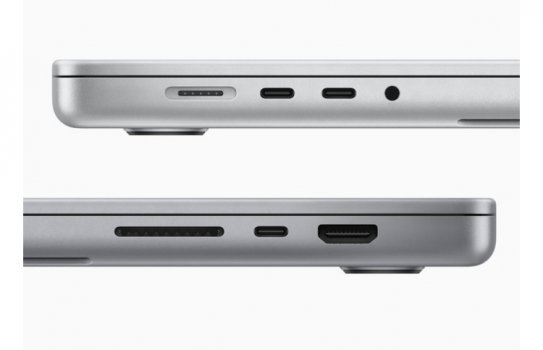
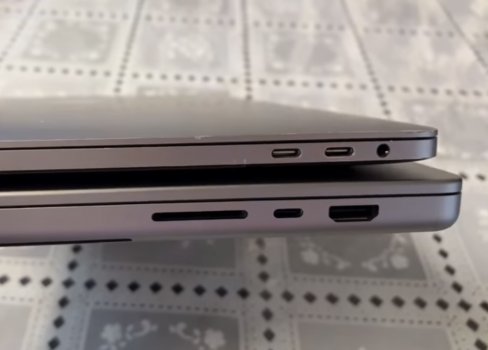
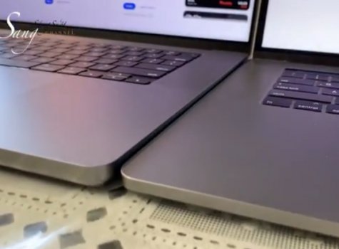
The new MacBook Pro is thicker, heavier, with a Magsafe, an SD card reader and the biggest one: the HDMI 2.0 (not 2.1). The Touch Bar dream is gone, Giving way for the older function key row.
They also love protrusions, Triple on the iPhone camera and now the feet of the MacBook Pros look way more protruding than the previous version.
And let’s not talk about the unnecessarily wide notch without the face ID.

“ We believe in a wireless future“ said Jony five years ago.
Well the future looks like the past, with more ports and no touchbar. The new Macbook Pro is an updated 2012 MacBook Pro with Retina display rather than an evolution of the 2016 model.
The sleek and elegant chassis is lost.
The epitome of that vision was the 2015 12” inch MacBook, super thin with only one usb-c port. One could argue that it was a visionary device ahead of its time but that the path was indicated. Six years later and today apple killed that vision. Jony Ive is gone and his vision too.
Despite boasting less power hungry processors compared to Intel the device isn’t thinner than the 2016 MacBook Pro.
So long for minimalism. I really hope that this is only for the pro MacBooks and that we will see a super thin 12 inch device with only two USB-Cs.
 

Attachments

  • 67DAFAD5-54E2-4068-ABCE-2DEEE9648C8E.jpeg
    67DAFAD5-54E2-4068-ABCE-2DEEE9648C8E.jpeg
    86.4 KB · Views: 857
  • D48832F8-9DDC-4EAB-A0EB-B1A1E9FF337D.jpeg
    D48832F8-9DDC-4EAB-A0EB-B1A1E9FF337D.jpeg
    100.4 KB · Views: 443
  • 854B9C3E-01BC-4BE6-99A7-EC2490EC4BAA.jpeg
    854B9C3E-01BC-4BE6-99A7-EC2490EC4BAA.jpeg
    164.1 KB · Views: 443
Last edited:
My only dislike is the notch.
My very first thought in seeing it was "Oh it's a thinner version of the polycarbonate MacBook!" Which to me is a good thing.

I'd substitute your use of 'visionary" with "crippling". Thin and limited ports is fine for things like MacBook and Air, NOT for Pro devices where people need to actually do work and get things done. Looking cool is NOT a primary point of a Pro device. Function is.

Now if they could just bring back the IR sensor and remote for presentations....
 
I don’t agree. This MacBook Pro is very reminiscent in design to the titanium PowerBook that Ive’s designed prior to its ‘01 release. Honestly it takes the best parts of each PowerBook/MacBook laptop design and pulls them together in a minimal, sleek, cohesive pro machine.

I would almost say Apple has started daring to try again with product design. I rate the new iMacs, this MacBook, and the AirPod 3s as some of the most iconic designs since late 90s. Notch and all.
The 2016 MacBook Pro was a daring machine. Betting everything on four USB-C, massive trackpad, and the Touch Bar. This one reverts back to many ports and standard function keys!
 
The new MacBook Pro is thicker, heavier, with a Magsafe, an SD card reader and the biggest one: the HDMI 2.0 (not 2.1).
They also love protrusions, Triple on the iPhone camera and now the feet of the MacBook Pros look way more protruding than the previous version.
And let’s not talk about the unnecessarily wide notch without the face ID.

“ We believe in a wireless future“ said Jony five years ago.
Well the future looks like the past, with more ports. The new Macbook Pro is an updated 2012 MacBook Pro with Retina display.
The sleek and elegant chassis is lost.
The epitome of that vision was the 2015 12” inch MacBook, super thin with only one usb-c port. One could argue that it was a visionary device ahead of its time but that the path was indicated. Six years later and today apple killed that vision. Despite boasting less power hungry processors compared to Intel the device isn’t thinner than the 2016 MacBook Pro.
So long for minimalism. I really hope that this is only for the pro MacBooks and that we will see a super thin 12 inch device with only two USB-Cs.
First, given the extraordinary thermals expected for the M2, I expect you'll see that slimness you like in the next MBA (though not as thin as Ive would make it, since it won't have a butterfly keyboard).

Second, the thicker, higher-volume design of the 16" MBP is a very good thing. Remember this is supposed to be a pro (really, prosumer) machine. This design shows Apple is moving in the direction of making MBP's that live up that that, i.e., that emphasize function over form. The higher volume allows for better thermals, which means less throttling (=> higher performance) and quieter operation. And the added ports enable better connectivity.
 
Last edited:
The 2016 MacBook Pro was a daring machine. Betting everything on four USB-C, massive trackpad, and the Touch Bar. This one reverts back to many ports and standard function keys!
The 2016 MBP was not very Pro, IMO.

I am happy that Apple reversed a lot of the dumb design decisions that came with it, mostly bringing back the MagSafe.

Hopefully, the MBA is next.
 
The new MacBook Pro is thicker, heavier, with a Magsafe, an SD card reader and the biggest one: the HDMI 2.0 (not 2.1). The Touch Bar dream is gone, Giving way for the older function key row.
They also love protrusions, Triple on the iPhone camera and now the feet of the MacBook Pros look way more protruding than the previous version.
And let’s not talk about the unnecessarily wide notch without the face ID.

“ We believe in a wireless future“ said Jony five years ago.
Well the future looks like the past, with more ports and no touchbar. The new Macbook Pro is an updated 2012 MacBook Pro with Retina display rather than an evolution of the 2016 model.
The sleek and elegant chassis is lost.
The epitome of that vision was the 2015 12” inch MacBook, super thin with only one usb-c port. One could argue that it was a visionary device ahead of its time but that the path was indicated. Six years later and today apple killed that vision. Jony Ive is gone and his vision too.
Despite boasting less power hungry processors compared to Intel the device isn’t thinner than the 2016 MacBook Pro.
So long for minimalism. I really hope that this is only for the pro MacBooks and that we will see a super thin 12 inch device with only two USB-Cs.

Obviously a "hot take", but I can see your point and I also disagree. I think adding an SD card reader is a step backwards. Mostly because it isn't the fast version anyway so professionals will still need to use an external reader.

The HDMI port is mildly convenient, but I would rather have the flexibility of the TB4 port and use a dongle than to have Apple lock me into a port I would rarely use. 2.0 vs 2.1? No big deal for professionals since we will be connecting to our pro displays using TB.

I didn't love or hate the Touch Bar. It just seemed to never be that useful. Even if more apps had adopted it, it always felt like more work to use it vs just moving my mouse and using the gigantic touch pad instead. It was "innovative" but I don't really think it was very core to the vision of the MacBook. I guess though going "back" to physical keys could seem like a step backwards but I see it as more of a step sideways since the viability of the Touch Bar never seemed to materialize. I think that was more of a "live and learn" and not a "moving backwards" type thing.

Protrusions.....yeah the iPhone 13 Pro is OUT OF CONTROL with that bump! xD I am hoping the feet for the new laptop look better in person, otherwise very valid point!

So on those fronts I think the vision of the laptop pushing a "wireless future" blah blah stuff is true. MagSafe never should have been removed, so glad that is back. Sure it isn't as minimalist as just plan TB ports, but not loosing your laptop off the table is a good trade off in my opinion. But maybe another concession there :p

I am not sure what people's fascination with worrying about the notch it. Apple has it disappearing in fullscreen mode. Since I use all of my pro apps in full screen on the different monitors, including the built in one, I won't ever see it thanks to their programming. Even if I did see it, and I didn't like it, I would just apple a wallpaper with a black bar at the top and it is gone. Just such a strange thing to get this much attention when it is really a non-issue.

But the fact that they made the laptop more usable for professionals by ever so slightly increasing the size....good! The ability for creative professionals to now do full workflows from a laptop is exactly what we expect from Apple. Pushing those boundaries to unheard of levels all while maintaining essentially the MacBook form factor. Truly awesome and so happy for the upgrade!!
 
The 2016 MacBook Pro was a daring machine. Betting everything on four USB-C, massive trackpad, and the Touch Bar. This one reverts back to many ports and standard function keys!
It dared and missed the mark just like the G4 Cube for the Pro market.

This new Mac takes all the things that didn’t quite work for pros in the old model and tosses them in favor of features pros have asked for and wanted.

For me, this makes it a well balanced design worthy of praise and may even represent new insight into Apple’s pivoting design philosophy - balance of form and function.
 
My only dislike is the notch.
My very first thought in seeing it was "Oh it's a thinner version of the polycarbonate MacBook!" Which to me is a good thing.

I'd substitute your use of 'visionary" with "crippling". Thin and limited ports is fine for things like MacBook and Air, NOT for Pro devices where people need to actually do work and get things done. Looking cool is NOT a primary point of a Pro device. Function is.

Now if they could just bring back the IR sensor and remote for presentations....
I loved the WhiteBooks. Apple should really revive the MB lineup with a polycarbonate device with a stylish but plastic body and a basic M1 setup for like 699. I would buy one.
 
I rather have slightly bigger bezel.

I rather have expansion ports with covers to put what you want.

MagSafe should have been modern and new, instead old and tired.

Apple lost its vision.

Since the notch is not visible in fullscreen, and you could use dark mode/black bar at the top of the wallpaper to hide it outside of dark mode, how is the bigger bezel better? It is truly just "extra space" since it is the same exact screen as before with just 74 more pixels above the normal screen. If it wasn't so easy to make it go away, I would understand the desire for larger bezels, but it seems like Apple make it pretty easy to just ignore that it is there and pretend you have the bigger bezel you are asking for. Digital bezel :p
 
  • Like
Reactions: harold.ji
Terrible decision to add back single use ports in place of a versatile multipurpose port like they have done. Absolutely terrible decision. And why not have the Touch Bar plus the function keys if they feel the need for f keys to return?

People go on and on about Apple losing their way when they do brave, insistant moves like with the original Touch Bar/only USBc - but that’s real Apple.
This reverse course pandering is just the worst thing for them to do - no idea what they’re thinking.
 
Terrible decision to add back single use ports in place of a versatile multipurpose port like they have done. Absolutely terrible decision. And why not have the Touch Bar plus the function keys if they feel the need for f keys to return?

People go on and on about Apple losing their way when they do brave, insistant moves like with the original Touch Bar/only USBc - that’s Apple. But this reverse course pandering is just the worst thing for them to do - no idea what they’re thinking.
Franky I am ok the HDMI port since its still what I use when I connect my TV/Projector, not having to bring a dongle or charger when the battery lasts that long is awesome as well. How many people really needed all 4 USB-C plugs vs how many that were using the HDMI dongle?
 
Franky I am ok the HDMI port since its still what I use when I connect my TV/Projector, not having to bring a dongle or charger when the battery lasts that long is awesome as well. How many people really needed all 4 USB-C plugs vs how many that were using the HDMI dongle?
It’s not the point though. Not at all.
Firstly - you don’t need a HDMI dongle. You just need an HDMI to USBc wire.
Secondly, not everyone needs HDMI. This way everyone has to have HDMI. We lost a port that could be anything we wanted (including HDMI), and gained a port that can only be HDMI.
 
That vision is dead. Halleluja!
These things are meant to be used. By people. To do stuff.
Those marketing close-up renders of The Object floating in empty space is just designer porn.

I pay for a tool that can look nice, and should have good tactile/haptic qualities. I appreciate that. But I don’t wan’t a designer fellow deciding what my computers can and cannot do.
 
It’s not the point though. Not at all.
Firstly - you don’t need a HDMI dongle. You just need an HDMI to USBc wire.
Secondly, not everyone needs HDMI. This way everyone has to have HDMI. We lost a port that could be anything we wanted (including HDMI), and gained a port that can only be HDMI.

Seems you have made your mind up here :) but I still think the majority of people are better served by having one less dongle given how pervasive HDMI is and the fact it isn't going away.

On the technical side Apple probably ran out of PCIe lanes to do 4 ports of Thunderbolt 3/4 and it might be the M2 or beyond that they will add more
 
  • Like
Reactions: motulist
Nice thread as long as it does not boil down to ports which is a feature choice and not a design choice.

It is clear that Jony Ives hands are gone from the Mac line. The iMac 24 will not age as well as the 27 inch tapered design which is still a beautiful machine. Likewise, the shape of the new MBP (and feets) seems like an afterthought rather than a fresh new take. The new MBP seem to be designed by engineers to host a spec list of features and misses the care the Jony Ives had for every detail.

I say it is overall a fail: half the TDP in a thicker, physically heavier and a body that is also heavy in the design language. Apple, you are on a slippery slope here.

Performance will certainly be top notch but the "package" is not impressive. It reminds me of the PC world.

A pro machine without an 10 Gb Ethernet port??? Only works for the lone wolf "pro". Frankly a USB-C hub with all necessary ports is a better solution overall.
You've set it up as Apple not paying as much attention to detail with Ive's departure, but there are two key kinds of attention to detail. And Ive gave great attention to design detail, but poor attention to engineering detail. There has to be a balance, and IMO the pendulum swung too far to form over function during the Ive era.

Further, engineering detail should not be dismissed merely as a list of specs. It includes usability. Take the butterfly keyboard, for instance. [And let's set aside the reliability problems.] Here we have great attention to design detail, because it enabled a slimmer, more beautiful machine. But we have poor attention to usability detail, since the lack of travel made (for most users) a less comfortable typing experience, especially after many hours at the keyboard. And it was noticeably noisier, another fine but important detail Ive missed.

Another key usability detail is fan noise. You can get used to a machine not being as svelte as you'd like much more easily than to it being noisy. It looks like Apple paid better attention to this key usability detail with this machine, by combining processors that generate less heat with a case that can dissipate more of it, which will make for a much quieter (and more performant) user experience.
 
Last edited:
Nice thread as long as it does not boil down to ports which is a feature choice and not a design choice.

It is clear that Jony Ives hands are gone from the Mac line. The iMac 24 will not age as well as the 27 inch tapered design which is still a beautiful machine. Likewise, the shape of the new MBP (and feets) seems like an afterthought rather than a fresh new take. The new MBP seem to be designed by engineers to host a spec list of features and misses the care the Jony Ives had for every detail.

I say it is overall a fail: half the TDP in a thicker, physically heavier and a body that is also heavy in the design language. Apple, you are on a slippery slope here.

Performance will certainly be top notch but the "package" is not impressive. It reminds me of the PC world.

A pro machine without an 10 Gb Ethernet port??? Only works for the lone wolf "pro". Frankly a USB-C hub with all necessary ports is a better solution overall.
10Gbe is something that may or may not be better served by a dongle. The physical shape of the RJ45 connector and socket might be tricky to accomodate on these machines. I do agree that it would make sense on these kind of machines.
It’s a question of priorities.

Basically I see computers as tools, or as Tim Cook would put it ”vehicles of creativity”. As with any tools you use a lot, you want them to be enjoyable to use. Pens, notebooks, computers, mass spectrometers, their use can be enhanced by good design. But usability is the first criterion.
As I said a few posts ago, Apple designers and marketeers love to show The Object floating around in isolation, but people are going to put their grubby hands on them, plug all kinds of things into them, they need to communicate and be carried around, they’ll be dropped and scuffed, and that is the point. They are meant to be used. That’s how they come to life. The more they are used, the better they perform and yes, the more they disappear and just become an unobstructive part of your workday, the better.

Usage, not looks, is the prime objective. We have sculpture for that.
 
The new MacBook Pro is thicker, heavier, with a Magsafe, an SD card reader and the biggest one: the HDMI 2.0 (not 2.1). The Touch Bar dream is gone, Giving way for the older function key row.
They also love protrusions, Triple on the iPhone camera and now the feet of the MacBook Pros look way more protruding than the previous version.
And let’s not talk about the unnecessarily wide notch without the face ID.

“ We believe in a wireless future“ said Jony five years ago.
Well the future looks like the past, with more ports and no touchbar. The new Macbook Pro is an updated 2012 MacBook Pro with Retina display rather than an evolution of the 2016 model.
The sleek and elegant chassis is lost.
The epitome of that vision was the 2015 12” inch MacBook, super thin with only one usb-c port. One could argue that it was a visionary device ahead of its time but that the path was indicated. Six years later and today apple killed that vision. Jony Ive is gone and his vision too.
Despite boasting less power hungry processors compared to Intel the device isn’t thinner than the 2016 MacBook Pro.
So long for minimalism. I really hope that this is only for the pro MacBooks and that we will see a super thin 12 inch device with only two USB-Cs.
What you want is the Macbook Air. Thin, light, no fans, minimalism at its best.
Oh, and Apple is still selling it...
So... yeah.
 
It’s not the point though. Not at all.
Firstly - you don’t need a HDMI dongle. You just need an HDMI to USBc wire.
Secondly, not everyone needs HDMI. This way everyone has to have HDMI. We lost a port that could be anything we wanted (including HDMI), and gained a port that can only be HDMI.
I actually agree with you. I'd rather have more Thunderbolt4 ports that I can convert to anything I want versus a large single-use port.
Heck, why can Apple put a huge HDMI port on the 16", but cannot afford to even put another USB-C port? Space shouldn't be an issue on the 16".

But what's done is done. I think as the first non-Ives-designed Macbook Pro, and also a platform to debut their Pro Apple Silicon chip, I'm guessing Apple needed to make a statement to their Pro market "hey, look, we hear you. Here are all the things you said you wanted. Don't forget us, as we love your money..."

Let's see what the redesigned Macbook Air would be. Imo Apple will be focusing more on design on that one, and thus thinner, USB-C only, and more wireless focused.
 
I loved the WhiteBooks. Apple should really revive the MB lineup with a polycarbonate device with a stylish but plastic body and a basic M1 setup for like 699. I would buy one.
Apple probably wouldn't want any Macbooks to be under the $999 price point. They want you to buy an iPad instead. Right now, the Macbook Air itself is already a steal when you compare it against an iPad Pro with magic keyboard.
 
Register on MacRumors! This sidebar will go away, and you'll see fewer ads.