ya can't design UI's for people with bad eyes. they can use glasses or contacts . the rest of us want thing to take advantage of modern screen clarityAccessibility features should not be for a majority of a user base.
That has things totally flipped.
Got a tip for us?
Let us know
Become a MacRumors Supporter for $50/year with no ads, ability to filter front page stories, and private forums.
Liquid Glass Appreciation Thread
- Thread starter Mr. Awesome
- Start date
- Sort by reaction score
You are using an out of date browser. It may not display this or other websites correctly.
You should upgrade or use an alternative browser.
You should upgrade or use an alternative browser.

I’m gonna watch it all (thank you) but after watching the first seconds… Aqua!!! I mean… this is actually the Aqua comeback, without the exaggeration of the early 2000s. I think Steve Jobs would have loved it.After watching the Meet Liquid Glass WWDC video I have more confidence it’ll get better before launch.
They mention a lot of the issues people are seeing - so they are aware of it.
- legibility
- not layering glass on glass, etc
Knowing how secretive Apple are, they probably didn’t tell half the teams about the redesign until late, and now they have to rush to fix their parts of the system.
Each time I read LG I think about the south-corean display manufacturer…I'm really into the LG design. I think once it's been touched up and fully released it's going to look really nice. It'll look great on ProMotion devices for sure I think.
I think while icon design language is a huge leap from what we have currently, they will still have to redesign icons from scratch at some point. I mean those same color combos have been for more than 13 years. They have to sit down and think how icons can be made better. Overly acidic colors (like the blue of the AppStore icon or Mail icon, or almost the same Safari icon) would not fit the lower contrast theme of new liquid glass design.
And I think this is already planned but for iOS 27 or 28, so that there would be less overload and no possible backlash from users who “can’t find where Safari is”
And I think this is already planned but for iOS 27 or 28, so that there would be less overload and no possible backlash from users who “can’t find where Safari is”
I absolutely love it. Wouldn’t go it back. I don’t know where the hate is coming from, everything is good to read, and its beta 1. there will be tweaks.
Everything is not good to read…
Attachments
I agree with you. I hated it the first few hours, but it has grown on me substantially and I wouldn’t go back.I absolutely love it. Wouldn’t go it back. I don’t know where the hate is coming from, everything is good to read, and its beta 1. there will be tweaks.
Makes the device a more joy/fun to use for me. Also when you scroll down the page it minimizes out of the way. Very full screen experience.
I think it looks fantastic. I'm very excited to run the public beta on my phone; I can't risk breaking it with the dev beta, but my iPad is under no such pretences, so I'm running the dev beta there. The glass effects are so much more complicated than a lot of the negative press seems to assume. It's not just Windows Vista (which was a knock off of OS X Aqua anyway but I digress), the transparency effects actually bubble and bleed into the sides of icons and windows like a real pane of glass. I noticed this most impressively when I do Fitness workouts; the stats bar top left is now glass, and the way the video can be seen under it is unlike any generic transparency effects I've ever seen. And it's running on an iPad 8, the lowliest supported iPad, with hardly any hiccups.
I always wanted them to bring the colour and fun back into the OS that it seemed to lose around 10.8 or so, with skeuomorphism being dead and all. I think this is the resurrection of skeuomorphism, and I hope it catches on elsewhere. And don't worry about the bad press, all the companies making fun of them now will in five years be implementing the same ideas. Apple always wears it for doing it first.
I always wanted them to bring the colour and fun back into the OS that it seemed to lose around 10.8 or so, with skeuomorphism being dead and all. I think this is the resurrection of skeuomorphism, and I hope it catches on elsewhere. And don't worry about the bad press, all the companies making fun of them now will in five years be implementing the same ideas. Apple always wears it for doing it first.
The only one appreciating Apple Vista new design is probably your optometrist in a year and a half or two.
I hope they get it sorted before release date, unless they delay that too, because it is just looking good but it has zero practicality, it is just distracting.
I hope they get it sorted before release date, unless they delay that too, because it is just looking good but it has zero practicality, it is just distracting.
its a sentence that i remember as well.I love it!
When Steve Jpbs ...“we’ve got a gigaflop ...”
when he said it he was actually referencing the Cube.
i bought two of them for my family.
i loved pulling out the core by the handle.
Yes and no.that's who accessibility features are for...
While there will always be a group of people needing additional accessibility features, there’s something called Universal Design. This incorporates the concept of making sure design is suited for use by the vast majority of people including those with disabilities.
Yesterday I watched this WWDC video about inclusive design of apps, which goes into depth of how Apple looks at accessibility through the lens of Universal Design (= inclusive design). This, and considering how much money and time they throw at making their products accessible you’d think they make sure that Liquid Glass is designed so that it is usable for most people without special accommodations (with exceptions, that is).
I’m well aware that we’re just at beta 1, so I will patiently wait for the final version to arrive and then judge. But from what it looks right now, it’s a hot mess to those with even the slightest visual impairment.
Last edited:
I don't see/feel much change except for the colorless icons on my 12 Pro Max. Not sure if it's because my phone is quite dated and doesn't have all the bells and whistles of the LiquidGlass, but I'm a bit disappointed.
Fair play for having the confidence to look stupid on a public forum! I sincerely hope you are never in charge of software design.Yeah, no. It needs minor tweaks, here and there. You don't even know what design is.
I’m genuinely sorry they gave in to a loud minority that just wouldn’t stop whining for years about how the system looked. You know, because apparently, it had become so boring. Since iOS 7, everything looked the same — what a tragedy! We were bored, our brains weren’t getting that little dopamine kick when we used our phones. The word of the generation? Boooring!
Well, now it’s all stars, sparkles, lights and shiny reflections — things move, shimmer, wiggle, they’re practically one bark away from being fully animated pets. But hey, at least we’re not bored anymore! Now we can change colors! Move apps around! Flip everything upside down if we want! Anything to keep the existential dread at bay, right?
I genuinely miss the design team that made actual decisions. When something looked a certain way because that’s how it was meant to look. It’s honestly a bit sad to see Apple cave to this “customization at all costs” trend — it feels vulgar, especially when you remember the thoughtful, cohesive design language they used to champion. iOS has gone full Android — and not in a good way. In the worst, most tasteless way possible.
What can I say? The end of an era.
I’m genuinely sorry they gave in to a loud minority that just wouldn’t stop whining for years about how the system looked. You know, because apparently, it had become so boring. Since iOS 7, everything looked the same — what a tragedy! We were bored, our brains weren’t getting that little dopamine kick when we used our phones. The word of the generation? Boooring!
Well, now it’s all stars, sparkles, lights and shiny reflections — things move, shimmer, wiggle, they’re practically one bark away from being fully animated pets. But hey, at least we’re not bored anymore! Now we can change colors! Move apps around! Flip everything upside down if we want! Anything to keep the existential dread at bay, right?
I genuinely miss the design team that made actual decisions. When something looked a certain way because that’s how it was meant to look. It’s honestly a bit sad to see Apple cave to this “customization at all costs” trend — it feels vulgar, especially when you remember the thoughtful, cohesive design language they used to champion. iOS has gone full Android — and not in a good way. In the worst, most tasteless way possible.
What can I say? The end of an era.
View attachment 2519586View attachment 2519587
But what about the vision issues amplified with ugly minimalist interfaces from iOS 7 era? Smh never had eye strain with iOS 3,4,5,6. It started to kick in only after iOS 7 because I COULDN’T FIND THE ICONS!!! And it even exacerbated when they released HDR displays and elements. Combined with new OLED displays it is “f that phone” experience.
Recently got non-updated iPhone 4 in my hands and it was such a pleasant experience, despite it having a tiny display I was able to use the phone without issues and eye strain.
Yeah yeah yeah you can already start telling me to get an eye check or “get a new pair of eyes” like some bros from reddit did back when iOS 7 was released. I did and I know I am short sighted, this knowledge didn’t help me feel better with their interfaces…
After all, I don’t truly understand why are you sad about “26” revolution since it looks very similar to version 18 just with new cool-looking glassy interface and refreshed icons and tons of under-the-hood improvements + the new features.
If we take it to higher highs, Apple went full Android ever since they adopted useless OLED displays, widgets and iOS 7 redesign. I can barely differentiate is that an iPhone or Xiaomi, they have same interface!
How is your comment appreciative? You know, the theme of this thread? Would you go into a UK Pub, and say soccer is rubbish, American Football is the best...I’m genuinely sorry they gave in to a loud minority that just wouldn’t stop whining for years about how the system looked. You know, because apparently, it had become so boring. Since iOS 7, everything looked the same — what a tragedy! We were bored, our brains weren’t getting that little dopamine kick when we used our phones. The word of the generation? Boooring!
Well, now it’s all stars, sparkles, lights and shiny reflections — things move, shimmer, wiggle, they’re practically one bark away from being fully animated pets. But hey, at least we’re not bored anymore! Now we can change colors! Move apps around! Flip everything upside down if we want! Anything to keep the existential dread at bay, right?
I genuinely miss the design team that made actual decisions. When something looked a certain way because that’s how it was meant to look. It’s honestly a bit sad to see Apple cave to this “customization at all costs” trend — it feels vulgar, especially when you remember the thoughtful, cohesive design language they used to champion. iOS has gone full Android — and not in a good way. In the worst, most tasteless way possible.
What can I say? The end of an era.
View attachment 2519586View attachment 2519587
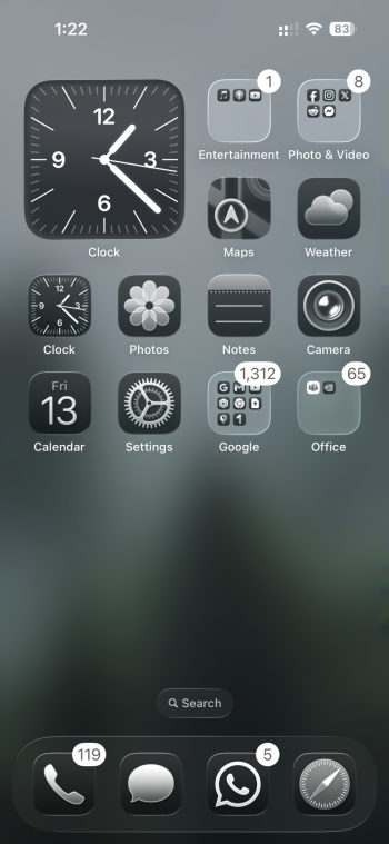
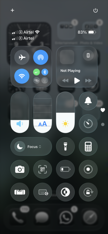
Mine is not cherry picked lol, literally took 2 screenshots off my actual screen.
It looks and reads better with dark backgrounds, on a lighter background it is a totally different story, so Apple need to implement some sort of a dynamic transparency to make it work well for both light and dark backgrounds.
Still searching for the camera app…I think while icon design language is a huge leap from what we have currently, they will still have to redesign icons from scratch at some point. I mean those same color combos have been for more than 13 years. They have to sit down and think how icons can be made better. Overly acidic colors (like the blue of the AppStore icon or Mail icon, or almost the same Safari icon) would not fit the lower contrast theme of new liquid glass design.
And I think this is already planned but for iOS 27 or 28, so that there would be less overload and no possible backlash from users who “can’t find where Safari is”
Why isn’t there a camera anymore in the first beta?? 😀
Still searching for the camera app…
Why isn’t there a camera anymore in the first beta?? 😀
Literally the first thing I noticed during the keynote😄
Absolutely agree.It looks and reads better with dark backgrounds, on a lighter background it is a totally different story, so Apple need to implement some sort of a dynamic transparency to make it work well for both light and dark backgrounds.
Their adaption of the text switching from white to black usually works pretty well but they need to improve it further for the LG design. And absolutely: we need a more frosty look to increase the readability, especially on light backgrounds.
Pretty sure we see a lot of refinements over the upcoming weeks.
Register on MacRumors! This sidebar will go away, and you'll see fewer ads.