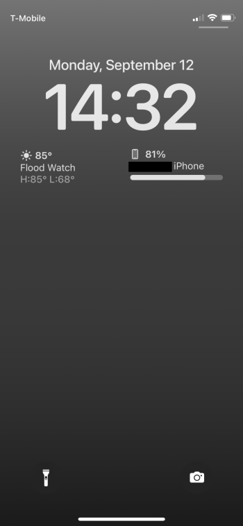
Is it only me or did I expect these new Lock Screen Widgets to be much better? They look kind of crapy and you can't see much. You either get 4 small circles or 2 slightly larger squares. Yes, there is some info that wasn't there before but it looks pretty underwhelming. I expected that you will be able to add more widgets and maybe in full color.
Got a tip for us?
Let us know
Become a MacRumors Supporter for $50/year with no ads, ability to filter front page stories, and private forums.
Lock Screen Widgets - Almost useless?
- Thread starter akidokraja
- Start date
-
- Tags
- ios 16 lock screen widgets
- Sort by reaction score
You are using an out of date browser. It may not display this or other websites correctly.
You should upgrade or use an alternative browser.
You should upgrade or use an alternative browser.
You answered your own concern with one word, “expect”…
Widgets look like a 3 year old threw them together. No innovation there.
I personally don’t see the point of them since we have a dedicated widget screen on the left.
The ability to add more rows of widgets (including an option for full width) would help once more 3rd party apps add this functionality
Only 4 widgets are possible. Why they don’t get rid of the huge clock and put it there where you see it when your phone is unlocked?
Why have they prioritized these nearly worthless widgets over notifications? Why is there an extra step just to see the notifications (swiping up)?
Yeah for whatever reason apple is just changing stuff on iOS just because they can now. Like changing ipad multitasking every year. Imagine if they changed core mac functionality like this every year.
I honestly think they don’t know what to do anymore and are just randomly changing things around. Remind me of stores in US where every few months they change the location of things so you have to go hunt for stuff.Yeah for whatever reason apple is just changing stuff on iOS just because they can now. Like changing ipad multitasking every year. Imagine if they changed core mac functionality like this every year.
It just released today. Give it time for more developers to implemented more widgets in their apps
It is not about not having widgets it is about that they are restricted to very small amount of information that is on top of that monochrome. So, weather app for example will have very similar widget to any other weather app. No difference, no colors, etc.It just released today. Give it time for more developers to implemented more widgets in their apps
I like the idea, but it’s definitely very basic. The fact that all I have to do is pickup or tap the phone to see the weather and chance of rain is nice. I also like how I can set an alarm straight from the lock screen. Here’s mine.

These widgets are to give glanceable information without having to pickup/unlock your phone. They're not meant to be flashy or novel experiences. In the event you want to act on it, you tap and go straight to the app, avoiding the potential of getting sucked into other experiences on your phone.
My only critique would be to shrink the size of the clock a bit and introduce a 2nd row of widgets. With most phones in their lineup at 6.1 now, no reason to limit us to 4. Maybe make both clock size and widget rows configurable by user. Hopefully this can be addressed in a dot release and we don't have to wait a whole year until iOS 17.
My only critique would be to shrink the size of the clock a bit and introduce a 2nd row of widgets. With most phones in their lineup at 6.1 now, no reason to limit us to 4. Maybe make both clock size and widget rows configurable by user. Hopefully this can be addressed in a dot release and we don't have to wait a whole year until iOS 17.
Correct me if I'm wrong, but if you add any widgets, the "depth effect" goes away. The depth effect is useless, but still kind of cool looking, especially with pics of people.
I like it..
View attachment 2059489
Thats mine too, with weather and battery/fitness widgets.
I played around with a couple other color schemes too, but I revert back to plain. Looks the most like the dark iPhone stock wallpaper for the iPhone 12, which is what I’ve used.
Same here. I remember this exact problem happened when they redid the widget screen before. Frustrating.Is anyone else only seeing widgets for Apple apps? I was hoping to add a Fantastical widget but none are visible, even though I just updated the app to the version with Lock Screen widgets.
Evidently it forces the widgets to the center if they're small, and left if they're bigger (2 spaces vs 1 space). So if you want to spread out 2 small widgets to maintain a center focus on your wallpaper (photos of people for example?), you're SOL...
Register on MacRumors! This sidebar will go away, and you'll see fewer ads.


