Got a tip for us?
Let us know
Become a MacRumors Supporter for $50/year with no ads, ability to filter front page stories, and private forums.
Logo Critique
- Thread starter Synthion
- Start date
- Sort by reaction score
You are using an out of date browser. It may not display this or other websites correctly.
You should upgrade or use an alternative browser.
You should upgrade or use an alternative browser.
First of all i think its good that people make logos themselfs and not let some "pro" make it for them. I think the logo looks a bit too childish, if you know what i mean. Some 3d logo would perhabs fit a bit better and colors are always welcome. You could try the font that gizmodo is using right now and make it transparent in order to let the text shine thru.
Remember that was just the opinion of some random guy on the internet so don't take it too serious.
Remember that was just the opinion of some random guy on the internet so don't take it too serious.
I'm trying to keep it simple, and monochrome, but I understand what you are saying. I love Gizmodo, (but their redesign is hideous) I am just using Gimp. But yeah, I will add some effect, and probably do something similar, but less rushed, for the final.
I'm trying to keep it simple, and monochrome, but I understand what you are saying. I love Gizmodo, (but their redesign is hideous) I am just using Gimp. But yeah, I will add some effect, and probably do something similar, but less rushed, for the final.
Yeah the new "desing" is jus awful but the logo is nice (in terms of font desing).
The most constructive thing I can say... Ditch the computer for now, grab a pencil and some paper and spend at least 2 or 3 hours sketching different ideas. Then scan them in and trace some of the best ones and see how they all look after that.
Basically the only way to make that logo better, would be to start all over again. Sorry if it seems a bit harsh but the only other way to have a good professional looking logo, is it hire someone to create one. Not gonna be cheap, I get from $15-45 an hour for logo work as a freelancer, Just as a ballpark of what you can expect to pay. "The $50 for a logo" adverts you can find on CL.... you would be better off keeping what you have.
Good luck
Also, GIMP is NOT for logo design. You are using a raster program to make a logo, you really want/need a vector based program like Adobe Illustrator. You'll make a logo in GIMP that is only one size and will not scale without horrible distortion.
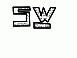
This is a rough draft, (I mean rough, like, in 15 minutes rough), of a logo for a website my friend and I are creating, called ShareWall. It is more of a concept critique, tell me what you think. I love constructive criticism.
uhm, no.
as in:
no originality
no style
no class
no elegance
and, definitely no...no, this will not attract customers to you.
were I you, I would find the best graffiti artist in the community you live in..contact him/her (spray paint yr contact info on a wall via anonymous means next to some of their most prominent work. they will def see it)...have them create yr logo, and go from there. That would be a win/win.
you folks just don't have the artistic/drawing skillz to pull of what I think you want to pull off.
best of luck.
Guys, I am trying to show a concept. Not a finished piece of work. Are you trolling or something? You were absolutely no help. This is going to be in a corner of a webpage, not on a mass advertisement. Others were helpful, you are a troll. Give me some ConstructiveCriticism or ideas, not a suggestion to hire someone. So please, I did this in ten minutes on GIMP to explain a CONCEPT.
Haha, awesome nearly was suckered in by the troll!
An obvious rick roll but still funny
What? Is that me? I'm the troll? WHAT?
What? Is that me? I'm the troll? WHAT?
This is a gag logo post right?
Well we are trying to tell you GIMP is the problem. Its not for making logos at all, its simply not the right program. You also need to consider.... if your serious enough to be starting up a website, dont you want a good quality logo to represent you? Instead of people saying "o ya that company with a crappy boring logo" wouldn't you rather they say "O ya that company with that really creative kick a** logo!" ??
I don't think anyone here is trolling, but you have to understand when you ask for a critique and have graphic designers responding in your thread... its going to be harsh because its what most designers are when it comes to looking at designs, I know I am at least most of my peers hate me for being so brutally honest.
LIke I said originally get away from the computer and just sketch out some ideas for a couple hours you might come up with something really cool. I have found that putting small text inside larger text only really works on very large print media like billboards. On a website small in a corner the text inside will become un-readable and will really only be distracting if anything.
Sketch a bit and scan them in for us to look at again, its your best bet right now, yes its not a logo right NOW and it'll take a little more time but dont rush it. You'll kick yourself later if you do.
Good job if you are trying to make a 15 minute logo. It looks just like one. If you want constructive crit to improve, then try posting something you have spent a bit more time on. Else, all we have to talk about is concept and you don't have any of that in your computer doodle.
Good job if you are trying to make a 15 minute logo. It looks just like one. If you want constructive crit to improve, then try posting something you have spent a bit more time on. Else, all we have to talk about is concept and you don't have any of that in your computer doodle.
I actually thought this was a troll/gag thread...
I actually thought this was a troll/gag thread...
Yeah, me too. I'm glad when people post these kinds of threads asking for logo/design advice. For me, it validates the complexity that goes into effective graphic design. It's proof to me that just because you like computers and think you are creative or talented - it doesn't mean you can do great design. It's extremely rare for anyone who hasn't had the proper training to be able to design effectively. Anything they do is usually lacking concept, has poor execution, and is lacking in design gestalt.
For people who can't afford to pay for a professional and think they can do it on their own, I usually suggest they just stick with a simple logotype of some sort. But even then they usually muck that up with poor kerning and/or bad type selection.
I understand where you're coming, the issue being you can create a nice logotype with a good simple font like Helvetica or something from Font Squirrel.
I don't mind if someone who has a interest asks for feedback or advice but generally they've made up their mind, think it's great and are just looking for approval (and get upset when people give honest sometime brutal critique).
If this isn't a gag post my advice is LEARN something from:
- Logolounge
- Logopond
- Smashing Logo FUBAR
- Smashing Logos
THEN sketch some ideas, and create a mock up in ILLUSTRATOR OR INKSCAPE.
Does is make me feel good that someone post a logo like that? Nope, but I hope they will take away some of the advise and hopefully create something good that will suit their purpose and not break the bank.
You said the logo is supposed to look crooked, but you need to put more effort into your mockup if you're expecting people to put any effort into their response. You're getting a lot of flack on this thread, and to be fair you're reaping what you've sowed. Here's an offering which may have given you more credibility to start with...
Attachments

It's not a bad concept but get rid of the busy text fill. That is awful.
Isn't that the whole point of the concept? I agree, it needs to go, but then all your are left with are some abstract type shapes that have no meaning whatsoever. I say use the type face inside those doodles as do a typographic solution and call it a day. Else hire someone who knows how to design logos.

You're off to a good start, I would just tighten it up a little. Try to add at least one color in there but no more than 2 different colors. But I like your start, keep at it.
My advise is don't jump the gun, you have said 15 mins it took you, well you will have a 15 min looking job. Go back to pen and paper, layout a few concepts. Also go through all the different fonts and throw a few together for inspiration. I think at this point it is not worth giving feedback on the logo until a little more time and thought is placed into it (I mean this in a nice way)
You will get far more feedback and further ahead with your project by spending the extra time at the start.
Hope this helps
You will get far more feedback and further ahead with your project by spending the extra time at the start.
Hope this helps
This is a rough draft, (I mean rough, like, in 15 minutes rough), of a logo for a website my friend and I are creating, called ShareWall. It is more of a concept critique, tell me what you think. I love constructive criticism.
Dude have you checked out a website called logo pond?
its a really awesome website for logo designers, good guys over there
CLICK ME to go to the pond!!!!
Dude have you checked out a website called logo pond?
its a really awesome website for logo designers, good guys over there
CLICK ME to go to the pond!!!!
I posted it before... Obviously it wasn't clicked
Green peas
Imagine you are invited to a friends house for a candle-lit dinner.
Now cut to reality.
Imagine you are invited to a friends house for a candle-lit dinner.
You fast for hours to build up an appetite. Upon arrival, no aroma fills the air. You approach the amber glow illuminating the white tablecloth, fine china and silverware. There sits a single opened can of tepid green peas. Your friend wanted you to have something nutritious but only had 15 minutes to get things prepared.
How do you feel? Would it make a difference if your friend asked for a critique before you dined? Would you return the next week for dinner?
How do you feel? Would it make a difference if your friend asked for a critique before you dined? Would you return the next week for dinner?
Now cut to reality.
First, I want to commend you for your initiative. You obviously care deeply enough about your friend to offer assistance. Then considering how valuable your time is, you spent several minutes to develop a concept. And even longer to post and monitor a public thread. Altruism isn't dead.
There is much to say but since your time is limited, why waste more of it? I recommend showing your concept to your friend. Perhaps (s)he'll love it or better yet, won't care.
Then you can get on with investing thousands of hours to make your site one that many more will visit. Every visitor develops feelings about your company based on what you present. The logo, site design and customer service all contribute to your brand image.
Site visitor logs are telling. Only after many months of value time do some contemplate how they can rebuild the appetites of the many visitors that were served canned peas. This question skews SEO and is ultimately more expensive to rectify than initially ordering a tasty take-out meal.
Last edited:
Register on MacRumors! This sidebar will go away, and you'll see fewer ads.