Become a MacRumors Supporter for $50/year with no ads, ability to filter front page stories, and private forums.

-kritter-

macrumors regular
Original poster
Mar 8, 2007
155
0
Idaho
Just wanting some advice as to if anything could be done to this to make it look better...My high schools publishing class is holding a contest for a logo, so i thought i should give it a shot...be as brutally honest as possible please as to what you like and do not like about it!!!:)

2070017438_4881692c2b_o.jpg
 
Hey Kitter,

I must say you've got some good skills there! Although as a logo it appears rather complex and the two portions of text are extremely far away from each other.

Personally I'd get rid of the big quiff and place the Trojan directly over the top of the helmet, which might help bring it all together nicely without major drastic changes. Perhaps look into a slightly different font, im sure theres something out there that would fit nicer.

Thats all I've got atm.

thanks for the reply, working with text has never been my strong point, and my computer graphics teacher really emphasized that i need to figure out a different situation for the text, so i have work to do on it still. but thanks again...

Revised Version:
quickly got rid of that tall head piece thing, and moved text down to the actual helmet, im looking for a better suited font right now as well.
2070091702_454d52d23f_o.jpg
 
Great job!

First, I'd get rid of "T.P." because of obvious referrences to Toilet Paper, and considering that this is a school publication, your peers may not be mature enough to overlook that. In addition, the T.P. is redundant.

I would try "breaking" the text out of the logo, like having "Trojan Publishing" span across and beyond the helmet symetrically from left to right. The placement will take some experimentation. Try just retyping the text in a font size big enough to be wider than the helmet, and just place it in different places until it looks good.

Have you tried making the helmet quiff more like a mohawk? It would be attached to the helmet's top.

I'll think on it some more.
 
Thanks for all of the input tsd and luis... The helmet quiff is something that i had originally attached to the helmet, but ended up not liking it at all, i think though that i might remake the quiff, and hope it turns out better this time around. Because having a nice looking quiff would really fill out the logo and make it look more interesting, and it would make my helmet tie in more to the design my school uses for everything else. I still have three days to finalize this so i have time on my hands still...

this is what i have now! I think the text is looking a bit better, ill probably make up a version later using your idea for the text tsd....

2070788202_0a88cd0093_o.jpg

I really like that, exactly what i meant.
 
You're going to find that the text on the helmet and the fine detail are going to be lost at low resolutions and at small sizes, and in adverse printing conditions (silk screen, bad web press with high dot gain, etc.).

Try printing it out in black and white at about 1/4" to 1/2" tall. Can you still make out the details? If not, then you need to make your lines stronger and the design simpler, and the text clearer. Don't rely on colour... a logo has to work in B&W

To give you an example, we just printed logos on USB memory sticks -- the printable area was max. 5.5mm tall, so the logo had to work at that size. Concentrate on getting the logo simple and direct enough to work in multiple sizes and media.

I am going to talk with the publishing teacher to find out what the logo is actually going to be put on...i am guessing it will mostly likely be used for business cards and for the publishing section in the school year book. and the logo can be re worked for different needs if i win...
I am also planning on printing it out in black and white on one of the school's printers like you suggested...
thanks for the input though!!!:)
 
Personally, I think it is missing something. If you google "trojan helmet" you come up with a lot of stuff on the first page that looks like these images:

23298468.jpg


trojan.jpg


I'd like to still see the tuft on the top of the helmet. Maybe the word TROJAN can make up that tuft (although I usually HATE design like that). Just my $.02 worth.
 
I'd like to still see the tuft on the top of the helmet. Maybe the word TROJAN can make up that tuft (although I usually HATE design like that). Just my $.02 worth.

yah i think im going to work on the quiff tomorrow, and hope something that looks good yet remains simple comes out of my attempt.Thanks klymr
 
What part of Idaho you from? Just curious. I'm in extreme Northern Utah. Only like 20 minutes away from where Napoleon Dynamite was filmed.
 
2070788202_0a88cd0093_o.jpg


Ok, lose the orange stripes- you can barely see them. Same with the letters on the helmet. And the white keylines. A logo should always be clear when scaled down.

The helmet is far too big in comparison to the text. And I'd like to see some nicer type, on a straight, not a curve. The Courier style font says publishing, but it also says naff and unprofessional.

Any chance of some brighter colours? Black and grey = zzzzzzz.
 
I would tend to agree with the others. Losing the top piece loses the whole trojan feel. Without it, the first thing I think is mediaeval, like Knights more then Trojans etc.

I like the latest font you have used over the initial fonts but maybe something a little more professional...perhaps a New Century Schoolbook (Roman) font, could possibly work well with the whole Trojan/Roman feel.

It's getting there.
 
I can't honestly say that helmet would say trojan to me, the 'quiff' isn't right and due to the way most people are taught history it would most probably be assumed to be roman or greek (my first thoughts when I saw it)

If you want to keep the helme the 'quiff' needs to be more like this
AH6120%20trojan%20helmet%20side.jpg


However I do agree with others in regards to the text and stripes on the helmet, its not needed and will be hard to read in most situations.
The text for 'trojan publishing' - well I personally prefer the first set due to it being more of a publishers font but its more of a personal preference.
 
My quick effort using the image posted by klymr

snippy snip

You can use it if you want, or something similar. :)

I'd go for the something similar since I pulled that image off google. That's a quick way to possibly get into some trouble.
 
2070788202_0a88cd0093_o.jpg


Ok, lose the orange stripes- you can barely see them. Same with the letters on the helmet. And the white keylines. A logo should always be clear when scaled down.

The helmet is far too big in comparison to the text. And I'd like to see some nicer type, on a straight, not a curve. The Courier style font says publishing, but it also says naff and unprofessional.

Any chance of some brighter colours? Black and grey = zzzzzzz.

I like the orange lines and the white keylines! On the other suggestions, it gives the same for me, although the curved text does not bother me.
 
I agree, lose the font at the bottom, the grunge style is trendy and will not hold up to the times, not to mention it screams free font. I would assume that a professional foundry font is not in the budget, if so try out Fontshop I have bought some from there. I would maybe try www.dafont.com and see if they have any good ones (free!). Maybe a Roman serif typeface would look good? I can look through suitcase this weekend if I have time and see if anything pops out.

Also lose the PFHS and add the school logo or mascot instead? I guess that would depend largely on the mascot or logo as well. If you need the PFHS on there your going to need to find a more suitable font

I also agree on the "quiff" you need something more like those color photo's and needs to be in perspective to the helmet and not a profile of a quiff.

Again I agree with losing the white outline except on the inside where there's black on black, and try and design the logo in BW and scale down to a letterhead size and do a fax test to see how the details look. If you look at any big company you will recognize there logo on B+W in an instant....Nike, McDonalds, Adidas etc... It's not to say your logo can't be in color but it should start out in B+W and then you can add color variants later.

Take my advice with a grain of salt though i'm on my last semester at a design school in NYC so maybe some of the pro's can give more insight.

Keep it up can't wait to see the finished product!
 
Maybe a Roman serif typeface would look good? I can look through suitcase this weekend if I have time and see if anything pops out.

Really good point.

Try and design the logo in BW and scale down to a letterhead size and do a fax test to see how the details look. If you look at any big company you will recognize there logo on B+W in an instant....Nike, McDonalds, Adidas etc... It's not to say your logo can't be in color but it should start out in B+W and then you can add color variants later.

Take my advice with a grain of salt though i'm on my last semester at a design school in NYC so maybe some of the pro's can give more insight.

Fantastic advice, always get it right in B&W before having "fun" with it. Plus I don't think a pro could have said it any better :)

I took a couple of minutes to have a crack (Aussie for giving it a go) put together something quickly.

It just combines two designs attached already and then simplified to B&W. I then took the concept of publishing: printing words etc and integrated that into the logo with scrolling text (Using Bondini, a Roman type font). By varying the size I was able to highlight the name among the rest of the text effect.

LOGO_TROJAN.jpg


Ahh "such a brave corporate logo". Just my 2 cents, good luck with it all.
 
Thank you all for the replies, they have been amazingly helpful...
Hopefully I am headed in the right direction as far as the helmet is concerned...
I am still looking for a better font to use, and I also learned today the logo is going to be used mainly in letterheads if it is chosen...

But here is the helmet with the quiff in B&W...:)
2075553478_61272476c6_o.jpg
 
I think you need to simplify.

spartan_logo_2color_225.gif


See how the quiff is just a semi circle in effect. Even the helmet would look even better without the side flaps and was simplified further perhaps.
 
I agree with posters above, remove the stroke lines from the outside edges, or make them varying thicknesses. IF you are using Illustrator, go to Object>Path>Outline Strokes. It turns the stroke on the outside into an editable object so you can make those strokes thicker and thinner.

Also, like others have mentioned, make it about a 1/2 inch high in just black/white and print it off and see how it looks. I've included a screen shot from part one of my assignments that I had where we had to create a pictogram in color at 2 inches high and a black and white one at about 1/2 inch.

I have to also ask, what the relevance of the huge tall quiff? I personally think it needs to be shorter.
 

Attachments

  • Picture 3.png
    Picture 3.png
    22.5 KB · Views: 99
bammac has thrown you a bone. A nice one with lots of meat left on it! That's the type of quiff I was thinking of, but didn't take the initiative to create. I also like the orientation of the text on his. It's actually a nice job, bammac! I would try the same text orientation, but with just "Trojan Publishing", maybe with "PFHS" in smaller text underneath the Trojan Publishing heading. Both would extend beyond the helmet.

I think the semi-detached quiff is distracting. An attached one seems to add to the design.
 
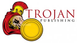
Just something I threw together. Image is from istockphoto.com and font is Trajan Pro. Colors could be change to your schools colors and school initials could be added to shield. It could also go B&W pretty easily.

TTE :)
 

Attachments

  • TrojanPub-COMP.jpg
    TrojanPub-COMP.jpg
    128.4 KB · Views: 140
Register on MacRumors! This sidebar will go away, and you'll see fewer ads.