Become a MacRumors Supporter for $50/year with no ads, ability to filter front page stories, and private forums.

Mildredop

macrumors 68020
Original poster
Oct 14, 2013
2,478
1,510
I left Apple/iOS because I got frustrated with its self importance and over emphasis on looking snazzy rather than being productive. Android has always felt less polished but much more sensible and logical.

But lollipop has totally ruined that for me.

- Losing the vibrate and silent options on the power button and replacing it with the 'priority' and 'none' business has got me totally confused. I'm now missing calls and texts because my ringer volume is often left low by accident.

- Calls and texts popping up on a banner is annoying because there's no way of clearing them once they've popped up - you just need to wait. And they're quite big banners so really get in the way. I much preferred the scrolling in the notification bar.

- The double pull down of the notification screen is irritating. For example, when changing the screen brightness, you now need to pull down, pull down, adjust, push up, push up. I'm sure it used to be pull down, adjust and then the notification screen would automatically disappear.

All the animations are also annoying. Everything now spins and whizzes around. It's too much. I hate the way whenever you touch a menu item, a ripple radiates from your finger. It's distracting.

It feels like it's gone back a few steps to me.
 

Dreday24

macrumors regular
Apr 30, 2012
121
24
two finger pulldown, goes straight to quick toggles, swiping up from the home button closes both panels
 

sviato

macrumors 68020
Oct 27, 2010
2,432
430
HR 9038 A
Hmm two of my friends have also mentioned that they're annoyed by Lollipop, though I didn't pay attention to details of their complaints.

I am annoyed by some iOS8 bugs though as well. Hopefully 2015 is the year of proper QA.
 

MRU

macrumors Penryn
Aug 23, 2005
25,370
8,952
a better place
Not on my phone!

1 finger swipe up closes mine and I've got a moto x 2014 too ? :confused:

edit : Just playing around - make sure your finger is below the notifications (close to the capacitive buttons) when swiping up with 1 finger and it will close all - if you do it on just the brightness section it contextually thinks you just want to hide that part of the panel.

Personally i'm liking lollipop a lot - however my issues

1 . yep we should have easier access to mute / silence / vibrate and maybe reboot option when pressing power button.

2. still annoys me that I can't change my lock screen picture independently from my home screen picture. Why on earth this is beyond Google baffles me.
 
Last edited:

Mildredop

macrumors 68020
Original poster
Oct 14, 2013
2,478
1,510
1 finger swipe up closes mine and I've got a moto x 2014 too ? :confused:

edit : Just playing around - make sure your finger is below the notifications (close to the capacitive buttons) when swiping up with 1 finger and it will close all - if you do it on just the brightness section it contextually thinks you just want to hide that part of the panel.

Personally i'm liking lollipop a lot - however my issues

1 . yep we should have easier access to mute / silence / vibrate and maybe reboot option when pressing power button.

2. still annoys me that I can't change my lock screen picture independently from my home screen picture. Why on earth this is beyond Google baffles me.

My phone doesn't have any capacitive buttons! So, to be clear, here's my series of events to change brightness:

- 2 finger swipe down
- Adjust brightness
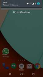
- 1 or two finger swipe (either has same effect) up from very bottom of screen (or below the bottom of the screen makes no difference) gives me the attached screen.
- Swipe up again to lose the notifications bar.

Yours works differently?
 

Attachments

  • Screenshot_2015-01-13-15-18-08.png
    Screenshot_2015-01-13-15-18-08.png
    1.5 MB · Views: 184

MRU

macrumors Penryn
Aug 23, 2005
25,370
8,952
a better place
My phone doesn't have any capacitive buttons! So, to be clear, here's my series of events to change brightness:

- 2 finger swipe down
- Adjust brightness
- 1 or two finger swipe (either has same effect) up from very bottom of screen (or below the bottom of the screen makes no difference) gives me the attached screen.
- Swipe up again to lose the notifications bar.

Yours works differently?


Sorry I meant on screen buttons.

Here we go to prove I'm not fibbing - just stuck a video on youtube.


I swipe down two fingers - it reveals whole notification area / controls

I swipe up 1 finger below the end of the notifications and it all closes

If you swipe up 'on' the controls - it only closes those controls. It's contextual.


Mildredop

macrumors 68020
Original poster
Oct 14, 2013
2,478
1,510
Sorry I meant on screen buttons.

Here we go to prove I'm not fibbing - just stuck a video on youtube.


I swipe down two fingers - it reveals whole notification area / controls

I swipe up 1 finger below the end of the notifications and it all closes

If you swipe up 'on' the controls - it only closes those controls. It's contextual.

YouTube: video

Here's my reply. I notice your toggle pane is much smaller than mine...
 
Last edited:

MRU

macrumors Penryn
Aug 23, 2005
25,370
8,952
a better place
Here's my reply. I notice your toggle pane is much smaller than mine...

https://www.youtube.com/watch?v=bMnRgbVWFww&feature=youtu.be

That is strange. Yeah your toggle area does seem bigger than mine ? You have an invert colours icon, was that something you added ?

Ok I just added that from accessibility - and that is the cause of the issue. Only problem is ... I disabled it and the icon still remains in my notification drawer... FECK!
 

Mildredop

macrumors 68020
Original poster
Oct 14, 2013
2,478
1,510
That is strange. Yeah your toggle area does seem bigger than mine ?

Figured it out. You need to swipe from below the toggle area. As mine is so large and inevitably has notifications below it (like in that video it had Connected as USB device), the pane is so large it falls off the screen.

I'm glad I've figured it out, but how rubbish that I will likely always need to double swipe.
 

MRU

macrumors Penryn
Aug 23, 2005
25,370
8,952
a better place
Another lollipop quirk - how to fix !!!

Ok to remove that irritating toggle - that you add to the notification menu you have to trick the phone into thinking you haven't used it for a month !!!

So set your date back 6 weeks manually - then use the toggle you want removed such as invert colours. Then simply tick automatic date in date/time to correct the time and make the phone think 6 weeks has passed without you using it - and hey presto stupid toggle has gone !


Seriously Google ? This is pure android ? I have to trick a device into removing an annoying toggle rather than simply having the ability to select and remove it ??????? Sometimes stock android can indeed be user unfriendly......
 

diamond.g

macrumors G4
Mar 20, 2007
11,443
2,673
OBX
Ok to remove that irritating toggle - that you add to the notification menu you have to trick the phone into thinking you haven't used it for a month !!!

So set your date back 6 weeks manually - then use the toggle you want removed such as invert colours. Then simply tick automatic date in date/time to correct the time and make the phone think 6 weeks has passed without you using it - and hey presto stupid toggle has gone !


Seriously Google ? This is pure android ? I have to trick a device into removing an annoying toggle rather than simply having the ability to select and remove it ??????? Sometimes stock android can indeed be user unfriendly......
It is supposed to be a smart toggle section where some controls show up or are removed based on usage, with no way to control it (which is annoying). I have found that swiping from the home button (on screen) consistently closes both panes.
 

Fernandez21

macrumors 601
Jun 16, 2010
4,840
3,183
For the sound, tap the volume up or down, then when the sound bar appears tap the bell and it will switch it to silent. To go back just do the same.
 

MRU

macrumors Penryn
Aug 23, 2005
25,370
8,952
a better place
It is supposed to be a smart toggle section where some controls show up or are removed based on usage, with no way to control it (which is annoying). I have found that swiping from the home button (on screen) consistently closes both panes.

For the sound, tap the volume up or down, then when the sound bar appears tap the bell and it will switch it to silent. To go back just do the same.

Thanks for tips guys. I still love android - but yeah do get a little annoyed with some of the workarounds on stock android. :)
 

Fanaticalism

macrumors 6502a
Apr 16, 2013
908
158
I left Apple/iOS because I got frustrated with its self importance and over emphasis on looking snazzy rather than being productive. Android has always felt less polished but much more sensible and logical.

But lollipop has totally ruined that for me.

- Losing the vibrate and silent options on the power button and replacing it with the 'priority' and 'none' business has got me totally confused. I'm now missing calls and texts because my ringer volume is often left low by accident.

- Calls and texts popping up on a banner is annoying because there's no way of clearing them once they've popped up - you just need to wait. And they're quite big banners so really get in the way. I much preferred the scrolling in the notification bar.

- The double pull down of the notification screen is irritating. For example, when changing the screen brightness, you now need to pull down, pull down, adjust, push up, push up. I'm sure it used to be pull down, adjust and then the notification screen would automatically disappear.

All the animations are also annoying. Everything now spins and whizzes around. It's too much. I hate the way whenever you touch a menu item, a ripple radiates from your finger. It's distracting.

It feels like it's gone back a few steps to me.

You can swipe them away.

Go into developer options and remove animations and transitions by reducing to 0.
 

El3ctronics

macrumors 65816
Mar 30, 2011
1,017
40
NYC
All the animations are also annoying. Everything now spins and whizzes around. It's too much. I hate the way whenever you touch a menu item, a ripple radiates from your finger. It's distracting.

Then you must truly HATE iOS with the zooming in and out of apps and the slow and elongated transitions with speeds that are not even customizable (like they are with Android).
 

Mildredop

macrumors 68020
Original poster
Oct 14, 2013
2,478
1,510
Then you must truly HATE iOS with the zooming in and out of apps and the slow and elongated transitions with speeds that are not even customizable (like they are with Android).

I haven't used iOS for three or four years, but yes, I found it all rather over the top. Subtle animations like the rubber band effect are cool and a great way of informing you you've come to the end of a list. But animations for animations sake just slow things down.
 

gotluck

macrumors 603
Dec 8, 2011
5,717
1,260
East Central Florida
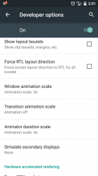
I recommend these animation settings, quickens them without getting rid of them entirely
 

Attachments

  • Screenshot_2015-01-13-14-01-50.png
    Screenshot_2015-01-13-14-01-50.png
    160.6 KB · Views: 179
Register on MacRumors! This sidebar will go away, and you'll see fewer ads.