Can't wait for square corners to become fashionable again, I believe the Fruit company reached peak brainrot regarding corner radius with this release.
Got a tip for us?
Let us know
Become a MacRumors Supporter for $50/year with no ads, ability to filter front page stories, and private forums.
macOS 26: All The Little Things
- Thread starter KoolAid-Drink
- WikiPost WikiPost
- Start date
- Sort by reaction score
You are using an out of date browser. It may not display this or other websites correctly.
You should upgrade or use an alternative browser.
You should upgrade or use an alternative browser.
- Status
- The first post of this thread is a WikiPost and can be edited by anyone with the appropiate permissions. Your edits will be public.
Added to the list. 👍
someone on this forum (sorry, don't remember who) suggested this might be in anticipation of newer macs with almost no bezels... perhaps that?Can't wait for square corners to become fashionable again, I believe the Fruit company reached peak brainrot regarding corner radius with this release.
Container is still in devellopment. Thohnb, what do you mean with performance? Are you talking about performance of the devellpoment system or the performance of ready to use containers? I think in both cases it is too early to say anything about it. Container has to be develloped further. But it is a very interesting peace of software and i am waiting to see how it devellops.
I have a question: You can now change folder colors. Is that separate from tags? Or do folders simply take on the color of the tag they're given? If yes, what happens if a folder has multiple tags, what color does that folder become?
In my experience with beta 1, changing the folder color is the same as changing the tag. That being said, customizing the folder with an icon is independent of any tags that may or may not be applied to the folder(s) in question.
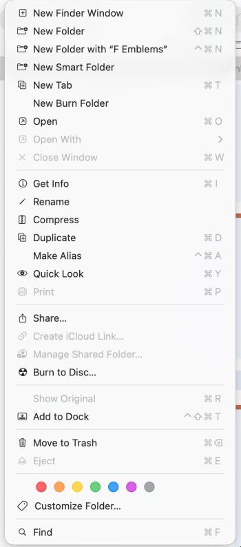
Changing the folder color/icon is simple and it already exists in the beta:Yes.
View attachment 2518596
I wouldn't mind, but not sure how to do it. Can someone help generate the Wiki?
Not sure. I'm struggling to figure it out. Perhaps not this beta release, maybe the next one? I see no obvious UI function that would allow for folder color/emoji changes.
1. Right click the folder
2. Choose: "Customize folder..."
3. Choose your options:
Really easy!
Yeah, I overlooked it for some reason. 🤷🏻♂️ neat feature for sure!Changing the folder color/icon is simple and it already exists in the beta:
1. Right click the folder
View attachment 2521948
2. Choose: "Customize folder..."
3. Choose your options:
View attachment 2521949
Really easy!
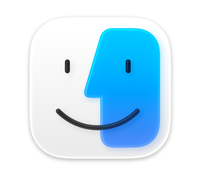
The ICNS inside the Finder.app bundle is the current (Sequoia) one so I don't know where the Beta 1 one lives. I got you a max zoom screenshot though.Can someone share the ICNS file of the Finder icon in System/Library/CoreServices/Finder.app before updating to beta 2? Apple massively changed the icon to reflect previous versions. I’d love to have the other one as an alt version.
Attachments
Whilst it is fixed in beta 2, they forgot about the dark mode iconThank you. Not my preferred approach to be honest.
I’ve seen this mockup by Michael Flarup (@flarup on X) that I much prefer:
View attachment 2520123
Thanks for the effort but won’t do me much good unfortunately.The ICNS inside the Finder.app bundle is the current (Sequoia) one so I don't know where the Beta 1 one lives. I got you a max zoom screenshot though.
After moving a Shortcuts dialogue window, subsequent dialogue windows will appear at its position rather than reset to the middle of the screen. This always bugged me, I’m glad they changed it!
I know it's picking nits but the one visual change I'm struggling with on Tahoe is the lack of a background or border for the menu bar. I just don't like how there's no shading or shadow between the text/icons and the wallpaper. I thought perhaps they could bring that back but give it the round edges on the top and bottom corners, like a giant version of the tab selector in a lot of the apps. It would feel more clean and official and not like something half finished. But maybe that'll be coming in another beta. Fingers crossed. They could also make it an optional setting if they want folks to have the choice.
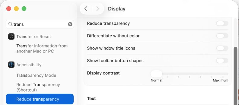
Added option in beta 2I know it's picking nits but the one visual change I'm struggling with on Tahoe is the lack of a background or border for the menu bar. I just don't like how there's no shading or shadow between the text/icons and the wallpaper. I thought perhaps they could bring that back but give it the round edges on the top and bottom corners, like a giant version of the tab selector in a lot of the apps. It would feel more clean and official and not like something half finished. But maybe that'll be coming in another beta. Fingers crossed. They could also make it an optional setting if they want folks to have the choice.
Can you have dark mode without the dark mode icons? I find them all ugly.
No it wasn’t. He’s replying to someone requesting at the minimum an old style menu bar (like the one in macOS Sequoia) instead of a fully transparent one. The option to bring that back, while preserving transparency system-wide, got added in beta 2 and wasn’t present in beta 1.
Last edited:
Yes you can. You just choose 'Default' icons in System Settings, and the icons will remain as the 'light' versions regardless of if Dark Mode is on.Can you have dark mode without the dark mode icons? I find them all ugly.
Added option in beta 2
Sweet! Gonna roll Beta 2 into a VM and check it out. ☺️
Register on MacRumors! This sidebar will go away, and you'll see fewer ads.


