Become a MacRumors Supporter for $50/year with no ads, ability to filter front page stories, and private forums.
Status
The first post of this thread is a WikiPost and can be edited by anyone with the appropiate permissions. Your edits will be public.
I think what everyone is saying is that the whole "glass" thing is completely 100% unnecessary, poorly conceived and implemented. A waste of time and effort. And horrendous from a UX/UI point of view. Did I get that right?
I’m reading a great book at the moment called Creative Selection by Ken Kocienda, who was an engineer at Apple during the early OS X days to the launch of iPad. The timing of this read really couldn’t have been better with the launch of Liquid Glass.

The book gives arguably one of the best insights into how the Apple of (now, sadly) old, early-to-late 2000’s, operated. One of the most spectacular take aways is in fact how unspectacular this era of Apple ran as a company, well before Apple Park, the trillions, and with a strong leadership team that cared only about doing the best in everything they were tasked with. Focusing on fewer things really well.

The company really did run like a startup, even down to the ‘demo’ conference room that was furnished with basic Formica tables, worn seats, tatty posters and stained whiteboards. It sounds ridiculous now, but things like this helped workers to keep their feet on the ground. They all knew that lavish furnishing didn’t solve problems, and it didn’t form inspiration. Problem solving and ideas often came from abrasive and bold discussions.

I particularly like reading of how there were generally two types of employee; those who took Jobs’ criticism of their work personally and feared him, and those who saw beyond the narcissism - almost to the point of humour - to challenge this guy and rough-out their best work. And this might be the real secret of Jobs’ success, not just his taste for design but the fact that he instilled a culture of snappy decision making and ruthless drive to for an employee to create their best work. Employees had a clear moral compass.

Not that anyone of us would see it from a PR angle, but I certainly cannot imagine Cook having this tenacity and aggression, and I feel that is the problem with Apple today and Liquid Glass is just one example of this.

They’ve realised that with the safety net of their trillions, their cringingly over-thought campus, and their culture of self-righteousness that they can dip their toes into practically any industry or concept and not have to be punished for failure. It may be to Cook’s credit that he realises he is not creatively inclined and has delegated leaders in various positions; but ultimately there is no evidence that he has full control, either because Apple has diluted its interests or because he trusts his senior leaders too much.

The clear goal with Liquid Glass was to unify all their platforms with a common theme and I continue to respect this vision: but the fundamental idea of using transparent, reflective, and low contrast materials for interfaces that must conform to a range of input methods - which for absolutely no reason mimic the properties of real life glass (aside from a pointless tech demo that has novelty factor for one week in September) - is one of the stupidest decisions I’ve witnessed from such a wealthy and resource rich business.
I cannot agree with this more! Well said. Things like this happen when people start believing their own BS. E G O.

"The clear goal with Liquid Glass was to unify all their platforms with a common theme and I continue to respect this vision: but the fundamental idea of using transparent, reflective, and low contrast materials for interfaces that must conform to a range of input methods - which for absolutely no reason mimic the properties of real life glass (aside from a pointless tech demo that has novelty factor for one week in September) - is one of the stupidest decisions I’ve witnessed from such a wealthy and resource rich business."
 
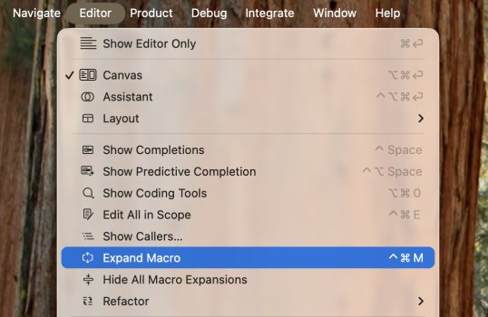
Seen this picture on twitter. Icons in menus goes into my s.h.itlist.
 

Attachments

  • GvqHm49bsAMagUX.jpeg
    GvqHm49bsAMagUX.jpeg
    87.9 KB · Views: 144
I subjectively think that the music and sound quality in the Tahoe is better than the Sequia. Could that be true? Other audio driver?
 
Tahoe might actually be the first OS design that I truly don't like. Full transparency has no place in a GUI. I don't mind the semi-transparent/frosted glass look of Sequoia, but this Tahoe interface looks like a hot mess and a complete dumpster fire to actually use.

Apple has a tendency to fix/change things late in the beta stages, so I suppose they could make adjustments that greatly improve things. But as it stands now, I don't see a single redeeming thing about the appearance of Tahoe.

Thankfully, I spend 90% of my time in software that don't use or respect Apple's GUI guidelines/defaults (Adobe and Microsoft Office apps, for example). Up until now, I always hated that about their interface, but with Tahoe I may actually be thanking them for sticking with their own interface.
 
You can no longer make Calculator walk by pressing command + control + S repeatedly.
I miss the ability to destroy someone's workflow by hitting shift + cmd + M repeatedly and the active window would minimize and restore in slow motion for like 15 minutes. Said person would never again forget to lock his/her Mac when getting a coffee or going to the restroom

Good times.
 
  • Like
Reactions: T'hain Esh Kelch
I miss the ability to destroy someone's workflow by hitting shift + cmd + M repeatedly and the active window would minimize and restore in slow motion for like 15 minutes. Said person would never again forget to lock his/her Mac when getting a coffee or going to the restroom

Good times.
Oh that thing still can be enabled i think.
 
Really, through a terminal command? Holding shift to slow down animations like minimize als Mission Control (Exposé) hasn't worked for multiple versions now.
 
I miss the ability to destroy someone's workflow by hitting shift + cmd + M repeatedly and the active window would minimize and restore in slow motion for like 15 minutes. Said person would never again forget to lock his/her Mac when getting a coffee or going to the restroom

Good times.
How immature and destructive. Couldn't you just wipe boogers all over their keyboard like most normal people?! 😬
 
  • Haha
Reactions: n-evo
In addendum, I still think those scrollbars are ugly and do not fit this aesthetic.
They are crying for aqua like in your avatar. Aqua w/ glass is so obvious at this point it is baffling to me why it isn’t there. Grey on white is so tired at this point. Those excess window borders are bloody awful to look at. A dedicated Mac team is needed like there is used to be before Mr. Penny Pincher “streamlined” executive teams.
 
Finder's new and ugly sidebar now looks like a tall capsule, terrible depending on your wallpaper. 😕
I am scared to even look at 26 because I think I would puke. And probably get vertigo. I am very UI/UX conscious. So far it is like a house of horrors, UI/UX wise. So entirely unnecessary.
 
Last edited:
I am scared to even look at 26 because I think I would puke. And probably get vertigo. I am very UI/UX conscious. So far it is like a house of horrors, UI/UX wise. So entirely unnecessary.
I'm sorry. I can't imagine how frustrating that must feel, hopefully the 'reduce contrast' and other settings helped. And for those laughing at your post... honestly? Be nice. It's valid to have sensitivities and be concerned about a new UI that might not be the best for those sensitivities. No need to laugh at, or minimize, their valid concerns. Thank you.
 
I'm sorry. I can't imagine how frustrating that must feel, hopefully the 'reduce contrast' and other settings helped. And for those laughing at your post... honestly? Be nice. It's valid to have sensitivities and be concerned about a new UI that might not be the best for those sensitivities. No need to laugh at, or minimize, their valid concerns. Thank you.
i think most of us are "UI/UX conscious"; but this is, really, pretty ridiculous: "I am scared to even look at 26 because I think I would puke".

it's the look of an OS, not a roller-coaster ride or some insane CGi in a marvel movie. 🙄

it's fine for people to not like it. it's reasonable to expect improvements over the course of the betas. but it's not the end of the world, the worst design ever, or a plan by the shadow government to confuse our brains; it's this years mac OS, and, as has always been the case, the complainers will move on, adapt... until the next big GUI change 🤔
I agree that it's reasonable to expect improvements/for people to not like it. However, I must admit, the UI is a teeny bit jarring to me, and I don't have any sensitivities. It's just a bit much, and it's a bit overwhelming to take in; it feels like such a drastic change to me. I'm sure I'll adjust, and grow, to like it, but I do understand where people are coming from. Glass/glossy/transparent UI's can be a lot to take in, and I do expect most people will get used to it, but I also can imagine some would not be able to stand the UI or even feel ill by all the effects. And that's okay! We're all different. I just want us to be supportive to all different perspectives and not belittle anyone.
 
I agree that it's reasonable to expect improvements/for people to not like it. However, I must admit, the UI is a teeny bit jarring to me, and I don't have any sensitivities. It's just a bit much, and it's a bit overwhelming to take in; it feels like such a drastic change to me. I'm sure I'll adjust, and grow, to like it, but I do understand where people are coming from. Glass/glossy/transparent UI's can be a lot to take in, and I do expect most people will get used to it, but I also can imagine some would not be able to stand the UI or even feel ill by all the effects. And that's okay! We're all different. I just want us to be supportive to all different perspectives and not belittle anyone.
fair enough. i feel ill with movement, and have always 'reduced motion' on my macs and iphones; so i get it. still, i think, if people give it time (as so many people ranted the second os 26 dropped), they'll all survive 👍
 
  • Like
Reactions: KoolAid-Drink
If they would just make the three colored dots bigger that would have solved 75% of the problems. And do not anyone tell me to use a keyboard. My hand is ALREADY on the mouse, why should I move it? One needs a damn electron microscope to access those effing dots F U Apple! I'll say it again, NO MAJOR change was/is necessary. It is all make work BS. Reeks of "big brother knows best".
 
  • Like
Reactions: JUMA55
Register on MacRumors! This sidebar will go away, and you'll see fewer ads.