Become a MacRumors Supporter for $50/year with no ads, ability to filter front page stories, and private forums.

tkermit

macrumors 68040
Original poster
Feb 20, 2004
3,586
2,921
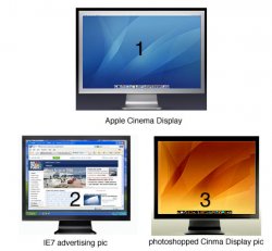
Internet Explorer 7 d o e s look best on a Cinema Display :-D .

Maybe Microsoft is cleverly hinting at the possibility of Windows running on Intel-Macs ?! Who knows...

v e r y clever changing the form factor and color like that... maybe leaving the Apple logo on there would have been nice....anyway: look at Microsoft advertising Internet Explorer 7 beta 2

:)

Do you have pictures of other companies arguably using Apple products in their ads ?
 

Attachments

  • Bildschirmfoto 2006-01-31 19-49-25.jpg
    Bildschirmfoto 2006-01-31 19-49-25.jpg
    154.3 KB · Views: 879

kwajo.com

macrumors 6502a
Jul 17, 2002
895
0
Bay of Fundy
hate to break it to you but that isn't a Cinema Display. It may have a similar pedestal, but it's different in too many ways to be called an Apple product
 

tkermit

macrumors 68040
Original poster
Feb 20, 2004
3,586
2,921
kwajo.com said:
hate to break it to you but that isn't a Cinema Display. It may have a similar pedestal, but it's different in too many ways to be called an Apple product

alright, so maybe it isn't, but it just looks awfully similar...
granted, that may be, because the Cinema Display design itself is so reduced to the simplest form possible, that it is quite easy to create an at least similar looking form very quickly...

They may or may not have used a picture of a Cinema Display as the starting point to create the picture from the advertisement...anyway, look at this attached pic, I just quickly photoshopped the cinema display, so you can see where I'm coming from
 

Attachments

  • comparison.jpg
    comparison.jpg
    65.9 KB · Views: 669

Josh

macrumors 68000
Mar 4, 2004
1,640
1
State College, PA
kwajo.com said:
hate to break it to you but that isn't a Cinema Display. It may have a similar pedestal, but it's different in too many ways to be called an Apple product

Which ways would those be?

Looks like an ACD to me.

I wouldn't be surprised if MS's webdesigners were Mac users, in which case a quick photo of their monitor would be taken and used for the site.

They wouldn't want it to be blatently identical to an ACD (this thread would have still existed either way lol), but a minor change would be in order.
 

Cooknn

macrumors 68020
Aug 23, 2003
2,111
0
Fort Myers, FL
It's definitely a Cinema Display. The hacked out some width, brushed out the Apple and painted it black. Sacrilege I tell ya :rolleyes:
 

freeny

macrumors 68020
Sep 27, 2005
2,064
60
Location: Location:
Cooknn said:
It's definitely a Cinema Display. The hacked out some width, brushed out the Apple and painted it black. Sacrilege I tell ya :rolleyes:
I agree. Although I'm pretty sure Microsoft didnt do it and may have been unaware of it. The advertising agency probably thought it looked best and used the photoshopped version. It is a very nice and clean design you've got to admit.
 

freeny

macrumors 68020
Sep 27, 2005
2,064
60
Location: Location:
tkermit said:
alright, so maybe it isn't, but it just looks awfully similar...
granted, that may be, because the Cinema Display design itself is so reduced to the simplest form possible, that it is quite easy to create an at least similar looking form very quickly...

They may or may not have used a picture of a Cinema Display as the starting point to create the picture from the advertisement...anyway, look at this attached pic, I just quickly photoshopped the cinema display, so you can see where I'm coming from
Hey tkermit, I visited Dusseldorf several years ago while on a job in Oberhaussen. I painted a mural outside the Planet Hollywood at Centro Oberhaussen. Is it still there? Oberhaussen was a bit depressing but Dusseldorf had some charm.
 

Cooknn

macrumors 68020
Aug 23, 2003
2,111
0
Fort Myers, FL
freeny said:
I agree. Although I'm pretty sure Microsoft didnt do it and may have been unaware of it. The advertising agency probably thought it looked best and used the photoshopped version. It is a very nice and clean design you've got to admit.
I'll admit that I like the silver 23" ACD on my desk! It looks a heck of a lot better running OS X too :D

OT: freeny what time does your commercial air during the Super Bowl?
 

freeny

macrumors 68020
Sep 27, 2005
2,064
60
Location: Location:
Cooknn said:
I'll admit that I like the silver 23" ACD on my desk! It looks a heck of a lot better running OS X too :D

OT: freeny what time does your commercial air during the Super Bowl?
Not sure, but it will be a commercial advertising the release of ESPN's new mobile phone. At the very end there will be a bumper of the phone on an all black screen. I did the motion graphics that will be playing on the phone. Approximately 6 seconds of fame:D

Im gonna talk with someone who will know what time cause im curious myself.
 

kwajo.com

macrumors 6502a
Jul 17, 2002
895
0
Bay of Fundy
all I meant was that while it may have been drawn (or photoshopped) with inspiration from the Cinema Displays, that is not the same as previous ads where it is clearly a person sitting using a TiBook running Windows XP or something to that effect. LCD monitors all look fairly similar and if you are bothering to make a black, non-widescreed version of the cinema display and photograph it from straight ahead, it can't really be considered using an Apple product in an ad.

to be fair though, you did nab a nice find by identifying the inspiration for that ad, good eye!
 

tkermit

macrumors 68040
Original poster
Feb 20, 2004
3,586
2,921
freeny said:
Hey tkermit, I visited Dusseldorf several years ago while on a job in Oberhaussen. I painted a mural outside the Planet Hollywood at Centro Oberhaussen. Is it still there? Oberhaussen was a bit depressing but Dusseldorf had some charm.

Wow, that's amazing - sounds very fun, too - I'm going to have to take a look at that next time I'm there (which is not very often). I haven't actually been there for a long time and only once before - I've never been to the Centro or Planet Hollywood, though.

I think cities like Oberhausen are changing at a rapid pace right now, lots of restructuring going on, the whole region is still in the process of changing from formerly being heavily coal-centered to relying on new-media and new technologies. Actually, Oberhausen as a whole is supposed to become a shopping-place mainly... But Duesseldorf is becoming t h e place to be, for advertising and media...and of course fashion - it's actually nicely developing.
 

freeny

macrumors 68020
Sep 27, 2005
2,064
60
Location: Location:
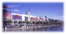
I did a quick picture search of the mural I painted. the bottom picture is small but you can see the mural painted on the cylendrical structure all the way to the left.

Judging by the more recent top picture you can see that the mural as well as Planet Hollywood are no longer there.:rolleyes:
 

Attachments

  • centro.JPG
    centro.JPG
    11 KB · Views: 893
  • oberhausen-centro-alex.jpg
    oberhausen-centro-alex.jpg
    52.7 KB · Views: 142

tkermit

macrumors 68040
Original poster
Feb 20, 2004
3,586
2,921
freeny said:
I did a quick picture search of the mural I painted. the bottom picture is small but you can see the mural painted on the cylendrical structure all the way to the left.

Judging by the top picture you can see that the mural as well as Planet Hollywood are no longer there.:rolleyes:

that's quite a lot bigger than I expected, must have looked great - so what is it exactly that you do ? I mean, apparently you also do some sort of animation work ?!

edit: nevermind, I just looked at your profile (Occupation:
Motion Graphics/Animation/Graphics) - so I guess you're just versatile :)
 

Chundles

macrumors G5
Jul 4, 2005
12,037
493
Is it just me or does putting the Back/Forward buttons and the address bar ABOVE the IE menu bar look utterly silly?
 

freeny

macrumors 68020
Sep 27, 2005
2,064
60
Location: Location:
tkermit said:
that's quite a lot bigger than I expected, must have looked great - so what is it exactly that you do ? I mean, apparently you also do some sort of animation work ?!

edit: nevermind, I just looked at your profile (Occupation:
Motion Graphics/Animation/Graphics) - so I guess you're just versatile :)
I worked for a design company that specialized in murals and coorporate interiors durring the 90s. I was pretty much assigned to Planet Hollywood. Worked on about 50 of them and traveled around the globe either supervising murals and installations or actually doing them myself or with a team. I have since moved on to computer aided design, motion graphics etc. Got REALLY tired of all the traveling if you can believe that.

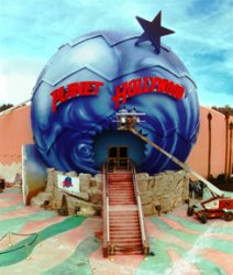
Not trying to float my own boat but im attaching a picture of my favorite mural I painted for PH. its located in Myrtle Beach SC. took me about 2 weeks to complete. I painted 4 or 5 similar globes some even bigger but this one was my fave. As you can see I got a little overspray on the left side. oops.

Sorry for moving off the subject:eek: Ill stop now
 

Attachments

  • ph-mb-.jpg
    ph-mb-.jpg
    43.5 KB · Views: 157

floyde

macrumors 6502a
Apr 7, 2005
808
1
Monterrey, México
Mike Teezie said:
It looks ridiculous!

I don't know why it looks so bad, but it just.....does.
Well the beta is out and it looks even worse on XP:eek: Creating new tabs is easy though. I'll post my full impressions later, for now a screenshot:
 

Attachments

  • ie7.jpg
    ie7.jpg
    91.9 KB · Views: 247

Chundles

macrumors G5
Jul 4, 2005
12,037
493
Christ that's ugly.


I mean really, really ugly. Talk about cluttered and confusing, GROSS!!
 
Register on MacRumors! This sidebar will go away, and you'll see fewer ads.