Got a tip for us?
Let us know
Become a MacRumors Supporter for $50/year with no ads, ability to filter front page stories, and private forums.
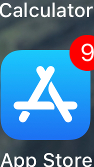
Mistake in new App Store icon
- Thread starter msephton
- Start date
- Sort by reaction score
You are using an out of date browser. It may not display this or other websites correctly.
You should upgrade or use an alternative browser.
You should upgrade or use an alternative browser.
This is a really interesting find, good stuff @msephton. The type of basic mistake that manifests into bigger design issues.
Yes it seems to be OK on Plus devices? I've not been able to check one myself, however I downloaded firmware for the Plus devices and the problematic icon is in present.Here is a bummer for you.
I don’t see what you see on my iPhone 6s Plus. I tried zooming in. Tried carefully seeing the icon, but still, no sign of wrong pixels.
I am all good.
It’s normal on my iPad Pro 10.5” on the latest beta. My 7+ is still on iOS 10.3.3, so I can’t confirm on it.
Wow. Somebody at Apple should be drawn and quartered. How in the world was this ever allowed to happen? Fire the QA wonk that passed this one. /s
View attachment 715216
Hardly anything to get your panties in a wad about. *sigh*
Now THAT is an emoji I finally like! Love it.
Cool observation! Apple would do That still not as bad as Apple maps:

But i think the new iOS 11 App Store icon is a mistake all together, too
Lol I recall this one. Maps is a screwed up practice no matter who is creating it: Apple, Google, Uber (especially), and even the first mobile player Nokia and their purchased Nantis.
It's guys like our bread starter that helps us truely love our iOS devices and see that quality is a paramount to end user experience vs just specs on Android. Android N still looks like a Fischer Price speak and spell with heir icons yuck!
Bulge is still there in GM.
Interestingly it's not there on the iPhone X promotional pages.
And the iOS 11 page still features the old App Store icon.
Interestingly it's not there on the iPhone X promotional pages.
And the iOS 11 page still features the old App Store icon.
I'm thinking the same thingShhhhh... Let’s see how long we can ride this wave!
It's OK on Plus, iPad and TV.Really don't see it on my 7 plus..
It's bad on all other devices.
To be fair, they intended for that route to mean get onto 280 and continue. If they would've included the marks for the exits on 280 it would've looked odd thanks to them being different sizes, and it just wasn't necessary and would've looked odd to any average consumer.Cool observation! Apple would do That still not as bad as Apple maps:
But i think the new iOS 11 App Store icon is a mistake all together, too

God I've missed this thread so much; I've got that bulge and I cannot lie.
11.1 dev beta 1 has the bulge
It that really even a thing? I certainly way more important things in my life to concern myself with rather than whinge about a perceived flaw in an iOS icon. (And no, I don't see a problem with the icon, either)...
Dwfaust You just don’t get it. You’ll never understand us!It that really even a thing? I certainly way more important things in my life to concern myself with rather than whinge about a perceived flaw in an iOS icon. (And no, I don't see a problem with the icon, either)...
Bets on what? On this continuing to not be a thing?11.1 beta 5 and the bulge is still there.
Shall we place our bets?
Bets on how long until this is corrected.
It's definitely a thing. And it's irrelevant whether or not you think it is.
It's definitely a thing. And it's irrelevant whether or not you think it is.
Register on MacRumors! This sidebar will go away, and you'll see fewer ads.