Become a MacRumors Supporter for $50/year with no ads, ability to filter front page stories, and private forums.

GollumBoy

macrumors regular
Original poster
Jan 31, 2010
113
0
Chesterfield, UK
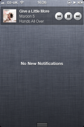
One thing I've wished for with iOS5 is a nice widget for the music app.
Instead of double tab and swipe. Yeh thats okay, but just shows the song title - nothing else. No cover art, no artist/album etc.

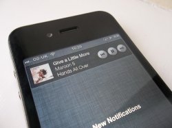
I have quickly mocked this image up as a possible concept if Apple were indeed to make a music app widget.

Please comment :)

Edit: Added a on phone image.
 

Attachments

  • ios5-music-player-widget.png
    ios5-music-player-widget.png
    949.3 KB · Views: 264
  • ios5-music-player-widget-phone.jpg
    ios5-music-player-widget-phone.jpg
    913.2 KB · Views: 194
Last edited:

kolax

macrumors G3
Mar 20, 2007
9,181
115
I'd just like Widgets in general to be allowed by Apple.

Being able to adjust brightness via a widget, check sport results etc would be great. Especially if some widgets can even be put onto the lock screen.
 

nburwell

macrumors 603
May 6, 2008
5,556
2,459
DE
Very nice. I would love to see Apple implement this in a future iOS release using your concept.
 

kolax

macrumors G3
Mar 20, 2007
9,181
115
I wish Apple would just combine the multi-tasking bar and notification centre into one, and have it accessible by double-tapping the home button.
 

DaLurker

macrumors 6502
Mar 30, 2006
364
0
I wish Apple would just combine the multi-tasking bar and notification centre into one, and have it accessible by double-tapping the home button.

That sounds like a good idea.The widget for the Music app is also great.

Apple please improve your multi-tasking/widgets!
 

Small White Car

macrumors G4
Aug 29, 2006
10,972
1,468
Washington DC
I'd like these, but Apple needs to figure out how they want to deal with swiping through multiple pages of widgets. (Or hopefully something better than that.)

Because I'd fill mine up FAST and I have no desire to scroll down for 10 pages of cool widgets.
 

kolax

macrumors G3
Mar 20, 2007
9,181
115
I'd like these, but Apple needs to figure out how they want to deal with swiping through multiple pages of widgets. (Or hopefully something better than that.)

Because I'd fill mine up FAST and I have no desire to scroll down for 10 pages of cool widgets.

Yeah, then there'd be a dilemma over whether widgets are replacing apps, and if you have pages and pages of apps, and pages and pages of widgets, how those join together in the UI.

I personally think that we should have a live widget display as the home screen, and applications accessible from a folder. I know this will look like Apple is copying others, but having just pages of icons is no longer good..

Live widgets are the way forward.
 

Small White Car

macrumors G4
Aug 29, 2006
10,972
1,468
Washington DC
Yeah, then there'd be a dilemma over whether widgets are replacing apps

I am absolutely certain that Apple will require future widgets to have an app installed to back them up.

Just like now, the notifications only come in if you have the app. You can't have Facebook notifications without the Facebook app. Likewise, you wouldn't be able to get a Facebook widget without having the app on your phone.

Yes, I think you're right that Apple wouldn't want widgets pushing apps off the phone.
 

ramsescabello

macrumors newbie
Nov 8, 2011
14
0
I think this will be too much. We already can change songs as you say, double click the home button and swipe, or when is blocked, just double click the home button and use the controls. I don't need to see the Cover Art of the song I'm listening to anytime I need to change a song.

Anyway, I think you did a good job with the mockup ;) congrats.

xx
 

GollumBoy

macrumors regular
Original poster
Jan 31, 2010
113
0
Chesterfield, UK
I think this will be too much. We already can change songs as you say, double click the home button and swipe, or when is blocked, just double click the home button and use the controls. I don't need to see the Cover Art of the song I'm listening to anytime I need to change a song.

Anyway, I think you did a good job with the mockup ;) congrats.

xx

Thanks :) However widgets are optional. I've turned of the stock market widget. It's up to the user then.

Other reason to have as a widget is my home button doesn't always work due to over use! Out of warranty now too so can't get a replacement.
 

Xgm541

macrumors 65816
May 3, 2011
1,098
818
I keep my music app on my bottom dock so accessing the notification center or pressing the icon at the bottom are the same for me.
 

Thetonyk123

macrumors 68000
Aug 14, 2011
1,627
1
Earth
Thanks :) However widgets are optional. I've turned of the stock market widget. It's up to the user then.

Other reason to have as a widget is my home button doesn't always work due to over use! Out of warranty now too so can't get a replacement.

I disabled bot widgets, because I found they drain battery quicker.
 

MotoMaster

macrumors newbie
Jan 24, 2010
8
0
Very nice purposed setup. That would be a great addition to iOS 5. I tip my hat to you good sir!
 

BHP41

macrumors 6502a
Jul 21, 2010
834
2
United States of America
Nice looking mockup.

What if the notification center had pages? Like intelliscreen X. That I see is a way to organize the widgets that you want and leave the first page as your notifications. It would be more like dashboard with pages then.
 

APlotdevice

macrumors 68040
Sep 3, 2011
3,145
3,861
I wish Apple would just combine the multi-tasking bar and notification centre into one, and have it accessible by double-tapping the home button.

I agree with combining them, but only so that the double-tap can be *eliminated*. This way there would be less wear on the home button.
 
Last edited:

BergerFan

macrumors 68020
Mar 6, 2008
2,170
63
Mos Eisley
I wish Apple would just combine the multi-tasking bar and notification centre into one, and have it accessible by double-tapping the home button.
That will destroy your home button!
Have everything in Notification Center, yes, but keep the swipe gesture.
 

kolax

macrumors G3
Mar 20, 2007
9,181
115
That will destroy your home button!
Have everything in Notification Center, yes, but keep the swipe gesture.

You don't double tap all the time anyway to access the multitask bar?

I fail to see how this would add on any "wear" to the home button than the multitask bar already does..
 

APlotdevice

macrumors 68040
Sep 3, 2011
3,145
3,861
You don't double tap all the time anyway to access the multitask bar?

I fail to see how this would add on any "wear" to the home button than the multitask bar already does..

Because as well as switching apps and controlling your background music, now you would also have to double tap every time you want to check your notifications. That equates to more wear. Possibly many times more, depending on how often one checks.
 
Register on MacRumors! This sidebar will go away, and you'll see fewer ads.