I've never really messed around with Photoshop before but I needed to design a cover for work so I thought I would download the trial version. This is what I've come up with so far. Please tell me if it's terrible. Is there anything I could do better? I wanted to keep it pretty simple and professional looking. Thanks in advance.
Got a tip for us?
Let us know
Become a MacRumors Supporter for $50/year with no ads, ability to filter front page stories, and private forums.
My first try with Photoshop
- Thread starter bowens
- Start date
- Sort by reaction score
You are using an out of date browser. It may not display this or other websites correctly.
You should upgrade or use an alternative browser.
You should upgrade or use an alternative browser.

I think it's like a little plain for some stuff but for its intended use I think it very very awesome
For a first attempt, it's not bad. Everyone has to start somewhere.
Now, just because I have to put an end to this before you do it again...I'm sorry...but papyrus sucks!
Never use that font again!
In fact, go and delete it from font book right now!
Ok, that was a little over dramatic, but I really hate that font, so much.
Now, just because I have to put an end to this before you do it again...I'm sorry...but papyrus sucks!
Never use that font again!
In fact, go and delete it from font book right now!
Ok, that was a little over dramatic, but I really hate that font, so much.
bowens said:I've never really messed around with Photoshop before but I needed to design a cover for work so I thought I would download the trial version. This is what I've come up with so far. Please tell me if it's terrible. Is there anything I could do better? I wanted to keep it pretty simple and professional looking. Thanks in advance.
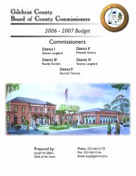
it's good work, but the layout is a little inconsistent. I re-worked in Photoshop a bit, just fixing alignment and scaling to my liking. It might work a little better for you...
Attachments
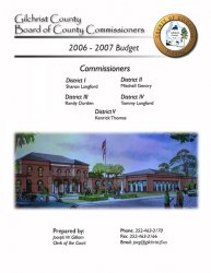
Thanks for all of the advice. I will definately try and straighten things up a little bit. You guys don't like that font. I kind of liked it. What font do you think would be appropriate there and I'll give it a try?
Edit: I should explain why I like the font. We live in a very small county (the smallest population wise in FL). It's very country and I thought this font had a nice rustic look to it.
Edit: I should explain why I like the font. We live in a very small county (the smallest population wise in FL). It's very country and I thought this font had a nice rustic look to it.
bowens said:Thanks for all of the advice. I will definately try and straighten things up a little bit. You guys don't like that font. I kind of liked it. What font do you think would be appropriate there and I'll give it a try?
Edit: I should explain why I like the font. We live in a very small county (the smallest population wise in FL). It's very country and I thought this font had a nice rustic look to it.
The main beef I have with that font is every designer starting out gravitates to it an thus it gets way over used in things like this. I can spot it on about 5-6 business during my bus ride using nothing more than their name in that font as their logo. Yeah, it's simple & er 'pretty' but it's over used and to me at least, it screams amateur.
Start looking for it, and I'm sure you'll find it quite often too. Trust me when I say this is one of those things you want to drop, a couple of years from now you'll look back at this font and go "eww!"
dornoforpyros said:Start looking for it, and I'm sure you'll find it quite often too. Trust me when I say this is one of those things you want to drop, a couple of years from now you'll look back at this font and go "eww!"
Thanks. I'll start looking around for it. It sounds like it's everywhere. I guess I never noticed it because I wasn't looking for it.
bowens said:I guess I never noticed it because I wasn't looking for it.
you'll notice it, haha. I always see it used on local commercials and lots of church flyers and signs, especially around Christmas time.
don't feel bad tho, like dornoforpyro said a lot of people really like the font at first and I admit that I was also one of those people four or five years ago using it for everything!
here are some free rustic-looking fonts i found for you to look at, all from the same type designer, Dieter Steffmann:
http://www.dafont.com/roman-antique.font
http://moorstation.org/typoasis/designers/steffmann/samples/p/packard.htm
http://moorstation.org/typoasis/designers/steffmann/samples/p/powell.htm
http://moorstation.org/typoasis/designers/steffmann/samples/c/caslonant.htm
vicki2314 said:you'll notice it, haha. I always see it used on local commercials and lots of church flyers and signs, especially around Christmas time.
Ditto! it screams "Holy Church of God Rummage Sale This Saturday!" hehe
dornoforpyros said:Ditto! it screams "Holy Church of God Rummage Sale This Saturday!" hehe
lol, exactly!
I noticed a few other things when looking at the flyer-
be careful not to overuse italicized fonts as it makes things harder read, such as your contact information at the bottom. I'd also un-italicize (is that a word?) "Commissioners" as it competes too much with your districts and maybe even "2006-2007 Budget," but as it stands I don't really mind it too much as long as you change "Commissioners". Italic and bold should always be used in small doses. If you'd like to learn some basic typography I recommend "The Mac is Not a typewriter" by Robin Williams. Great for beginners, the book is inexpensive and if you're lucky it may even be in your local library and should be available at both Barnes & Nobles and Borders. "The Non-Designer's Design Book" by Robin Williams is excellent as well and will help you out on layout and basic design techniques along with basic typography. Here are links for both from Amazon.
http://www.amazon.com/gp/product/0201782634/ref=pd_lpo_k2_dp_k2a_2_img/103-5735379-9575813?ie=UTF8
http://www.amazon.com/gp/product/0321193857/ref=pd_bxgy_text_b/103-5735379-9575813?ie=UTF8
Also, I think the illustration is too dark. you can lighten it up using a number of different ways but I'd start of by using "Levels" first under Image->Adjustments. To fine-tune, I love using Curves. You can also access these controls by creating a new "adjustment layer" marked by a circle divided half black/half white at the bottom of the layers palette. I recommend using an adjustment layer because it wouldn't alter your original photo and you can always throw away the layer or add new ones.
Great job for your first try at Photoshop! The program can be very overwhelming at first and I hope you'll continue to use it and just play with all its features!
As an Amazon Associate, MacRumors earns a commission from qualifying purchases made through links in this post.
vicki2314 said:Also, I think the illustration is too dark. you can lighten it up using a number of different ways but I'd start of by using "Levels" first under Image->Adjustments. To fine-tune, I love using Curves. You can also access these controls by creating a new "adjustment layer" marked by a circle divided half black/half white at the bottom of the layers palette. I recommend using an adjustment layer because it wouldn't alter your original photo and you can always throw away the layer or add new ones.
Great job for your first try at Photoshop! The program can be very overwhelming at first and I hope you'll continue to use it and just play with all its features!
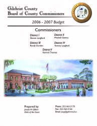
I definately agree about the image being too dark. I printed this out and it was all shaded blue. I lightened the image up, straightened some things up and changed a couple fonts. How's it look now?
Attachments
bowens said:I definately agree about the image being too dark. I printed this out and it was all shaded blue. I lightened the image up, straightened some things up and changed a couple fonts. How's it look now?
The image looks a hundred times better and really improves the entire document!
I like the font change for "Gilchrist County..." but I liked the original drop shadow as it was more subtle. Maybe you can even change the direction of the shadow to match the county seal (is that what you call it?) so they'd have the same light source.
Nice job!
EDIT: Actually, the more I look at it the more the drop shadow seems to be going in the same direction as the seal... not entirely sure though
vicki2314 said:The image looks a hundred times better and really improves the entire document!
I like the font change for "Gilchrist County..." but I liked the original drop shadow as it was more subtle. Maybe you can even change the direction of the shadow to match the county seal (is that what you call it?) so they'd have the same light source.
Nice job!
EDIT: Actually, the more I look at it the more the drop shadow seems to be going in the same direction as the seal... not entirely sure though
Yeah, both of the drop shadows are going in the same direction.
bowens said:Yeah, both of the drop shadows are going in the same direction.
very nice...
those two lines that go across the top of the document...if the bottom line isn't going to be covered by the county seal graphic, then the line should probably go all the way to the edge of the page. It just kind of stops for no apparent reason...it's a little disconcerting.
beatsme said:very nice...
those two lines that go across the top of the document...if the bottom line isn't going to be covered by the county seal graphic, then the line should probably go all the way to the edge of the page. It just kind of stops for no apparent reason...it's a little disconcerting.
You know, I really didn't know what to do with that line. This was the best I could come up with, but I will try a line all the way across. I really didn't want a solid line. I wanted it to kind of fade out, but I'll try it. I just want something that will look good with the top line.
something like this...
I just think having the line go all the way across, even if it fades, makes the design a little more cohesive...
I still think that county seal should scoot down a little so it will cover the lower line, but whatever makes you happy
bowens said:You know, I really didn't know what to do with that line. This was the best I could come up with, but I will try a line all the way across. I really didn't want a solid line. I wanted it to kind of fade out, but I'll try it. I just want something that will look good with the top line.
I just think having the line go all the way across, even if it fades, makes the design a little more cohesive...
I still think that county seal should scoot down a little so it will cover the lower line, but whatever makes you happy
Attachments
It looks a lot better than your first. My motto is that just because you have 100 fonts on your computer, it does not mean you need to use all of them on one project.bowens said:I definately agree about the image being too dark. I printed this out and it was all shaded blue. I lightened the image up, straightened some things up and changed a couple fonts. How's it look now?
PS, that font in the first one should die a horrid death with comic sans.
jessica. said:My motto is that just because you have 100 fonts on your computer, it does not mean you need to use all of them on one project.
I've only used two fonts on this. Powell Antique at the top and Gill Sans for everything else. Also, I tried moving the seal down and I don't think I like it as much lower. See what you think.
Attachments
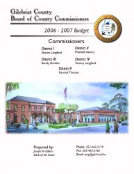
bowens said:I've only used two fonts on this. Powell Antique at the top and Gill Sans for everything else. Also, I tried moving the seal down and I don't think I like it as much lower. See what you think.
at the risk of waving my ego around, check out my earlier post with the attached thumbnail. I moved the seal down enough that the bottom of it just crosses the lower line. I kinda like it there. But, that's my opinion. If you're happy with where you had it to begin with, then that's where it should stay.
Register on MacRumors! This sidebar will go away, and you'll see fewer ads.