I've really enjoyed reading through this thread. I bought a black HTC One several weeks ago. I did so primarily because I was bored with my iPhone and wanted to see what Android was all about. For whatever its worth, here's my take. Mind you, some of my observations have little to do with the HTC One and/or Sense UI; they are specific to Android OS phones in general.
Also, I should preface myself by saying that I am not trolling. Feel free to read through one of my many posts throughout the years I've been on this site. I have a 15" Retina Display MBP, iPad Mini and Apple TV. I have also owned every model of iPhone since standing in line for the better part of a day when they were first released. I am essentially an Apple guy.
Anyway. Here's where I'm at with this HTC One.....
Strengths:
- Outstanding build. I love the look and feel of the HTC One. Dare I say it looks
like something Apple may have built? One of the problems I've had with Android phones is the build quality. I'm not down with the plastic on the S4 and the glittery black on the back of the Nexus 4. Stuff like this make a phone look cheap IMO.
- 4.7" display. .....most of the time. When I'm not driving, I love the 4.7" display. The extra real estate makes using this phone more enjoyable. That said, there are those times when I'm driving around that I wish I had a 4' display.I'm wondering what this phone would be like at 4.5"?
- Speakers rock! The dual speakers on the One are arguably the best speakers on any phone available.
- BlinkFeed. Love it. Love it. Love it. I am coming to find that BlinkFeed is either a love or hate relationship but include me in the "love it" camp. What can I say. I'm a news junkie and BlinkFeed is like heroin. "Nuff said. For those of you that don't like it, I can foresee an update from HTC that provides the ability to disable it.
- Lock Screen. I like the option of having different types of lock screens (wallpaper, productivity, photos, music or none). I also like being able to pull down my notifications menu from the lock screen.
- Home screen. BlinkFeed, time and weather. Perfect. Simply perfect. By the way, the weather app is cool and seems to be pretty darn accurate.
- Notifications. I'm sure that part of this has to do with the larger display but notifications are clearly displayed and the ability to swipe individual notifications off the screen is a nice feature.
- Customization. This is a really broad topic but Android devices are *obviously* much more customizable. From live wallpapers to widgets, you can make your phone truly *your* phone. My current setup is as follows. Screen 1 is obviously Blink Fee. Screen 2 has a calendar widget and various toggle widgets including Brightness, Wi-Fi, Hotspot and Sync All. Screen 3 has sticky note widgets. That's it. That's my setup. Where are the app icons? Read the next item. By the way. Don't like my setup? No problem. Create your own. That's part of the beauty of Android OS. .....and no. Moving an app icon from one screen to another on your iPhone is not customization.
- App drawer. One of my biggest complaints about iOS is that when you download an app, the icon for said app will populate to one of your screens. There is no way around this. Sure, you can put 'em in folders or whatever but the reality is that they are still there. The problem with this is that my iPhone is littered with app icons. Three pages of app icons. Yucky. Messy. Cluttered. On my One, I simply depress the center app drawer icon on my dock and there they are all in glorious alphabetical order. Brilliant. Simply brilliant. Furthermore, I can choose "Hide Apps" from within settings and have seldom used apps not even show up in the app drawer. This app drawer thing is *huge* for me as I am an organizational freak.
Weaknesses:
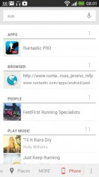
- No universal search feature. You can't blame this on Android devices 'cause Apple has a patent on it so they are between a rock and a hard place but I do miss this feature.
- Google Play. Don't get me wrong, Google Play gets the job done. It really does. That said, after using it for a couple weeks you see the advantage of having apps pass a stringent approval process. A lot of the apps in Google Play are utter crap and should be pulled immediately. Not to mention those apps that do nothing more than litter your notification center with ads.
- Camera. I think HTC could have knocked this ball out of the park if they had included a better camera. It's simply not up to par with the iPhone camera. Furthermore, good luck texting or emailing one of those HD videos you take. Can't be done because the file size is too big. IMO this is the One's weakest link. If there is any redeeming quality, it is the Zoe. The way the One takes your stills and Zoe's and puts them into an event that automatically produces a 30 second video complete with sound and effects is awesome.
That's all I can think of for now. The bottom line for me is that the pluses outweigh the minuses so for now I'm sticking with the HTC One.
Great reading, and nice to see you' re enjoying Android and one of it's newest flagships:thumbup:


