Become a MacRumors Supporter for $50/year with no ads, ability to filter front page stories, and private forums.

Mantat

macrumors 6502a
Original poster
Sep 19, 2003
619
0
Montréal (Canada)
Hi all,

I have completed the first design / code pass of my web site, http://megapixelicio.us and it is now time to get some feedback from the users.

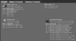
The site is targeted at photographer who wants to sell-buy used gear. So unless you understand the mechanics and wording of the photography world, you might get a bit lost for some stuff.

But still, I would really like to have some feedback on about everything (typos, bad grammars, wrong specs on lens, suggestions)! It is currently hosted on an old G4 so performance are not that great (sorry!). Feel free to pass the link to any of your photographer friends!

you can provide feedback and ideas at megapixelicious@gmail.com

Thanks a lot!
 
  • Site looks pretty good overall.
  • Home page, right side box "Megapixelicio.us?" the heading is off alignment with the description text below it, would look nicer if it did.
  • Bulleted items, the bullet looks a little higher than it should be. Likely a CSS thing, I've run into it.
  • Bottom right of page, there's two little icons, which I can tell have tooltips associated with them, but since the icons are at the bottom of the page you can't read them with scrolling down after they have appeared. Likely have to give the bottom of the page some extra margin or padding to resolve that.
  • Some of the text is a little small my liking (using MacBook w/ 13" screen).
  • On Gear Database page: The light gray link text on the light gray background is very hard to read. I'd darken the background.
  • The Glossary/References page the terms are listed in reverse alphabetical order. You really should list them in alphabetical order.
  • Search page, white text on light blue background is very hard to read.
  • The buttons on forms look very faded.
  • There seems to be a lot of JavaScript attached to the pages, but it doesn't get used much. You should make sure to only attack JavaScript files to pages that need them, otherwise it's a waste of bandwidth for users visiting and can increase page load speeds.
  • I like the various text styles you use, helps break up the sections.
  • Colors work well except where already mentioned for contrast issues.
 
Site looks good at first glance. The above poster already listed a few changes, especially about font size and color. The rest looks good.
 
Thanks a lot for your feedback!

I am aware of some of these CSS glitches, problem is that I am a coder, not a styler so the know how to fix these elude me.

As for the size of the text, I am really having a problem picking the right size since I have a huge monitor (23'' ACD). I will see what I can do.

Also, if someone could tell me how to fix the CSS bug in Safari for the search results. When you mouse over the result, there should be a loupe only in the first cell (as in Firefox) but it shows up in every cells in Safari. How can I fix that?

The CSS layout I used is a premade CSS template that I heavily modified. I still have to put the about page to give credit to the guy, as with some of the icons that come from iconbuffet.com.

As you can see, this is still a work in progress, hence my appreciation of your feedback!

  • Site looks pretty good overall.
  • Home page, right side box "Megapixelicio.us?" the heading is off alignment with the description text below it, would look nicer if it did.
  • Bulleted items, the bullet looks a little higher than it should be. Likely a CSS thing, I've run into it.
  • Bottom right of page, there's two little icons, which I can tell have tooltips associated with them, but since the icons are at the bottom of the page you can't read them with scrolling down after they have appeared. Likely have to give the bottom of the page some extra margin or padding to resolve that.
  • Some of the text is a little small my liking (using MacBook w/ 13" screen).
  • On Gear Database page: The light gray link text on the light gray background is very hard to read. I'd darken the background.
  • The Glossary/References page the terms are listed in reverse alphabetical order. You really should list them in alphabetical order.
  • Search page, white text on light blue background is very hard to read.
  • The buttons on forms look very faded.
  • There seems to be a lot of JavaScript attached to the pages, but it doesn't get used much. You should make sure to only attack JavaScript files to pages that need them, otherwise it's a waste of bandwidth for users visiting and can increase page load speeds.
  • I like the various text styles you use, helps break up the sections.
  • Colors work well except where already mentioned for contrast issues.
 
An advice would be to use gif on some images which needs transparency settings, there is still a number of users using IE6, I am not one of them of course.
 
The site's not bad, but my initial, 100ms reaction when I got to the home page was that there was just too much text. When you see that much writing it just puts you off wanting to read it.

However if you added some photos (which shouldn't be hard considering you're trading photographic equipment!) to disperse / section out the text then it would definitely make it easier on the eye. And best of all you could keep the amount of text more or less the same.

You could also try and counterbalance the whole grey/white theme going on throughout the site which feels quite "intense" with all the text by adding some more colour / photos / images. Obviously remember everyone has a different opinion so the more feedback you get the better. But that was my honest take on it and I hope it helps! :)

Oh and in Internet Explorer 7 in Windows XP, there seems to be some weird positioning problem going on on the /products page:
 

Attachments

  • mega.JPG
    mega.JPG
    19.2 KB · Views: 380
PNG: I will have to convert some png to gif... I dont know why but I was sure that I already did it for most pics, seems like not :-S

As for spreading some pics between paragraphs, it is a good idea. For me it seemed ok but now that you said it I have to agree! Probably because I stared that page for too long! Now I just have to find some pics that make sens...

AS for the big JS files, these are used all around the site so I wanted to make them load on the first page to speed up browsing afterward but I understand how it could turn out some people. I will see what I can do about them.

Finally, for the IE7 bug, this is gonna be had to fix since I dont have access that browser (or OS! )

Let seen how many fixes I can include in tonight patch!

Keep the feedback coming!
 
Sorry if it was mentioned, I only glanced through. The Recent posts area - the text is blurred slightly for me.

I think the login and register buttons at the top would look better with the darker background, they stand out - oddly.

Oh and your CSS and xHTML is not valid.

p.s I saw the top of your stylesheet, made me lol. lol.
 
Btw, anyone has a rule of thumb how how big should be the landing page (in kb)?

I have managed to shrink the various JS to about 30-40k and wonder if it is enough.
 
also the home and search pages are too short content wise so the black doesn't extend to the bottom of the window for me. try adding this to your CSS: body {background-color: #000; }
 
Worked a lot on Angelwatt comments and some of the others.

Decreased the size of the JS files from 225k (!) to about 70k and that is going down to about 30k once I get GZIP working. So I think we can call that issue solved.

I did a lot of work on the home page and I would love to get some feedback about it.

Also increased the size of the products on the catalogue page. I hope it is more readable now on smaller screen (please confirm!) but I dont want to play too much with the color because I want to maintain consistency with the rest of the site.

Finally, did a few tweeks (mouse over on the contact icons, alpha order for tags, etc... ).

Left to do: convert more PNG to GIF (annoying to do with SVN) and improve the look of the buttons in forms (especially the top login forms). So keep the suggestion coming! Especially about the usability and real world use of the app (if you are planing to buy - sell photographic gear online!).

Thanks all for the great feedback so far!
 
  • Changes look good.
  • The slightly larger font size is doing good on my 13" screen.
  • On the News pages, the date line for entries is rather aliased (jagged). Not sure if it's the size of the text or the font family, but looks ugly in comparison to surrounding text.
  • I'd probably increase the line-height (line spacing) of pragraphs. Looks to be about 1 currently, I'd say 1.1/1.2 would help with readability a touch.
  • There really isn't much reason to use a XHTML 1.1 DOCTYPE since it's suppose to be served as application/xhtml+xml rather than text/html, and IE (of course) doesn't support that. XHTML 1.0 should be fine, and that'll help a little bit with getting the pages to validate. Most of the errors should be really quick fixes too from the looks of them.
  • The CSS errors that come up are easy fixes too.
  • Still not digging that background color on the Gear Database and Search page. It gives it a faded look, and most of the site has a more crisp look.
  • On the register page, when you have a part not filled in and it gives the error messages in blood red, that red really vibrates with the background. I'd lighten it up a bit.
  • A minor detail, on the home page there's a link in blue, which is easy to see, but when you mouse over it doesn't change color or anything (sure the mouse cursor changes). All of your other links change in some fashion when you mouse over so this one should too. It's the only link of its kind on the site that I saw, which is a bit strange in itself, but I noticed it before, but didn't say anything. I know, I'm nit-picking, but that's generally good because that means I'm having a hard time finding issues.
  • On the Gear Database page, I'd give the text in the tabs a little more comfort room (padding).
  • Pages handle text increase/decrease well, something a lot of pages can't say.
  • Error page for bad login (because I have no account), the labels for "Login" and "Password" are hard to read (contrast-wise).
 
Thanks, Angelwatt, I will work on these now. I find it weird that you are having issues with the constrast of some of the pages because on my screen everything looks ok (some arent as punchy as they could tho), maybe it is a color balance issues. I will have to check that on some other computer.

Darran: I am not able to reproduce that problem in Safari or Firefox

Hopefully the third time is the charm!

Really thanks a lot!
 
I also can't reproduce that, but I found something else with the hovering: when the window is smaller than the site (and a horizontal scroll bar appears), the page is 'widened' by the tooltip. But then it is not possible to scroll to the side, because the mouse would leave the icon.
 
On color contrast: There's actually a formula for determining sufficient color contrast. Here's a page that you can enter the colors and see if they are contrasted enough for foreground and background. It's sometimes a little extreme, but is still a good guideline. If I picked out the right colors for the contrast in question: (bg: #505050, fg: #BBBBBB) you get a score of 107, with 125 being the sufficient contrast level so it's pretty close. The colors look like they have more contrast today, but the lighting in my room is a bit different as it's morning now.

On the icons at the lower right of pages: If you use the title attribute rather than the custom tool tip, it'll be able to be seen without having to do any scrolling.
 
Mantat, I like the homepage now. Those pictures you've put up splits up the text nicely and makes it far easier to read.

Are the vast majority of people who are gonna visit your site gonna be Mac owners? (I don't know anything about photograpers but I assume a large number of them own Macs.) Cos otherwise it may worth buying yourself a copy of Windows (a cheap OEM version) and bootcamping it so you can see and sort out compatibility problems with Internet Explorer such as the weird text positioning that's still there on the /products page.

I know Internet Explorer is the one that normally causes the headaches but when so many people use it (such as Mac owners having to use it while in the office at work) it makes sense to make sure your site works with it.

Personally, while designing I always check my sites out on Safari (Windows and Mac versions), Internet Explorer 6 and 7, Firefox (Mac, Windows, Linux) and finally Opera (Mac, Windows, Linux). Although hardly anyone seems to use Opera anymore. Yes, it's a pain as there always seem to be at least one browser where a feature won't work correctly without modification, but at least I know 99% of users will get the same experience I created. :)
 
Are the vast majority of people who are gonna visit your site gonna be Mac owners? (I don't know anything about photograpers but I assume a large number of them own Macs.) Cos otherwise it may worth buying yourself a copy of Windows (a cheap OEM version) and bootcamping it so you can see and sort out compatibility problems with Internet Explorer such as the weird text positioning that's still there on the /products page.

I would at least check it works in Internet Explorer, you can use IE4OSX if you don't want to buy a copy of Windows.
 
Thanks guys. I am aware of the IE7 issue and my fear is that fixing it will cause more issues with IE6... Brought a PC laptop home to test all of this tonight.

And I totally agree with you guys about having to work with people on IE. Sucks but it is reality...

As for the various issues with the tool tip I think I can live with it knowing that most photographer have high resolution screens so it should not be an issue.

But one CSS problem that is really bugging me is when I mouse over the results of searches in Safari, the loupe is displayed in every cell. the problem is only present in Safari, anyone knows why?

I cant work much on this tonight, it will have to wait until tomorrow but I hope to be able to show you an app that would satisfy all your designers standards a that time! :)

Thanks a lot for the suggestions. And the contrast tool is great!
 
On the Safari issue with the repeated background image on hover. It's possible that Safari is having the td tags inheriting the background style from the tr tag that has the background image. You can try overriding that with the following,

Code:
#results table tr.result:hover td {
 background-image: none;
}

I don't have any code at easy access to try it out myself.

Edit: OK, the above doesn't work. I downloaded the page to try it. Did find a solution though that at least works in Safari and Firefox. Didn't try IE.

Code:
  #results table tr.result:hover {
      background-color: #292929;
      border-top: 1px solid #292929;
      cursor: pointer;
  }
  #results table tr.result:hover td.icon {
      background: url(/images/btn/zoom.png) no-repeat 5px 50%;
  }
 
Ok, I think I have fixed every issue that you guys pointed out, with the exception of the IE stuff that is going to be fixed as soon as I can install parallel on my MP.

So please, take another look and dont be afraid to be picky! Once this site pass your design filter, I will show it to a photography forum to get their input on usability so I want this to be polished.

Thanks a lot all for the great suggestions/pits so far! And if you are a photographer I can use your input too!
 
To be honest, when it first popped up the one word that came to mind was "depressing". As a site devoted to photographers, it's pretty devoid of color or contrasting elements. Now, if you were looking for the Ansel Adams look, well, then maybe a little more variation in the gray? I read the other responses and they are keying more on the little things that are on the site which is fine, but I have to stick with my first impression.
But it IS growing on me. :)
 
What did you use to make your site? it looks nice.

It is a template made by ArcSin that I heavily modified. Everything was coded in Textmate, images made in Picturesque, CSS in CSSEdit2 and by hand and icons are either from my friend, www.iconsbuffet.com, famfamfam or me. I am going to change the headboard as soon as I can take a picture of all my lens boxes. So everything is made on a mac, and hosted on a :apple:

Les Kern: I understand your point of view. My first idea what to do full color and all but:
1- I am not a designer and at the time when I looked for a designer to help me with the site I was not able to find anyone with good design skill who knew how to make a layout without using table (I am serious!). So I had to do all the work by myself, and I hate CSS with a passion!
2- Once the site is on track, I have a few planned features that will add a nice wow factor (as in: no one has done something like that yet!) and touch of color. So dont despair!
3- a lot of photography sites use a similar color palette so I wanted to create a color association with the photography domain.
4- I personally like the clean look provided by this palette.

Thanks for your comment, and if it is growing on you, it might mean that I am on something good after all ;)
 
Register on MacRumors! This sidebar will go away, and you'll see fewer ads.