To my eye, #1 is all context and no "subject" and therefore seems vacuous and uninteresting.
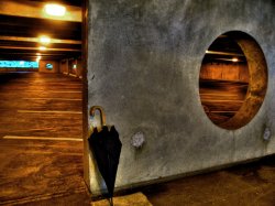
#2 is a bit more interesting, but the umbrella and the large pool of water (?) are competing for attention, so the photo doesn't seem resolved.
#3 seems to be all composition and no concept. Sorry, but it just doesn't make my eyes want to linger.
#4 is the most interesting of the lot, largely because the "subject" (i.e the fence) is in a complementary color to its environment and therefore jumps out, but also because it has some conceptual depth. It seems ironic that these busted up fence slats, which are made of wood, should end up leaning against live trees for support. However, I wonder if a different angle could have foregrounded this dependency to greater effect.
#5 suffers from compositional weakness, but the content is interesting. The blue, rusting, graffiti-tagged dumpsters nestled against each other and juxtaposed with greenery have the potential to make a great photograph, but the substantial foreground adds nothing of interest. The dumpsters are too close to the center, and the structures at the right are distracting.
Thanks for all the pointers. The hard part (at least, from my perspective) in shooting a carpark was finding a way to make the images interesting; apart from the structure of the building, I had a hard time finding any central aspects to shoot (hence the model). I think I did pretty well with the fence, as all the surrounding brush made it VERY hard to get a good perspective..
As for the dumpsters, I see what you mean about compositional weakness. I do find that place very interesting though, and am planning a re-take.
This is my friend Ida from Norway and some of her photographic work:
http://flickr.com/photos/idasorknes/page9/
Check out page 10 as well.
Her portfolio when she came to Uni was based around self portraits and that was it, the consistency of her involvement in the work showed she was interested in her idea enough to repeat it and go over it again and again. Even after 3 years she still does self portraits!
You could use the other car park photos and if you are interested in the subject matter just talk about hyper realities. That could be your main strength, if you feel you need to include other shots, put them in a different portfolio.
I will definitely check out her work later today.. (I'm a bit busy at the moment with homework..) After reading your points though, I think that perhaps one of the most important factors is making the portfolio coherent and self-supporting.. However, I don't think that the carpark images are enough to go on by themselves and am therefore thinking of planning a portfolio perhaps based on my last 2 images, with strong colors throughought.
I like a lot of it but the saturation is too high for my tastes and some of the HDR feels like "HDR for no better reason". I'm assuming you are attempting to over saturate one primary color in a frame dominated by gray. That theme certainly works in most images in each set. The addition of a model makes these shots work better for me -I just wish there was no visible HDR halo around the figure in the exterior parking garage.
I like where you're going. Perhaps grab another model and try to refine the path you've chosen.
I agree that HDR is very tricky as a tool. Too much and it looks ridiculous, but just enough and it can add an entire dimension to the picture. I think that I will try fiddle around to get rid of the HDR halo. Another shoot with more models is definitely a good idea
")
.
Stick with the last two. The members that commented on all of the images says pretty much the same thing I would. They other three lack interest and center focus.... there aren't any dominant elements in the others.
You are doing a good job, but I just want to say be careful getting caught up into the artsy fartsy photography instead of fine art photography. Not that your images are artsy fartsy, study as many genuine art photographers as you can, and learn how and why they produced their images they way they did.
I definitely think that studying art photographers is a good way to get inspiration and learn new techniques. The carpark shots with the model were mildly influenced by the work of Jeff Petry, whose photos are quite amazing..
http://www.troubledartist.com/
when you say you are applying to a fine arts degree, is it commercial photography or fine art photography? I guess the thing to work out is why you are taking these images, and what they are visually describing about your experience of constructed places and environments. There is a whole history of this stuff in art, especially the 'Germans', starting with the Beshers, then Gursky, then Hoffer, and others like Edward Burtynsky [not German, but check out his images on China]. They all have very specific ideas about what these places mean to them, and why they make art about it. The idea of human experience in manufactured landscapes is central to contemporary art discussion etc etc.
In terms of your images in relation to these things, the last one is probably the most successful in that it highlights the connections and absolute contrast of a natural and manufactured environment. The others are relatively decent images technically, but the edges are all wrong, and there is no strength in the composition that connects with the strength in the objects.
Anyways, for an entry folio there are some promising things in here.
I am applying to a fine arts program, not a commercial one. If things do work out, I am hoping to go into fine arts photography, although if not I would still like to do commercial work.
Thanks for the pointers, also. I agree that most need revisions on composition and perhaps more of a 'focus'.. Something I will try and implement when I retake them.
No central point of focus, no good leading lines, no interesting visual elements, lightest points aren't worthy of visual focus and don't lead anywhere at all.
Boring. Not enough contrast between the water and the asphalt. Water doesn't lead the eye anywhere interesting. Eye goes up the frame, then hits the lights and is led right out of the frame.
Person is too small to be the main subject, person offsets the blue as the subject. Crop out the light behind the person in any case, it's distracting. crop the photo in half and the blue almost holds its own, and the lines lead the eye in a nice circle.
Not a bad image, but it really doesn't "tell" me anything. No leading lines, no central point of focus- the color's offsetting one another isn't bad, but nothing leads the eye anywhere.
Again, good color- but that's about it- the pattern of the blue is overtaken by a useless foreground, distracting but not interesting trees and a sky that really doesn't balance, not to mention the vignetting. If you crop out the foreground and the sky/trees, and porta-potty on the right you might end up with an interesting and usable composition.
The second set, the umbrella picture is ok- that and #4 are probably ok, outside of that, I'd look for more leading lines, stronger overall composition and watch where the highlights are- your eyes will be drawn to the highlights first, unless there's a strong leading line to start with, and that line or brightness needs to lead to something worth looking at. Then your image needs to lead the eye around a bit if it can, and if not, it needs to leave it on the subject, not lead it off out of the frame.
I find that glancing quickly at a shot and seeing how my eyes go over it tells me if it "works" in terms of composition, space/negative space and contrast.
Ron Resnick's "Sure Shot" videos have the best overall quick ABCs of composition of anything I've seen, even if the name's stupid and he's not the most engaging speaker I've ever heard. The set's probably worth-while if you're going to pursue photography seriously.
A more detailed criticism would take larger images, these are at the very lower limits of usefulness.[/QUOTE]
Thanks for the analysis - it was really helpful! I appreciate all the tips and will definitely keep them in mind when I try redo these photos.. Also, I will check out the "sure shot" videos.
I am kicking myself over the composition of the last image, and I think that when I re-take it I will try a much closer angle. To be fair, the vignetting is probably because of the quality of my camera (Panasonic point and shoot), but I will see if I can get rid of it by re-doing the HDR.
Also, I'm not sure about what you mean by 'larger' - actual full size prints? I posted all these images in their full size formats (due to them all being taken with a 7mp P & S), and simply attached them as thumbnails to the post..
I already know that I need a better camera, don't worry.