Become a MacRumors Supporter for $50/year with no ads, ability to filter front page stories, and private forums.

stovetop6872

macrumors regular
Original poster
Dec 27, 2007
110
0
I was sick of the pink MobileMe iDisk icons, so I changed the colors to blue, not pink. They are attached below...Just go to HARD DRIVE/System/Library/CoreServices then right click CoreTypes.bundle and click show package contents. Then open Contents and then Resources and find copy iDiskGenericIcon.icns and iDiskUserIcon.icns and move those to the your Desktop (or any other folder, just SAVE THEM, just incase). Download these two new files and drag them into the Resources folder. Then just log out and back in and presto! There is just not 4 different icons in this just one. I actually do not know what all of the different sizes do, thats why we made backups. So if you don't like them, just put the originals back. Hope this helps anyone annoyed by the new icons. NOTE I AM NOT RESPONSIBLE FOR ANYTHING HARMED IN THE PROCESS, but there shouldn't be a problem.

EDIT: Also, thanks to RICHTHOMAS, I missed one iDisk file. So download the second attachment (a 48X67 iDisk graphic) and place it in /System/Library/CoreServices/AOS.bundle/Contents/Resources . MAKE SURE YOU BACK THE OLD ONE UP if you want it back later.
 

Attachments

  • icons.zip
    742.7 KB · Views: 2,809
  • 48x67iDisk.tiff.zip
    5.9 KB · Views: 1,260

stovetop6872

macrumors regular
Original poster
Dec 27, 2007
110
0
Thank you so much for these. The purple icons were just a little too feminine for my tastes.

haha no problem..

If anyone has any other icons they want changed, I'd be happy to do it. Also I think I know how to make the Apple Icon the original blue instead of the boring black in Leopard...but not positive... I will post back later.
 

Daveoc64

macrumors 601
Jan 16, 2008
4,075
95
Bristol, UK
I forgot to post in this thread before.

I'm really happy that someone decided to make these. The default purple/pink one was just awful. It didn't fit Mac OS X and it didn't fit MobileMe's other designs. The blue is perfect.

I've recommended these to a few friends as well.
 

stovetop6872

macrumors regular
Original poster
Dec 27, 2007
110
0
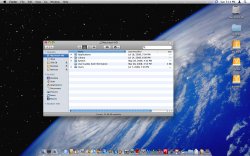
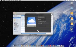
Here are some screenshots.....enjoy!
 

Attachments

  • Picture 1.jpg
    Picture 1.jpg
    132.7 KB · Views: 306
  • Picture 2.jpg
    Picture 2.jpg
    138.5 KB · Views: 358

Maxamillious

Suspended
Jul 11, 2008
72
0
I must have misunderstood your post, but I thought you were referring to the iDisk icon on the MobileMe webapp site. Sadly, I don't own a Mac so I can't really use this but it looks pretty sweet nonetheless.
 

stovetop6872

macrumors regular
Original poster
Dec 27, 2007
110
0
I must have misunderstood your post, but I thought you were referring to the iDisk icon on the MobileMe webapp site. Sadly, I don't own a Mac so I can't really use this but it looks pretty sweet nonetheless.

Sorry for the miscommunication!
 

pcguru83

macrumors 6502a
Sep 13, 2006
583
0
Charlotte, NC
Anyone want to post a screenshot of what they looked like before? I haven't mounted my iDisk yet and I'm not at my Mac at the moment.

Were they seriously pink with a white cloud? Wow...
 

AliensExist4

macrumors member
Nov 2, 2007
49
0
stovetop6872: Just replaced the original iDisk icons with yours and they look way better. Thanks for the icons. Good work.

- Patrick
 
Register on MacRumors! This sidebar will go away, and you'll see fewer ads.