Got a tip for us?
Let us know
Become a MacRumors Supporter for $50/year with no ads, ability to filter front page stories, and private forums.
New music lock screen is horrible!
- Thread starter yaboyjay65
- Start date
- Sort by reaction score
You are using an out of date browser. It may not display this or other websites correctly.
You should upgrade or use an alternative browser.
You should upgrade or use an alternative browser.
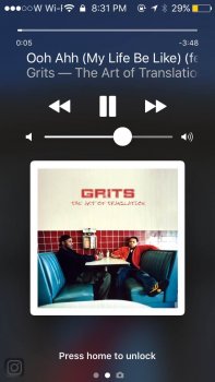
it should adjust according to your text size settings. it looks redic, i am not 80
I don't know how people are defending these music lock screen changes. iOS9 had it perfect. Text was beautiful and looked polished like the rest of Apple's software. The font size increase came out of left field, and really should've been left as a setting, just like they do with other text sizes. This is a step backwards in terms of software design, imo.
I don't know how people are defending these music lock screen changes. iOS9 had it perfect. Text was beautiful and looked polished like the rest of Apple's software. The font size increase came out of left field, and really should've been left as a setting, just like they do with other text sizes. This is a step backwards in terms of software design, imo.
i agree, it looks like they forgot to scale down the iPad music controls or something lol
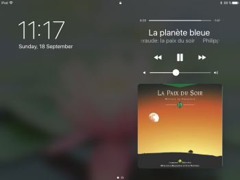
Anyone in there right mind would say that music app lock screen capture is terrible. The back and forward arrows, pause button and volume scroll and font for song titles are huge, way too big, look out of place. It is not pleasing to the user. I can't believe they approved this design. I'm staying on 9.3.5
Couldn't agree more. Apple seems to have a habit of taking things (and interfaces) that don't need fixing in the first place and ruining them.I don't know how people are defending these music lock screen changes. iOS9 had it perfect. Text was beautiful and looked polished like the rest of Apple's software. The font size increase came out of left field, and really should've been left as a setting, just like they do with other text sizes. This is a step backwards in terms of software design, imo.
[doublepost=1474157633][/doublepost]
Agreed, but it's not bad enough to make me revert (if they're still signing iOS9 anymore). Lots of other cool features.Anyone in there right mind would say that music app lock screen capture is terrible. The back and forward arrows, pause button and volume scroll and font for song titles are huge, way too big, look out of place. It is not pleasing to the user. I can't believe they approved this design. I'm staying on 9.3.5
Here's a side by side comparison that I got from Google.

I prefer the iOS 9 design. The redesigned iOS 10 music controls is more like a 180 degree rotation from the new music app's Now Playing screen. Unnecessary scrolling album text when it can all be displayed in one line. Now, you need to do an additional step (click on the ellipsis) to 'love' a song. Oh, and the iPad's version of this is even worst.
Apple in 2016 be like, "if it ain't broke, let's fix it"....
Last edited:
For me. It's much better. Controls that are bigger and therefore easier to use. No wasted space on the screen. Larger fonts so that things are easier to read. And useless/rarely used controls moved off the screen.
My only observation/suggestion would be, why not move the controls to below the artwork like on the actual music player? Would be much easier to use one handed and would then be consistent.
My only observation/suggestion would be, why not move the controls to below the artwork like on the actual music player? Would be much easier to use one handed and would then be consistent.
Cleary the person who worked on this had vision issues, look at how much larger the font is for the song title and then the pause/play button and volume buttons. What's funny is I never once heard anyone complain in the ios9 music app that they wished the font was larger or the buttons larger or the word Library larger yet they did it anyway because they had nothing better to do. It makes no sense and adds no value.Here's a side by side comparison that I got from Google.

I prefer the iOS 9 design. The redesigned iOS 10 music controls is more like a 180 degree rotation from the new music app's Now Playing screen. Unnecessary scrolling album text when it can all be displayed in one line. Now, you need to do an additional step (click on the ellipsis) to 'love' a song. Oh, and the iPad's version of this is even worst.
Apple in 2016 be like, "if it ain't broke, let's fix it"....
I'm a fan of the bigger controls, and getting rid of the stupid heart, but not a fan of scrolling text. The larger song name is fine but album and artist should probably have separate lines.
But the "stupid heart" is now an essential way that Apple decides what music to send you. So it makes zero sense to bury it in "..." menu Hell.
I don't know how people are defending these music lock screen changes. iOS9 had it perfect. Text was beautiful and looked polished like the rest of Apple's software. The font size increase came out of left field, and really should've been left as a setting, just like they do with other text sizes. This is a step backwards in terms of software design, imo.
I think Apple decided to sacrifice the aesthetics for the sake of convenience with iOS 10. Now things look bolder vs polished, as it was in iOS 9. Which makes them easier to spot quickly, but they are not as pretty. I use Apple Maps and was initially shocked to see its new interface vs that in iOS 9, but got used to it over a month or so.
[doublepost=1474190421][/doublepost]

If you guys think you had it rough on the iPhone locked screen, check it out on iPad Air!
Last edited:
Is it just you? Given that there's hundreds of millions of iOS 10 users now, what do you think the probability of that would be? So no, it's not 'just' you.Is it just me or is the new lock screen display for when music is playing horribly ugly compared to ios9?? What do you all think... is this just me?
View attachment 653589
And I think the controls look horrendous too
I agree.The whole music app is a nightmare now.
It's all so convoluted now.
Not only is it ugly, but due to the new design of the lock screen my telephone now have a life of it own ... if the last thing you did was to listen to music it can decide to start playing music .. just because.
Also the switch of 'AirPlay' is less that good, actually it's very crappy....
Also the switch of 'AirPlay' is less that good, actually it's very crappy....
Not sure what the complaining is all about. Yeah the font is big but they FINALLY spaced the damn controls out so I don't accidentally skip tracks when trying to hit the volume slider. HUGE ANNOYANCE UNTIL iOS 10 came along
Register on MacRumors! This sidebar will go away, and you'll see fewer ads.


