Got a tip for us?
Let us know
Become a MacRumors Supporter for $50/year with no ads, ability to filter front page stories, and private forums.
Not Another HDR thread
- Thread starter G.T.
- Start date
- Sort by reaction score
You are using an out of date browser. It may not display this or other websites correctly.
You should upgrade or use an alternative browser.
You should upgrade or use an alternative browser.

They might be tonemapped but they are HDR images that have been tonemapped. Correct me if I'm wrong.
Once they've been tonemapped they're no longer HDR images as the dynamic range has been compressed to fit into an 8bit image format.
It's as simple as that, the images are indeed combined into an HDR at some point during the process but the images you're posting should not be called HDR.
Read any decent book on HDR and most authors have one pet peeve in common and that;s people calling tonemapped output HDR.
I see threads like this posted on most photographic forums but just because it's a common misconception doesn't make it right.
Matt
360precision.com
http://www.360precision.com
nah, i think calling these images hdr is more convenient than saying tonemapped.
somehow it's like everyone says pencil-lead when in reality it's graphite and whatever else.
No it's nothing like that what-so-ever. So convenience is more important than being correct ? I guess it's just like spelling and grammar no longer matter as long as people know what you mean.
There are various options in Photomatix and other HDR/fusing applications that have nothing to do with HDR. There are other methods for creating similar output using the various fusing applications like enfuse, TuFuse etc. Again these are not and do not create any HDR files during the process.
You can call these images anything you want but calling the HDR images is wrong. If you want to be wrong then go ahead.
Matt
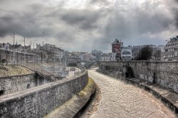
this kicks serious butt, congrats to both shady and thr33face
love the dramatic sorta industrial look, wonder how it would look in black and white. Even though having quite a bit of noise, it feels like it adds to the atmosphere, a more vintage/ damaged film pic
It really is a great shot! Your black and white idea got me thinking... I'll be back shortly with a B&W one!!

Here you go svndmvn
I dont like it in black & white one bit. The color one I did on page 1 was way better

this kicks serious butt, congrats to both shady and thr33face
love the dramatic sorta industrial look, wonder how it would look in black and white. Even though having quite a bit of noise, it feels like it adds to the atmosphere, a more vintage/ damaged film pic
I dont like it in black & white one bit. The color one I did on page 1 was way better
thanks, but I have to agree, not enough contrast or clarity... not really the point of black and white, or of a photo for that matterI dont like it in black & white one bit. The color one I did on page 1 was way better
I appreciate the effort thoughYou can call these images anything you want but calling the HDR images is wrong. If you want to be wrong then go ahead.
Matt
Does it matter, they are HDR images, just tone mapped after processing the 3 or 5 or 7 exposures, but basically G.T. is learning something here so where is the harm in the learning curve he is experiencing? dont take it so seriously, it's just a bit of fun fella
thanks, but I have to agree, not enough contrast or clarity... not really the point of black and white, or of a photo for that matter
No problem.
Does it matter, they are HDR images, just tone mapped after processing the 3 or 5 or 7 exposures, but basically G.T. is learning something here so where is the harm in the learning curve he is experiencing? dont take it so seriously, it's just a bit of fun fella
Exactly.
Please people, stop calling these images HDR when they're not. The final images posted in the this thread are tonemapped images NOT HDR.
Unless you're posting 32 bit images in an actual HDR format ie .exr or .hdr then please call them what they are, tonemapped images.
If you want to learn about HDR images you should grab a copy of this book:
http://www.hdrlabs.com/book/
Matt
So does that make it impossible to post HDR images to the web, since .exr and .hdr files aren't web files?
I dont like it in black & white one bit. The color one I did on page 1 was way better
Its quite good, although, I think I would have to agree that the colour adds more to the image.
Its quite good, although, I think I would have to agree that the colour adds more to the image.
Yea I like the color one I did way more than this one..
Congrats to 'thr33face' on the great shot!
Okay, I spent an hour with my Sunday coffee and some music, making love to the ole' Photomatix editor.
1) Final color version, perhaps a bit too "fakey-looking" now that I'm done, sometimes that'll happen.

2) B&W:

3) Here are the tone-mapping settings I used in the Photomatix editor (click for full screen):

4) Minor tweaks to curves and exposure; added a tinge of yellow through Selective Color just because I liked it.

5) Now we go into Photoshop to fix some things. I run the image through Noiseware Standard (plugin to Photoshop) and I apply a bit of an Unsharp Mask.

-------------------
Now, I may be getting superfluous here, but sometimes I like to partially "Orton-ize" the photo by merging all adjustment layers with the background layer, duplicating it, increasing exposure by 1.5 to 2.0 or so, and throwing a hefty Gaussian Blur on top of it. Then I overlay that duplicate with my original (Move Tool + Select Key to align) and then in the Layer Blending Mode, select Soft Light. Now, throw a black and white layer between that blurred layer and the original background layer. Play with the Opacities and Fills of both until you are satisfied. Sometimes I find this adds a "richness" to the photo and its colors. Other times (though less often, it makes it worse).
6) Here's what I'm talking about kind of (before I added the black and white layer in between the blurred layer and the background layer) --

7) Now with the B&W layer thrown in there, and after I had adjusted my opacities and B&W sliders to my preference.

8) And the Black & White conversion; note the sliders in the adjustments palatte for black and white - experiment with and take advantage of those.

--------------------------------------------------------------
Something to be mindful of -- Color Profiles! Have a look...

The reddish one resulting from when I opened my Photomatix tone-mapped edit of thr33's photos in my own Photoshop which is set to use ProPhoto RGB. From what I could tell, this would be the difference between ProPhoto RGB and Adobe RGB that thr33 uses (I'm assuming). We've all got to be mindful of the color profiles.
I've come to understand ProPhoto RGB is better at maintaining consistent color across different pieces of software, so that's why I've been using it. Someone correct me if I'm wrong on that point...
1) Final color version, perhaps a bit too "fakey-looking" now that I'm done, sometimes that'll happen.
2) B&W:
3) Here are the tone-mapping settings I used in the Photomatix editor (click for full screen):
4) Minor tweaks to curves and exposure; added a tinge of yellow through Selective Color just because I liked it.
5) Now we go into Photoshop to fix some things. I run the image through Noiseware Standard (plugin to Photoshop) and I apply a bit of an Unsharp Mask.
-------------------
Now, I may be getting superfluous here, but sometimes I like to partially "Orton-ize" the photo by merging all adjustment layers with the background layer, duplicating it, increasing exposure by 1.5 to 2.0 or so, and throwing a hefty Gaussian Blur on top of it. Then I overlay that duplicate with my original (Move Tool + Select Key to align) and then in the Layer Blending Mode, select Soft Light. Now, throw a black and white layer between that blurred layer and the original background layer. Play with the Opacities and Fills of both until you are satisfied. Sometimes I find this adds a "richness" to the photo and its colors. Other times (though less often, it makes it worse).
6) Here's what I'm talking about kind of (before I added the black and white layer in between the blurred layer and the background layer) --
7) Now with the B&W layer thrown in there, and after I had adjusted my opacities and B&W sliders to my preference.
8) And the Black & White conversion; note the sliders in the adjustments palatte for black and white - experiment with and take advantage of those.
--------------------------------------------------------------
Something to be mindful of -- Color Profiles! Have a look...
The reddish one resulting from when I opened my Photomatix tone-mapped edit of thr33's photos in my own Photoshop which is set to use ProPhoto RGB. From what I could tell, this would be the difference between ProPhoto RGB and Adobe RGB that thr33 uses (I'm assuming). We've all got to be mindful of the color profiles.
I've come to understand ProPhoto RGB is better at maintaining consistent color across different pieces of software, so that's why I've been using it. Someone correct me if I'm wrong on that point...
Okay, I spent an hour with my Sunday coffee and some music, making love to the ole' Photomatix editor.
...
ahh, yes sunday coffee and music, lovely
From what I could tell, this would be the difference between ProPhoto RGB and Adobe RGB that thr33 uses (I'm assuming). We've all got to be mindful of the color profiles.
I'm using color mode "Ia", which should be sRGB.
From my understanding "ProPhoto RGB" is a Wide-Gamut colour space that allows for redder reds/greener greens/etc. than sRGB or AdobeRGB, but I might just as well be wrong
The reddish one resulting from when I opened my Photomatix tone-mapped edit of thr33's photos in my own Photoshop which is set to use ProPhoto RGB. From what I could tell, this would be the difference between ProPhoto RGB and Adobe RGB that thr33 uses (I'm assuming). We've all got to be mindful of the color profiles.
I've come to understand ProPhoto RGB is better at maintaining consistent color across different pieces of software, so that's why I've been using it. Someone correct me if I'm wrong on that point...
If your after consistent color your right about ProPhoto RGB, from ACR through to PS from start to finish use ProPhoto RGB for better color control, I use it as my monitors standard profile too, since switching ive found i'm much happier with the sharper colors ive been getting, the color gamet is much wider, perfect for 16 bit workflows.
No it's nothing like that what-so-ever. So convenience is more important than being correct ? I guess it's just like spelling and grammar no longer matter as long as people know what you mean.
U R rite!
So does that make it impossible to post HDR images to the web, since .exr and .hdr files aren't web files?
Not only that but the thing is being rendered by a screen so you're surely not going to have any more 'dynamic range' in the output, you can only have from white to black, as your screen render them.
IMO people are absolutely fine to call these things 'HDR' we are not writing a science paper, and everyone knows what we mean. For the reason I have stated above I don't think it makes any functional difference from the observer's point of view if an image is 'really' HDR or not.
When people say "HDR" they mean "an image which has captured a range of dull to bright exceeding that of traditional capture methods and expressed it within a viewable space". People understand what people mean by "HDR photography". Are you [zoetropeuk] suggesting people refer to images posted as "the eventual product of a process of fusing multiple photographs of differing exposure into one HDR image and then exporting the result in a communicable format"? If it's what you can see of the 'HDR' image, and it is the product of 'HDR' imaging techniques then it is 'the image product of a HDR technique' or a 'HDR image' for short.
I don't know how this exp. set will work out, but have a try if you want:
http://dl.getdropbox.com/u/380634/thr33facehdr3.zip
exps:

http://dl.getdropbox.com/u/380634/thr33facehdr3.zip
exps:


Register on MacRumors! This sidebar will go away, and you'll see fewer ads.